Showing posts with label EK SUccess. Show all posts

March 09, 2015

Whimsical Baby Card

The Friday Mashup for the next two weeks is a combination challenge. You have to choose two old challenges and use one or two elements from each. I chose #4 which is Make a Baby Project and Use Punches. And #7 to make a Feminine Project with Ribbons/Pearls. And just for kicks, I added the sketch from #21.

fri mashup 200 ann baby card

I used the punch to cut the scalloped edge at the top of the dotted panel. I used a pearl pen to ‘colour in’ the doodled lace on the onesie. I think the other elements are pretty obvious. I layered the heart and the word. The ‘baby’ die cut has all pink layers underneath. It looks so cute from the side. Same with the heart. I used a micron pen to doodle.

10959302_10203549997739255_7045455550433877867_n

Thanks for so many great challenges Friday Mashup! Click on the photo to go to the challenge.

FM22LesleyF

Enjoy, Rebecca

RECIPE
Paper:
Echo Park New Baby Additions and Dots n Stripes, aqua mist CS
Accessories: baby, heart and onesie die-Echo Park, epoxy hearts-MME, ribbon-unknown, EK Success Scalloped punch,

May 17, 2014

Chalkboard Thanks for Unscripted Sketches #257

I am trying to be more judicious when choosing a sentiment for my cards so I can fill up my stash evenly. One type of card I am always looking for last minute is a hostess card. But since you haven’t actually enjoyed the hospitality yet, it can be awkward to find the right thing to say!

RebeccaEdnie257

KWIM? I can’t say thanks for the meal before I’ve eaten it right? ha ha!! But I like to give a card and small gift when I arrive… So I figured this would work perfectly. And if I needed it as a regular thank you for our family, that would be great too!

I like how the chalkboard technique turned out. I don’t like it when I see it done with just white embossing, no flourishes and no ‘dust’. To me those aspects of the technique are vital to making it look like real chalkboard art.

257

Come on over to the Unscripted Sketches blog and see what everyone has created! This was a tricky sketch for me but you could always straighten those diagonal lines if you like! It’s all about being inspired by the sketch!

Enjoy, Rebecca

RECIPE
Stamps:
Thanks all ways-PTI, Maison (flourishes)-Fiskars
Ink: Versamark, versafine white
Paper: Bazzil black cardstock, Theresa Collins Simple Summer DP
Accessories: enamel dots, washi tape-MME, foam dots-The Sticky Stuff Store, white pastel pencil, white EP-Hero Arts, lace-stash, punch-EK Success

December 07, 2013

Shabby Baby Card for Unscripted Sketches

This sketch was a lot of fun! Some of them kinda stump me at first but this one flowed easily!

RebeccaEdnie234

The ‘Baby’ die is by Marianne I think and the baby things are by Memory Box. They are really quite teensy, for comparison, this is a 5x7 card. The bottle and rattle are about a bit less than an inch high and the soother is only about 3/8” high!

un sc sk234

I coloured them with Copics and oh, so gently sponged them with Distress ink. I also had to be very careful with the word to get ink sponged on the inside areas of the die. I used a Fantastik for the tiny areas. It’s like a sponge tipped pen you can dip in ink. Also good for fixing missed areas of solid stamping.

baby closeup1

The papers are from Little Darlings and G45’s patterns and solids pack. The baby face flower is a chipboard piece. The greyish buttons are Mother of Pearl and look so much nicer IRL!

baby closeup2

I have a couple girlfriends who are pregnant right now so hopefully one of them has a little girl! I have several boy cards already in my stash.

baby closeup3

I do hope to see you over at Unscripted Sketches later this week! We’d love to have you join us! Even if you can’t play. be sure to check out the DT’s awesome projects; they are a talented bunch!

Enjoy, Rebecca

RECIPE
Ink:
Frayed burlap Distress ink
Paper: G45, Ivory CS-PTI
Accessories: EK Success mini scalloped punch, PTI buttons, MOP buttons-Ebay, G45 chipboard, Marianne Baby die, baby things die-Memory Box, Copic Markers, Flowers-Wild Orchid Crafts, Lace-stash, ivory iridescent sequins-Ellen Hutson

September 19, 2013

Shabby Rose Tea Cup

I made this card for the Shabby Tea Room Design Team call but never submitted it. I made it in plenty of time but kept hemming and hawing about submitting and when I finally sat down to do it, I was a few hours too late. I guess it wasn’t meant to be.

rose tea cup tstr dt card

I’ve tried to figure out why I was so reluctant to just submit it! I’m not sure it was one thing, a combo of being too busy with 3 kids, 2 with special needs and one baby, my health and fear of rejection I suppose. I’ve entered a few card challenges lately and haven’t been chosen so I’m getting kinda worried I’m losing my mojo. Oh well. I thought this one turned out really well so it would have represented what I love to make perfectly.

tstr DT Call - 8th Term

Enjoy, Rebecca

RECIPE
Stamps:
Taylored Expressions
Ink: Versamark, Archival Potting Soil, frayed burlap distress
Paper: DP-My Minds Eye, kraft, ivory CS-PTI
Accessories: Roses-Really Reasonable Ribbon, gold EP-SU!, pinking shears, scalloped edge punch-EK Success, Labels Nesties, twine-PTI, MOP button-Ebay, lace-vintage, foam dots-Jody Morrow, tulle-stash, pearls-Dollarama, Hug Snug Seam Binding (hand dyed)

July 02, 2013

Mojo Monday 300! No Small Miracles Awareness Ribbon Card

Wow, Mojo Monday is on their 300th sketch! Even though this is a hard week for me to get any crafting done, I had to play this sketch!

miracle awareness ribbon card

My original idea wasn’t to use all pink or an awareness ribbon theme but as with most of my cards, it changed as I worked on it and ended up very different than I originally envisioned it. That’s just my process. I really love it though and that’s what matters! The sentiment is light but easier to read IRL. It says ‘There are no small Miracles.

Mojo300Sketch

Enjoy, Rebecca

RECIPE
Stamps:
t-shirt-Flourishes, sentiment-Verve
Ink: Memento Black, Hero Arts Rose shadow
Paper: DP-Lavender My Mind’s Eye, Blushing bride,moss CS-SU!, kraft CS-PTI
Accessories: foam dots-Jody Morrow, doily-Wilton, rose-Prima, MS rose leaf punch, label 1 Nesties dies, Sizzix embossing folder, Copic markers and airbrush system, EK Success punch, Sakura gelly roll pen

December 16, 2012

Pretty Green Dress for The Shabby Tea Room

I LOVED this week’s inspiration photo! The colours were amazing, aqua, a slightly peachy pink, silver and a bit of brown which I didn’t really use much. I decided to recreate the dress and add some silver and pink accents.

green dress form tstr

There are so many details that are hard to see and so much prettier IRL. The rose on the top of the dress form is clay and from some broken jewellery my mom gave me. It had a flaw on it so I covered the petal edges in glitter. No way to see the super fine glitter in the photo. You may be able to see in the  close up that I added the tiniest possible drops of Pearl Pen to the straps and neckline because to me the bodice looked beaded.

The belt ‘buckle’ has tiny flowers on it. The bodice has a vellum overlay to soften it and make it match better with the colour of the skirt with the tulle over it. The mannequin is covered in pretty tone-on-tone floral paper. The music stamped behind the mannequin has small areas which are embossed with silver glittered embossing powder which gives it a bit of vintage, distressed looking sparkle. I really wish you could see those things. They took me ages to add!

green dress form tstr2

The ribbon medallion, which is mimics the one in the inspiration photo, is much pinker IRL and not so orange. More like a deeper version of the Paris postcard colour on the lower part of the card. I tried manipulating my photo every which way but it either made it worse or seriously and disastrously affected the other colours. I didn’t really use the brown  much but there is a touch of it on the Paris postcard in the postmark which you can se below.

green dress form tstr3

This gorgeous embellishment originally had a bright pink crystal dangling at the bottom which didn't suit at all so I swapped it out for a pearl bead. Ah, much better! Since I wasn’t hanging it from anywhere, I added a ribbon to the loop at the top. I love the subtle glitter they embedded in the epoxy when they made it.

tstr144

TMS _176

Click on either photo to visit the challenge blog posts. One other fun detail. I should have taken an angle shot because you can’t see it but the mannequin is several layers thick. She is made of pretty thick coaster board, 4 layers, so she stands out quite a bit from the background. You can tell a bit by looking at her shadow. much larger than it would be if she was flat or popped up on foam dots.

I’m also entering this in the Simon Says Stamp Challenge to use Your Favourites because this music stamp is one of my favourites. I lost it for a while and was THRILLED to have found it! YEAH!

Enjoy, Rebecca

RECIPE
Stamps:
music-SU!, flourish-PTI
Ink: Antique Linen, Encore silver
Paper: background dp-MME, roses-American Crafts, postcard-Cavalini, blush CS-SU!, coaster board-Ellen Hutson, silver paper, vellum-stash, aqua mist CS-PTI
Accessories: bird charm-Girl’s Paperie, medallion ribbon-American Crafts, white ribbon-May Arts, tulle-Michaels, pearls-Dollarama, rhinestones-TE, lace-Etsy, Tim Holtz mannequin dies, PTI label dies, SU! silver and iridescent ice EP, flower bouquet-Jesse James buttons, foam dots-Jody Morrow, pearl bead-stash, mini scalloped punch-EK Success, Pearl Pen, ribbon slide-stash, sheer white ribbon-stash, Glitter Ritz Warm Highlights

November 26, 2012

Sarah’s Shower Card and Cake

My sister is getting married and yesterday was a huge shower for her. It was arranged by the family of her fiancée and they are Italian. My family is of British descent and it isn’t a heritage we really honour in any way. But the Italians have quite a few traditions and lots of fabulous food so I am having a blast joining in with all the fun!

sarah shower card2

This is the card I made for her. If you are really on the ball, you will remember that I already made her a card but since this is what I do, why not make another? Especially since he really likes birds and I found this paper with two sweet little birdies on it and an appropriate sentiment! The trim isn’t 100% perfect but it does match better IRL. I think I’m going to have to buy some matching ribbon from PTI because it’s an odd colour to match.

sarah shower card

So back to the shower. In my circle of friends, our tradition is to have a bridal shower one afternoon or evening, have appetizers and desserts in someone’s home, usually whomever has the biggest house, and bring lots of gifts. The Italian tradition is to rent a banquet hall, have served lunch, several courses, wine, music and mostly money in cards as gifts. Wow, what a huge difference! I loved every minute! I’ll take cheesy mushroom risotto, spinach and cheese-filled, cream sauce-covered pasta, stuffed herb stuffed chicken breast over veggies and dip, pastry-covered mini sausages and brownies made from a mix any day!  And tartufo (Italian layered ice cream), fruit and a sweet table later! It just isn’t doable in my group as we don’t have the money but it was scrumptious. I don’t want to sound ungrateful for any of the showers I’ve been invited to; they are fun and lovely especially since the company is most important but it was a nice afternoon out sans men and it was great getting to know some new extended family.

sarah shower cake

One of Sarah’s fiancée's sisters is a cake maker and make this beauty for the shower. Amazing huh? The cake plate even is to die for. Another fun part of the shower was the door prize draws. I have a big voice and I was sitting with the ‘sisters’, so I was nominated to call out the winners. I ended up winning a door prize basket! No, I didn’t cheat! A nice fabric covered box with a tin of cookies, some Hershey’s Kisses, a coffee mug, bath salts, body wash, a bath pouf, a candle and a packet of hot chocolate! Awesome. Then I also won the centerpiece! Whomever was sitting in the seat with the yellow ribbon tied on it got to take it home. Every chair had a different colour and I only chose the seat I did because it was at the back so out of the way because I had the baby and the stroller. I had thought a little curling ribbon was an odd choice in decor!

sarah shower centerpiece

My card based on November’s SFYTT. You have a couple days to try it out! I’ve actually played 11/11 so far and I am so proud. Watch me drop the ball on December’s sketch! As you can see, I rotated mine 180 until it was upside down. And then stretched it to landscape orientation. But all the elements are still there in basically the same places!

sfyttnov2012sketch

Enjoy, Rebecca

RECIPE
Stamps:
WMS Say It Loud
Ink: Autumn Rose-PTI
Paper: Autumn Rose CS-PTI, DP-Blush MME
Accessories: lace-Fabricland, trim-stash, flower-Michaels, pearl brad-Recollections, punch-EK Success,

September 04, 2012

Sweet Bee Card for Mojo Monday

I liked the sketch for this week’s Mojo Monday so much, I decided to make a second card using it!

bee mojo_thumb

I just bought this stamp set second hand and I was thrilled that it went so well with some new paper too! The yellow hexagons just screamed bee to me! I LOVE the shape of this bee; it is realistic without being creepily so. I have a huge bug phobia but it looks sweet stamped right? And no icky, overly detailed eyes (I find totally realistic eyes especially creepy). The stamp set includes a body stamp to make the bee yellow but I have no ink that even approaches a colour that would coordinate with or match this paper. So I paper pieced it instead which also gave it a sweet yellow halo! I LOVE how it looks. Can you tell this card is going to be hard to part with? {{ GRIN }}

Mojo257Sketch[6]

Did you notice what I stamped directly on the patterned paper? They already had ‘be.’ on the paper; I added the ‘Bee’. I thought it made for a cute play on words! Then I added a little ribbon tab in place of the flag in the sketch. If you ever like to enter the M0jo Monday contest, be warned that I’ve found the judges are particular about seeing you not deviate from the sketch too much. Sure you can swap out the shapes and add a layer or two as matting but they really like to see all the elements and in the same places and relative proportions. I won in July and made sure every element was on there! I added a bit of washi tape sticking out from under the largest panel for a bit of interest.

Enjoy, Rebecca

RECIPE
Stamps:
PTI
Paper: MME DP, kraft, rustic white-PTI, vintage music paper
Ink: Archival black-Ranger, London Fog Memento, Bordering blue-SU!, Old Paper, Vintage photo Distress
Accessories: roses-Prima, button card die-PTI, lacey circles, circles dies-Spellbinders, WRMK corner rounder, EK Success mini scallop punch, washi tape-Studio Calico

April 14, 2012

CPS 161 Guest Designer–French Inspired Collage Pocket Card

I am thrilled to be a Guest Designer for CPS today! I won CPS 158 a couple weeks ago, Yeeeaaaah!, and playing along with their DT is the best reward! (Read to the end for a link to the winning card.) Be sure to check out the challenge if you’d like to play along with CPS 161. I’ll admit I was taken aback by the diagonal line on the sketch as I am not a huge fan of diagonal lines. But this is called a ‘challenge’ after all! So…

CPS 161 GDT card wo tags

… I made a pocket card! For me, it was a perfect way to make the diagonal line work! This card actually has two pockets. You can find the tutorial here: SCS  Diagonal Double Pocket Card. My paper started to tear at the ‘spine’ so I punched some holes in the side and turned it into a mini book style card. I would have tied a bow but the tulle was too short. I really like this and I think I’ll keep it so I may add another sheet of paper, the same design but folded with the yellow out and make it an actual mini book. For each pocket, I made a tag which I collaged.

CPS 161 GDT tag1

The base was actually a sticker so I adhered it to some of the leftover DP from cutting a 12x12” sheet down to the 8.5x11” sheet required for the tutorial. Although I removed the bulky plastic bits from inside the flowers, they still are a bit thicker than is ideal for the pocket. Oh well…

CPS 161 GDT tag2

The base of this one is a plain white tag. Quite a few of the items I used for this project were given to me in swaps so if something isn’t in my recipe list at the bottom, that’s why. I have no idea of the origin. Sorry. In fact, on this tag, the only thing I can list is the metal clip and the ribbon.

CPS 161 GDT card w tags

Here is the card with everything. It is quite busy so that is why I decided to photograph everything separately first. I hope you will play the challenge today.

CPS161

I want to thank the CPS judges so much for honouring the card I won with (You can see it here: Happy Anniversary Double Challenge Card) and for choosing me to Guest Design today. I really appreciate it! I’d love to join your team in the future, once my baby is a bit older. You can see photos of him HERE.

Enjoy, Rebecca

RECIPE
Stamps:
PTI Vintage Labels (gold stamping along pocket edge)
Ink: Faded Jeans, Antique Linen, Vintage Photo Distress inks, Encore Gold ink
Paper: Vintage Blue-Glitz Designs, vintage music paper, Cologne and France stickers-Cavallini Papers & Co., vanilla CS-SU!
Accessories: seam binding ribbon- Masterstroke Ribbon, Silk ribbon-May Arts, bling strip-Recollections, tulle, sentiment sticker-Glitz Designs, mini clothespins-Pebbles Inc., pearls-Dollarama, Kaisercraft, vintage lace, metal clip-Making Memories, film strip, staples-Tim Holtz, flowers-Michaels, gold shimmer mist-LuminArte (clothespin colouring), foam dots-Jody Morrow
(Anything not listed is unknown)

April 08, 2012

Beach Retirement Card

Hubby gave me exactly 1.5 days to make this card for a colleague’s retirement! Fabulous right? Yeesh… At least I was happy with how it turned out!

beach retirement

I used the Mojo Monday sketch from this week. Click on the sketch below to link to their blog. I haven’t managed to play a contest week for a while so I am excited! Especially since I won the CPS 158 last week! AND I was one of the Terrific Top Three Winners at the Shabby Tea Room 107! Wahoo!

Mojo235SketchCONTESTWEEK

I wasn’t thrilled with my Copic colouring on this one, I think it lacks a bit of depth but it’s ok. I was making it between 1 and 3am so I might have spent more time on it normally. I just noticed that I should have made the sand closest to the water darker to make it look wet and the sand under the chair should have been darker too. Ooops! I used a Spica pen to make the waves and sand look a bit glittery. Here’s a close up of the fish netting and shells I used to embellish it. I got the real fish net in Ocean City (the family version of Atlantic City) and I much prefer it to net ribbon or cheesecloth.

beach retirement bellie closeup

See the bird at the top of the oval panel… well, I have to admit, mistakes are the mother of embellishment. I was using a very new Copic marker, Y26 I think, and I noticed it was getting very juicy. Normally I might have clued in to what was about to happen but this was about 1:30 am so nope. You guess it, my marker blobbed all over my work. And did I blot it immediately? No (honestly…)! I just waited for it to dry! It was so saturated that I couldn’t get it all out with the colourless blender. So it became embellished! note to all of you who have Copics. When you get new ones, take off both caps to allow the pressures inside to equalize. That’s what makes is blob, usually anyways. Rarely it can blob because it is overfilled but that doesn’t happen often straight from the factory.

Enjoy, Rebecca

RECIPE
Stamps:
sentiment-Say It Loud WMS, beach scene-JustRite Stamps
Ink: Memento Cocoa, Colourbox chalk ink, Baja-SU!, Vintage Photo Distress
Paper: MME DP, kraft, vanilla, moss CS-SU!, white CS-XPress It, Ocean Tides CS-PTI,
Accessories: EK Success punch, Oval Nesties, Shells, bird-Jesse James buttons, seam binding-Masterstroke ribbon, fish net-Ocean City boardwalk, foam dots-Jody Morrow, pearls-Dollarama, Copics-Y21,26, YR61,YG61,63,67,G24. BG10,72,75,99 B91,93, BV02, E08,31,33,71,74,77, C1,3,5, W3,5,7, Spica sand, clear, gold metallic paste (distress shells)

April 01, 2012

Shabby Tea Room Spring Challenge Shadow Box

egg shadow box

I am entering the Spring Shabby Tea Room Blog Challenge to use a butterfly with yellow, blue, lilac and kraft. This is a shadow box I am going to use as a wall hanging. I’m not sure when the Tea Room judges look at the projects but I am off to make a matching card shortly.

egg shadow box closeup front

Here’s a close up of the floral cluster. The greyish flower actually looks more bluish IRL. But there is blue in the DP and the eggs are bluish right?

egg shadow box inside

I cut the paper carefully so most of the eggs would show and the piece I trimmed off the top is now the strip at the bottom. I placed some vintage gathered lace around the base of the nest. I LOVE how this looks!

egg shadow box closeup inside

Aren’t those little eggs cute? Believe it or not, they are off of an Easter sprig from my local dollar store! Cool right?

egg shadow box side

I custom dyed the lace trim seen here so it would match the papers better. I used Copic Various inks. This is going to hang on my wall so I constructed the ribbon tab so I can replace the ribbon if it gets too gross. I am fine for it aging vintage-y but I have young kids so who knows what might end up on it! I punched two holes with my Crop-a-dile (easy-peasy) and actually sewed the button on through the ribbon and the box and into another button on the other side for strength. When it came to tying it, that got tricky so the ends were hidden but I managed!

I’ll be back with my card soon.

Enjoy, Rebecca

RECIPE
Paper:
7 Gypsies
Ink: Antique Linen, Faded Jeans, Vintage Photo Distress inks
Accessories: mini scalloped punch-EK Success, brown acrylic paint, vintage buttons and laces, Hug Snug seam binding ribbon, Kaisercraft pearls, nest, eggs and branches, pearls-Dollarama, Box-Basic Grey, silk ribbon-May Arts, silk flowers (coloured with Copics)-Michaels, paper flowers-Recollections, Copic markers and Various inks

March 27, 2012

Celebrate–You Deserve It!

I managed to do the March SFYTT! Third one in a row! I can’t believe I remembered! Hubby got a promotion in Feb and it took me this long to make him a card, shame on me.

promotion celebrate SFYTT

I used Graphic 45 Le Cirque paper because it is so masculine. Hubby took one look at the card and said, “It’s very guy.” Yep, definitely not girlie. The sentiment panel is much more obvious and intense looking IRL. The EP is called Medieval Metals and is a mix of gold, silver and copper. You can’t see that it is metallic in the photo. Yeah, you can probably tell that the little words on the Kraft paper were not my original intention. I wasn’t sure if the EP would be OK for the tiny lettering. I decided it would be fine but I accidentally grabbed another colour of EP. Nuts! And it did NOT look good. Sad smile But I think it looks OK in the end. I inked the DP the embossing is on so the embossing would show up more.

The star is cut from DP glued to thin chipboard. Then I glittered the edges with black glitter. I figured glitter was OK because circus costumes are so sparkly. And it is black. I cut the bottom panel with a large scalloped punch because I thought it looked  like a curtain held back with cords or rope.

mar2012sfytt

Click on the sketch to see visit the site. You only have a few more days to participate.

Enjoy, Rebecca

RECIPE
Stamps:
WMS Say It Loud
Ink: Versamark, Vintage Photo Distress, chocolate-SU!
Paper: Graphic 45, black, kraft CS-SU!, chipboard-Ellen Hutson Craft-a-Board
Accessories: WRMK heart distresser, punch-EK Success, twine-Karen Foster, Medieval Metals EP-Sweet Stamps, foam dots-Jody Morrow, Sizzix star die

February 25, 2012

PTI Blog Hop


This month's theme was interactive cards! I can't wait until I can order the Movers and Shakers dies! For now, I used an SCS tutorial for a wiper card.

spring life wiper card closed
Here's the front…

spring life wiper card

and this photo below shows what it looks like opened up.

If you hold it open and flat, the wiper section sticks up perfectly straight. We've just had three straight yucky days with snow so I needed a happy card with springy colours! I made a very similar card before in deeper colours; if you go to the search box in the top left corner next to the orange Blogger 'B' and type in wiper, you will find it. Hard to create links how I'm posting. It would be perfect for a sympathy card. ETA: Here’s the link.

spring life wiper card close up
I've always wanted to make one with a pocket inside for a gift card holder with an arrow on the wiper pointing to it! I didn't realize until now that my Laughter panel looks unbalanced so I'll probably add a little leaf sprig at the top later. I used a marker to create the centers for the pink flowers.

The yellow flower doesn't have a center for it exactly. I tried thumping my markers in the center but it didn't show up enough. So I used the tiny flower stamp included to stamp several times in apricot ink to make a center. It's the same stamp you see in pink in a few places.

EDITED SINCE I WROTE THIS: I apologize for the very lousy iPhone photos. I promise to get better ones up this afternoon but I'm so tired. I got up right after nursing the baby to make this. He actually slept through the night, from 12:30 until almost 8 (awesome for a 2 month old), but I'm behind on sleep because he's usually up several times! So I'm posting from my iPhone and will post properly later with real camera pictures. I'll add the recipe then too. The PTI products are the papers except the Kraft and plum CS, the stamps, dies, buttons and striped twine. The inks, scalloped punch and twine are not PTI.

Enjoy, Rebecca

RECIPE
Stamps:
Life-PTI
Ink: banana, apricot, moss, olive, plum, pink, eggplant-SU! Distress Linen, Photo
Paper: spring moss DP, rustic white CS-PTI, kraft, perfect plum, pale plum CS-SU!
Accessories: butterfly and scalloped circle die, chocolate twine, white button twine, buttons-PTI, foam dots-Jody Morrow, twine-stash, bee bellie-Jessie James buttons, Battenburg lace tape-stash, EK Success mini scallop punch, WRKM Corner Chomper

January 25, 2012

Mojo and Make It Monday Challenge Card

THIS A SPOILER ALERT! REBECCA, DO NOT READ THIS POST!

I am going to type everything at the top of this post so my BFF Rebecca (yeah, same name, I know!) doesn’t see it before she closes this page.

This card uses the Mojo sketch for this week and also meets the requirements for this week’s PTI Make It Monday to make a shaker card using dies. I hadn’t thought to use dies before and I really had a fun time with it. I think this also qualifies for the JustRite colour challenge if I still have time to enter. ETA Darn, missed it, again!!!

I used Labels 1 Nesties for the outer frame and PTI’s heart die for the inside. I had a sheet of foam dimensional material that I cut instead of fun foam. The acetate sheet comes from stamp packaging. Way to recycle right?

Mojo225Sketch

Hopefully this is down far enough on the page that she won’t see it!

teddy bear mojo225 sfytt

Isn’t that ice cream paper the cutest?? I made the heart button with another PTI heart die. The little words inside the shaker box are from Mega Mixed Messages and I hand cut them. Also in the box is clear micro beads and some glitter, a mix of white and gold I think, I bought it like that. The bear is paper pieced and shaded with Copic markers. Actually, I though the paper needed muting so I coloured the whole image with E71.

My girlfriends threw me the best Teddy Bear themed baby shower in honour of my new baby, Theodore, Teddy for short. I love it! Rebecca even bought honey bears for everyone and HANDCUT 30 or 40 bear shaped tags! WOW! So the shaker words say ‘wish’, ‘friend’, ‘merci’ and ‘thanks’. I took a photo of how I layered the shaker box so if you’d like to see, just let me know.

Enjoy, Rebecca

RECIPE
Stamps:
flourish under shaker box and Mon Amie-SU!, bear-TE, mini words-PTI
Ink: Chocolate, ivory-SU!, memento black, Antique Linen, Vintage Photo Distress
Paper: dark brown-stash, probably Bazzil, kraft-SU!, DP-MME
Accessories: heart dies, square pinked die, button-PTI, black liquid enamel-Ranger, foam dots and dimensionals sheet- Jody Morrow, Nesties labels 1, silk ribbon-May Arts, lace-vintage, EK Success Mini scalloped punch, MS micro beads, Art Institute Glitter, Copic E71,74,77

Sketch for You to Try January

I am not good at remembering to do things, at all. But I am going to TRY to do all 12 sketches this year for SFYTT. I hope I manage. I have a reminder in my iPhone but who knows…

01 12 sfytt sweet peas

I used dies from Heartfelt Creations Miniature Rose to make the flower. I got it from Joan’s Gardens. Its really pretty easy, the die cuts 6 flowers with holes in the center and a star shape for the petals. You shape the flowers, the inner one (or ones) cup inward and the rest outward. The very inner petals are glued together to form the bud. I only cupped one flower inward and glued it but next time I will cup at least 2, maybe 3 inwards, glue the first into the bud then partially glue one more layer of petals near the bottom only as well.

jan2012sketch

Enjoy, Rebecca

RECIPE
Stamps:
Sweet Pea and frame-JustRite Stampers
Ink: Memento black, Antique Linen, Vintage Photo Distress, white-PTI, celery-SU!
Paper: Lily Kate-Basic Grey, kraft, celery, banana CS-SU!, white CS-X-Press It, sweet blush CS-PTI
Accessories: circle Nesties, May Arts lace and silk ribbon, Heartfelt Creations Miniature Rose die, EK Success mini scalloped punch, foam dots-Jody Morrow, Pearls-Dollarama, twine, edge die-PTI, corsage pin-Michaels, Copic markers-R11,20,22,32, G21,24, YG63,67, YR30, Y21, Bow-Easy

January PaperTrey Ink Blog Hop

I love this blog hop but haven’t participated in a while. It’s so hard to create something in time with only one day notice! (Unless the topic is posted in advance somewhere I am not aware of, please let me know if it is.) So I often miss out. But this time, I already made a card that qualifies that I hadn’t posted yet, NO WAY! Oh yeah, WAY!
 

button btq easel card
The challenge was to find your favourite card from 2011 that features PTI products, then to CASE yourself using that card as inspiration. I absolutely love Button Boutique and had a blast playing with it when I first got it. The original post is HERE.You can see the other button cards I made that day HERE.
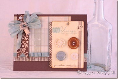
pti mojo button card
I actually made this for last week’s Mojo Monday sketch but as is typical with me, I forgot to post it in time to link it up. I drive myself crazy doing that! And I remembered only 40 minutes late. Sad smileBut now that I see it will work perfectly for this month’s blog hop, I am not so disappointed in myself. Smile

pti mojo button card bow macro

I really had fun making this stick pin. I decided to go very sewing themed with it once I found that the charm I picked would go on the pin when I bent the charm ring back. I was going to bend it back all the way flat against the back but when I got it half way, I got the brilliant inspiration to slide it on a corsage pin. A mini thread spool quickly followed as it was sitting in the same bellie container as the charm. I store my bellies by theme if it has a theme and by type, eg: brads, buttons etc if it doesn’t. Some things are subdivided by colour as well if I have too many for one container.
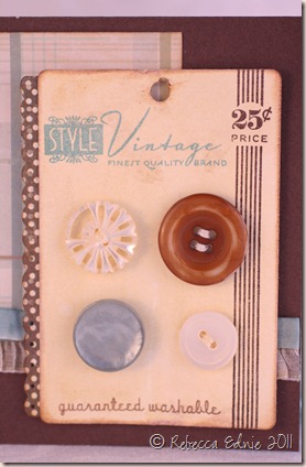
pti mojo button card button macro
This is a close-up of the button card. I used a broken vintage MOP (Mother of pearl) button and the others are from PTI. The brown one looked too new and perfect so I scuffed it up with a nail file. I really like these colours together, cocoa, chocolate and baja by SU! (I apologize for the weird colour cast to these photos, I tried to adjust the colour but I am not using software with an auto white balance adjustment so I could only go more blue or more pink,  this was the closest to neutral I could get. I actually do better photographing at night as usual!)

button btq easel card closeup

Here’s a close-up of the original card’s button card. I think this is baja again, LOL! I wanted each button to look different so I either threaded differently or placed them at different angles. But I really embellished the plain white button with embroidery thread making it look like a little flower! Awww, so cute right? The pink part is a French knot, easy to learn to do; I’m sure there are zillions of instructions on the web or on YouTube if you’d like to try this. A small detail but card making is all in the details right?

If you enjoyed this project, please visit again or subscribe. I have RSS and email sub widgets on my sidebar. I don’t always post regularly as I have a 1 month old so bear with me!

Enjoy, Rebecca

RECIPE (see original card link for those supplies)
Stamps: Button Boutique-PTI
Ink: cocoa, chocolate, baja-SU!, Distress Antique Linen, Vintage photo, Antique Linen Distress Stain
Paper: chocolate, vanilla CS-SU!, DP-MME,
Accessories: button card die, buttons-PTI, damask ribbon-Wal-Mart, thread spool, corsage pin-Michaels, charm-stash, Silk ribbon-May Arts, Copic BG72,75, Bow-Easy, lingerie ruffle-stash of bra making supplies I sell, foam dots-Jody Morrow, Zots dimensional clear glue dots, EK Success mini scalloped punch, WRMK distresser
