April 29, 2009

Card Making 101-Part 1 Analyze Your Style, Choosing Stamps and Paper!

I was asked for advice by a beginner card maker; I spent ages writing her a long, long email with advice for her. She was thrilled with it and suggested that I publish it for others who might also be starting out. We bloggers often assume that others understand not only our short forms for terms but basic card making techniques and supplies. So this is Part 1 of a beginner card making series.

Before you can buy patterned paper or stamps, you need to analyze what your style(s) is/are. There are too many stamps out there to just grab what is pretty to your eyes at first glance! The best way to waste money is by buying stamps that are gorgeous but you end up not using. Think about your style in other areas of life. What is your decorating style? Not necessarily what you have but what you wish you had! What about your clothing style? Bohemian? Sophisticated? Vintage? Retro? Cute? Tailored? Casual? Outdoorsy? Include not only what you wear on a regular basis but also what you would wear if your lifestyle allowed it or if it was popular. I love heirloom clothing but it would make me look like I was dressed as an extra in a movie!  What type of art do you like? What type of jewellery do you go for? Where do you vacation? Beach? City? Country? Camping? Historical tours? That will often help you figure out what type of stamps you should buy. Not that you will only have one style or only buy one type of stamps. Because of that, you might also want to look what you don’t like! There are gorgeous stamps out there that appeal to me at first but when I really think about it, I just know I won’t use them. One nice thing about stamps is that you can buy ones that are in a style you like but aren’t brave enough to wear or decorate in!

Now, remember this is advice for beginners, striving to creating a collection of stamps you will use most. Experienced (or wealthy!) stampers will always have some images they LOVED and HAD to have but they don’t use much. But when you are starting, every stamp has to be one that will get some serious use because you don’t have many to choose from.

When you look at a stamp, ask yourself the following questions: What type of cards would I make using this stamp? When I use this stamp, who am I creating for? Can I use this for a variety or pt1outline stamp cards or only for a single holiday/occasion/person? For example, if you make manly cards, think of outdoorsy, animal or vintage images. Flower images are very versatile and can be used for most occasions. If you have a lot of parties, get a set for invitations; lots of new babies on the way-pregnancy and baby sets; little kids parties-cute cartoony images; lots of older ones in your family or those of your friends-sympathy or get well sets… you get the idea. As a beginner, never buy a stamp if you can only think of one or two ways to use it. I’d go for a combination of at least 5: people to use it for, occasions it suits or techniques to use with it. If you are buying sets, you need to like/need at least half, if not more, of the images.

What techniques or colouring mediums do you like best? If you like to solid stamp or make your own specialty backgrounds, get pt1 solid image silhouette images. Love markers, water colouring or  pencil crayons? Get outline images. Love paper piecing? Get simple shapes. (Paper piecing is when you stamp an image on coloured cardstock or patterned paper and you cut out part or all of the image and glue or foam dot it to the same image stamped on neutral cardstock. Often used for clothing or furniture. See HERE for an example.)

One other consideration in buying stamps is the type. There are pt1bkgdtwo basic kinds of stamps. Ones that come on or with wooden blocks (generally rubber) or ones that do not. They can be clear  or rubber. Wood block stamps require nothing but ink to get started unless they come unmounted. If they do, follow the directions to apply the stamps to the blocks provided. Clear stamps (AKA photopolymer) require acrylic blocks but nothing else, they stick to the block on their own. I recommend at least two sizes of blocks, one at least as large as your largest stamp and one about 2-3” square. If possible, at least one block should have a lines or a pt1gridblock grid etched into the plastic so you can be sure words and sentiments are straight. (Click to enlarge photo)Unmounted or ‘Naked’ rubber requires some type of adhesive to stick them to the acrylic blocks. Some people use double-stick tape or certain kinds of liquid, repositionable adhesive but I prefer a type of foam cushioning called EZ mount. You buy it in sheets and pt1clr stamps permanently apply trimmed rubber stamps to the adhesive side, then cut them from the sheet. The other side is referred to as cling in that it clings to acrylic blocks. With either method that doesn’t use foam cushioning (clear or rubber and adhesive), a cushion of some type is recommended. Close To My Heart (CTMH) stamps come with a cushion in every stamp set. A mouse pad works well too but I don’t often find it need it as both rubber and clear stamps have some give to them anyway. If your stamping surface is possible even slightly uneven, always use cushioning. One other category of stamps is foam mounted but there are few sets like that, they are cheap though.
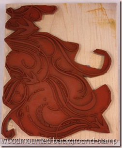
Pros and cons? Unmounted of either type is WAY cheaper than wood mounted, about 50-75% of the price of wood mounted. Rubber will last longer than clear (several lifetimes if cared for) and although they have improved the clear technology lately, no one really knows how long they will last. If you get unmounted rubber provided with wooden blocks, you can choose they way pt1custom mount you mount them (centered or to one side, sentiment attached or separate) but it takes good scissors along with time and patience, especially with alphabets, small stamps or ones that need to be mounted very straight like borders. If your stickers aren’t on straight, later placement can be difficult. I prefer mine like the pt1customset
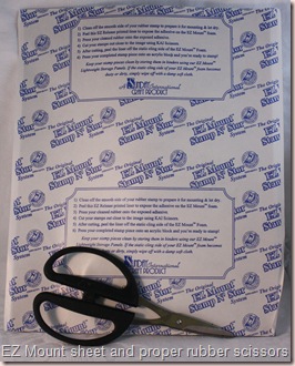
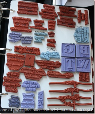
photo  above because as a right-handed person, I can see the edges of the rubber helping me get the image in the right place. Wood mounted takes about 4-8 times more room to store but is convenient because you don’t have to place them on acrylic blocks. Clear stamps are easy to lose because they are hard to see once dropped but take little room to store. Shipping is usually cheaper for clear or unmounted rubber stamps.  Some companies pt1binder storage sheet provide storage panels, tins or cases for storage including index stickers for their stamps so check that out ahead of time if it matters to you. You can sometimes buy unmounted rubber stamps extra cheap if you buy a whole sheet of rubber as manufactured and cut them apart yourself. Unmounted rubber very rarely comes in any kind of envelope, case or plastic sheet so storage requires some thought. EZ Mounted stamps take up about double the storage space compared to plain rubber or clear but no cushioning is needed. Most of my stamps are rubber and pt1ezmountsheet scissors EZ mounted; I store them on laminated storage panels in zippered three ring binders stored by theme-nature, flowers, vintage, masculine, girlie, animals, words and verses etc.
Paper is a bit easier to choose, not only because it is cheaper and therefore less of an investment, but also because you don’t have it forever like stamps. Still, try to think of how you will use it. I recommend that you buy cardstock and paper that coordinate to start (and ink but I will cover that in Part 2) because it wastes time and pt1ezmount from back money to have to buy paper in the middle of a project and it is impossible to match/coordinate colours online. I strongly recommend that you choose a single company to buy from to start. Like www.stampinup.com (my fave but no affiliation anymore) www.ctmh.com or www.papertreyink.com . I strongly recommend you buy packs of CS because it is MUCH cheaper, and ALWAYS buy good quality CS rather than from the dollar or discount store. Bad cardstock can ruin all your hard work, you go to stand it up and it falls over! Good quality CS in a pack is usually cheaper than bad CS by the sheet. If you stamp solid images a lot, go for Stampin’ Up! white and vanilla CS because it is coated which makes for smoother solid stamping. It helps other images to stamp cleanly but is NOT good for Copic marker colouring. They all sell coordinating paper, cardstock and embellishments. Don’t get carried away with embellishments at first (Part 3!) because there are tons of ways to save money so you can start buying tools (Part4) that will make your life easier and your cards more fun!

This got way too long, sorry. I hope this helps some newbies. Enjoy, Rebecca
April 28, 2009

Froggie Card for Twinkling Tuesday-Penny Card Tutorial

I have a new e-friend who is a beginner card maker. She asked me for some beginner advice, I emailed her back and realizing how many things we ‘experts’ take for granted, I am starting a series of tutorials for things I might have previously considered too easy for most readers. Everyone has to start at the beginning right? So I did a tutorial for this fun penny card. I only used the most basic of supplies to prove you can do a lot even as a beginner with limited supplies. If you don’t want to follow the tutorial, feel free to scroll down to Step 9 showing the final card.

Supplies:
Cardstock for card base 4.25x5.5” folded
One white panel 5x3.75”
Cardstock scraps for paper piecing
Black ink
White glue
Sharp, fine tip scissors
2 pennies
Foam dots
1/4” and 1/2” hole punches
Ruler
Pencil
Coloured ink (optional)
Markers (optional)
Glitter (optional)

frog1Step 1: Stamp your frogs on cardstock. I would have coloured them with Copic markers but I wanted to go with limited supplies. TIP: When cutting out thin areas like the frog’s arms and legs, cut out the body first. Then cut out the ‘fingers’, then the arms. If you cut the arms first and you aren’t careful, you can rip them off while cutting the fingers.  Notice I have two of the mushroom’s top and extra eyes!

frog2Step 2: Notice the mushroom now looks 3-D because I layered  it with foam dots. Layering of stamped images cut from coloured or patterned paper, then glued on a background is called paper piecing. If these frogs were wearing clothes, I could cut them from patterned paper and glue them on top. Get the idea? Layering the mushroom top over the mushroom using foam dots is called paper tole but some refer to it as paper piecing. I also coloured in the spots on the mushroom, shadowed the mushroom’s gills and shadowed some areas on the lower part of the frogs. Fancy markers? Nope, Crayola IQ markers, grown up versions of the childhood classics!

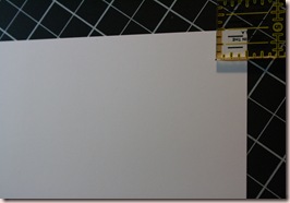
frog3 Step 3: Cut and score a card base. Standard card maker size is 4.25x5.5” which is a half sheet of 8.5x11” cardstock folded in half. Cut your main layer 5x3.75” which gives you perfect 1/4” borders. I marked a dot at 1/2” in from the corner for my next step. I frog4goofed! It should have been 1/2” in from the sides but 7/8” down from the top. You will understand better with later photos.  Punch a 1/2” hole with the dot as the center on both corners. Don’t have a 1/2” punch? Trace a dime, poke a hole through the center with a pin and leave the pin in. Poke the pin through your pencil dot to line it up. Trace and hand cut. You could just trace the dime but it would be hard to place them evenly in both corners exactly where you want them.

frog5 Step 4:  Draw lines from the top of one circle to the other. Repeat for the bottom. Cut along both lines with scissors, craft knife (AKA XActo knife) or your paper trimmer. I used a knife for the straightest edges.

frog6

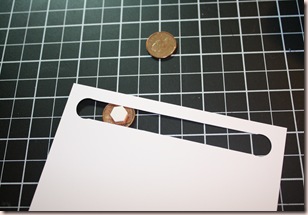
Step 5: This shows the paper after cutting. Place a foam dot right in the center of your penny. If you only have square dots, trim corners to create an octagon. If your foam dot is larger than your slit, be sure to trim it down before applying.

frog7 Step 6: Place the penny under the slit. Place the other penny over top.


frog8 Step 7: Cut out a circle to glue over the penny. If the image you wish to place on top is larger than penny, no need to cover it. I didn’t have an appropriately sized punch. Nestabilities? Nope, I traced a nickel and cut it out! Now start planning where you want your paper piecing to go. If part of the image is not cut out, stamp it in your desired colour on the background like I did for the grass around the mushroom. Glue down or foam dot your paper piecing.

frog9 Step 8: The mushroom is glued on with ordinary white glue. Both frogs are attached with foam dots. The flower was done with a technique called ‘marker direct to stamp’. Colour each area with fine-tipped markers, plain old Crayola again. Now the next step is really important. Hold the coloured stamp in front of your mouth and slowly and heavily exhale over it. This is called huffing. Because the marker ink dries as you colour, you need to remoisten the marker. If you want a sharp image, huff; if you want a soft, watercolour-y image, use water from a misting bottle to remoisten. I just huffed. Stamp and cut out the image you want on the penny. I used a dragonfly, coloured in with Crayolas, covered it in clear drying glue with dollar store glitter. Glue onto the penny.

frog penny
Step 9: Flip your cardstock over. You need to place foam dots in all 4 corners and two in the middle, roughly under each frog, TWO DOTS THICK. You need this depth to allow the penny to rotate freely. I goofed, my slit is too close to the top of of the white piece. I didn’t leave room for foam dots in the top corners. (I used some thin strip foam I had.) The space between the slit and the top needs to be wide enough for the foam dots and still allow the penny to slide past. 3/4-7/8” should be enough even if your dots are larger than mine. If you are going to send this by mail or if the card will spend time in an envelope, add THREE layers of foam dots. I found out the hard way that the foam compresses under pressure. When you try to get the penny to roll, it won’t budge because there is no room between the two cardstock layers.

Our Temporary Twinkie, Nicky didn’t want to do a colour, sketch or inspiration challenge. He went for a theme! FROGS! Easy Peasy, I have two frog sets and I even keep them mounted for Jameson to use. Please play along with Twinkling Tuesday by making a frog-themed card! Upload to SCS or PCP using MTTSC20 or your blog and be sure to leave a link at Madelynn’s Twinkling Tuesdays blog! Now don’t forget to visit all of the other Team members, they all need some love too! I love visiting all of their blogs, the variety is AWESOME!!!

Enjoy, Rebecca

RECIPE
Stamps:
Unfrogettable
Ink: Stazon black, eggplant, celery
Paper: purple and two greens from Bold Brights (forget the names), white
Accessories: 1/2” punch, Crop-a-dile, foam dots-Jody Morrow, foam strips-UK, Crayola markers, glitter-$ store
Techniques: Paper piecing
All products SU! unless otherwise noted.

April 23, 2009

Shaped Card Tutorial

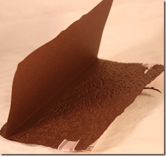
I got a comment from a friend saying she wanted more clarification on how I did the card back for this card. If you notice, there is no flat area where my card is folded. That is because it is made in two pieces, therefore there is no fold. This tutorial will work for any shape you want to make. If you don’t teacup challengemind a flat area, then by all means, fold your card the traditional way and cut out after folding. However, one small advantage to this way; I noticed that my Cuttlebug and Nestabilities really didn’t like to cut through 2 layers at once (I nearly gave up cranking it because it was so stiff!) and the edge wasn’t perfect. Seems when you cut through two layers you get little paper bits stuck to the main shape, small but annoying. There were lots of areas I had to sand to get a smooth edge. If you cut the layers separately, no such problem. It was also very easy to emboss the card front this way.

Step 1. Cut two of your card base shape.
Step 2. Decorate your card front as desired.
Step 3. Decide where you want your card ‘fold’ to be. On this card, it was at the top just like a standard folded card. Score about 3/8” to 1/2” on the card back only. Fold with bone folder.
Step 4. Apply adhesive to the folded edge and apply to the card front. I didn’t do another card for this tutorial but I took a couple of photos of the card I made so you can see the back.
shaped tut 1
shaped tut 2

Enjoy, Rebecca

RECIPE see original card post.

Paris Challenge

It is time for my ‘Every Other Thursday Challenge’ with Cassie from the Twinkle Team! We really need a better name for this! Hey Cassie, what about the Gal Pal Challenge? We each contribute part of the challenge details. This week my theme was Paris and Cassie added a collage-y style. Perfect, because that is what I would have done anyways! A couple days later, she emails me and says, ‘Was that it? Just those two things?’ So I replied that if she removed for DT appl wanted to make it harder, add a fancy fold of some type! So Paris theme in a collage style with fancy fold! Whew! I had better ideas in my head than came out in the form of paper. I love collage style cards, (I ADORE Melissa Phillips, you HAVE to check out her site), but I have trouble making them! I need to work with her for a  week or two. Come on, a gal can dream right?

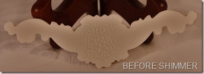
This is a gatefold card, the ribbon holds it closed, you can only see the ‘seam’ at the bottom below the chipboard. Speaking of chipboard, I thought I’d give you the details of how it was done. I paris challenge closeup beforecovered it in Tim Holtz crackle paint, thicker coats cause larger crackle patterns and vice  versa. I put  thicker coat in the larger center area and thinner on the ‘wings’. I altered this photo so you can see the crackle sections more easily; IRL it is whiter. It looks so cool like that but I added to it with Shimmer Mist by paris challenge closeupLuminarte, same thing as Glimmer Mist basically. It pooled up slightly on the acrylic paint and sits in the center of each crackle section. Click on the photo to get better quality and enlargability. Now that I see this card photographed, I think I need to grunge up the edges of the chipboard; it is still too white!

A couple other deets-the postmark was burned and sponged; La Tour Eiffel was coloured with a C3 Copic and then burned. The mega rectangle Nestie was sponged with Olive ink. I applied baby powder to the back the Paris sticker so I could pop it up with foam dots and yucky things wouldn’t stick to the underside. Can you imagine me giving this card to someone with a 12”+ hair of mine dangling off? YUCK!! I also sprayed the sticker with medium brown Glimmer Mist (I forget the colour’s name) and sponged the edges. I reinforced the mega rectangle panel with cardstock so it would be stronger when opened. The card base was stamped with French script background using Versamark Dazzle Champagne and I brushed on Pink Gold Pearl Ex after. A really neat effect.

Enjoy, Rebecca

RECIPE
Stamps:
SU! for all except Par Avion, Eiffel Tower and the postmark which are UK
Paper: DSP, eggplant, confetti ivory-SU!
Ink: old olive, close to cocoa, riding hood red-SU!, Adirondack black, Versamark Dazzle Champagne
Accessories: C3 Copic marker; red flowers, green ribbon, gold ribbon, chipboard-all UK, foam dots-Jody Morrow, clear pop dots-Thermo-Web, Pearl Ex, Shimmer Mist-Luminarte, Glimmer Mist-Tattered Angels, Nestabilities Mega Rectangle, Tim Holtz Crackle Paint Picket Fence

April 22, 2009

Earth Day! Reuse Your Packaging!

A quick note before I start. I meant to take a photo of my spray box I described HERE (scroll down to the italicized TIP section.) I will get one soon and add it! It doesn’t make too much sense without the photo! I have to wait for good light because it is much too big for my photo booth!

In honour of Earth Day I decided to do a project using something otherwise headed for the trash.  I snagged this cute box when I was at my Card Buffet class. It previously held Prima journaling earthday beforespots. Funny thing is the journaling spots were very distressed and vintage looking while the box is anything but. To me, white with black dots is very fun and /or sophisticated, not at all vintage! Perhaps all of their journaling spots all come in the same  packaging. Not that it matters to me, recycler extrordinaire, I just consider it an opportunity to decorate it properly! But, yet again, I digress…

I was really glad the box itself was quite cute because this style of earthday insidebox would be hard to cover completely. I only had to cover the front panel using a layers of pink and black cardstock. Next I used a label 4 (I think, could be  3) Nestabilities die to cut the patterned paper panel. The rest is pretty easy. The pink in the center of the flower is a Basic Grey button.

Hope this inspires you to look at your packaging in a new way. earthdaySome scrapping suppliers are even creating packaging specifically to be reused in some way. I think I will use this  container to hold tags for gifts, then I will give it as a gift. Happy Earth Day!!

Enjoy, Rebecca

RECIPE
Stamps and Ink: none!
Paper:
black and pink pirouette CS, pink pirouette DSPP-SU!
Accessories: flower-Scrapbook Sally, Basic Grey Bittersweet buttons, EK Success rhinestone, leaf-UK, ribbon-Dollarama
Techniques: Earth Friendly Reuse!

April 21, 2009

Masked Glimmer Mist Card

Here is another card I made at the Card Buffet class I took on Saturday at Scrapfest. Super simple but fun. The card is a textured, deckled-edge, pre-scored card by Strathmore. There were matching envelopes too which was nice, especially for this size, 5” x just shy of 7”. The paper is similar in texture to rough watercolour paper but much thinner. I sprayed it with Moonlight blue scroll maskGlimmer Mist over a Tattered Angels  mask. In my own workspace, as opposed to the class situation, I will be sure to spray my masks with repositionable spray adhesive so the image is sharper. As you spray the GM on the paper, the paper curls up and the mask lifts up in places. This allows the GM to spray under the mask and the image gets indistinct. Still, it is an interesting effect. I used an Xacto knife to cut along the masked image and then tucked my focal image underneath. Makes for an interesting, flat, easy-to-mail card.

TIP: Get a clean, empty pizza box for spraying all glimmer mists, inks and adhesives. With the box lid at slightly more than a 90 degree angle, cut ‘wings’ out of fabric to prevent overspray at the edges. Using fabric means you can staple the fabric in place but still close the box when not in use. Place the box on a table or counter, the lid should want to fall back but stay up because of the fabric wings. This set-up also allows you to place your project vertically if you wish, which prevents big blobs if you want only fine spray. When your work is vertical, the blobs fall before reaching your project because they are so heavy.

Enjoy, Rebecca

RECIPE
Stamps and Ink:
NONE!
Paper: card base-Strathmore, image-Crafty Secrets
Accessories: Tattered Angels moonlight GM and mask, ribbon-UK

Flower Soft Garden Scene for Twinkling Tuesday

Before I get to this week’s card, I want to mention that I posted my Twinkling Tuesday card late last week so if you missed it, click HERE. It was very special to me so I hope you will take a look.

I love buying new stuff and trying it out. I got Flower Soft from ScrapFest and I couldn’t wait to use it! I specifically went ‘stamp shopping’ in my collection for an image that would work. This stamp was the first one I found. I coloured it in with Copics including the flowers themselves, no detail or anything, just base flower soft garden scenecolour. Flower Soft comes in a small, clear plastic container and it is really packed in!  You have to ‘fluff’ it up before using it and if you don’t like glitter because it is messy, you won’t like Flower Soft too much. It isn’t as bad as glitter but you do get little bits falling off even after you think you have shaken off all the loose particles. TIP: Work in small areas so your glue doesn’t get a skin over it before you add all your Flower Soft. After applying it, press it into the glue to get best results.

After colouring clip_image002the image in, I remembered why I don’t use this stamp too much. There are too many things requiring neutral or brown colouring! It gets much brighter with the addition of the Flower Soft though. Perhaps next time I will try colouring the pitcher as if it is enamelled or whitewashed instead of made of galvanized metal. You could tell that was the look I was going for right? I used my colourless blender to add the textured appearance that galvanized metal has. Hope you see it but if not, try clicking on the photo to enlarge it. I am not thrilled with the way the ground looks, I tried a technique I learned from Marianne during my Copic Certification class but it wasn’t quite what I was going for so I added the ribbon to cover some of it up.

The sketch is from little Jack, age 6, for Twinkling Tuesday. I’m afraid I couldn’t find a way to mimic the small lines attached to flower soft garden scene copicsthe small circles and I felt I needed more than 4 ‘circles’. The little  rhinestones are Taylored Expressions Tiny Twinkles; first time I have used them! I didn’t have nearly as much trouble working with them as I had expected even though they are truly tiny. It is hard to tell that they are pale pink in the photo, sorry. I hope you will try this sketch, upload to SCS or PCP with MTTSC19 or your blog and link to Madelynn’s Twinkling Tuesdays blog. Be sure to check out the Twinklette’s blogs; two members are leaving after this week so be sure to leave Danni and Jami some love!

Enjoy, Rebecca

RECIPE
Stamps:
pitcher of flowers-SU!
Ink: Memento cocoa, old olive-SU!
Paper: Neenah white, pink pirouette, celery CS-SU!
Accessories: foam dots-Jody Morrow, silk ribbon-UK, Tiny twinkles-Taylored Expressions,  Inkssentials white gel pen

April 19, 2009

Card Buffet Class at Scrapfest!

Scrapfest in Kitchener, Ontario yesterday was awesome! Over 40 vendors, nationally and internationally renowned instructors, a huge crop area, fabulous! I mean think about it, how much $ can you lay down at ONE STORE!? Can you IMAGINE OVER 40! Woooow! I signed up for a card buffet class taught by Trisha Ladouceur; she is a hoot! This type of class is quite new; you sit down in a  room with various tables set up with oodles of supplies. Cardstock and patterned paper on one table, ribbons, fibres and dear friend buffet brads on another, masks and Tattered Angels Glimmer Mist, punches, stamps, Primas and other flowers, Class-A-Peels and Sakura (Soufflé and Glaze) pens, chipboard-you name it, there was a table full of it. Only rule? Make one card at a time, no assembly line production. That being said, if you were waiting for the Glimmer  Mist to dry on one card, you could work on another. 2 hours of make ‘em as fast as you can! For me, it was a bit disconcerting because I like perfect mats and take ages to decide on one embellishment. My average card takes about an hour or a bit more. I soon got into quick mode and it was delightfully freeing! I did only get 4 cards done but I have bits and bobs I painted or sprayed but didn’t use so I can build a couple more using those pieces. $40 seems a lot to pay for a class where I made just 4 and a bit cards but the fun of it made it more worthwhile than just 4 cards worth of supplies. Some people didn’t like the class because they are used to being provided with every step of every card but the description did warn you that the class was freeform. I’ll show the other 3 cards this week sometime.

A couple of things weren’t perfect, the cards provided were only white and ivory with limited colours of cardstock to cut and score your own card bases and to use for mats and layers. The teacher felt there were lots of stamps, however to me the supply was extremely limited with about 10 sets and maybe 20 singles. And no backgrounds! It was frustrating to have such cool stuff at home I am used to using that simply wasn’t there. And she lost the foam dots and glue dots until class was over! Ooops! Playing with the Glimmer Mist and masks was fun. I have a gold mist of some kind (forget the brand) but I have only used it for all over shine, not using a mask! Very cool. I bought some masks and two shades of brown GM and I can’t wait to play.

Enjoy, Rebecca

RECIPE
Stamps:
NONE!
Ink: SU! chocolate
Paper: Dear Friend from Crafty Secrets vintage sheet, others-UK
Accessories: laser cut borders-K & Co. (I think), flower-Dollarama but I haven’t seen them in Ontario, she got them in Edmonton where scrapbooking is more popular

April 16, 2009

Clearly Original Spring Card

Spring is here! Yesterday was absolutely gorgeous, I am posting ahead so I hope today was gorgeous too! I was inspired by a card by Jennifer McGuire on her blog recently. I like hers better than mine but oh well, it is cute. I have heard that transparencies do not make the best cards because they are too thin so I thought this acetate sheet would be great. Unfortunately, it is too thick to clearly originalscore easily and a bit hard to work with, also it is 5x7 so not an idea card maker’s size. It absolutely would not stay flat while I was working with it and even mini binder clips struggled to hold it closed. I have to get some clear cardstock next time. It was also hard to photograph! Because I folded it unevenly(short in the front), it cannot stand on it’s own. The overall measurement is 4x5” but the front panel is only 3x5”. All elements are double-sided, the squares all have another one on the back and the flower does also. The front flower is adhered with the brad through the card, the back one has a brad through it as well but it only goes into the flower, not the card; I used glue dots to adhere it. To keep the flower petals aligned, I glued the outer petals to each other. TIP: I have noticed while punching, the border guide on some punches isn’t perfect and your scallops will have little jinks in them. So, when punching the border pieces, punch them together with right sides out. That way, if your punching isn’t perfect, the tiny little imperfections will match. I normally trim any uneven areas with scissors, do this to both pieces at once too! I still have to add a panel inside to write on and a matching panel on the very back unless I use a paint pen or permanent marker for the message. Hmmm, maybe a silver or gold paint pen…

Enjoy, Rebecca

RECIPE
Stamps:
Original-SU!
Paper: DSP and pink pirouette, pretty in pink CS-SU!
Ink: pretty in pink
Accessories: flower punch-SU!, brads-Oriental Trading Co., rickrack-UK, Crop-a-dile, acetate sheet

April 15, 2009

GUESS WHAT? I WON MOJO MONDAY!!

YEE HAW! HOWDY, HOWDY, HOWDY! (Frank, the frilled lizard from Rescuers Down Under) I won Mojo Monday. When I first got the winner’s announcement post by email I was so mad. Rebecca #411 won and I knew I was #420. Then I realized that a few posts might have been disqualified for not linking directly to the sketch card so I checked and I did win! For my Blissful Beach card! I am so excited, probably more than I should be ‘cause it isn’t like I got on a Design Team I wanted or anything but I don’t care. I am going around the house singing, “I won, I won, I won, I won!” Silly but fun. Now I am off to decide which set I want. YEAHHHHHHH!

PLEASE SCROLL DOWN FOR MY LATE TWINKLING TUESDAY POST.

Rebecca

Twinkling Tues… er Wednesday! Breast Cancer Awareness Card

First of all, I have to say Yeah! for today. It was absolutely glorious here, warm, sun shining, not a cloud in the whole sky! I was in a T-shirt without a coat for the first time today and my jeans were actually getting hot absorbing heat from the sun! I could feel my batteries being recharged, literally. I suffer from SAD, Season Affective Disorder (a real disorder!) which basically makes me want to hibernate all winter. I have little desire to go anywhere or do anything. Today, I even did errands, WITH SPENCER (in and out of the car seat…) and wanted to! WOOOO awareness HOOOO! On Monday, I was wearing two sweaters, a wool coat, gloves, wishing I had ear muffs and needed soup to warm me up after being outside for less than 30 minutes. Today, seems spring is finally here, it had better stay or else… I guess you can’t threaten the weather with bodily harm should it disobey you. ***SIGH***

I am so sorry I didn’t get my Twinkling Tuesday card up yesterday, heck, I usually try to get it up Monday night but two nights without sleep was taking it’s toll on me Sunday and Monday nights. But I finally got it done (another sleepless night produced this card at 4am today) and I am quite happy with it. I have had quite a few wonderful ladies in my life affected by breast cancer, I mean, who hasn’t? One in 8 or 9 women get it depending on the stat you read. There is one lady in particular I would like to remember here. Her name was Jitsumi Asa but better known as Mimi. She was a gentle soul, quiet and loving. Anyone in the congregation who was ill or having a hard time could expect a gorgeous bouquet of flowers, and expensive ones at that, along with a full-sized, gorgeous card full of warm, loving sentiments carefully written in precisely perfect handwriting on ruler-straight pencil lines (though erased, slightly visible occasionally!) Her hospitality was legendary, with the best foods including expensive seafood and Japanese fare before sushi was popular. When Caucasian folk unfamiliar with sushi would ask what was in it, her husband would say, “rice, carrot, fish and sea weed!” Horrified that no one would eat her delicious treats she quietly chided him, “oh, don’t say seaweed, say sea vegetable or they will not eat!” This loveliest of ladies found she had breast cancer and bravely fought it. She would quietly tell us stories of growing up in Japan near Nagasaki, at age 5 she was whisked up into the mountains one day during WWII because an attack was imminent. No one there knew the devastation that was to follow when an atomic bomb levelled the city. I always wondered if the radiation could have caused her cancer; funny that they use radiation to cure cancer. She beat the cancer, at least it seemed so initially. Years later, it metastasized (spread) to her brain and bones too I think. What a sad end to a lovely life full of joy and caring for others. So I was thinking of her as I made this card. Sorry the story was so long, yet this is just a little of her sweet life.

clip_image002The sketch is courtesy little Madelynn for Twinkling Tuesday. Since I am so late getting mine done, I had the privilege to see everyone else’s blog posts. Funny, many found this sketch daunting but I had several ideas; I just love sketches especially ones by Madelynn. Nothing too fancy that you can’t tell how I did it from the photo. Aren’t the beads cute? I was in the bead store yesterday and these caught my eye. And three colours? That reminded me of sketch I had yet to do so here we are. TIP: You need a beading needle to pull the silk ribbon through most beads meant for jewellery. They are really cheap for several in a package so no big deal to get yet another tool! Be sure to play along, tag your card in SCS or PCP with MTTSC18 or upload to your blog. Either way, link your creation to Twinkling Tuesdays blog! And visit the Twinkle Team to see their cards and leave ‘em some lovin’! (links on sidebar) 

Enjoy and stay healthy! Rebecca

RECIPE
Stamps:
UK
Paper: Basic Grey Bittersweet, pink pirouette, white CS-SU!
Ink: Pink pirouette, pretty in pink
Accessories: awareness beads-That Bead Lady, silk ribbon-UK, Nestabilities

April 14, 2009

Stripes Card Gift Set

There are some really lovely people in my congregation who always seem to be giving and giving. Once in a while, I’d like to give back. I can’t do a whole lot of practical things for most people but I can give them some cards I’ve made. I don’t know the personal taste of this couple beyond seeing what they wear monogram s stripes indiv card because I’ve never been to their house. So I kept these cards very neutral, even a bit boring. When I give them, I’ll offer the wife some girlie ones with her own initial rather than the surname initial if she’d like. I didn’t do that this time because I am not sure if perhaps he writes some of the notes (he is that kind of guy) so they are a bit more masculine than I would normally make. I also didn’t want them too girlie even if she writes them because they might be from both of them and I don’t want him to be uncomfortable with his name in a girlie card. Most guys wouldn’t care less, a few might object to anything feminine monogram s stripes set cards and this guy definitely isn’t the pink shirt type. (Rebecca, can you guess which couple I’m talking about??) My phone number will go in the bottom of the box with a “For Refills, Call…” sign! I think it will be really cute as I do want to make more when they run out. Now the box is pretty plain, again, I don’t know their taste, but I didn’t mind it being girlie here because chances are, she will be responsible for storing them.

I went the ‘discount’ way with my cuts. I say that because I cut my 12x12” paper into 3x4” pieces for the bottom panel and monogram s stripes box 2.25x4” for the top panel. I know some people prefer to use full width pieces for this type of card but that wastes a lot of paper and this way you get a matted look. True, the paper isn’t actually wasted, the scraps can be used for something else, but it divides more efficiently cutting 12” paper into 4” pieces. You KWIM! I have four other sets to make sometime soon, 2 for gifts and 2 more for other deserving couples in our congregation.

Enjoy, Rebecca

RECIPE
Stamps:
Lovely letters
Ink: Chocolate chip
Paper: DSP, banana, chocolate, brocade blue, bashful blue, white CS
Accessories: Nestabilities, Cuttlebug, cocoa grosgrain ribbon, foam dots-Jody Morrow, sheer white ribbon, paper rose-UK, silver cord (for stretchy belly band technique). All products by SU! Unless otherwise noted.

April 12, 2009

Office Mojo 81 and I Have a New Disease!!

ETA: This ended up being a duplicate post of sorts, you have seen this card before, I posted it quickly without all the usual chatter planning on editing it later. My computer was dying, I didn’t know when I would get a new one and I wanted to be sure my card was uploaded so I could link it to Mojo Monday. I got a new computer and when I uploaded posts from my blog back into Windows Live Writer, I didn’t know it wouldn’t just edit the old post as usual but rather duplicated it! I would have just deleted the older post but it was linked to Mojo Monday and there were several lovely comments so both are staying! Now, back to our regularly scheduled programming…

Now I have to confess something. I suffered from PAS while making this card. Fortunately, it isn’t terminal and my card didn’t suffer in the long run. Not familiar with PAS? I will explain it. PAS stands for Premature Adhesive Syndrome. A condition which causes the sufferer to adhere things to a card or scrapbook page before considering all other elements and how they will work together. I sewed around the edges of this card completely office mojo forgetting about adding the ribbon! I was forced to unsew (AKA pick out) the stitches near the ribbon. To prevent fraying, I picked out more than needed so I could tie the threads in back. (The sewer in me REFUSES to use tape!) Then I pushed glue dots under the patterned paper to hold the ribbon, which was no small feat considering the library card was already adhered! Now, on to re-sewing; there was one small problem with the settings. My sewing machine is fully computerized including the touch display and all settings so once turned off, the zigzag settings I had customized were no more. AHHHH! For once I was wishing for a less fancy machine with dial settings! (Not really, I was just frustrated!) So I hand-wheeled the machine through every stitch from the upper left to the sentiment layer. Not easy to hit every hole just right. Thankfully I am a pretty good sewer so that came in handy. If there are any other sufferers of PAS out there, I’d love to hear your stories so I don’t feel so alone! Surely I can’t be the only one??

Such a cute sketch. There was one similar to this on SCS a few months back but it didn’t have the split down the center, the ribbon or the brads. I love playing the first Mojo Monday sketch of the month; I plan to continue every month. There is a prize if yours is one of 7 cards chosen-a $25 gift certificate for Verve! There are several sets I want, I sure hope I win. But I am not getting my hopes up; there is a lot of pretty stiff competition on there!

I used some old SU! DSP on this card called Notebook. Funny thing is, my computer is dying so we are looking for Notebook computers. (ETA I am currently working on my new laptop!!!) But I digress. The library card is stamped on paper from the same pack. I dyed the ribbon with a Copic marker because I had really no ribbon the right colour. I had some baby rickrack but that wasn’t quite the look I wanted. I am finding more and more that I am customizing my embellishments with Copics and it sure stretches some basic supplies a long way. I am going to buy a huge spool of white ¼” May Arts ribbon and share it with another gal; then I will dye it to the colours I need with markers.

Enjoy, Rebecca

RECIPE
Stamps:
Office Accoutrements, Alphabet Soup
Paper: DSP and banana, white, celery, (forgot the name of the aqua-In Color) CS
Ink: Versamark Dazzle Champagne (flower), chocolate
Accessories: Teal, celery markers, taffeta ribbon, brads-CTMH, sewing machine, Mettler thread, foam dots 2 heights-Jody Morrow and UK, Copic marker. All products by SU! unless otherwise noted.
Techniques: sewing

Mojo Monday 81-Blissful Beach

ETA: I won with this card! WOOO HOOO!

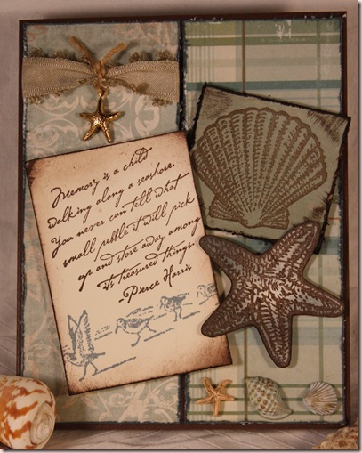
I wasn’t thrilled with my last Mojo card and since the rules do not seem to say anything about one entry per person, I decided to make another card. This one I love. I always seem to be happiest with cards I make that are beach-themed or vintage. Funny thing is I often distress those types of cards, for instance this card has 4 different distress  techniques on it, yet when I try to shabby chic blissful beachor grunge up a scrapbook page, I usually hate it! Hmmmm…

This card uses only two papers and two cardstocks. Chocolate and vanilla are the cardstocks, the other papers are the front and back of two sheets of Bella Bella patterned paper. I was so glad they had solid colours on the back because no SU! Colours seem to match and I have very little supply of any other colours. I think bordering blue might match but I decided I didn’t need it after all. I did use bordering blue ink for some distressing. I grunged up the solid plastic shell embellishments with gold rub-on paste. The distressing techniques I used were edge distressing using 1. My fingernail, 2. Heidi Swapp distressing tool (the pink PacMan one), as well as 3. DTP (direct-to-paper) inking and 4. Sponging. I list the first two separately because to me they each give different looks. If anyone wants some more info or a tutorial on distressing, just leave me a comment, I’d be happy to oblige. I am by no means an expert but my inky fingers seem to argue that point!

Enjoy, Rebecca

RECIPE
Stamps:
Beautiful Beach, Along the Shore
Ink: chocolate chip, close to cocoa, bordering blue
Paper: Bella Bella patterned paper, chocolate chip, vanilla CS
Accessories: gold starfish charm-UK, sand picot-edge ribbon, shell embellishments-Dress it Up!, gold rub-on paste-UK, foam dots-Jody Morrow and UK. All products by SU! Unless otherwise noted.
Techniques: distressing, sponging

Mojo Monday 81

office mojo

I am really tired right now but I have to post this to enter the contest. I typed up all the deets for this card but they are on another computer I can't access right now. I thought I had emailed myself the file but I can't find it and it is 1:30am! So here is my card for the contest and I will edit this post later.

Enjoy, Rebecca

Teacup Stamp Challenge Card and Sorry!

First, I have to apologize for not posting for so long. Hubby was really tired this week and went to bed early several nights which is usually my crafting time. In addition, once I finally got some stuff done on Friday, my computer decided to get sick! I really try to not let so long pass between posts but sometimes it is inevitable.

On to the fun stuff!! Cassie (from the Twinkle Team) and I decided to do a couple of challenges a month, just because. We have gotten to be e-friends lately, chatting about kids, paper and just life! She is sweet and talented, you should check out her blog! (sidebar under Twinkle Team) The challenge actually started teacup challengewhen I made a card using this same  stamp. She commented that she really liked it so I offered to send her some images. She laughed (in email terms) and told me she already had it! Thus the challenge was born. It seems to be a mix of ideas, we take turns choosing a theme and the other one of us adds some specifics to make it more interesting. I added to it by including the requirements of using chocolate, ribbon and two other embellishments. I can’t wait to see her card. (ETA: I have seen it now, gorgeous! Run, don't walk to go see it!)

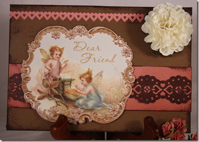
The card base is actually two pieces. That way I don’t get any flat spots on my shaped card. The back piece is scored and folded over then attached with adhesive. I used a Cuttlebug textile folder on the front of the card base. The flower was crocheted by my girlfriend, Rebecca. I really like how I did the ribbon. There are actually 3 ribbons in total. The one that stretches across the card, another tied in a single overhand knot over it and a third different ribbon tied in a square knot so it has a nice smooth middle and points the opposite way to the other ribbon tails. I used a Copic marker to go over he edges of the paper piecing because you could see the white core. Because the first teacup's handle doesn't connect to the cup, I also used it to colour the handle. The riding hood red paper on the left and the chocolate one are from the Bella pack, the other is from the DSP patterns pack.

Enjoy, Rebecca
RECIPE
Stamps:
Stampington
Paper: DSP, pink pirouette, chocolate, white CS-SU!
Ink: Chocolate chip
Accessories: pink ribbon-UK, chocolate stitched ribbon-Taylored Expressions, Copic markers, fleurette-Rebecca Wu, foam dots-Jody Morrow, rhinestone-SU!
Techniques: paper piecing, dry embossing

April 07, 2009

Wish I Was on the Beach-Twinkling Tuesday

Mother nature is a cruel jokester. We got snow today! Not the usual snow we get in April in Southern Ontario, but real, stayed-on-the-ground snow! I had even put away my boots! Most snow we get this time of year doesn't accumulate or get thick enough to keep you from wearing shoes! So my first thought for this week's Twinkling Tuesday challenge was this lighthouse stamp because I would sooooo prefer to be at the beach! The actual challenge was "In With The lighthouse Old", use an old stamp that needs some love. Funny story about this stamp; I entered a swap once called 'Favourite Stamp'. Well the lighthouse stamp was brand new and therefore couldn't be my favourite but I used it for the swap anyway.

Yeah, I know, not funny yet right? What I didn't tell you yet was that it was a swap where one card is sent to your partner, the other however was submitted to a magazine! I was shocked about two months later to find out I was going to be published! WOOO HOOO!! So they phoned me, but never having been published before, I didn't realize that they were writing down what I was saying for a blurb in the magazine! Of course they asked why was this stamp was my favourite! Clearly I couldn't admit that it was a brand new stamp for fear I would be disqualified from being published so I just prattled on about loving the beach and wishing I was there! I think I am safe to admit this now in public because the cards was published and they can't exactly take back the free issues I got as compensation!

This image is watercoloured except for the sea grass which was so thin I chose to use markers; old olive for the grass in the foreground and artichoke in the background. The watercolour paper is distressed along the edges with chocolate chip ink and gold rub on paste as well as burned with a heat gun. The entire image is distressed with close to cocoa marker in the SU! colour spritzer giving the fly specked look. The image itself is 6" tall even though you can see I left virtually no extra watercolour paper beyond the image. This means that even with 12x12" paper, you can't do a top fold card. I really wanted it that way, (though I'm not sure why) so I matted the image with riding hood red paper, 1/8" border, then added a picture frame style backing, you know the ones that hold the frame up if it is on a table? It is large enough to still work if you want to write a message inside. It looks much better IRL, I had to colour correct it to keep it from looking too dark to the sky looks washed out and overall a bit too orange-y. Gotta save up $ for a photography class!

Be sure to play along with us! Try your hand at this challenge and upload to PCP or SCS with MTTSC17 or your blog so we can see what you create and leave a link at the main challenge blog. Don't forget to visit the Twinkle Team to see their work giving some new lovin' to some old stamps! Links on sidebar!

Enjoy, Rebecca

RECIPE
Stamp:
UK
Ink: chocolate chip-SU!, Stazon black
Paper: Strathmore watercolour paper, SU! riding hood red CS
Accessories: SU! colour spritzer, metallic rub-on paste, gold sand dollar charm, hemp twine-all UK, close to cocoa, old olive, artichoke markers-SU!, shell-Dress It Up!, 0.2 Copic Black Multi-Liner (fixing missed areas of stamping)
Techniques: distressing with heat gun, watercolour

April 04, 2009

Romance Isn't Dead! Hubby Made Me A Card!

I can't believe I haven't shown this to you already! I meant to do it ages ago! My hubby made me this cute card for our anniversary last November, isn't that sweet? He mostly used stuff that was already on my anniversary 08 by tim craft table and printed the photo on the computer. Yeah, the ribbon is rumpled (he chose it because it was out on my desk, not realizing that I iron it before I use it) but it really shows how much he loves me and you better believe that romantic gestures are few and far between in our relationship. It was so funny hearing the story of how he made it. He was telling me how he didn't know where I keep anything or what to put where or which glue to use. So he used what was out but he didn't know how the ribbon stays on or how to tie it properly :) Guess it occasionally pays to leave your craft area messy!The fold of the card has punched holes in it using the Crop-a-dile to thread the ribbon through. Figures a man would use the one tool that most closely resembles pliers! I think it is a pretty good job considering the only other cards he has made are the ones printed on those card blanks you get from Staples with tons of clip art and word art! He even managed to find the right size of envelope! Thank you, honey!

Enjoy, Rebecca

April 03, 2009

Newborn Spencer Thank You

There is a challenge going around lately I've seen on a few blogs; remake one of your earliest cards. This isn't exactly one of my earliest cards (are you kidding, those are embarrassing!) but I newborn thank you wanted to show it here and I wasn't sure I had kept a photograph because I made these when Spencer was a newborn. I looked for it and I did have the presence of mind, even with a tiny baby, to take a photo. YEAH! But when I saw it, I was vaguely disappointed. I remember thinking it was one of the best cards I'd ever made and at the time, it could have been up there. So rather than just post the original card, I decided to remake it and show both!

The reason I wanted to show this card was the nifty opening. I figured I would need a lot of thank you cards, in fact I think I might have started then before he was born. OK, I realize that could seem presumptuous but every new mom gets gifts for the newborn spencer thank you baby right? Anyway, I wanted a layered look but didn't want to use up my entire stash of paper. So I came up with a neat way to have my cake and eat it too! This card is not folded, the banana layer is just a 4.25x5.5". the celery panel is held in place only with the brad in the upper corner and the semi-circle made with the slit punch at the bottom. The celery layer swings up and out of the way to read the message underneath! This uses a lot less paper than making full cards and I think it is pretty interesting was well. I just hope everyone figured it out and didn't think my hormones got the best of me and I was sending out cards with no message!

Sorry about the smudge in the upper right corner. In retrospect, I think I like the larger font better. I think the giraffe is a bit dark but I am still learning my Copic markers. I am not used to the paper I am using either. The white streak down the front of the giraffe is my attempt at a highlight with the blender pen. On SU! paper I am used to, I might get little to no ink movement with the tiny amount of blender I applied. With the Neenah cardstock I was using, well, you see the results and I went very lightly! If I was going to make this again, I would also use a background stamp on the yellow layer. Maybe some subtle lines. I would really like to have used a Cuttlebug folder but they don't quite fill a whole 4.25x5.5" piece of paper and I didn't want to re-cut my yellow layer.

Enjoy, Rebecca

RECIPES
Original card
Stamps:
Bundle of Joy, whimsical alphabet
Ink: celery, chocolate chip
Paper: confetti white, celery, banana CS
Accessories: silver brad, markers, slit punch All products SU!

Remake card
Stamps: Bundle of Joy-SU!, Hero arts alphabet
Ink: celery, chocolate chip-SU!
Paper: confetti white, celery, banana CS-SU!, Neenah white CS
Accessories: brad-UK, button-SU!, Copic markers, silk ribbon-UK, banana SU! marker (dyeing ribbon), celery SU! marker(edging), MS cornice punch, taffeta ribbon-SU!

Silver Damask Card

Have you ever seen a card that was so gorgeous you just had to remember it and make one of your own?? I was blurfing along, saw THIS card by Sharon Johnson and ***LOVED IT***. I don't often CASE (Copy and Share Everything) quite so obviously but this was too pretty to pass up! I actually like hers better but I am quite happy with my version. This card of Sharon's was a remake of an earlier card she had in her SCS gallery; apparently doing a silver damask remake of an old card was a recent challenge. Funny thing is, the other card I was working on tonight is a remake of an earlier card I did! You will get to see it soon.

I didn't have any grey ribbon, it wasn't until I had nearly finished that I realized that the original might actually be black but looks silver damask closeup grey with the white ribbon under it showing through. I wanted to use silver cardstock for the main panel but I wasn't sure if metallic paper would emboss well and I didn't have time to experiment (she used kraft cardstock). I hadn't seen someone put beads on BOTH ends of the stick pin before so I copied that too. I think her card must be larger than mine because I wanted to use a panel at the bottom with a sentiment and the same punched edge but I ran out of room. The close-up shows a bit better the real colour and the twinkly crystals! The patterned paper does have a hint of taupe tones to it, somewhere in between both photos is the real colour.

Enjoy, Rebecca

RECIPE
Stamp:
Gel*a*tins
Ink: versamark
Paper: going grey, shimmery white CS, patterned paper-
Accessories: pin, beads-pretties kit by SU!, silver spacer beads-UK, white EP-UK, ribbons-SU!, black foam dots-Jody Morrow, silver paint pen-Pilot, label 1 nestabilities, rhinestones-Swarovski
Technique: heat embossing