January 26, 2016

Kiss Kiss Mixed Media Canvas

I am always saving photos on Pinterest and in my photos on my phone. This time my inspiration came from the Stampington newsletter. I’d link to it but the newsletter wouldn’t allow me to save a URL to either it or the photo. Boo!!

kiss kiss canvas

I started by adding some music paper from an old songbook from my church using soft gel medium. The titles were all love related although 2 got covered up entirely or too much to read; the other two peek out just a bit but I know they are there. The top of the paper got a coating too. Then I added gesso; I usually mix in some water but I didn’t this time, now I wish I had since the music paper texture is a bit too covered up after adding the acrylic paint layer on top. Before the acrylic paint tho, I added the sticky backed canvas with folds for more texture.

kiss kiss2

Next I added the paint. Unbleached titanium white in the middle and a blend of white, blue and teal for the outside with burnt umber along the canvas edge. Then I painted on the flowers, to say that was a trial is not fully expressing the frustration I felt. I was struggling to mimic the loose almost watercolour-ish nature of the original canvas. Because I was working on a very porous surface, the paints just wouldn’t blend like I wanted. On the original canvas, I suspect they used gel medium to seal the surface before painting the flowers or maybe the acrylic paint was smooth enough, not sure. I finally got them to a point where they were good enough to leave alone, 6 layers or more later!

Last but not least, the finishing touches: script writing stamped in brown (stamped off) around the edges and in turquoise in the center, a few clear sequins, the frame, a Crate Paper rub-on sentiment and a big recycled sari silk bow. Nuts, I just realized that I meant to add some gold rub on paste also known as gilder’s paste to the edges. Oh well, I am not going to retake the photos after I do and swap them out because this is already the third time I took photos then changed it! First retake I had added the stamping, second time I added the bow! Just use your imagination!

Enjoy, Rebecca
January 25, 2016

Ha Ha! Another Summer Card!!

But once you see the inspiration photo, can you blame me? These are not winter colours!!

hello sunshine flip flop shaker

The inspiration photo is not my style of art at all. But I liked the surf board shapes and the fun summery colours so I started looking through all of my beachy products: stamps, dies and papers. Turns out the best match was the fabulous summer kit from August by Simon Says Stamp.

pti insp

Then I saw the flip flop die by PTI and this great frame die by SSS. They go together so well right? All of the cardstock except the shimmer teal and light orange (flip flop straps) are PTI, the patterned paper inside the frame is by Simple Stories as is the ‘washi’ tape. It’s not real washi just thin paper printed like the patterned paper but I still like it. I just wish it came on a roll and not in really small sheets. The sequins are a mix of Lucy’s Little Things, Teresa Collins and some misc.

The sunshine was removed from the frame and airbrushed with R02 and 05 (it’s brighter IRL). Since the die cut is so small, I used my finger as a ‘mask’; it was perfect because a finger doesn’t leave a hard line like any other mask would. Then I flipped the die cut over and airbrushed the rest of the word with the other colour. I also shaded the flip flops with Copic markers, YR61 and R32. They were stamped with PTIs Bitty Backgrounds in berry sorbet ink and the sentiment was stamped using SSSs Flip Flop Season using PTI kraft ink.

Enjoy, Rebecca

Entered In: Retro Sketches 199, PTI blog hop

rs199

January 24, 2016

Summertime in January???

I have a good sense of humour eh? It’s so dreary and cold outside that I just had to post a few summery projects! I make them year ‘round!

beach retirement

First up, a retirement card I made for my hubby. He always seems to need one for work so I made this for his stash. The papers are Kaisercraft, stamps by Waltzing Mouse and the shell is one I made in a polymer clay mold using paper clay then enhanced it with gilder’s paste. I LOVE that stuff!

hello sunshine

Next is a card I made using one of the summer SSS card kits. I added some silver Wink of Stella to the sun rays but where they met was blobby looking so I added the heart sticker to the middle. The Hello was watercoloured I think (I made this a while ago) and the sunshine die cut was sponged.

shell matchbox

Last but not least was a matchbox I made literally years ago. It was hiding in an ‘unpublished’ file on my computer. I would have jazzed it up a bit more if I was making it now. But I still like it.

Enjoy, Rebecca

January 23, 2016

Shabby Love Pop Up Card

Welcome to another edition of Crazy 4 Challenges! This week we were asked to be inspired by the word POP! I decided to make a pop up card!

you have my heart pop up

So the front is pretty cute right? in my signature simple shabby style. Which includes the aqua paint splat I accidentally but happily spilled on it while I made a mixed media canvas (you’ll see that in the next few days) but inside…

you have my heart pop up2

… is a fun pop up! This one is very easy to do. All you need are two symmetrical die cut shapes with a bit extra hanging off the bottom edge. I partially die cut mine but I suppose you could also glue on a tab. Glue each tab a bit away from the fold line of your card and glue the tops together. That’s it!

you have my heart pop up3

This photo shows the alignment a bit better. I added jump rings, chain and some chipboard hearts covered in liquid pearls. I added some detail to the frame with liquid pearls too. If you make one of these, be sure to use sturdy cardstock. I thought lightweight would be better because this is an intricate die and then it wouldn’t fall over under it’s own weight. Well… I hadn’t thought to add all the dangly stuff then! It looks a bit drunken when you first open it but it eventually sways into place once the card is fully open. Then the hearts swing back and forth for a bit. It’s quite interactive!

I hope you will play with us at Crazy 4 Challenge this week. It’s a great time to check out all those fun pop up card tutorials you know you’ve been saving on Pinterest! Right??!!

Enjoy, Rebecca

Entered in: Fusion, Inspiration Challenge, Colour Throwdown, Really Reasonable Ribbon #133 Pink ribbon

fusion woodgrain

swatch376

Love Mini Shaker Card

Can’t seem to get enough shakers can I?? This time I went for a little bitty one!

mini love shaker

I used a slide frame by Marianne Designs. Inside the shaker are a mason jar heart paper clip along with clear heart confetti and red sequins. Sorry the sentiment is hard to read, it is a rub on and I didn’t even notice the glare on it until I edited the photo. It says “True Love”.

Enjoy, Rebecca

Entered In: Paper Players, Retro Sketches

pp278

rs198

January 20, 2016

Lasting Hearts Card Drive

This card drive is close to my heart. It provides a handmade card and a book to moms who have lost babies to miscarriage. Two of my friends have lost babies and when they speak about it, there is so much sadness in their voices.

lasting hearts1

I can’t even imagine what it must be like to lose a baby; so glad I don’t know. But I love my kids so much that I really empathize with these moms. It made me happy to be able to help by making some cards for this wonderful cause. Flat cards are easier to mail and less likely to get damaged so I designed them without bling or foam tape. Using gold ink helped add some elegance and shine without 3-D embellishments. With the help of my MISTI, these cards were quick and easy to make.

lasting hearts2

If you haven’t made any yet, feel free to CASE my designs if you like. It shouldn’t be too hard to come up with a few sizes of heart stamps or a couple of heart die cuts. Any sentiment that isn’t overly religious seems to be ok; something like Hugs, Praying for You, Thinking of You, In My Thoughts, Sorry for Your Loss. The insides can be blank or you can add a simple message like mine or ‘Sending lots of prayers from {your name} in {your city}’. I simply wrote, “So sorry for your loss. Best wishes, Rebecca Ednie, Toronto ON CAN”.  (I live an hour north east of Toronto but this seemed simpler since people are more likely to know where it is.) If you include an envelope, please send it unsealed but they aren’t required.

You can mail them to:

Lasting Hearts Card Drive
2892 N Bellflower Blvd Ste 216
Long Beach, CA 90815

If you send by 2.29.16 you can be entered in draw for $100 in Hero Arts Products. Just add a sticky note with your name and email in with your cards. For more info or to make a donation, check out this post by Jennifer McGuire or check out the Lasting Hearts Facebook page. If you chose to send a card, you can also make a donation in a way. Sandy Allnock has pledged $1 per person who leaves a comment on her blog saying they will send a card up to $300!! So make sure to comment http://sandyallnock.com/lasting-hearts-card-drive/?utm_source=Subscribers&utm_campaign=03bd0b1759-RSS_EMAIL_CAMPAIGN&utm_medium=email&utm_term=0_e84d5c7a22-03bd0b1759-73840473&mc_cid=03bd0b1759&mc_eid=78c626fb57 if you are sending a card!!

Rebecca

RECIPE
Stamps:
Thinking of you-Hero Arts, scripture, Tons of Hearts, dot background-SSS
Ink: Archival black, gold Brilliance, Angel pink Memento, blush-PTI
Paper: white CS-Georgia Pacific, pale pink CS-blush PTI, brighter pink CS, banana CS-Pretty in pink-SU!
Accessories: heart dies-PTI, washi-stash

January 16, 2016

Winter Wonderland for Crazy 4 Challenges

This week was a sketch challenge! I must admit, I found this one a bit tricky! But it’s called a challenge for a reason right?!!

winter wonderland

I loved the big panel in the middle. Deciding between colouring an image and going a technique was tough. But in the end, I chose to do two techniques. First I sponged my inks onto a white cardstock panel. It looks like an early sunset to me. Then I die cut the Impression Obsession birch trees twice; once from the sponged background and again from white cardstock.

I removed the coloured trees from the background and coloured all the little sticking out bits that show the texture on the tree with a dark grey Copic marker. I wish I’d used a warm grey instead of a cool grey and a bit lighter colour but I still like it. Wouldn’t it look weird if those bits were multi-coloured like the background? Then I pieced it together on a plain piece of cardstock just to hold it together.

C4C319SKETCH

The little pieces at the top took  some work to piece in but it wasn’t piecing that was hard so much as keeping all the little bits straight and making sure I didn’t lose any! (You should see my desk! :o ) I wasn’t sure what to do with the 3 squares under the main panel. I didn’t have any patterned paper that would suit and I didn’t want plain cardstock. So I got out a stencil and embossing paste and added snowflakes under the main panel. I am not thrilled with the results especially since I forgot and added a 4thin the corner where I planned to have a cardstock snowflake OVER the main panel. Oh well… Last but not least I added a PTI sentiment as well as some snowflake and sparkling clear sequins.

I’m sure this sketch will be much easier for you! I’d LOVE for you to join us this week! Let me know in a comment if you decide to plan and I’ll be extra sure to check out your project! Our fabulously talented Crazy girls would love some nice, encouraging comments to so be sure to leave a comment on our challenge blog or even better, visit their blogs and comment there!

Enjoy, Rebecca

January 15, 2016

Baby Onesie Shaker Card

I can’t seem to stop making shaker cards and baby cards. Well today I combined the two!

baby onesie shaker

Ok, I have to start by saying that the purple in the patterned paper is really much, MUCH closer to to the cardstock in the window. I have no idea why it looks so dark here! The spring green colour is paler IRL too. Weird… I used a baby onesie die by Echo Park for the center and a labels die by Spellbinders for the frame. I cut the Hooray (PTI) from plain paper and used a gold paint pen on it. So much cheaper than gold cardstock!

Inside the shaker I used a huge variety of sequins and beads, mostly from Lucy’s Cards but also from a couple other places. The heart banner is by Simon Says Stamp and all the patterned paper is by Carta Bella. The (supposed to be pale) plum cardstock in behind the shaker bits is by SU! and the base is some old Clear Dollar Stamps cardstock. Are they even around anymore?

Enjoy, Rebecca

January 14, 2016

Love Heart Canvas

Recently I found a top 10 review on the Stampington blog. There was a very sweet little square canvas with a pink heart on it. I fell in love. Sadly, I couldn’t find it online but only in their email which is weird considering it was a top 10 project. Anyway, this is my CASE of their canvas.

love heart canvas

It’s an 8x10”canvas and I didn’t prep it at all. I wanted the canvas texture to shine through. I airbrushed the edges with a E42 marker to add some depth. The edges were stamped with a music background stamp in light brown ink. Then I added light texture paste lightly tinted with R20 Copic refill ink through a Prima rose stencil. It’s very hard to see in the photo because it’s so pale so either click to get a better quality photo or see the close up below.

love heart canvas2

For the heart, I took some SU! blushing bride cardstock, spritzed it with lots of water and scrunched, flattened and rescrunched the paper several times. Then while still wet, I added a bit of light tan ink to the raised areas and three colours of Perfect Pearls, pearl, gold and light pink. The shine helps it look a bit more like the faux leather look I was going for. Some gel medium was used to glue it to the canvas. I didn’t add adhesive to the edges so it wouldn’t stick too perfectly to the surface. The slightly raised edges give it mroe texture. Last but not least, I added the bling strip by Recollections and the word I stamped with a retired stamp set. I don’t even recall who made it. The V isn’t distorted, it’s a funky take on a typewriter alphabet; several of the letters are a bit wonky.

I hope you like this. It was a blast to make, so much faster and easier than most of the technique- and embellishement-heavy messy canvases I usually make. Only about an hour was spent making it start to finish! It would be a great gift for a certain holiday coming up, am I right? A twist on a basic card perfect for hanging in a bedroom! Then it can be loved for a long time and year-round!

Enjoy, Rebecca

Entered in:

Simon Says Stamp Monday Blog: Stencil it.

January 13, 2016

Lemon and Roses Place Setting Card

This week’s sketch is a special one for Fusion Card Challenge. It’s their 2nd Year Celebration! I LOVED the inspiration photo, so bright and cheery and NOT wintery!

fusion lemon n rose place setting card

While looking for some yellow chevron paper, I found these lovely lemons! I thought they were perfect for the feel of this card, bright and summery! The table setting dies are from PTI though I added a couple extra layers with Spellbinders dies. I don’t have the stamps for these so I hand drew in the cutlery with silver gel pen. It wasn’t as hard as I thought it would be. The rose stamps and dies are also PTI. The gold paper is actually a gift bag that I adhered to cardstock to make it stronger! I save the oddest things!

2nd Year Anniversary fusion

I didn’t add a sentiment, which is something I often do, so I can add one later. This will probably end up as a thank you for your hospitality card but I might use it for something else. I like adding them later so I have some cards that aren’t too specific. I often look through my stash and wish some cards had different sentiments.

Enjoy, Rebecca
January 09, 2016

Springy Thank You Card

So sometimes I refer to my style as ‘simple shabby’. I just don’t use as many layers as other shabby chic card artists like say Melissa Frances, Melissa Phillips or Beatriz Jennings.  Even when I add lots of embellishments, there still aren’t to many layers of paper. This is exactly the type of card I have in mind when I say simple shabby.

spring shabby ty

So this is my shabby version of Clean and Simple! I do actual lean and simple once in a while but I’m not super good at it. The closest I get is either this or freestyle collage. Isn’t this sentiment gorgeous? I could use it on 100 cards and never get tired of it. It’s by Impression Obsession. The paper is by Webster’s pages, a really old collection.

Enjoy, Rebecca

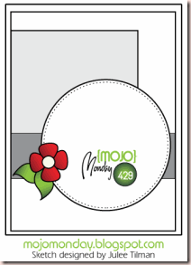
Entered In: Mojo Monday

Mojo429

Pamper Yourself Bubble Bath Card

I haven’t been colouring as much as I used to. But I’ve been so inspired by Sandy Allnock lately that I have been pulling out my markers more! (She is my new online bae!). This card is for this week’s Crazy 4 Challenges to use some form of bubbles!

bubble bath n roses

If you don’t know the term ‘bae’ it means ‘before anyone else’ as in girl/boy friend. Ask any teenager in your life! But consider this a platonic crush type of thing! Sandy is amazing! So I pulled out lots of markers and coloured this in. I even pulled out my airbrush for the wall. Sandy recommends sometimes chosing a skin tone that reflects diversity rather than always colouring with your own shade (most people’s default) so I did so with this image.

I wish I’d chosen a paper piecing paper for the mirror frame with a bit more contrast but oh well. Please click on the photo for a better quality version. I was quite pleased with how the tub turned out. I also coloured and Glossy Accented the wine bottle and wine glass which are tucked into the corner.

bubble bath n roses2

The flowers are from Really Reasonable Ribbon and Recollections. The ribbon is from Paper Sweeties. The very intricate and hard to work with border die is by Marianne. The cut outs look just like the tops of pineapples so I’m filing that info away somewhere! Do you ever ‘see’ shapes in the negative pieces from your dies? I made pizza party invites a long time ago and I used the negative pieces from a border punch as mushrooms! The sequins and beads are all by Lucy’s Cards.

I hope you will visit Crazy for Challenges and play along this week! Bubbles are super fun right? I’m going to ask Sandy to do a post on colouring irridescence like bubbles! Mine are just shaded with a light blue-green marker. And too small for real colouring but I’d like to know how to do it. Don’t forget to visit all the Crazies’ blogs and leave em some love!

I’ve been Periscoping a lot lately so be sure to catch me there too! I’m usually on when my kids are in school around 1-1:30 EST weekdays. my username is @rednie. I’d give you a link but since it’s an app I don’t know how to do that, if it’s even possible! If you aren’t familiar with Periscope, just email me or leave a comment and I’ll explain everything. It’s super easy unlike most social media platforms!

Enjoy, Rebecca

January 08, 2016

Oh Nuts! Don’t you hate it when…

I am always messing things up. You just don’t know because 90% of the time, I manage to fix it. The other 10% gets recycled or tossed or I flip the paper and restart on the clean side. I am like a super expert on fixing things so I don’t waste paper! Well, this time I am showing you my mistake for a few of reasons. 1 I worked hard on this card. 2 I promised the people who watched me colour it on Periscope that I’d post it to my blog and 3 while goofed up I think it is still sort of pretty.

smile tea cup card

So I was almost done. That’s especially when Mr Murphy likes to come a callin’. I had already made another stacked die cut Smile and covered it with silver Wink of Stella pen but decided it was too dark grey. So I die cut another stack and this time I wanted it shimmery but not grey. So I got out a shimmery clear spray mist. Then I thought, hey, why not place the card behind the die cut so catch the overspray so I don’t waste any and get some rpetty shimmer on my card! Great idea right?

It might have been if my nozzle wasn’t partly clogged and instead of a fine mist I got giant droplets! ACK! Those droplets dried looking like a white mirrored dots over everything. They are so thick with shiimer that they became opaque! Not what I had in mind! The drops also did a number on my image both blocking out the black lines and reactivating them as well so the lines are super fuzzy. But there was just to much work invested in it to turn back! OH, reason 4 to post this anyway. I made it for Mojo Monday and since the draw is random and not juried, well I mgiht still be able to win with this card! Don’t be afraid of your mistakes, just learn from them!

My bokeh panel was sponged with various colours of inks and then I stamped the hearts on top. I used several of the smallest sizes making sure to stamp the hearts in the same colour as the sponging underneath. I tried stamping it otherwise but it didn’t look right so I flipped the paper over and started again. Sounds like me right? The card base is textured using light embossing paste mixed with pink ink applied using a tim Holtz stencil. Then warm microfine glitter was added while the paste was still wet.

Enjoy (maybe??) Rebecca

Entered in: Mojo Monday

Mojo429

RECIPE
Stamps: Jillian Vance Designs, lots of hearts-SSS

January 06, 2016

Fawn Welcome Little One Baby Card

Everyone has a favourite type of card to make. While I love making shabby, girlie cards, my faves are baby cards! (by a thin margin granted) Any type, style or description!

fawn welcome little one

First off, I gotta tell you, it is very hard to photograph a softly coloured card that is mostly white without washing it out. But I’ve done my best. The outline parts look better with brighter light but then you can’t see the sentiment! The colours are much brighter yet still soft IRL. You can hardly even tell the leaves are coloured :(

These stamps are from Avery Elle and while reluctant, I used 120 lb Simon cardstock for the image. I would normally use Xpress It paper for Copic colouring but as I needed a whole panel, I use the cheaper (I think) 120lb Simon paper. And it works quite nicely for Copic colouring!

I Googled fawns (Don’t google faun by accident, weird stuff there!) and there were so many sweet images! I picked one with light fur and coloured my image even lighter for a delicate baby feel. I added the dots with a Sakura pen. I deliberately left this lacking typical gender colours so I could use it for either. I used my MISTI to line everything up perfectly and could have made (and should have made) quite a few at once. Have to remember that next time!

Enjoy, Rebecca

January 04, 2016

We All Scream for Ice Cream

Yeah, yeah, I know it is a million degrees below and everyone is freezing but at our house, icecream is a year-round treat!

scream for icecream

I actually made this in April for a Make It Monday Challenge but I guess my first photos turned out badly because I couldn’t find them anywhere! I’m guessing I deleted them and put the card away before I took more photos! I used my MISTI to get this multi-inked sentiment but it still took 2 tries as I kept forgetting to add or remove the tape which blocked the ink from the other parts of the sentiment. This wasn’t a stamp I was going to cut apart. There were a lot of steps because not only did  Iuse several colours but the brown and turquoise are both ombre stamped as well. To see more about the white-on-white die cut technique, click here.

Enjoy, Rebecca

Entered in: Make it Monday 236/209

RECIPE
All PTI except embosing folder-Sizzix, cherry embellie?, label die cut-Lifestyle Crafts

January 01, 2016

A NEW Design Team for a New Year!!

I am officially one of the Crazies! Ok, I know, you already knew that. But I meeeean, I am on the Crazy 4 Challenges Design Team! Wahoo! I only found out a few days ago and here I am!

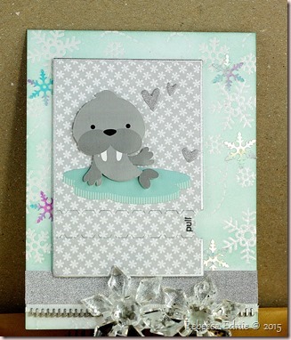
walrus snowflake ty card

Our first challenge was to use inspired by the letter Z. As in zipper, Z-fold card, zebra, zinnia, zoo… (Lots of great new zoo stamps out lately.) So I hope you will join us! I was dying to use my new SSS card kit (I skipped the last one) but how to incorporate a zipper. No zebras or zinnias go with igloos and Inuit children… So I pulled out a PTI ZIPPER die! Yeah! And I remembered I had some Melissa Frances ZIPPER tape! Underneath the zipper it says, “Sending flurries of Thanks”. I’ve added a sticky note to the inside so I don’t forget.

I’d be so honoured if you’d leave a comment or link a project for this week. There are two other girls starting with the team this week too so I’m sure they’d love a comment of welcome too! We do a variety of challenges from technique and photochallenges to sketches and product challenges! Something for everyone! I can’t wait to play more weeks!

Enjoy, Rebecca

Enjoy, Rebecca