Before starting this, make sure you’ve gone to the washroom and grabbed a beverage, it’s pretty long!
For anyone who wasn’t aware of the massive stamping event this past weekend, Papertrey Ink had a huge video tutorial/event/challenge/prize giveaway for anyone who wanted to join and best of all, it’s all online! Each year has a theme; this time it was traditional anniversary gifts for the first 10 years of marriage.You might notice I published this with mere minutes to spare to link these cards up.
Well, I tried! I fought the clock and the clock won! I got carried away making cards this morning until I had no time left for leaving comments (which I should have done days ago) and I only got to link up 4 of these! I’m honestly pretty bummed because I worked really hard on them. But this year the event was so huge, too huge really! There were 21 challenges compared to 11 normally and honestly, I was overwhelmed. I did create during all three days including almost all day on Sunday but I work pretty slowly. And, ya know, I’ve still got kids, a hubby and a life to live. Eating and sleeping are pretty much requirements no matter how much I want to stamp.
So here are all the cards/projects for the challenges I completed. Please forgive the hasty photography. I didn’t have time to get creative. Starting from the top:
Warm up: Choose a colour palette from the inspiration photos out of the ones provided to make a quick card.
I’m not normally into all things super CAS, graphic or black and white. But something about this just spoke to me this day. All products are PTI.
Year 1: Gift-Paper
The challenge was to use paper to make some embellishments for gift packaging. The papers, button and leaf die are PTI.

Year 2: Gift-Cotton
This tutorial made me intensely happy! OMW! Isn’t this the cutest thing ever? Well except for newborn babies, oh and newborn animals, ok and maybe little tiny girls in ruffled bottom swimsuits (we were at the water park yesterday). Fine, maybe not the cutest thing ever but definitely one of the cutest card embellies I’ve ever seen! It’s made with dyed cotton balls! My glitter stripes were enhanced with some heart confetti before I added the glitter. It just ups the cute factor right? The cardstock, die, ink and ribbon (not the pompom trim) are all PTI.
Another cotton challenge using crinoline. I had some from way back and honestly, I don’t know why I haven’t made more of these flowers lately! When I bought the crinoline, I also bought some satin and organza to make other flowers. This time I combined them for this shabby chic lovely! I’ve also added some tulle in there. The polyester layers were heated to make the edges curl which gives them more volume and also makes them look more shabby. The PTI products on this are the cardstock, ribbon, sentiment, ink and the border die.
Year 3: Gift-Leather
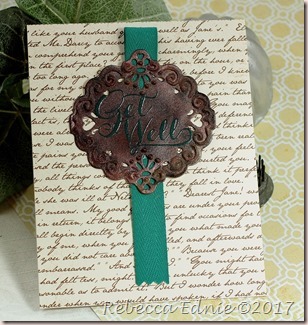
This was a fun technique to do. I’ve done it before but not for a very long time. You scrunch up and ink your paper after wetting it to make it look like leather. They used some glycerin in the water but just water works fine too. Everything is PTI except the sentiment and brads. I didn’t get to the second leather challenge.
Year 4: Gift-Linen
I struggled to find fabric for this challenge, to stamp on fabric to make a Japanese inspired gift wrap, in a very messy basement! Then I walked through a spider’s web getting to my fabric boxes, ehh! So I found this piece only to get it upstairs and find it was a piece my mom gave me with adhesive from embroidering or using adhesive interfacing? all over the back. I’m sure many moons ago when she gave it to me I was told to wash it, or only use it for card fronts or something. Anyway, the back is yucky but I figured I’d try out stamping on it with paints. The first time was too light because I used too little paint. Next time the details were obliterated by too much. The next time was just right, like when Goldilocks found poor baby bear’s stuff! I learned to add the paint very quickly, then remove excess from the grooves with a small paint brush then stamp. Stamps are PTI.
The next video taught us to stamp on fabric for an embroidery-style look. I think it might be fun in the future to stamp an image really lightly then embroider over it! Everything is PTI except the frame die.
Year 5 was wood and I loved the challenges, I just didn’t get to them. Bless you if you’ve made it this far, go grab another cuppa, there’s still a lot to go.
Year 6: Gift-Iron
This was one of the most unique in my opinion. I’ve always loved the look of aged metal with a patina. Especially green copper! So I was super excited for this challenge. you’ll have to go to the blog to read about all the steps. I started with PTI inks but my ridges were too high so I switched to Copic markers applied by airbrushing tohem. The background paper, some of the ink and sentiment are PTI. I didn’t get to the other iron challenge. I just didn’t like the look so I skipped it.
Year 7: Gift-Wool
We were asked to make a stitched wool felt embellishment. I used PTI felt and background paper to make this flower.
In another totally adorable tutorial, we were shown how to make some felt cookies! My 5 yo son just got a play kitchen from IKEA so he was thrilled to have some cookies to add to his collection of play food. I used PTI felt to make them. The stitch Debbie taught us was so cool! I’d never seen that one before in any book or online. Totally awesome!
Year 8: Gift-Bronze
I love shiny, pretty stuff so these videos were perfect! I don’t use my Perfect Pearls often enough so the first challenge got my ideas flowing. In the end, even though I loved the teal and bronze combo, I struggled to find another colour I liked with them, with this style of die. A turquoise or aqua paper didn’t look elegant enough. A pink or red was too jarring. A neutral too boring. A yellow, orange or blue, too primary. So I stuck with monochromatic. The word die is inset which looks pretty classy, if I don’t say so myself! The cardstock and word die are by PTI.
This tag was really fun to make. I remain one of those people who think heat embossing is super cool even though I’ve been stamping on and off for 30+ years. It’s even cooler when you add a ton of layers to get a solid metal appearance. These feathers look like they’ve been dipped in liquid metal right? The sentiment I wanted to use was way too long for the space. I didn’t want to cut it up so I selectively inked each section. But it would be tricky to get it all perfect and lined up that way. So I left it messy on purpose! I really like how it looks! Cardstock. stamps, ink and feather dies by PTI.
Year 9: Gift-Pottery
Ok, so if you’ve never used air dry clay, it’s like the coolest thing ever!OK, maybe not as cool as heat embossing, or walking on the moon or… Fine, but it’s pretty cool! The video showed how to roll it flat then ink up a stamp pressing it into the clay to get a coloured impression. Pretty neat right? Then all you have to do is STAY AWAY. Do not fuss the clay! I’m always trying to move it and touch it, check on it and dry it faster by turning it over. Just leave it alone (or so I try to tell myself repeatedly!) The cardstock, stamps and ink are by PTI. The other challenge was to make an easier version of salt dough which I was going to make with the kids but I ran out of time for that one too.
Year 10: Gift-Aluminum and Tin
I think this one turned out super fabulously! The ‘tin’ item on here was supposed to be silver gilding flakes but I chose gold instead. This was my first time using them so it look me a couple of tries to get it right. I started with Heat n Stick with a stamp that was too fine. Then I tried stamping the same sentiment with regular ink but outlining it with a glue pen. ooh, also no good, too hard to control! But this time worked out for me, mostly, it’s far from perfect! But I really like it. I used a more solid, defined stamp and used heat n stick powder. For the line I used Be Creative Tape. The flowers have gilded centers adhered with the glue pen. But it doesn’t stick well to the embossing so next time I plan to use gilding, I will brush off the embossing powder from the areas I plan to gild before setting the powder. The flowers were simply watercoloured by dropping the pink into each area which was already wet.
If you got this far, you deserve a medal! Brava! I posted many of these cards to Instagram on the weekend. I’m going to try to post there more often, right from my craft desk. I’d love to see you over there! You can find me at this link. Rebecca Ednie’s Instagram.
Enjoy, Rebecca


