October 06, 2018

Exciting News!!

I’ve decided to move, yep, I’m on my way over to a WordPress blog! And while I’m making big changes, I’ve decided to rebrand myself as well. So pop on over to My Crafts are Like a Box of Chocolates, You Never Know What I’m Going to Make! No one could ever spell my blog name anyway and the new name incorporates all the different styles of crafts I’d like to post.

Rest assured that I will continue to post lots of fun stamping and card designs. But this new blog makes me feel more comfortable adding calligraphy, jewelry, mixed media, home décor, mail art, ATCs, sewing and so much more!

I’m not sure yet what will happen if you are a subscriber but I promise to edit this post to let you know. I do hope you will follow me over there! I definitely will be importing my content to the WP site but I will also keep this blog open so any bookmarks or saved links on Pinterest will still work.

Please also pop on over to Instagram (link on sidebar) to see more of what I love to create. If the link isn’t working, I’m BecCreates1.

Thank you for your dedicated readership! I’m looking forward to engaging with you over at WP!

September 29, 2018

Fall Branches Bouquet

Welcome to another week at Crazy 4 Challenges! With it turning fall here in the Northern Hemisphere, we were asked to make a a fall-themed card. I’d forgotten what the challenge was but when I looked it up, I was like “YAY” as I had been working on a fall card anyway! Fun coincidence!

c4c 18 fall branches

The stamps are from the September Hero Arts kit. I stamped them in Antique Linen Distress ink but added a few stampings to the upper part of the bouquet even though the stems didn’t reach. I just painted them in as I watercoloured the image. The antique linen is so light that it doesn’t interfere with the watercolour plus it also dissolves away with the water because it’s a water reactive ink. The painting of the leaves and berries isn’t that interesting  because they are too small to add much shading.

But the vase, there’s more to talk about. I used a very damp brush to add water to the image. Then I dropped in very concentrated colour on the top, left and bottom. I allowed the paint to move on it’s own with little interference. As it started to dry a bit, I added more and more colour to the left with my board tilted slightly downwards. I loved how the paint was moving so I allowed it to dry completely on it’s own which I rarely do. When I was done, I added stamping over the background, Antique Linen in the middle and a tiny bit of Vintage Photo applied with a foam blender to the sides only. Then I added sponging in the same way with the same colours. Last, I added a warm grey shadow under the vase. I normally would add some sequins or embellishments but I wasn’t sure how I was going to use the card. There’s a high likelihood that I’ll use it for a sympathy card and I don’t bling them up like I do with normal cards.

I hope you are inspired by my card and our challenge this week. The challenge is open until Friday midnight so I hope you will pop on by and play along!

Enjoy, Rebecca

Pastel Party!

When I saw the inspiration photo for the latest Card Concept Challenge, I knew exactly what stamps and dies to use. I’ve always loved pastels so I pulled out all of my pastel cardstock scraps and my Copics and went to work.

pastel party unicorn

The stamps and dies are by Concord & 9th. They are some of my favourite stamps of all time. I used a Simon Says Stamp cloud stencil on the background with Tumbled Glass Distress Oxide ink. I made a small cloud-shaped shaker filled with white and clear sequins and confetti. I packed it fairly full so you always have a full window of sequins, many of which are iridescent so they reflect a rainbow of colours. But I left just enough room so they still shake around nicely.

pastel party unicorn2

The rainbow dies are unique in that they are individual arcs. This means that you don’t waste paper cutting the colours from the wrong colours as you would if the die was all one piece. I lined them up against a ruler so I’d have a nice straight bottom edge. But the arcs aren’t perfectly semi-circular so if you placed them kinda wonky-ways, they’d look fine that way too. In the top corner I added a Believe in Yourself sentiment.

pastel party unicorn3

The unicorn was coloured with Copics, I used cool greys for the body and a rainbow of pastels for the mane and tail. I have done each section in it’s own colour before but I prefer the blended look I achieved here. To finish the card I added some crystal hearts, clear sparkly sequins and added clear Wink of Stella to the rainbow arcs, the mane, tail and sentiment. You can see the sparkle in the closeup photos.

Thanks for stopping by!

Enjoy, Rebecca

Entered in:

The Card Concept #98

pastel party

September 24, 2018

Numbers Celebrate

This week at Crazy 4 Challenges we were asked to make a birthday card with numbers on it. If you have been reading my blog for a while, you probably already know that I don’t celebrate birthdays so I made a basic celebration card instead.

c4c 18 numbers celebrate

The sketch is Sketch Saturday #531. It’s a great basic sketch that was easy to work with . I grabbed some older paper, sorry but I don’t remember the names of the packs. I used an Altenew set, Label Love, for the Celebrate sentiment. The twine I tied around the panel loops through the eyelet in one way for the first wrap and through the other way for the second wrap. I like how it balances out the tag so it doesn’t twist funny. I adhered it with some foam tape.

Thanks for joining me this week! You have 5 more days to play along with this challenge so pop on over to the C4C blog to join us!

Enjoy, Rebecca

September 20, 2018

Pumpkins and Sunflowers

No!! It can’t be fall already, can it? I don’t like fall much because it means winter is close by and I hate the cold. But these images are too fun to pass up!

c4c 18 pumpkin sketch

Speaking of the images, the stamps are by Hero Arts from last year’s fall card kit. The images are all layered giving loads of colour to these simple shapes without any colouring. I researched sun flowers to come up with one that was non-traditional. There is a super pretty one that’s actually pink? They also come in a dark purple, a rich burgundy, white and yellow and the one I stamped, pink and yellow. It took me a while to come up with the perfect colour combos for both colours of the sunflowers and pumpkins but I love the final variety I was able to achieve.

C4C452Sketch

I arranged my elements according to the sketch challenge for this week at Crazy 4 Challenges. My base was some woodgrain paper then adding a gold mirrored die cut from Spellbinders. I tucked some patterned paper and lace under the gold die cut for some rustic charm and to fulfill the vertical panel on the sketch. I love the combination of rustic elements, the lace, woodgrain and autumn images, alongside the elegance of the gold die cut and embossing.

I hope you can play along with us this week! I’m running a bit late this week so you only have one more day to play! It’s a great sketch because you can do so much with it!

Enjoy, Rebecca

September 08, 2018

Ornate Heart Love Card

Whew! This summer has been so busy! I’ve taken a break from Crazy 4 Challenges for a couple of weeks but I’m back with a fun new theme. This week we were asked to make a love or thank you card for a family member. This card will likely be my sister’s anniversary card next year.

c4c 18 ornate heart love card

I took inspiration from Jennifer McGuire who has shown a couple of variations on the gate fold card on her blog in the past few weeks. I’m used to gatefold cards being made from just one piece of 5.5x8.5” paper but her way uses two sheets that size. So I tried it out for this card. For the background, I used a piece of paper from My Mind’s Eye. The ornate heart came from a Hero Arts kit from a while back. Isn’t it lovely? I stacked 5 die cuts together to make the die cut sturdy enough then covered it in Versamark and WOW Vanilla sparkle embossing powder twice. Last I added some Caramel Cream Nuvo Drops to some spots.

c4c 18 ornate heart love card2

On the inside, I added a layered Love sentiment. I used Avery Elle rose gold embossing powder for the bottom layer. I added three layers until it was nice and shiny and smooth. Then the next layer was stamped with Versamark then embossed with WOW vanilla champagne powder which has gold glitter in it. It didn’t show up very well because the gold glitter made it look splotchy. So I added some SSS Pale Blush Pink ink right on top of the embossing. It helped fill in the flourish part of the stamping.

c4c 18 ornate heart love card3

I hope you love my card because I was very proud of it! I’d love it if you would play along with us over at the C4C blog. All you have to do is make a love or thank you card for someone in your family!

Enjoy, Rebecca

August 23, 2018

Autumn Coffee Card

I just got my August Hero Arts card kit so I was excited to use it. When I make card, I often start out without knowing exactly where I’m going with it. But when I have a sketch to work with, it makes it so much easier!

coffee shaker

Today we have a sketch for you at Crazy 4 Challenges. The large center shape made me think shaker! I don’t think I could ever get sick of making and shaking them! I forgot that even Distress glitter sticks to the acetate sheet. I’ve done this before and it does finally settle so I wasn’t too worried but I was bummed that it didn’t make for a better photo! The cups are both stamped on patterned paper and coloured with Copics. The curvy cup reminded me of me and the other of my husband so I added appropriate sentiments. I hate coffee so switching them wouldn’t have worked. The background paper was from the Hero Arts kit, so unique. It’s thin though so I added a background layer of cardstock before die cutting it. The leaves were cut with Spellbinders dies, coloured with either Copics or Distress sponging then splattered them with first brown watercolour then gold watercolour. I did the same with the background.

I hope you can come by the C4C blog and join us this week!

Enjoy, Rebecca

August 14, 2018

Revisiting Old Card Kits

If you buy card kits, do you ever use them up before the next one arrives? Leave me a comment and let me know! I have to admit, I NEVER finish a card kit right away! in fact, I have ones going back to 2014! I think only 2 in that time are all used. So sometimes when I have some time, I pull out an older kit and try to make at least 3 cards with it. I don’t always manage three but I try even if I have to make a simpler card or CASE* one of the cards shown on the insert. 

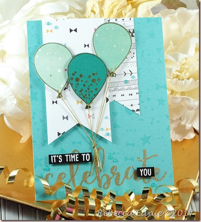
balloon celebrate card

*CASE stands for Copy and Stamp Everything, basically using someone else’s design as inspiration but changing it up to make it your own. As long as you don’t pass the card off as your own or try to sell it, you can even copy it exactly!

I was in a gold mood when I made these cards. Do you ever get in a mood to use a certain colour, a specific technique or product and use it over and over for a short while? I work in spurts like that. Then I move on to a new one for the next while. This card comes from a Simon Says Stamp kit all the way back from September 2015! I created a ‘background stamp’ using some of the small bows, triangles, circles and half-circles included in the Birthday Bits stamp set. I needed some more bits so I trimmed a couple of tiny shapes off of the small borders. I don’t prefer to cut my stamps apart but these are wonky borders anyway so realigning them perfectly isn’t important. I found a matching ink to the cardstock in the kit and stamped the grouping of stamps I put together on entire card front. Sometimes when I find a grouping I really like, I stamp an example and keep it with the stamp set.

balloon celebrate card2

I gold embossed some balloons on two of the papers by Pinkfresh Studio from the kit and on some scrap cardstock. I added some dots on the cardstock balloon. The strings are made of stretch gold cord which is my preference over plain gold string. The stretch means that you don’t have to be as precise when tying the strings together to make sure they all stay straight. I glued the knot to the card with glossy accents using a clothespin to keep it in place while it dried. The sentiment from Celebration Sentiments by Honey Bee Stamps is embossed with gold sparkle powder by WOW. I used banner dies by PTI but I trimmed the points so they weren’t so long.

gold foil balloon celebrate

In keeping with the gold theme, I made this card using the October 2015 Simon Says Stamp kit. The center panel is one of the journaling cards included in the kit. The cards and the patterned papers are by My Mind’s Eye, one of my favourite paper companies. The panel underneath has a gold-leafed I applied over Scor-Tape, then I rounded the edges to match the journaling card. I hand cut the balloons because the dies I have are too large. I added the same gold cord but this time decided to allow the strings to hang to the side whimsically. It’s hard to tell from this photo but the ‘Let’s Celebrate’ sentiment is gold foiled. A few gold confetti bits from Studio Katia finished off this card.

gold foil balloon celebrate2

Thanks for joining me for these fun cards. I’d love to hear how you use your card kits. Do you subscribe or just buy a few here and there? Do you buy more than one? If you get any other than the MFT, SSS or Hero Arts ones, let me know which ones and how you like them! I’m dying to sub to the Spellbinders ones but I only have so many $$$!

Enjoy, Rebecca

August 07, 2018

A Duo of Hero Arts Beach Themed Cards

The June Hero Arts kit, which was super popular, was called Sea and Sky. I ADORE everything beach so I sat down right away and made a couple of cards. I posted them on Instagram then promptly forgot to share them with you. It’s a funny thing, once I’ve shared a project in one place, I forget to post it in the other place. So today you get two cards!

beach chairs shaker

You will have to forgive me, I have a terrible memory for somethings due to my disability. Strange though, I can remember a wide variety of useless info! Anyway, back to the card. I painted the ombre background starting with blue and slowly transitioning to turquoise. I love painting my own backgrounds. It works so well for this type of card and I feel like I can justify the purchase of professional paints! {WINK} Can you say ‘Girl Math’?

beach chairs shaker2

The kit came with some sand-look embossing powder. It seems to have two sizes of copper powder, very larger chunks and normal sized bits and tan powder as well. I cut a Polaroid frame then embossed the bottom part so it would appear to have sand under the chairs. For the window, I used some heat-resistant acetate so I could stamp and emboss a white sentiment. I added lots of ocean colours of sequins and star confetti as well as some small shell stamped and die cut pieces to the shaker. Before adhering it to the background, I added a small boat and a dolphin to the background. That way I had two stable images and 3 floating ones inside the shaker. A few Nuvo drops finished this card without adding too crazy much bling.

kraft beach fancy frame card

For this card, I used an add-on to the kit, a fancy beach frame die. I coloured the frame with Copics adding leaves to the palm trees, some shading to the sides and colour to the details on the beach. The background was stamped with the ocean detail stamps from the main kit. There are three stamps total, one solid stamp, one shading stamp and one detail stamp. I stamped the first two normally but altered the way the top layer was to be used. It has a solid layer at the top meant to be used along the horizon and some small lines mean to show the waves. I moved the stamp down to near the shore. I stamped it in versamark omitting the top line then I embossed it in white. This makes the small lines look like froth on top of the waves! I love it when a stamp can be used in another unique way. It’s a shame so much of it ultimately ended up behind the frame.

kraft beach fancy frame card2

Stamping on kraft muted the colours of the stamping which I really liked in this case. It also made the cloud stand out really well. I used several layers of Hero Arts unicorn white for the base layer and white embossed the shading layer. A few sea birds completed the sky. I stamped tiny sandy dots with several colours of tans and browns on the sand area to give it more texture. A few sequins and pearls finished this card.

Do you love to make beach cards in the summer? I have more coming up for you in the next couple of weeks. I’m working on a mixed media piece too. Hopefully I’ll have it done in a few days. If you want to see it as soon as I’m done, follow me on Instagram. There is a link at the top of the blog on my side bar.

Enjoy, Rebecca
Mountain Landscape Sympathy

I’ve been getting into more and more watercolouring lately. I took some classes about 20 years ago but I was never very good. ;) But with it getting so popular and now that we have YouTube, it’s easier than ever to learn how to watercolour!

c4c 18 mountains

So I won’t pretend that this is a masterpiece but since I have no mountain stamps or dies and this week’s challenge at Crazy 4 Challenges was to make a card with a mountain on it, I had to figure something out! I followed a tutorial, step by step, until I had a decent panel. It’s my first try so I’m pretty happy with it. I used my new Silver Brush Company Silver Velvet brush and I can’t even describe how much I love it! It’s a size 8 but the tip is about the same as a size 1! Amazing right? It means that you don’t have to change brushes for some details. It also holds a TON of water! I had no idea how much easier it would be to paint with a brush that holds so much water! If you’ve been hesitating to buy one (or more!!), GO. NOW!!

Have some mountains? Come on over and play with our challenge at C4C!

Enjoy, Rebecca

July 29, 2018

Praying for You

Sometimes we have to make cards for some pretty serious occasions. We usually think of sympathy cards as being the hardest. But I find one other category is even tougher.

c4c 18 sea praying for you

Making cards for someone who is seriously ill or dying is definitely the hardest. Sometimes we can’t even make them for the person but instead for their family because they are too ill to appreciate a card. I call these hope cards as you can always hope for a miracle. Hope or sympathy cards were the theme at Crazy 4 Challenges this week. I usually use Thinking of You or a sentiment with prayers or praying in it if that’s appropriate. For imagery, I tend to go with the same things I’d use for sympathy cards. Writing inside the card is the hardest.

I used a Prima paper pad for the papers. The scalloped circle is by Spellbinders cut from Ocean Tides cardstock, but as the cardstock wasn’t bright enough, I added some BG15 marker. It’s a great way to use up some ink if your marker is too juicy too! The plain circle is actually stitched from Simon Says Stamp. The kraft card base was stamped with various postmark stamps from Rubber Buggy. They don’t show much, mostly in the torn areas. I distressed this card pretty heavily. Not sure why, maybe just because I haven’t done it in a while. I was working with the latest Global Design Project #148, case the designer.

Enjoy, Rebecca

Entered In:

GDP#148

GDP148_Connie Collins

July 21, 2018

Kindness Enclosed: Flower and Wood Frame Card

For the third week of the month at Crazy 4 Challenges, I designed a sketch for us to use. I’ll be honest, I CASE’d this from a card I saw but when I went to find the name of the designer, I’d lost it! oops!

c4c 18 peony wood frame sketch

So I learned some fun things when I was making this card. I tried a few different dies to make a frame. But, none of them were working quite right. So I tried making a frame with my new Infinity Rectangle Dies by Hero Arts. To save time, I used some cheap watercolour paper I bought for my son. I cut the frame 3 times. Then I wanted it to look like a wood frame so I embossed it with my Gemini Junior using a PTI texture plate. But, I made my sandwich too thick. My machine moaned and groaned but it finally allowed the sandwich through. My frame was deeply embossed but also quite warped and even torn in one place! At first I was annoyed assuming I’d have to redo my frame. Then I looked at it again. I liked that the frame wasn’t perfect, it made it look more rustic. Also, the torn part went together quite well while the remaining portion that showed could be hidden under the flower. I highlighted the texture with some gold wax paste.

c4c 18 peony wood frame sketch2

The flowers are from a Spellbinders stamp n die set. I used professional watercolours from several brands to colour the image that was stamped in Antique Linen Distress ink. I used spring moss cardstock for the card base, then some patterned paper with soft printed dots. A doily and some sequins added some shabby chic texture to this card. I wasn’t sure what kind of sentiment I wanted to use and I knew that I needed some new cards for More Love Letters. I try to send a couple of cards each month. It’s hard to know what sentiment to use when making cards in advance, so I went with a kindness sentiment from a set by Hero Arts.

Enjoy, Rebecca

July 14, 2018

Shaped Cards for Crazy 4 Challenges

For my second week hosting over at Crazy 4 Challenges, I decided we should make shaped cards. Anything other than a plain circle, rectangle or square. I had lots of ideas but then I realized I’d already made this card that I loved!

c4c 18 scalloped card shape challenge

When I made it, I was experimenting with some new supplies. The Rebecca Lace background from Simon Says Stamp and some gorgeous new Daniel Smith paints. If you like to watercolour, you MUST get yourself some professional paints, just a few at a time, when they are on sale. Preferably Daniel Smith ones. They truly are amazing! I also finally got myself a few Silver Brush watercolour brushes. They are soooo much better than the ones I’d been using. I had a variety of brushes from value lines from Curry’s to expensive ones from Michaels (coupon baby!) and even some from the dollar store. I’ve always wondered how someone could paint something then come back to the first part and add pigment when in my world, that paint would already be dry! Well, it’s because Silver Brushes hold an enormous amount of water! Oh, now I get it! That’s how their paint is still wet! Such a revelation!

The colours I used here were Amythyst Genuine, yes, the actual gemstone is used to make the paint, Duochrome Oceanic which is an aqua with gold shimmer in it, Rhodonite Genuine, Bronzite Genuine, Prussian Green and Cobalt Teal Blue. Most of these are shimmery which looks so amazing with the platinum embossing powder I used to emboss the lace image. I used multiple layers of the same powder to colour my Thinking of You die cut. The stamp is actually square but I decided I preferred it trimmed into a scalloped circle.

I hope you have some awesome ideas for shaped cards. If you join us over at the C4C blog, don’t forget to come back here and leave me a comment so you are entered in my giveaway!

Enjoy, Rebecca

July 13, 2018

Mermaid’s Treasure

For the last few years, I’ve been obsessed with all things related to the ocean and blue-greens like teal, aqua and turquoise. I didn’t have any mermaid stamps until this year but I am so hooked!

mermaids treasure shaker

This sweet little gal and her accompanying stamps are by Stamping Bella. This style of illustration is my favourite from this company. She was so much fun to colour with my Copics. The little dots on her tail look like scales right? The coins in the treasure chest are coloured with a coppery gold pen. Isn’t the ocean-themed frame stunnning? It’s by Hero Arts, cut from Bristol Smooth paper, sponged with Distress Oxide inks and flicked with water to create texture. The little tiny fishies I added as accents were cut from the area behind the mermaid; rather than wasting them, I trimmed the fish colouring them with warm colours to help them stand out. The background is hard to make out here but it’s stamped with the sea weed stamp that accompanies the mermaid.

Do you love the ocean? I could make nothing but beach and ocean themed cards and be very happy!

I’m hosting a giveaway! Read the details HERE!

Enjoy, Rebecca

July 09, 2018

Eiffel Tower Tea Set Card

I’ve got to admit, I’ve been holding out on you guys. I often post my cards to Instagram and forget to post them here. Sometimes I don’t even remember to take a photo of them with my good camera and all I have is an iPhone pic! So this summer, I am resolved to find all the cards I’ve made in the last while, about 6 months I think and post them all! We shall see how long this particular resolution lasts!

Eiffel tower tea card

This card was for the spring Coffee Lovers Bloghop. The Eiffel Tower is by Hero Arts, (I’m so used to Instagram that I almost typed #heroarts!) which I airbrushed in tan to get as close to the colour of the real tower as possible. Did you know that it is painted in an ombre of tan? But metallic tan of course. To save time, I die cut the tea pot and cup (dies by Poppy Stamps) with coaster board so I wouldn’t have to layer so many die cuts. Just snag a few every time you go out to a restaurant or bar! Most die cutters will get through it in just a couple of passes with a shim.

The background is text paper from PTI but it looked too plain so I airbrushed some of the colours from the patterned paper on it. At the bottom I added a fabric doily; sadly most of it was covered by the flowers.  I finished the card with some crystals, silk and paper flowers along with some die cut flourishes.

Eiffel tower tea card2

I wonder if some of you are curious as to why so few of my cards are my usual shabby chic style. There are a couple of reasons. First, many of the stamps I get in my Hero Arts and Simon Says Stamp kits don’t lend themselves to shabby designs. I wish I was like Melissa Philips and I could make a shabby card out of nearly any stamp set! But alas, I lack that particular talent. Also, I’ve been trying to sell my cards and the over-the-top shabby ones I love to make don’t sell very well. I will always be a shabby and elegant designer at heart but I have been enjoying making some cards that aren’t as ornate and girlie. Oh, I guess there is another reason. I’ve been colouring a lot and not finishing those cards! Especially since I’ve participated in the last couple of Kathy Rascoosin’s 30 day colouring challenges. That’s another goal of mine, to turn those coloured panels and backgrounds into cards!

Enjoy, Rebecca

July 07, 2018

Hola! Piñata Celebration Spinner Card

Hey paper crafters! It’s my month to host at Crazy 4 Challenges and I’m so excited for you to see the challenges I’ve created! In addition, I have a giveaway for you this month, more details below.

c4c 18 window pinata spinner

My card features stamps from the Mexican-themed Hero Arts kit from a couple of months ago. My theme for the week at C4C is WINDOWS. There are lots of ideas on the blog to get you started. When I thought of a window, I though of a spinner card, cutting a circle window in the front panel so the piñata can spin. There is only one little donkey (not two mirror images) so I didn’t have a stamp for the back of the spinner. I stamped the image, got out my light box and traced the image on the back. Then, d’uh, I realized that I needed two images so I could sandwich the clear thread in between them. So I grabbed another piece of paper and used my light box again to trace another donkey. Now I had one facing each way!

c4c 18 window pinata spinner2

The beautiful intricate white frame is from the kit too! I just love how it looks like lace. In this second photo you can see how the spinner seems like it hovers in space because I used clear jewelry stringing material to suspend it in the window. I added a few cacti in pots to the front of the card and I’d also coloured a cake but since it didn’t fit on the front, I added it to the inside of the card. I don’t usually decorate the inside of my cards (I like lots of room to write) but I’d already added the circle die cut and sentiment, so why not add a little more?!

So, I’m sure you are waiting for the giveaway details right? All you have to do is play along with any or all of this month’s C4C challenges, link up your card and come back here leaving me a comment that you made a card for the challenge! The prize is a pair of earrings custom made by me in your choice of colour and metal (silver or gold). We can discuss styles you like if you win. Below is a pair I made a while ago. I can easily make them more or less intricate and shorter if you prefer.

icicle lights for katie earrings

I’m also adding some paper crafting goodies! Have you ever pushed ‘Add to Cart’ once but then it seemed like it didn’t work so you hit it again? Well, I do that ALL.THE.TIME! I rarely if ever order something I already own in a later order but I accidentally order 2 in the same order! So, that means I have a stash of fun goodies that are duplicates! I’m happy to pass some on to you!

I can’t wait to see your take on WINDOWS! If you regularly post on Instagram, you can still link up your card! Just click on the 3 little dots in the top right of the screen. Then click Copy Link. Paste that link into the Mr. Linky and you are all set!

Enjoy, Rebecca

July 01, 2018

Party Balloons!

This week at Crazy 4 Challenges, we were asked to try out the Eclipse Technique. I did another card with this technique recently so I’ll have to post it soon.

c4c 18 party eclipse technique

Basically the technique requires you to cut a word or shape out of a background then add foam tape and add the die cut back into the spot from which it was cut. The background can be stamped, painted, printed (like patterned paper) or in my case, die cut! I cut a bunch of balloons all in white then added them to the card. The paper I used was not too thick so the die would cut through both layers. The balloons are by MFT, the confetti by PTI and the party from Winnie and Walter. I added Copic marker colouring to the balloon areas of the word die cut to make the word stand out more; all white would have been pretty boring right?!

So this card could be used for a male or female, I used only a bit of pink and purple for the die cuts and none for the sequins. I added a couple of strips of paper along the edges for another pop of colour. I rarely add a full sheet of paper when I do a layer. If just two edges show, I add strips of paper. If I want a layer that shows all around, I often cut the center out so I can save that bit for die cutting. I don’t do this on small layers but it does save money in the long run.

I hope you can come up with a cool design using the eclipse technique! Please join us over at the blog!

Enjoy, Rebecca

June 23, 2018

Time for Summer, Baby!

We’ve had some pretty hot temperatures lately here in Southern Ontario so a bathing suit card was perfect for this week’s Crazy 4 Challenges theme of Ombre!

c4c 18 ombre bsuit

I absolutely ADORE this background paper. I could have 10 sheets of it and it still wouldn’t be enough. I wanted 2 layers under the bathing suit  but I also wanted to let that awesome ombre paper shine so I used some vellum for my lowest layer. The bathing suit was popped up on foam but I chose to cut multiples of the ‘relax’ die cut to make it more dimensional. However, when it came time to add it to the card, I realized I was in a bit of a pickle as the ‘x’ is a separate piece! So I cut several more of the ‘x’ until I raised it up to match the rest of the word. I also did that with the ‘r’ so it would match the ‘x’. A touch of shimmer pen to the swimsuit and ‘relax’ plus a few coordinating sequins and I was done!

I hope you have lots of ideas for making a project with some ombre paper or other supplies. Maybe a watercoloured or sponged background? Don’t forget to link up your creation!

Enjoy, Rebecca

June 16, 2018

Cupcake Celebration!

We have a very intricate sketch this week at Crazy 4 Challenges! It’s got lots of shapes and layers to work with.

c4c 18 june sketch cupcakes

This project was coloured entirely with Copic markers with the exception of the inks on the banner but even that is shaded with Copics. I started by colouring the cupcakes but then I couldn’t find a background paper I liked for the life of me! ugh!! So, next I airbrushed a background with the same Copics I used to colour the cupcakes! I thought it turned out subtle but nice. The strips of paper and the die cut frames were also coloured using the same markers. The frames were made with some of the first dies ever manufactured, basic squares and scalloped squares from Spellbinders. The cupcakes, dies and the celebrate banner are all from the Baker’s Dozen set by PTI.

Isn’t this a fun sketch? Come on over to the C4C blog to play along with the Crazies this week!

Enjoy, Rebecca

June 09, 2018

Masculine Congratulations

Hubby always has me make cards for him for his co-workers. I really don’t mind because it’s the least I can do since a huge portion of our disposable income goes to my crafting! And the timing was perfect because our theme at Crazy 4 Challenges is masculine cards.

c4c 18 masc congrats

He needed a congrats card for someone he knows who is leaving for a job elsewhere. I always ask him about the person so I know what direction to take when designing the card. This guy likes the outdoors but that was all I got. Men aren’t the best at noticing the type of things about a person that lead to designing a card that suits them. :)

Fortunately, I have a searchable iPhone program that I’ve set up with a ‘masculine’ category so finding some outdoorsy male paper wasn’t too hard. The paper is from a great masculine pad by Kaisercraft. The small ‘quality’ panel and the congratulations are from the back of the same pad! I love how Kaisercraft has so many fun pieces in the back. The tree was die cut and sponged to add a bit more of the outdoors and I found some self-adhesive metal pieces that look like brads but had no prongs. They were the perfect colour, aged copper, for this card. The top of the card is made from kraft paper I embossed with a PTI texture plate. To add a bit more texture to the patterned paper, I stamped some vintage style stamping.

Do you struggle with masculine cards? Maybe you can find some inspiration over at our blog! Pop on by and leave a comment for our team. Then make a card and link it up!

Enjoy, Rebecca

June 02, 2018

Summer Flamingo Card

So apparently yesterday was Barefoot Day which makes that the theme for Crazy 4 Challenges. Which suits me fine as I regard socks as torture devices only to be worn when desperate! That means I’m barefoot anytime I’m inside and as much of the year as I can manage outside.

c4cbarefoot flamingo

All the papers are from Authentique, a pack called Utopia. The flamingo is an Echo Park die that I cut from more patterned paper. To make the dots not quite so prominent, I added some Worn Lipstick Distress ink. Then it was a bit too plain pink so I added some orange, just a touch, with Marmalade to mimic the flowers. I hand cut the monstera leaf, I just love those, don’t you? So vibrant in colour and organic in shape! The hibiscus flower (or whatever it is) is a wood veneer accent that I coloured. I filled the Polaroid-style frame from Simon Says with various Lucy’s Sequins. The aren’t as bright as the flamingo but that’s ok as I wanted the flamingo to stand out anyway. And they do look brighter IRL.

I hope you can find something in your stash that is barefoot so you can play along. Basically any bird or animal that isn’t dressed in some sort of outfit with shoes will work so hopefully you have lots to choose from! Even some sea creatures in shells have a ‘foot’, snails do too! So lots of ideas you can work with. Head on over to our blog and link up your project!

Enjoy, Rebecca

May 25, 2018

The Most Annoying Graduation Card EVER!!

So the challenge this week at Crazy 4 Challenges was to make a graduation card. Seems simple right? Oh, you would think so…

c4c 18 grad

Oh but I had to complicate things by using Chibitronics lights. These are usually pretty easy to use, I’ve done it before, no big deal! Well, this time I spent HOURS agonizing over why they wouldn’t light. So I get all but one working… try to adjust the last light in the sequence… don’t change a. single. thing. with the other three lights. Now the first three don’t work and the last one does!!!!! AHHHHH!!! {insert bag language here}. So hubby comes to help. After much ‘rewiring’ all of the lights work. By now I’ve tried soldering the lights (apparently I’m very bad at it), taking lights out and replacing them and adding the special fabric conductive tape to try and make them work. Hubby gets them all working. Great. Off he goes, I add the card front, one light goes out!! {insert tearing hear and rending of garments here}. After another hour, I finally get it to work. Ta Da!! (total of 5 hours now working on this card!)

c4c 18 grad2

Why oh why did I go to all this fuss and frustration? Well my baby is graduating from Kindergarten this year. I know, it’s a silly thing to have a kindergarten graduation but it is so terribly cute and he loves Chibi lights cards so much. I just HAD to get it to work. He’s actually been in kindergarten for three years now. Being born mid-December, he really wasn’t ready for JK the first year so he only went for afternoons until March, you know, like in the olden days!! June of last year (16/17 school year) he just wasn’t ready for grade 1. He would have been so far behind. He was diagnosed last year with ADHD, learning issues and academic delay. He should get special help but brilliantly, they don’t really help kids until they are already way behind in grade 3. Because many kids catch up by then. ugh…

As we don’t celebrate his birthday, he is only older than the other kids in his class for a week or so before the holidays. When he comes back from break, he will be the same age as any kind with a very early Jan birthday. So not really a social stigma which some parents worry about. So for him, leaving kindergarten is a real accomplishment. More so than for other kids.

Back to the card! I forgot to get a photo of the pull tab which is also the switch for the lights but it says ‘happy graduation’. He saw me making it but he hasn’t seen it finished so he will still be surprised.

I hope you can join us this week with your own graduation card. Don’t forget to link it up and leave a nice comment for the team and their inspiration!

Enjoy, Rebecca

May 24, 2018

Smile Tropical Card

It’s time for another sketch over at Crazy 4 Challenges! I’d just gotten my May Simon Says Stamp card kit when I made this card so I just had to use it for this card!

c4c smile floral

As I often do, I treated the sketch as more of a suggestion rather than making my card match it exactly. I also flipped the sketch turning it upside down.  The clusters of leaves and flowers represent the circles on the sketch and the adorable little scalloped circles sub in for the small banners. I also added some yellow vellum, (that matched perfectly! Wahoo!) so the stickers would stand out from the busy background paper. I actually needed to use two layers to get enough opacity to cover the paper. I used a Hero Arts tag die to cut the tags but ran it through my die cutter again after repositioning the paper so I got a narrower tag.

C4C435Sketch

I’ve been having trouble with the program I use to write my blog posts so I’m afraid you only have tonight and tomorrow to play along but I hope you love this sketch enough to make some time!

Enjoy, Rebecca

May 12, 2018

Camel Train

I had to think really hard about this week’s Crazy 4 Challenge Theme. Trains. That’s very specific and believe it or not, I have NO train stamps! What? I have over 7000 stamps collected across more than 14 years but not a single train? How is this possible? So I had to get very creative this week!

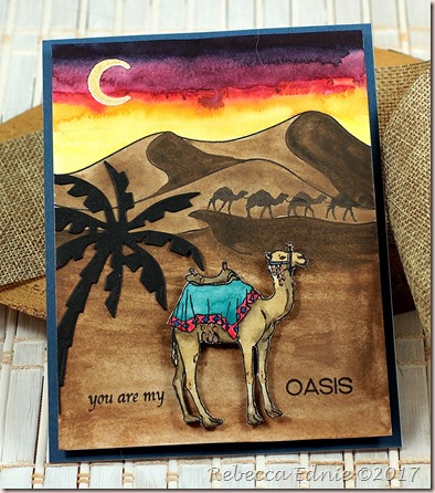
c4c 18 camel train

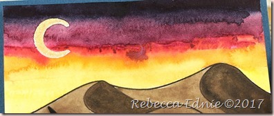
So I give you a CAMEL train! Also known as a caravan, a camel train delivers goods across many miles. Almost the entire card was done with one stamp set by Hero Arts from a recent card kit. Other than that, all I used was a single ink pad, one die and my watercolour paints. Oh, and some embossing powder for the moon but that is optional. I just think it would be pretty hard to leave the moon intact while painting around it with such deep colours. I used a lot of water to do the sky because extra water means blooms which I love in sunset or sunrise skies.

c4c 18 camel train2

Here is a close up of the sky. I do wish I’d brought the darker colours down lower but oh well. I just love sunrises and sunsets!

c4c 18 camel train3

I really wish you could see the lovely shimmer in the Daniel Smith bronzite paint I used for the sand. I tinted it darker with a dark brown paint for the shaded sand areas but you can still see the shimmer. Oh, and the intense metallic bronze tintedFinetec watercolour I used for the details on the camel’s tack (or at least that’s what they call the hardware you put on a horse); it’s very metallic! I didn’t mind that the sandy areas didn’t come out smooth as sand really isn’t in real life. I hand-cut the camel because the white edges really wouldn’t have worked well.

I hope you have better luck with your stash than I had with mine and you have some train stamps! Come on over to the C4C blog and join us this week!

Enjoy, Rebecca

May 05, 2018

Dad Hero Card

Our challenge at Crazy 4 Challenges this week was to make a super hero card! I was a bit stumped by this one! I have one super hero stamp but it’s really old so I pretty much gave it to my son who loves it. Sure, I could have used it anyway but I don’t have any papers that would go with it either! Not really my style as you know!!

c4c 18 dad hero

So I looked through my stash and found a hero sentiment. Perfect! The Fun Fasts paper is a journaling tag from Basic Grey; the papers are from the same collection all of which I received in a Simon Says Stamp kit from ages ago. I love the floral paper; it’s pretty but not so much that it can’t be used on a masculine card.

c4c 18 dad hero2

I used the shadow stamping technique for the sentiment. With dark ink like I used, you can just shift your paper and stamp again with the lighter ink. However, if you want to use a lighter ink for the main image or sentiment, you will need to emboss it to keep the shadow ink from overlapping. I didn’t want a shiny sentiment so I used some WOW matte clear embossing powder. I didn’t really need to emboss because my main ink was dark but better to do it when I don’t need to then forget when I do need it!

Have you got some cool super hero supplies? Come on over and play our latest challenge with us!

Enjoy, Rebecca

Time for Fiesta!

Last month Hero Arts sent a really fun Mexican-themed card kit. When I first saw it, I was hesitant as it really isn’t my style. But I get card kits for a reason, to challenge myself, and the images looked fun to colour. Also, the large ornate die was amazing!

Time for Fiesta chibi card

My kids had been begging me to make a Chibitronics card so I combined the kit with some fun lights. The concept was that in the day, the sun in the desert is so hot, it’s practically white hot. But later in the day, it glows orange as it sets. The mouse is coloured with Rather than colour the cacti, I used Distress inks, some Oxide, some regular, to sponge on some colour. After, because the Oxide somewhat covered the stamped lines, I re-stamped using my MISTI.

Time for Fiesta chibi card2

In this photo, you can see that pulling out the tab both completes the sentiment and actives the lights with a switch. I’m not thrilled with the obvious three lights rather than an overall diffused light so I may try to add some vellum over the two layers of tissue I used to see if I can get it to diffuse more. Once you get the switch set up properly, it works really well.

I’m not into scrapbooking much anymore though I always intend to go back to it some time. I kind of stalled out after my second son turned about 18 months. I never got a decent photo of him because he was obsessed with my camera; so every photo has his face next to the lens, massively blurred out, his arm in front of his face as he reached for the camera or was crying from being told he couldn't have the camera! But it is International Scrapbook Day so I thought I’d wish you a good one!

Enjoy, Rebecca

April 28, 2018

Snow in April?

And not just on my card! We recently had a massive ice storm so I guess it is perfect that our Crazy 4 Challenges theme this week is to be inspired by the phrase, ‘skating on thin ice".’
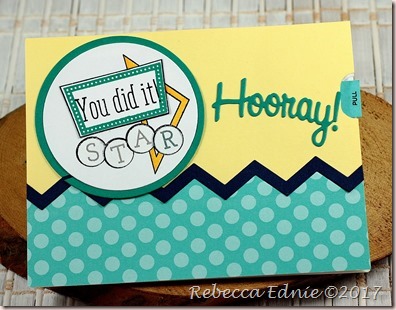
c4c 18 skating on thin ice

The large snowflake striped die is by Memory Box which I cut from white cardstock and some fancy specialty paper layered to create a 3-D embellishment. The edge of the patterned paper was scalloped using a Simon Says Stamp die which reveals some fun striped patterned paper underneath. From Honey Bee stamps I used the stamps and dies for the sentiment. Overall, this is a pretty simple card with not too much technical or intense going on. But sometimes simple is all you need right? :)

Do you have a take on the phrase ‘skating on thin ice’? Join us over at the C4C blog.

Enjoy, Rebecca

April 21, 2018

Seaside Happy Retirement Card

Do you love the sea? The beach is my favourite place! It’s where I would go if I was to retire so I often make retirement cards with this theme. This week at Crazy 4 Challenges we were asked to use a sketch so I managed to combine the two.

c4c 18 seaside retirement

The paper is from a pack by Prima. It’s an unusual collection of florals, vintage ephemera and masculine papers. These papers were ones with a definite masculine feel so they were perfect for a guy card. Only problem is that most of the wording on the ephemera images was love based. Not exactly perfect for a card for hubby to give to a colleague! ha! I’ve recently been redoing and reorganizing my craft room; in the process I found this awesome tag I saved from a pair of Nevada Jeans. I had to cut off the top of the tag as it was too big but this part of it was perfect and just the right size to fill the spot that had a very obvious lovey sentiment!

Do you  love sketch challenges? Be sure to pop on over to our blog to see the main sketch (my version is a bit of a take on the sketch, not exact) and link up your own version!

Enjoy, Rebecca