Showing posts with label kaisercraft. Show all posts

April 12, 2015

Vacation Island for Mojo Monday

I got some new Kaisercraft paper and it was so fun to play with it.

my island mojo

My mojo has been a bit low lately; I’ve been doing so much organization, it’s kind of sapped my creative energy. But as I worked on this, I just got more and more happy. I have to make a note to myself that anytime I’m not inspired I should go to this paper pad!

Mojo392

Click on the photo to visit the challenge.

To make the sun set background, I used Distress Markers. To make sure that the colours blended, I spritzed the stamp then dabbed off the area where the colours meet. Then I spritzed again. I love the effect! I stamped on the island using my MISTI to line everything up. It wasn’t perfect but it was user error. The MISTI placed the stamps exactly where I aligned them. I love this tool and it is totally worth the cost.

The card was sprayed with gold Glimmer mist when I was done and it looks great! Shame it doesn’t show up. I also added a few brushstrokes of Rock Candy Distress Crackle Paint. You can’t see it very well as the angle isn’t right and the cracks are very fine but it does add a bit more texture. The button was don a while ago so I don’t remember what I did too well but I remember adding Copic airbrushing to change the colour. Then the ink stayed tacky so I covered it with, I think, Glossy Accents. The finish ended up kinda cracked and textured which was really cool. The charm is covered in Sharpie paint pen to change it from silver to gold.

RECIPE
Stamps:
My Island-WMS
Ink: chocolate-PTI
Paper: kraft CS-PTI, DP-Kaisercraft
Accessories: shell ribbon-May Arts, shell charm-Fire Mountain Beads, button-PTI, gold and white thread, Copic Markers, faded jeans, broken china, marmalade Distress markers, Rock candy paint, Sharpie paint pen
August 25, 2013

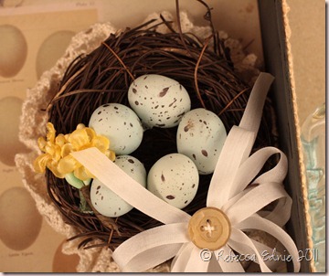
SAF Tea Staining–Vintage Daisy Card

I just got a new Sizzix die I used to make this sweet little daisy and I thought it would work perfectly with the deep tea staining I got on this seam binding ribbon.

SAF13 Tea Stained challenge

Instead of bright yellow, I used a deep, almost brown-yellow Copic to tint the middle of the petals giving it a vintage look to match the card. I have no idea who made the papers as someone gave them to me to use to make ATCs. They were sitting on my desk and looked so pretty and vintage they found a new purpose.

Enjoy, Rebecca

RECIPE: kraft, ivory, ocean tides cardstock-PTI, avocado cardstock-SU!, Hug Snug seam binding ribbon, Sizzix min daisy die, Viva decor paper pen, Kaisercraft pearls, Copic marker. Spellbinders embossing folder

December 03, 2012

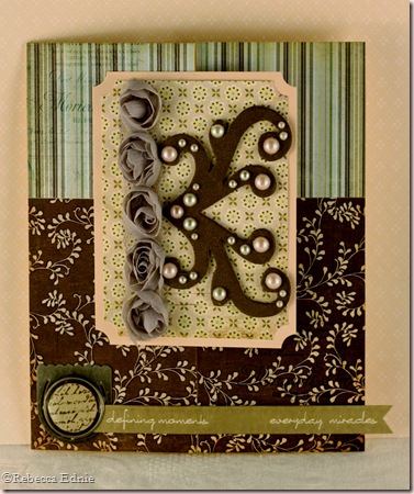
Sweetly Pink Baby Girl Card

Could a baby girl card be more girly? It looks much nicer IRL; it was very hard to photograph and edit.

kaiserc baby die script

The swirly baby die cut is from Joan’s Gardens. To be honest, I forget which company makes it right now. My guess would be Marianne. The diaper pin comes with it. I don’t emboss my die cuts a lot but this one definitely benefits from the detail embossing adds. Again, much more obvious IRL. The triple layered flower is from my girlfriend, thanks Bec!

I am entering this in the Simon Says Stamp ‘anything goes’ challenge.

I wanted to layer the die cut over the pink paper but they were too similar and the word didn’t show up. So I tried layering pink vellum, one was too bright and one was the wrong shade. UGH. The white let too much of the pink show through. So I used two layers. I was careful to only use adhesive under the die cut and pearls to prevent the adhesive showing through.

Here’s an example of how bad my memory is. I made this card mid month for SFYTT. I just realised it now, Dec 1st! I internally gasped as I thought I had missed entering a card for November. I just checked and realized that I made another card for SFYTT for November! So not only did I forget I made this card and make another for the challenge, but I linked up that card and then forgot that just now as I am typing this! Seriously???? At least I still have a chance to finish out the year! But it ends early so if you are playing, be sure to get your card linked up by midnight Dec 24. So sad it will be the last SFYTT ever. Sad smile

Enjoy, Rebecca

RECIPE
Paper:
white CS-TE, DP-Kaisercraft, vellum-stash
Accessories: baby dies-Marianne (?), scallop die-PTI, pearls-Dollarama, circle die-Nestabilities, heart button-stash

April 14, 2012

CPS 161 Guest Designer–French Inspired Collage Pocket Card

I am thrilled to be a Guest Designer for CPS today! I won CPS 158 a couple weeks ago, Yeeeaaaah!, and playing along with their DT is the best reward! (Read to the end for a link to the winning card.) Be sure to check out the challenge if you’d like to play along with CPS 161. I’ll admit I was taken aback by the diagonal line on the sketch as I am not a huge fan of diagonal lines. But this is called a ‘challenge’ after all! So…

CPS 161 GDT card wo tags

… I made a pocket card! For me, it was a perfect way to make the diagonal line work! This card actually has two pockets. You can find the tutorial here: SCS  Diagonal Double Pocket Card. My paper started to tear at the ‘spine’ so I punched some holes in the side and turned it into a mini book style card. I would have tied a bow but the tulle was too short. I really like this and I think I’ll keep it so I may add another sheet of paper, the same design but folded with the yellow out and make it an actual mini book. For each pocket, I made a tag which I collaged.

CPS 161 GDT tag1

The base was actually a sticker so I adhered it to some of the leftover DP from cutting a 12x12” sheet down to the 8.5x11” sheet required for the tutorial. Although I removed the bulky plastic bits from inside the flowers, they still are a bit thicker than is ideal for the pocket. Oh well…

CPS 161 GDT tag2

The base of this one is a plain white tag. Quite a few of the items I used for this project were given to me in swaps so if something isn’t in my recipe list at the bottom, that’s why. I have no idea of the origin. Sorry. In fact, on this tag, the only thing I can list is the metal clip and the ribbon.

CPS 161 GDT card w tags

Here is the card with everything. It is quite busy so that is why I decided to photograph everything separately first. I hope you will play the challenge today.

CPS161

I want to thank the CPS judges so much for honouring the card I won with (You can see it here: Happy Anniversary Double Challenge Card) and for choosing me to Guest Design today. I really appreciate it! I’d love to join your team in the future, once my baby is a bit older. You can see photos of him HERE.

Enjoy, Rebecca

RECIPE
Stamps:
PTI Vintage Labels (gold stamping along pocket edge)
Ink: Faded Jeans, Antique Linen, Vintage Photo Distress inks, Encore Gold ink
Paper: Vintage Blue-Glitz Designs, vintage music paper, Cologne and France stickers-Cavallini Papers & Co., vanilla CS-SU!
Accessories: seam binding ribbon- Masterstroke Ribbon, Silk ribbon-May Arts, bling strip-Recollections, tulle, sentiment sticker-Glitz Designs, mini clothespins-Pebbles Inc., pearls-Dollarama, Kaisercraft, vintage lace, metal clip-Making Memories, film strip, staples-Tim Holtz, flowers-Michaels, gold shimmer mist-LuminArte (clothespin colouring), foam dots-Jody Morrow
(Anything not listed is unknown)

April 01, 2012

Shabby Tea Room Spring Challenge Shadow Box

egg shadow box

I am entering the Spring Shabby Tea Room Blog Challenge to use a butterfly with yellow, blue, lilac and kraft. This is a shadow box I am going to use as a wall hanging. I’m not sure when the Tea Room judges look at the projects but I am off to make a matching card shortly.

egg shadow box closeup front

Here’s a close up of the floral cluster. The greyish flower actually looks more bluish IRL. But there is blue in the DP and the eggs are bluish right?

egg shadow box inside

I cut the paper carefully so most of the eggs would show and the piece I trimmed off the top is now the strip at the bottom. I placed some vintage gathered lace around the base of the nest. I LOVE how this looks!

egg shadow box closeup inside

Aren’t those little eggs cute? Believe it or not, they are off of an Easter sprig from my local dollar store! Cool right?

egg shadow box side

I custom dyed the lace trim seen here so it would match the papers better. I used Copic Various inks. This is going to hang on my wall so I constructed the ribbon tab so I can replace the ribbon if it gets too gross. I am fine for it aging vintage-y but I have young kids so who knows what might end up on it! I punched two holes with my Crop-a-dile (easy-peasy) and actually sewed the button on through the ribbon and the box and into another button on the other side for strength. When it came to tying it, that got tricky so the ends were hidden but I managed!

I’ll be back with my card soon.

Enjoy, Rebecca

RECIPE
Paper:
7 Gypsies
Ink: Antique Linen, Faded Jeans, Vintage Photo Distress inks
Accessories: mini scalloped punch-EK Success, brown acrylic paint, vintage buttons and laces, Hug Snug seam binding ribbon, Kaisercraft pearls, nest, eggs and branches, pearls-Dollarama, Box-Basic Grey, silk ribbon-May Arts, silk flowers (coloured with Copics)-Michaels, paper flowers-Recollections, Copic markers and Various inks

March 25, 2012

Happy Anniversary Double Challenge Card

I made this card for my BFF whose anniversary is on April 1st. No, her marriage is not a joke (get it? April Fools Day? Hee Hee! Just kidding… She reads my blog…) I am going to enter this in the Lily Pad Cards Challenge to use flowers and for this week’s CPS sketch challenge.

larkspur PTI anniv card

Hey, did I tell you I am going to be a Guest Designer for Lily Pad Cards? Yeah! I coloured this with Copics then I made my own Perfect Pearls mist, both green and blue and spritzed them on the focal panel. I love how it looks! It was way too stark white before. Then I sponged the edges with Antique Linen Distress ink. I added a panel to the sketch and mirror imaged it but I stayed surprisingly close for me! What do you think?

CPSsketch158

I used up the extra mist on the doily which I pleated to make it fit better. It looks so nice and shimmery IRL! I used my heat gun to melt and distress the ribbon a bit. It looks very shabby! I used my Copics to colour the blue pearls; the green ones are straight from Kaisercraft.

Enjoy, Rebecca

RECIPE
Stamps:
PTI Year Of Flowers: Larkspur, Mega Mixed Messages
Ink: Memento black, not quite navy-SU!, Antique Linen Distress
Paper: Wisteria-Basic Grey, kraft, NQN-SU!, white-XPress It, doily-Wilton
Accessories: WRMK corner chomper, Perfect Pearls Pearl colour, bashful blue, mellow moss reinkers-SU!, foam dots-Jody Morrow, sheer blue ribbon-SU!, pearls-Kaisercraft and Dollarama, thread-Mettler, flower-Michaels, pinking shears-unknown, Copics G24, YG61,67, B32,41,45, BV00

November 30, 2011

Paris ‘Challenge Me’ ATC

As any of my regular readers knows, I trade quite a few craft items on Swap-Bot. This one was for a swap I designed called ‘Challenge Me’ ATC which was quite new and different. In order to make the ATC, the sender had to list  their favourite 10 crafting supplies or tools in the comments section.

Paris challenge me ATC

The recipient would choose 5 of those that the sender HAD to use to make the ATC. The recipient would also look over the sender’s profile and choose a theme from things that the sender listed as likes. Then the sender created the ATC with the 5 items chosen (basic supplies like scissors, cardstock etc were givens for everyone) plus one additional item from the list of 10 and 2 other items of choice.

I made this a couple weeks ago so I’m not sure I'm 100% but I think the 5 were DP, ephemera, punches, dies and ribbon. The scalloped border is a punch, the doily a die. The ephemera is the music paper, background is DP. I used a stamp as an additional item from my list of 10. And I added pearls. The theme my partner chose was Paris but could I find my Eiffel Tower stamp? UGH! Took me ages! And I know I have 2 but I never did find the 2nd one.

I dyed the silk ribbon with Copic ink and distressed it with Vintage Photo ink. I used a Bow Easy to make a nice tidy bow. TIP: Did you know that if you wrap the ribbon in a figure 8 around the ‘legs’ rather than wrapping around the outside of the ‘legs’ of the Bow Easy and  you put a twist in the ribbon in the center, the bow loops will fluff much more easily? Especially with lots of loops. I forgot to do so here and you can see that my loops will stay out to the sides and not fan all the way into a nice circular shape. I don’t have enough loops to make a full circular shape anyway but if I did, they would always try to stick out to the sides unless you figure 8 wrap the ribbon.

Enjoy, Rebecca

RECIPE
Stamps:
unknown
Ink: Vintage Photo, Antique Linen Distress, Memento black
Paper: Graphic 45 Romantique, white typing paper (doily), vanilla, black CS-SU!, vintage music paper
Accessories: doily die-PTI, punch-EK Success, May Arts Ribbon, Bow Easy, Copic, Kaisercraft Pearls

November 09, 2011

Last Week’s Mojo Cards

So I finally get around to making some cards using a sketch and even within the actual week it was published. I often use sketches long after they are published if they fit the stamps or stickers or image I want to use. But did I remember to blog them and enter them? Of course not! Pregnancy brain is my only excuse!

singh hospitality mojo

This card was for friends of ours, a lovely couple who had an early anniversary party for us. We are celebrating 14 years on the 25th! Considering we only knew each other and dated for less than 6 months, I think we’ve probably beat some pretty amazingly high odds together. My husband is actually the only guy I’ve ever even kissed. Isn’t that sweet?!!

singh hospitality mojo closeup

I got to use the new Hero Arts stamps that come with matching dies, how cool is that! The dies are unique in that they have the cutting blade right at the inner edge so it is very easy to see through the center and line up accurately. You can see how close I got in the photo above! The flower is a bit off but pretty good for a first time.

suzanne sympathy

This card is a sympathy card I started ages ago. A friend’s MIL died of cancer at a relatively young age 2 months ago, what a shame. I decided to go with a shabby chic design as I haven’t done much of it lately. I made the  rose with a rolled flower die, cut the doily and tag, stamped the tag and that’s where I left it for way too long. I mean, it isn’t fun to make a sympathy card anyways and I started to get the favours and invites ready for a spa party I was having and this got set aside.

Incidentally, the tag die was too short for the sentiment so I carefully placed the die in my Cuttlebug plates so that only 2/3 of it cut. Then I moved the die across the paper so when I cut the other end, the die cut was longer than if I cut it all at once. I’ve done it before and it always works quite well! I may have to do a video on that at some point. Just be careful when you cut the second time that you don’t allow the plates to cut the first end or you will  mess it up. Let me know if you are interested in a video!

In case you are wondering, the card is made of two unconnected cardstock circles; doily is glued to the back of the card front. Then the card back is scored about 3/4” from the top and adhered to the card front, above the score line only, with the doily sandwiched in between. I had to use some pretty strong adhesive but it worked really very well.

Enjoy, Rebecca

RECIPE
HOSPITALITY CARD
Stamps: PTI-Homemade, flower-Hero Arts
Ink: vintage photo Distress, celery, rose red, regal rose-SU!
Paper: DP Restoration-Crate, yellow DP-stash, kraft, black CS-SU!
Accessories: embossing folder-Cuttlebug, gold edging pen-Pilot, punch-MS, foam dots-Jody Morrow, pearls-Kaisercraft and Dollarama, Matching Hero Arts dies

SHABBY CHIC SYMPATHY
Stamps: JustRite
Ink: antique linen, vintage photo Distress, Artichoke-SU!
Paper: Basic Grey Perhaps, pink pirouette, celery, white CS-SU!
Accessories: Spellbinders dies, doily-Wilton, silk ribbon-May Arts, pearls-Dollarama, scalloped edge punch-SU!, foam dots-Jody Morrow

April 18, 2011

Berry French Horn ATC for Doodle Pantry

I’ve been making lots of ATCs lately because I’m in a swap where I send my partner 20! WOW, I know! So I’ve been searching through all kinds of images I’ve printed, coloured, stamped whatever, anything that shaves a bit of time off of making them! I love this pretty image from Doodle Pantry called French Horn.

pink silver french horn ATC

I’ve been trying to make my Copic colouring more realistic so I heavily relied on Google images of French horns. Most are brass coloured but a few are silver and some are even funky colours! So, in the spirit of realism, I coloured this as though there are lots of reflections on the horn. It looks pretty flat on here but IRL, I coloured it with a clear Spica pen  so it looks nice and sparkly! I hope it doesn’t look to weird to those of you who haven't Googled French Horns lately!

French_Horn_store image
I guess I should have printed it a wee bit smaller but when I printed it, I didn’t have an ATC in mind necessarily. I meant to do the ‘Outside the Box’ technique on the bow but would you believe, I forgot? Seriously? In case you don’t know it, it is the technique where you pre-cut areas of the image that stick out beyond the die’s edges and keep them out of the way while die cutting. It is a great look, bummer huh?

Enjoy, Rebecca

RECIPE
Image:
French Horn-Doodle Pantry
Paper: DP-Kaisercraft, white CS-Taylored Expressions
Accessories: Copics YG63,67, C00,1,3,5,7, R11,20,22,32,35, E37, rhinestones-Dollarama, Spica pen, Labels 8 Nesties

January 09, 2011

Capella Card for Unscripted Sketches

I needed a card for a very sick friend who recently found out she has a very aggressive form of cancer. I gotta say, no fun writing out that one. Sad smile But with this sketch and some new paper, I made the outside work at least.

capella katie get well

The sentiment was especially hard but I found a sheet of 12” long  stickers, all in strips, with several phrases per strip. I thought this one was perfect AND unexpectedly, matched the paper. I mean, how often does that happen?

US-sketch-88

http://unscriptedsketches.com/2011/01/unscripted-sketches-88/

The chipboard flourish is sprayed with Glimmer Mist, although you can’t see it, it is sparkly IRL. I added the pearls, I love getting them at the dollar store because I don’t feel guilty using so many!

The card base is a gatefold card. The main panel is glued on the left and the sentiment is adhered on the right, then tucks under the cute little clippie thing. You won’t believe where I got the flowers. I found a cute headband at Reitman’s, a business casual women’s store here in Canada. They were $5 so I left them. Then I found them for $1.99 when I went back so I bought 3! Each has about 10” of ribbon roses, 2 rows wide!

Enjoy, Rebecca

RECIPE
Paper:
Capella-Basic Grey, ivory, blush CS-SU!
Ink: Antique Linen Distress ink
Accessories: headband ribbon, pearls-Kaisercraft, Dollarama, chipboard flourish-stash, Glimmer Mist-Tattered Angels, foam dots-Jody Morrow, clippie thing-Making Memories, ticket corner punch-SU!

October 16, 2010

2S4Y Pink Peonies

I love using sketches to create! Better yet, this week, the gals at 2S4Y are looking 2! design team members! I would love that ‘job’! More like a privilege! Pick me!

2s4y entry peo

It is pretty easy to figure out. One little interesting note. If you click on the picture for a close up, you can see that I stitched around the perimeter of the DP. One row has thread but the other row is just piercing. Wonder why? I goofed up and sewed using the edge of the card to line up down one side but when I got to the corner, I goofed and followed the edge of the DP. So I removed the thread in the incorrect area and continued sewing correctly. Then to disguise the goofed up holes, I continued ‘sewing’ without thread the rest of the way. Make a mistake, figure out how to cover it up, I rarely ever throw out a card.

Enjoy, Rebecca

RECIPE
Stamps:
flower-JustRite, sentiment-SU!
Ink: Vintage Velvet, Antique Linen-Distress Ink, Memento black
Paper: DP-October Afternoon, white CS-X-Press It, banana CS-SU!, vintage music paper
Accessories: pearls-Kaisercraft, seam binding tape-Etsy, Copics-RV00, R81,83,85,89, G24,28, YR31 (airbrushed), Nestabilities circles, lacy circles, string-Dollarama, tag die-Quickutz, sewing machine, thread-Mettler

August 24, 2010

Butterfly Challenge Card

This card is for the Embellish Magazine colour challenge of kraft, sea foam, peach and cream with a quirky, cute style and Unscripted Sketches Challenge #69 with a piggy back challenge  to use anything except the typical punched flower!

peach aqua kraft cream butterfly card 
Unscripted69
Embellish it sea foam kraft peach aquaChallenge
I can’t believe I played in both challenges and neither have expired yet! I am always playing challenges and forgetting to enter my link in the challenge. Everything is pretty easy to figure out but I did have an interesting way of doing the clouds.

I wanted the clouds to puff up but still appear to come from behind the cut outs. At the same time, I didn’t want the paper to be puffy around the edges. So I cut the clouds using the die and I cut the shape out of the paper also. Then I stretched the fluffy cloud stuff, natural cotton quilt batting, so it went just under the edges of the paper and I put score tape all around the die cuts to they would stick down well. I got just the look I was going for.

Enjoy, Rebecca

RECIPE
Stamp:
Unity
Ink: chocolate chip-SU!
Paper: DP-Joy Ride Cosmo Cricket, kraft CS-CDS, Ivory, celery CS-SU! 
Accessories: corner rounder-WRMK, butterfly die-Quikutz, cloud and rickrack dies-PTI, tiny butterfly-adapted from hydrangea die-MS, foam dots-Jody Morrow, pearls-Kaisercraft, brown wire-stash

August 19, 2010

Larkspur for Joan’s Garden’s Challenge

Joan’s Garden’s Challenge this week was to use purple and green, a butterfly and a strip of DP.

larkspur purple and green 
Well, I used a bit more than a strip of DP so I hope she will overlook that! I coloured my own ribbon, again! creating striped ribbon this time. I used a V000 for the base colour and and V12 for the striping. I created a bow with my Bow Easy and arranged it into a half circle with a huge dimensional glue dot. I left half of it free to attach the button.

So guess where the lace came from? It was from a nightgown I wore to death! I kept the lace because it is still like new! One edge was sewn to the old fabric so I cut it off and that left a raw edge so this layout had a perfect place to place it where that would be hidden. I added beaded edges to the main panel using Scor-Tape.

The layout is Sweet Sketch 54. I though it was the latest one but I copied it off of someone’s blog and I guess they were playing an old one. I was so disappointed when I saw that! I am really trying to play more sketches and challenges.

sketch54 KML Designs MY POST

Enjoy, Rebecca

RECIPE
Stamps:
Larkspur-PTI
Ink: perfect plum-SU!, Antique Linen Distress ink, Memento grey
Paper: DP, pale plum, perfect plum CS-SU!, white CS-Taylored Expressions
Accessories: green ribbons-SU!, silk ribbon-May Arts, PTI button, Copic Markers, micro beads and punch-Martha Stewart, Kaisercraft and Dollarama pearls, Art Institute Glitter, Copics V00, V12, V14 or 15 (sorry, forget!), G21, 24, 94

March 28, 2010

L Monogram – CAS JustRite Card

I hope this card shows up OK for you on your computers. This on in particular is hard to tell if my editing is OK because it changes drastically on the tilt of my laptop screen. And since I am literally working with it on my lap, it keeps changing!

L monogram

I was making this card and since it wasn’t for anyone in particular, I naturally thought of using my own monogram but then thought again and made it for my mom. She is really supportive of our family; she is always buying the kids TONS of clothes, we pretty much don’t need to buy the kids anything except shoes and she buys those often too.

Can you believe I have paper and ribbon that match so well? They really do IRL. The background is embossed with the Victorian folder, I made it a wee bit smaller than a standard card because the folder isn’t quite that big. I find that quite annoying! Just another 1/4” each way and it would cover a full card front. They are making larger folders how so that is great.

TIP: In case you are wondering, yes, it did take a lot of twisting to manage to get all of the loops and tails with the print facing up! The trick is to get the twists inside the knot, twisting while pulling tight. If you try to twist them after the knot is tight, you will need adhesive to keep the ribbon from twisting back and it won’t look as good .

Enjoy, Rebecca

RECIPE
Stamp:
JustRite
Ink: chocolate-SU!
Paper: baja, white CS-SU!,
Accessories: ribbon-Wal-Mart, foam dots-Jody Morrow, Nestabilities Label 4, circles, Kaisercraft pearls, Victoria Embossing Folder

March 17, 2010

Dragonfly Cards for Whimsical Wednesdays

These are the last two dragonfly cards I’ll get finished before the deadline to send them in. If you haven’t read my previous posts about the card drive, please read HERE.

dragonfly lilykate1
I actually managed to get two done with this week’s sketch. TIP: The ribbon below is white twill coloured with a Copic marker. I didn’t like how much white showed through the twill texture so I sprayed it with alcohol in a Mini Mister. This dissolved the colour and allowed it to soak through the thickness of the ribbon.

dragonfly lilykate2
Just two other quick notes. I added pearls to both cards. They are harder to see in the photos than IRL but I think they add a nice touch. The background for the butterfly is airbrushed with B12 and a handcut cloud template. I am really having fun with the airbrush system. I can’t believe I had it for well over a month without playing with it!

I hope you will all play this week’s sketch! Isn’t it a fun one, courtesy Nikki? The DareDevils would love for you to visit their blogs to see their work! Everyone is playing except Valerie and Kim. Please be sure link up your card so you can be eligible for this month’s prize from our Sponsor, The Character Cafe. Make sure you leave a DIRECT link to your post at Mr Linky on the Whimsical Wednesdays blog, not the link to your main blog page. I am very sad to say that Sandra is resigning after this week. We will really miss you, Sandra! I’ve really enjoyed your fabulous, creative cards! Best wishes with your new job, DTs and your family!

Enjoy, Rebecca

RECIPE
Stamps:
flourishes-Autumn Leaves
Ink: Baja, celery-SU!
Paper: Baja, white CS-SU!, LilyKate DP-Basic Grey
Accessories: foam dots-Jody Morrow, twill-stash, Copic markers, airbrush system, Jesse James buttons, Nestabilities, scalloped punch-SU!

March 14, 2010

Coral Flower Sketch Challenge

This card is for Midnight Madness sketch challenge this week. I altered the sketch somewhat, the panel was supposed to be in the middle of the card but I just couldn’t bear to cover up the gorgeous glittery swirls on the DP. There is a close up of the glitter below.

coral floral midnight madness

 MMSC44
Not much to tell, the ribbon had pale pink flowers, I coloured over the entire ribbon with a coral Copic marker so it would match. The flower was coloured with a chocolate Copic marker and then sprayed with gold Perfect Pearls in water for some shimmer.

coral floral midnight madness closeup

Enjoy, Rebecca

RECIPE
Stamps:
sentiment-Verve, flower Hero Arts, flourishes-Autumn Leaves
Ink: coral, chocolate-SU!
Paper: vanilla, coral, chocolate CS-SU!, My Mind’s Eye Organics Stack DP
Accessories: ribbon-stash, flower-Scrapbook Sally, gold Perfect Pearls, Copic markers, Kaisercraft pearl, sewing thread

March 02, 2010

Sneak Peak!

I finally finished my Guest Blogger Spot I was given for my Winter Project at May Arts. I hope you will visit to see my Rose Napkin Ring Tutorial.

rose napkin ring sneak

Follow this link for my Tutorial and you might want to participate in their new Think Spring Challenge also.

Enjoy, Rebecca

January 20, 2010

Praying Faerie for Whimsical Wednesdays

Thank you to this month’s sponsor, Katie of Paper Makeup Stamps, for this great digi image. Isn’t she pretty?

praying faerie purple

I wasn’t sure I liked the colouring until I saw it in the photograph, now I like it. I still think the bottom of her dress might be too dark but she was lacking contrast before so I kept making the shadows darker. Her wings are covered in diluted Liquid Pearls but I think my brush was a bit dirty because in some light they looks a bit grungy, fortunately, you can’t see that here.

We have a fun sketch from Nikki this week. Hope you all have time to play. For inspiration, be sure to visit all of the DareDevils this week except Kim, Val and Debbie who couldn’t play. Once you create your masterpiece, be sure to upload it using DDSC19 and show it to all of us on Whimsical Wednesdays with a DIRECT link using Mr Linky.

DDSC19

Just a fun little note. We reached 100 followers on Whimsical Wednesdays! Thanks too all who have played and have made it a super fun challenge blog. We appreciate you all.

On another note, if you haven’t already watched it, Seven Pounds is a great movie. Sad, bring your tissues, but great. I would be balling my eyes out right now if my attention wasn’t split between the movie and blogging.

Enjoy, Rebecca 

RECIPE
Stamps:
Paper Makeup Stamps
Ink: printer ink, amethyst
Paper: Basic Grey, amethyst cs-SU!
Accessories: flower-Michael’s, brad-Recollections, pearls-Kaisercraft, ribbon-SU!

January 04, 2010

Thank You for Midnight Madness

This card is for MMSC34. I really like their sketches but whew, they are always very challenging. This one was a bit easier and I needed a break from making things for my craft sale. I enjoy the work but it is hard to know what people will like, how many to make, what colours, sizes etc. Anyone have any insights, please let me know!

midnight madness thank you
And here is the sketch.

I now kinda wish I had used larger petals so the card would look more balanced but I was working from my hand drawn version of the sketch, not from the one you see here. This one was in my iPhone, but it times out after 3 minutes; I have it set that way, I could change it but I’d forget to change it back and my battery would be gobbled up in no time so I work from my own sketch.

I think the only elements you might not be able to figure out easily are the photo corners. They are from a single Cuttlebug square embossing folder. I cut it diagonally to get two corners from it. Time consuming and fiddly but so pretty. The flower is actually two, one with 4 petals cut out from it and another with 6 petals cut from it. That left two larger pieces, I layered all 4 to get what you see on the card. The petals are sponged with antique linen and worn lipstick Distress inks.

Enjoy, Rebecca

RECIPE
Stamps:
Inkadinkadoo
Ink: Versamark, Distress inks
Paper: DP, pink CS-CTMH, vanilla, chocolate CS-SU!
Accessories: flowers-Scrapbook Sally, EP-Ranger, Cuttlebug embossing folder, Kaisercraft pearls, foam dots-Jody Morrow, Copics

December 15, 2009

Copic Journal

Ever since I got my first box of 72 Copic Ciaos over a year ago, I have been wanting, actually needing, to make a journal to record my favourite Copic combos, notes on what did not work etc. So today I got crackin’!

copic journal

I started with a half sheet of CS in each major colour family. I know Copic further subdivides it but I used pink, red/orange, yellow, green, blue, purple, brown to represent neutrals and blush for flesh colour combos. I then chose a paper from MME for the outside covers which were created with the chipboard from the back of a pack of paper. I wanted a bit of a border so I used 8 3/4 x 5 3/4” for both front and back. You can’t tell from this photo but the floral areas of the paper are covered in glitter, so pretty IRL! They are a combinations of a very soft rose and a very soft green. I wanted the letters to match so I chose a green paper from the same pack and covered the front of the letters with adhesive from my Xyron sticker maker. I added glue pen on the back, applied the letters to the journal and covered them with glitter.  I added the pearls and the ribbon-the outside was finished!

To bind it, I lines up the pages and punched them with my Rubicoil binding machine. Because of difference in the page sizes, I started with the cover, aligning the holes so they would be evenly spaced on each side. Then I punched the pages to match. When I create a book or journal, I always use a coil just a wee bit too long for the length of the book. That way, if I want to remove the coil, I can. It gets shorter every time you do this because you need to crimp the ends to prevent unwinding. When removing the coil, it is easiest to cut off the crimped end, rather than trying to straighten it to get it through the holes, and re-crimp after adding pages.

For the inside pages, I was going to design a lined sheet to glue on to the pages then I had a great idea. The sheets from the Papertrey notepads I just bought fit two across perfectly! It makes much more sense too for short notes like the ones I’ll be leaving.

copic journal inside

I left a bit more room on the right side because I was going to add tabs for each page. I am still toying with the idea. I love how Papertrey offers both white with grey lined paper and ivory with brown lines. Nice to have a choice. If I need to put an actual sample in, I will use a brad or an eyelet to make it look nicer.


Enjoy, Rebecca

RECIPE
Ink:
chocolate chip (edging the paper)
Paper: pretty in pink, real red, saffron, olive, night of navy, eggplant, chocolate, blush CS-SU!, patterned paper-MME, pages from Papertrey list note pad
Accessories: brad-stash, pearls-Kaisercraft, white silk ribbon-May Arts, green, brown seam tape-MasterStroke, Sizzix Girls are Weird alphabet dies, Art Institute Glitter-sea shell