Showing posts with label Simon Says Stamp Challenge. Show all posts

March 26, 2017

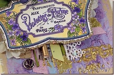
Layered Violette Card

It’s been a while since I made a truly shabby card dripping with mixed media and vintage-y goodness. So I took some time between design team gigs to make this fun card using a new-to-me JustRite stamp set.

layered violette card

To start, I used a palette knife to spread three colours of paint on the background. Then I mixed up some custom modeling paste with a dye reinker applying it with a Tim Holtz stencil. When that was dry, I added more stenciling, the letters, with just normal paste then applied gold embossing powder and heat set it. It will bubble a lot but in the end it looks really dimensional and interesting. If you want a smoother result, let the paste dry on its own, then heat set the powder.

layered violette card2

Then I started to layer all kinds of fun bits and bobs. The colouring (Prismacolor) was already done another day so I just had to die cut the Voilette panel and add some glass glitter to the edges. It took a while to decide where everything was going to go, I kept adding more then laying the panel on top, then I would take it off and level all the layers out with pieces of fun foam.

layered violette card3

To finish this card off, I added some brads, flowers and ribbon. I especially love how the metallic and glitter washi tapes look peeking out here and there. The gold straw is also a favourite. I took a blue and white flowered straw and painted it with gold leafing paint!

Enjoy, Rebecca

Entered In:

Simon Says Monday Challenge-Layer It

May 13, 2016

White Flower Cards

So, apparently, the flower for this month is Lily of the Valley. So our Crazy 4 Challenges theme this week is white flowers! Right up my alley! I love adding flowers of all kinds to my cards.

lilac n lace

This week I went all out for my first card making the flowers myself. It takes a long time to cut, shade, shape and glue them all then add the tiny centers! To start this card, I looked through my flower dies and settled on white lilacs with subtle pink and purple centers. I used Sizzix dies that are retired for the lilac and a cool lace die by Creative Expressions. (Elizabeth Craft now sells similar flower dies.)

lilac n lace2

The flowers were cut from white cardstock and shaded with Pan Pastels. The flower centers are made with a yellow Paper Pen from Viva Decor. I added some dots to the back panel with a Sizzix embossing folder and used some old SU! ribbon for the bow. All cardstock is by PTI except the green which is from SU!

floral camera yellow

Next up is a cool interactive card using stamps and dies by PTI. Sadly, I think this set is now in the vault meaning it costs double to buy it! I got it just in time. It resembles the very first instant camera and where the photo would come out, there is a pull tab where you can write or stamp your message. The paper is by MME. The cardstock and leaf die are by PTI as well.

I hope you will also enjoy this challenge. It’s so nice and easy and any style you chose is perfect! I was thinking about using some vellum for a flower so maybe that’s an idea for someone. We, the design team, are always so encouraged to see you play along!

Enjoy, Rebecca

Entered In: Simon Says Stamp Monday to use embossing, Simon Says Stamp Wednesday to add flowers

December 06, 2015

Glitter Wreath Winter Card

Welcome to another The Shabby Tea Room Challenge! WE have a FABULOUS inspiration photo for you this week! I know it’s a busy time for most people but I hope you can join us!

glitter wreath

I stamped the background with some tone-on-tone sketchy snowflakes. I’m afraid it’s very hard to see. Then I swiped the edges across my Versamark ink pad and sprinkled on some white embossing powder. It looks like that snow stuff stores spray on the corners of their windows in the winter. The card base was sponged with tone-on-tone ink as well using a diagonal stripes stencil. The sentiment was heat embossed with platinum embossing powder.

The wreath was formed from pine branch die cuts covered in silver and aqua glitter. I added lots of pink star confetti die cuts the two deer and lots of sequins. Last but not least I added the silver string. You can see the sparkle somewhat but it’s so amazing IRL!

tstr 265

Isn’t this photo lovely? I wish I’d had a ballerina to use for mine! So head on over to TSTR and take a look at the super talented gals projects! So much wonderful inspiration! You can post any kind of crafty project in any style! Be inspired by the tree, the holidays, the colours, the lace or the ballerina! Or something else I missed! Be sure to leave the design team some love while you are over there!

Enjoy, Rebecca

Entered in:
CAS-ual Chic 06 Snowflakes
Friday Mashup – Use Dies
Sparkle and Shine Challenge
Simon Says Wednesday “Let it Snow”

cas06

FM236

December 1 badge

RECIPE
Stamps:
SSS (sentiment) and unknown snowflakes
Ink: blush, aqua-PTI, Versamark
Paper: blush, aqua, hibiscus-PTI, white scraps, teal-Bazzill
Accessories: white pine bough-ELizabeth Crafts, Deer-Impression obsession, Fun-Fetti stars-CAS-ual Fridays, ModPodge, flower sequins-Paper Sweeties, platinum sequins-Theresa Collins, clear sequins-Lucy’s Cards, Platinum and white Embossing powder-Hero Arts, stencil-MFT, string-SU!,  clear wink of Stella pen, Martha Stewart glitter

November 01, 2015

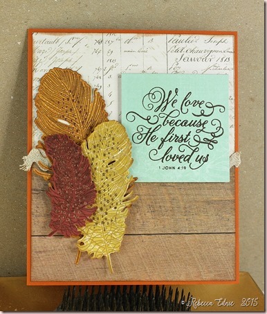
Fall Feathers Card

I’m quite late jumping on the feather trend. I like feathers but I’m not a huge fan or anything. But I’ve seen so many fabulous cards by many talented designers that I had to give them a try.

autumn leaves

I used a ton of paper packs for this card, 5 in total! I also used a sketch but it’s long since closed. The die cut feathers were die cut then stamped using my MISTI tool. I coordinated the inks to match the papers and used three different metallic embossing powders.

Enjoy, Rebecca

Entered In:

Simon Says Stamp Monday Anything Goes

Simon Says Stamp Wednesday: Throwback 

mmmc18

RECIPE
Stamps:
Feathers-PTI, sentiment-SSS
Ink: brown archival-Ranger, vintage photo, barn door Distress ink
Paper: WR Memory Keepers, 7 Gypsies, Glitz, Maggie Holmes,
Pink Paislee, canyon clay CS-PTI
Accessories: feather dies-PTI, rick rack-stash, gold, copper EP-SU!, other ep-stash

June 25, 2015

Bold Butterflies

One last teacher thank you card. My 14 yo son didn’t want anything too frilly or teacher-ish this year so I went with a bolder approach.

butterfly sketch

This was inspired by The most recent FUSION challenge.

Bright Butterfly

The sketch really threw me at first! Only one small shape in the corner? Well, I’m not too much of a CAS gal so I had to expand and embellish that one small shape!

I ended up going with some embellies that came with the paper. I was actually lucky enough to win this paper along with some 12x12 paper and two packs of embellies! The tag and clip were in one pack and the other was all die cuts including the butterfly and small banner. I took the reinforcement sticker off, covered the tag in music paper and reapplied the sticker. Then I layered on the butterfly die cut and the messy gold thread. Last I inked the banner (it was tan), stamped the sentiment and added it to the tag along with the tiny strip of black cardstock.

I’m also entering this in the SSS Wednesday Anything Goes challenge.

Enjoy, Rebecca

RECIPE
Stamps:
Simple Labels-Avery Elle
Ink: archival black-Ranger, Lipstick red-SSS
Paper: harvest gold-PTI, butterflies-SEI Field Notes
Accessories: die cut butterfly, banner, tag and clip-SEI

Thank You Teacher Card

School ends at the end of June here in Ontario. So many other bloggers are already past this stage with their kids but our last day of school is today.

teacher knowledge

This one was inspired by Retro Sketches 169. I’m also entering this in the SSS Wednesday Challenge Anything Goes.

The papers are older October Afternoon papers called Schoolhouse. This is a pretty basic card but it was fun to make. I kept it free of too many embellies but I did add Gl;ossy Accents to the third apple.

Enjoy, Rebecca

RECIPE
Stamps:
MFT
Ink: Versamark
Paper: kraft CS-PTI, DP-October Afternoon
Accessories: white EP-Hero Arts, twine-PTI

March 14, 2015

Rainbow Butterfly Canvas

I was inspired by the Simon Says Stamp Monday challenge blog to make this canvas. The challenge was to make something starting with the letter B.

rainbow butterflies canvas

Then the Wednesday challenge’s theme was Things that Fly. How perfect! I used a canvas board from the Dollar store that I prepped a while  ago. I started with some patterned paper strips which you really can’t see but they do add some texture. I covered that with gesso. Then I randomly added some texture paste using three different Prima stencils. Then I experimented with the new Prima line of art supplies, using the white crackle paste to apply a thin, splotchy, uneven layer over the canvas, adding a bit more in blobs near the edges. I left it that way until I decided what I wanted to do with it.

rainbow butterflies canvas closeup

I’m a big fan of Laura Bassen and her love of rainbows has worn off on me. So I went with a bold fun paint scheme. Usually when I do mixed media art, I use Golden Fluid Acrylic paints which are much higher quality than craft paint. But I didn’t have all the colours I needed so I went with some craft paint. Wow, what a difference. Besides the opacity (fluid acrylics are somewhat translucent), there was a huge difference in drying time and workability.

rainbow butterflies canvas closeup purple

I can keep adding water and move the fluid paints around almost indefinitely while the craft paints didn’t react to the water in the same way. You can see the difference near the stencilling. In the purple and pink areas, the fluid paint pooled nicely just like I wanted it to. But the craft paint didn’t thin out in the same way so it covered everything more equally for a less dynamic effect. But if you want opacity, the craft paints are great!

rainbow butterflies canvas closeup pink

I randomly stamped a couple background stamps without using a block which makes it patchy and uneven. The butterflies were created by stamping on die cuts of Art Parts Clear Film. I made the stamp using Quikutz stamping foam which I die cut using a Memory box die. Then I cut the art film with the matching solid die and stamped it with Staz-On ink. Then you form the butterflies into any shape you want with a heat gun.

You can’t keep it too close or it will start to shrink but it can take quite a bit of heat from a bit further back. The die cut bodies and antennae from black cardstock and covered them with black Liquid Pearls. The middles sunk for some reason but I liked how it looked anyways. More insect like and less perfect. The word was hand drawn, cut from cardstock and covered with white Glossy Accents.

If you have any questions, let me know. I’m also entering this in the Crazy for Challenges #277 to bring on the bling. I used rhinestones, Liquid Pearls and sequins on this.

Enjoy, Rebecca

RECIPE
Stamps:
French Script-SU!, Moroccan background-A.Muse
Ink: Staz-on black, Archival black
Paper: Basic Grey Curio
Accessories: rhinestones-Taylors tiny twinkles, sequins-Pretty Pink Posh, Clearly for Art Film, Quickutz stamping foam, Liquid Pearls-Ranger, various craft paints, Golden Fluid Acrylic paints, flowers-stash, Liquitex embossing paste, Prima stencils, Golden gesso

February 08, 2015

Rows of Hearts

There are so many challenges involving love, hearts and the red, white and pink colour combo around right now. I though it might be fun to enter a few.

rows of hearts

I was super inspired by the photo from TSTR week 245. How cute. I wanted to use the rows of hearts but not recreate them literally. So I made myself some patterned paper with the latest PTI Market kit. Part way through, I decided to add a heart with earrings to make this card a bit more special.

rows of hearts earrings

The earrings are quite simple but I think they will be pretty eye catching. Now who to give them to…

TSTR _245

I’m also playing in the Friday Mashup and Simon Says Stamp Wednesday challenge to use bright colours, All Things Bright and Beautiful.  And also Simon Says Stamp Monday challenge H is for… I used Hearts and heat embossing. And last but not least, JUGS challenge Word Week LOVE.

196f

Screen Shot 2015-01-18 at 12_56_20 PM

Enjoy, Rebecca

RECIPE
Stamps:
PTI market kit
Paper: white, pure poppy, hibiscus, raspberry Cardstock
Ink: Angel pink-Memento, real read, Rose red, pretty in pink-SU!, Hibiscus-PTI
Accessories: ribbon-Offray, Tag die and border die-PTI, silver cord-SU!, foam dots-Sticky Stuff Store, EP-Hero Arts, I’ll do a separate post for the earrings soon

November 13, 2014

Shabby Roses Thinking of You Card

I made this cad for the Wednesday SSS challenge that just ended. Nuts, when am I going to learn I have to post these right away! Ugh!

shabby rose TOY card

This card was a struggle that I don’t often find when making shabby cards. I started by using a fancy tag die that I recently bought. It needed to have a larger middle part for stamping the sentiment so I partially die cut both ends leaving a gap in the middle that I hand-cut to connect them. But it just didn’t work right with the lace and ribbon I REALLY wanted where I arranged it. The fancy end on the left just didn’t fit well. It’s a pretty big die cut. So I ended up cutting off the fancy ends. After all that finicky die cutting!

The vellum I used was too white so I airbrushed it with an E53 Copic marker. Then I still felt it didn’t stand out enough so I edged it first with a Wink of Stella glitter pen but that didn’t look right, too uneven. So I finally swiped the edges of the vellum with embossing ink and dipped it in embossing powder. Why the uneven EP looks good but the uneven Stella didn’t, I’ll never know. The ribbon doesn’t appear to match but it does IRL.

If you look really carefully, there are a few tiny mirrored bits on the lace. The light only reflected on two of them, they look like dark dots. They are the centers of bright shiny gold sequins. I thought they were pretty so I am going to use them here and there. There are two on the sentiment panel too. The sequins were given to me AGES ago and I ignored them until now. I even forgot I had them! I’m so happy I didn’t throw them out!

Enjoy, Rebecca

RECIPE
Stamps:
a.muse studio background script stamp (hard to tell it’s not part of the paper), SSS sentiment
Ink: Memento cocoa, Versamark
Paper: MME Record it, spring moss CS-PTI
Accessories: May Arts silk ribbon, lace-Fabricland, button-OA, twine, Foam Tac clear dimensional adhesive, gold EP-SU!

October 05, 2014

Bold Coffee for Mojo Monday

I know, I know, I never create in colours this bright and bold! But since I bought the October SSS card kit, I had to use it right? LOL!

coffee youre the best card 

I really liked this sketch and the scalloped DP is purple which my gal pal really likes. I know she prefers my softer styled stuff, but she also loves coffee! If I hadn’t been making this at the last minute I might have added a few sequins or rhinestones but oh well.

Enjoy, Rebecca

(PS: You get bonus points if you noticed that within the teal and blue paper, there are foxes as part of the print! I didn’t notice until I’d cut it the wrong way!)

RECIPE
Stamps:
SSS What’s Brewing
Ink: Memento black, black Archival-Ranger
Paper: DP Basic Grey, CS-SSS doll pink
Accessories: foam dots-The Sticky Stuff Store, scalloped die-PTI

December 28, 2013

I made a ‘thing’ for Unscripted Sketches and some other challenges :)

Wow, my mind is really fried after having my hubby and kids home for a week and a bit. Holy moley! I made something and don’t know what to call it. It’s for Unscripted Sketches and also some other challenges (finally) so let’s just get on to business shall we?

RebeccaEdnie237

So I get it, at first glance this is a strange mix of things to put on a … well, it’s not a canvas. It’s not even a canvas board. It’s not really a painting either is it? It’s way, way too big to be a card at 7.25x8.25” (it was supposed to be 5x7 with 1/4” framing borders but it was just too small for the snowflakes so I added a 3” section). And now it’s too big for any standard frame! It’s too warped to just hang on the wall with a ribbon and too big for my SMASH album!
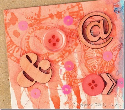
god is an artist 3

I started with the concept that I would be combining three challenges: The Shabby Tea Room-use snowflakes, silver/white and buttons/bells, obviously Unscripted Sketches and SSS Stamp and Show to use Tim Holtz products. I dragged out all the Tim Holtz stamps I own and was stumped. None of them are winter related at all. But, I have lots of inks and plenty of stamps that make nice background stamping plus plenty other stuff.

god is an artist 4

So I decided to drip TH inks artfully down a piece of watercolour paper. Hmmm, easier said than done. I chose a great big fat mop brush which would hold lots of paint right? Yep, I was right! However, it seems it didn’t want to release said paint onto the paper, grrr… Ok, second try, smaller fat brush would release the liquid, better but then too many lovely fat droplets ran all the way to the bottom of the page instead of artfully stopping with perfectly round balled ends right where I wanted them too stop. No wonder some artists get the big bucks. This stuff ain’t easy!

god is an artist 5

OK, so my page is dry, some artful drops have been stopped in the appropriate places, now what? So I fill in the space with some TH stamps. So far so good. Then I realized I’ve used butterflies. D’uh. Oh, well, I can cover them up! Up with what? Hmmm… Thus was the journey of the upper part of my… thing. I’ve seen some canvases end up nicer but look similar. The artist adds many items to the canvas disregarding the colour. Then gessos over the whole shebang, spray mists or paints it solid at first, then adding shadows, highlights and a few more embellishments. Tone on tone effect.

god is an artist 2

I had planned to add the snowflakes over the coloured drips at the bottom of the upper portion thinking it would create a great contrast, colour vs the silver but instead it just seems to cause competition for your eye and was too crowded. So I added a piece at the bottom and did the same thing with pewter Distress stain as I had done with Distress inks at the top. I started with full strength but it didn’t spread well so I went to a dilute version to help it move then back to full strength to add some deeper colour. I didn't have silver sequins so I took ivory ones, put a pin in the center and used a silver paint pen to colour them. I stroked outwards and slightly downwards from the center which also served to turn them as I coloured then just moved the pin which moved the sequin across my craft sheet so they could dry. Wash, rinse, repeat!
un sk237

When I saw the Artist sentiment I really wanted to use it but I knew it wouldn’t be read as a background stamp. And it didn’t make much sense by itself. But recently I saw a post on Digital Photography School about snowflake photography. The snowflakes looked like everything from typical snowflakes we see as stamps to satellites in space to glass platters to logos for computer companies to what’s inside a computer. Some were hexagons almost completely devoid of any other form. I know many don’t believe but for those of us who do, snowflakes are a pretty amazing and faith strengthening creation. So I realized this was a perfect way to use this sentiment after all. And it kind of ties in my art on top with God’s art on the bottom (his is way better!)

Sorry that was so long. I hope you will play with us this week at Unscripted Sketches. Hopefully you all had great weeks visiting with family and friends, you stayed safe and healthy, the busyness is over and you all have more time off to enjoy! So why not spend some time playing our sketch? The more the merrier!

Enjoy, Rebecca

RECIPE
Stamps:
Tim Holtz various, Mini Alpha-SU!
Ink: Archival black-Ranger, Worn Lipstick, Broken China Distress pad, Shabby Shutters Reinker, Spring Moss-PTI, Versamark
Paper: watercolour paper-stash
Accessories: Spellbinders, MFT snowflake dies, wood veneers, white Mr Hueys Mist-Studio Calico, Copic markers, hibiscus spring moss buttons-PTI, sewing thread-Mettler, Guttermann, rhinestone brad-American crafts, ivory (silver) sequins-Ellen Hutson, pink and blue sequins-FabricLand, green, pink sequins-SSS, blue star clips-Dollarama, silver EP-SU!, foam dots-Jody Morrow
November 02, 2013

Crystal Blue Persuasion Necklace and Earrings

Since the Monday (shabby and grungy) SSS challenge blog with the theme of anything goes said we were welcome to enter jewellery, I decided to enter a set I made a couple weeks ago.

crystal blue persuasion necklace

I made it hoping to get on a design team but turns out they only accept US residents. I even have a US addy I can use but unfortunately, the reason is for speed of delivery and that’s something I can’t offer at that address. I had won a prize of beads from this same company so I used mostly their beads to make this. All the pearls are from ZnetShows.

The crystals are Swarovski, though Znet also has amazing crystals, and the lampwork bead is one I fell in love with years ago when I bought it but it’s not just an bead and I hadn’t found the right home for it until I made this necklace.

crystal blue persuasion earrings

I’m afraid my loops aren’t quite perfect on these earrings though what looks like a lot in a close up photo is probably only a mm or 2 IRL. I made my own earwires for the first time and I was pretty proud.

Enjoy, Rebecca

RECIPE (as above) plus silver head pins, silver lobster clasp, rhinestone rondelles-Ebay, Beadsmith 19 strand wire, extender chain

Home Sweet Home Pumpkin Mixed Media Canvas

Creating this was interesting on so many levels. I’m trying to enjoy fall more by decorating my house a bit. These aren’t colours that go with the little I have decorated but it’s still fun.

pumpkin mixed media canvas

I hate fall because it brings cold weather right after I’ve enjoyed summer so much and is a forerunner to winter with even more cold. But I really wanted to enter a couple challenges that this theme worked with. I experimented with a new medium, water soluble oil pastels. And I tried out some other new techniques like adding colour to my embossing paste and not the background.

pumpkin mixed media canvas2

So here’s how it’s made.

  1. add crumpled tissue paper to the background. I used one with birds, leaves and bird cages. Use gel medium underneath and on top of the tissue and allow some wrinkles to form.
  2. add gesso mixed with water over hte top. Create as much opacity as you like. I often add two layers to make sure I don’t get too much coverage the first time.
  3. This step is one I don’t know I’d use again but it was fun experimenting. Add dark brown oil pastel around the edges and over the edge, about 1”. add a lighter brown inside that. Buff with a rag and add gilder’s wax to the outside edge spreading some colour across  into the center of the canvas. (this didn’t end up showing in the end, I’ll explain as I go).
  4. add music paper to the bottom of the page with gel medium, colour with alcohol ink.
  5. add lace.
  6. Die cut ivy tendril and flourishes, sponge and stamp them
  7. cut sentiment from paper pack and add gold paint pen to edges in distressed (not perfect) way
  8. tear oval shapes from orange paper. I used a die to tear against so my shapes were torn but still smooth-ish on the edges. cut a stem. ink all edges and assemble adding a twine bow .
  9. add pumpkin and flourishes to canvas with gel medium. Use layers of scrap paper under upper portion of pumpkin to raise it to the height of the bottom portion which is over the lace. I didn’t make sure it met the edge of the lace.
  10. add embossing paste to top of canvas using a stencil. Allow to dry without using heat gun. I found when I used the heat gun, it brought the oil from the oil pastels to the surface and made it shiny. When I buffed it, quite a lot came off and I had to add back more colour. It never looked quite as good as it did in the beginning.
  11. when paste is dry, add green and brown ink. the good thing about the oil pastel background is it resists inking so the colour only sticks to the leaves. a nice bonus and something to think about when I use pastels next time.
  12. add sentiment using layers of scrap cardstock behind it instead of foam dots. not only was a worried about the foam dots sticking on the oily pastel background, it is more sturdy to use cardstock.
  13. add antique linen distress stickles to the pumpkin using a thin layer and to the heart in the sentiment using a thick layer. The moisture from the stickles and the uneven backing to the pumpkin allowed it to warp slightly which is a shabby look I quite like.

I’m entering this in the holiday SSS Wednesday blog challenge Anything Goes, the Mixed Media Colour Challenge to make a holiday themed project, the SSS Monday blog challenge Anything Goes and TSTR 190 to make a project using a pumpkin.

tstr _190

Happy Holidays MCC Badge

Enjoy, Rebecca

RECIPE
Stamps:
fancy flourishes-PTI
Ink: artichoke-PTI, Vintage photo Distress
Paper: Simple Stories
Accessories: Portfolio Oil Pastels, homemade embossing paste, Crafter’s workshop stencil, gilder’s paste-?, lace-stash, ivy die-Poppy, flourish dies, twine-PTI, Krylon paint pen, tissue-?, gel medium, gesso-Golden, canvas-Dollarama, nesties ovals (as tearing templates)

August 25, 2013

Circus n Roses Card for Simon Says Stamp n Show Challenge

I can’t believe it took me so long to find out about the Simon Says Stamp and Show Challenge blog now called the Monday Challenge Blog. With my love of all things shabby and vintage, it’s right up my alley. This week’s challenge of Carnivals wasn’t super interesting to me until I looked at this month’s SSS card kit! The papers in it were perfect!

circus n roses

I’m going to keep it short and sweet today as I have 10 other projects to post! Yep, I participated in PTI’s Stamp-a-Faire so I have to blog all of those too. One thing that is hard to see both in the photo but also IRL is the gold tulle. If you look at the top hat above the top right rose you can see it. I sprayed it with gold mist so its uneven and very vintage looking. LOVE it! IRL it adds an ethereal quality and you don’t notice it at first but you can see it.

circus n roses2

Enjoy, Rebecca

RECIPE: paper-Webster’s pages, roses-Really Reasonable Ribbon, cardstock-aqua mist PTI, pearls-Darice, washi-Lifestyle Crafts shape n tape

June 16, 2013

Relax Card

I had a BLAST making this card. I started with the Verve challenge going on right now but realized that it worked for several other challenges! Scroll down to see the other card I made for those challenges as well. 9 challenges in two posts, that is a record! Wahoo!

relax verve challenge card

The Verve challenge was to combine the styles of two of their DT members, Jen, who is known for her colouring and Janelle, who is known to have  a paint brush in one hand and a Copic in the other. So combining those two styles is the goal but if you really want to make it challenging, add Jen’s love of kraft paper and Janelle’s love of mixed media.

Since I’ve been trying to add more mixed media to my work, I decided this was a challenge made for me. Especially since I won a Mojo Monday recently and had some brand spankin’ new Verve stamps to try out! And some new mists and masks… Yeah! I started by getting out my new Mister Huey’s mists but then I made the wise decision to cut some tags and test spray the mists. Sooo glad I did because they are so NOT the colours on the label!

Then I sprayed the background on my card base. Next time I will use some adhesive because the paper curls when the first few spritzes hit it but the mask doesn’t. I allowed it to dry while I prepared my tag. When I die cut the corrugated cardboard, the bumps got all squished so I lifted them back up with my bone folder. Then I applied two colours of paint, the turquoise you can see easily and a gold glimmer paint that is harder to see, along the edges. Then I added the sand and shell bits and while still wet I added some glitter. The rest is pretty easy to figure out.

I’m entering this in the following challenges.

Verve Dive Dare

DivaDare logo

Simon Says Stamp: Transport. I know a surfboard is a bit of a stretch but lifeguards use them to get to swimmers in danger so I figure that makes it count!

CAS-ual Fridays 105: Mapquest Summer Vacation

CAS-ualFridaysNoWords

Ribbon Carousel 82 Fun in the Sun

ribbon carousel 82

Enjoy, Rebecca

RECIPE
Stamps:
Verve
Ink: Mister Huey’s Bonny Blue, Memento black, teal zeal, Vintage photo Distress
Paper: reclaimed corrugated cardboard, kraft, aqua cs-PTI,
Accessories: mask-Crafters workshop, Copic markers, acrylic paint, Divine Twine, WRMK grommet, MuddPuddles shell bits, Malibu sand, foam dots-Jody Morrow, tag die-Spellbinders

Dad Sailboat Card

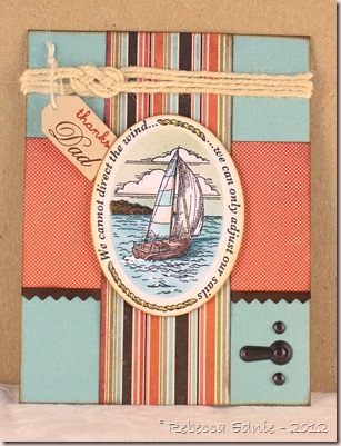
I haven’t played in any challenges lately so I managed to wrap a few challenges into one card. Yeah!

sailboat sss june kit

It’s a pretty simple card. I used some of the papers from the Simon Says Stamp June Kit as many are quite masculine and a JustRite image I haven’t used before. It’s hard to see here but I airbrushed the sea and sky then added some accents to the waves including a shadow of the boat. I took the Copic Colour and Ink class in Toronto last weekend – loved it – so I got inspired to buy an air compressor. You’ll find many of my upcoming projects will certainly include airbrushing! Gotta make use of it or hubby will get grumpy. To be honest, I’ve rationed my air cans pretty severely so there are lots of times I would have used more had I had unlimited air so I can be much more creative with airbrushing now! Yeah!

Now on to the challenges.

Simon Says Stamp: Transport.

Joan’s Gardens Anything Goes (but seems to have a masculine trend)

Deconstructed Sketches 105

deconstr sketch105

CAS-ual Fridays 105: Mapquest Summer Vacation

CAS-ualFridaysNoWords

Ribbon Carousel 82 Fun in the Sun

ribbon carousel 82

Enjoy, Rebecca

RECIPE
Stamps:
image and border-JustRite, Dad, thanks-PTI
Ink: Memento black, chocolate-PTI, orange-Ancient Page
Paper: Bazzil cardstock base (I think, came in kit), Basic Grey DP, espresso CS-SU!, kraft CS-PTI, white CS-X-press it
Accessories: tag die, twine-PTI, rope-stash, foam dots-Jody Morrow, metal hardware-SU!, pinking shears, oval Nesties, Copics, air brush system

February 11, 2013

10 Minute Craft Dash–Hearts n Washi

craftdash_11

Make a card in under 10 minutes? WOW! But I had to try it. I went with a very easy layout and minimal stamping.

washi 10 dash thanks

I adhered my white CS to my grid mat first so I could easily line everything up without measuring. I started with the thanks and worked out each way from there. I started with the Thanks up too high so when I got to the bottom, I created a row of hearts. I had already planned on incorporating them but not this way. Even with a 10 minute card, plans can change in a second, LITERALLY!

I’m entering this in the Simon Says Stamp challenge to use hearts.

Need Proof? It was a close one!

washi 10 dash thanks clock

Enjoy, Rebecca

RECIPE
Stamps:
  PTI Thanks all Ways
Ink: Memento black
Paper: white, raspberry, hibiscus CS-PTI
Accessories: Heat die-PTI, dotted, striped washi-Queen and Co, other washi WRMK??, Copics