February 28, 2010

Nasturtiums

Wow, another CAS card and a bright one at that! I decided to play Flourishes Timeless Tuesdays Challenge to use flowers.

flourishes challenge nasturtiums

I like to use the company’s stamps for challenges if possible but as I have NO Flourishes Stamps (how is that possible!?!?) I used some images I was given by Bonnie Sharp. I coloured them a long time ago so I am sorry, but I don’t know the colours I used. Once again, I can’t seem to get the colours in my photos right, the green in the ribbon isn’t as dark as the  leaves but much more vibrant than it looks.

The bow was an interesting discovery. I wanted both tails behind the loops and out to the sides but I couldn’t tie a bow to end up that way to save my life. So I used the method shown in THIS tutorial up to and including step 5. Then I punched two holes in the card, vertically, just under where you want the center of the bow to go. I placed the bow center over the holes and used another piece of ribbon to thread from the top hole over the bow down to the lower hole. Then I used a glue dot to attach the ribbon ends to each other inside the card. I prefer this method to simply tying a ribbon around the bow for the bow middle because it is less bulky because some bulk is inside the card. The size of the holes will depend on the thickness of your ribbon when bunched as does the spacing between the holes. Test ahead of time to determine the sizes to use. Remember that you don’t want the holes too large or you will see them and if the holes are too close together they may rip through.

Apparently, you can also get the tails to go to the back with the Bow-Easy if you pull them both up while tightening the knot. I’m not sure it would work with ribbon stiffer than the silk used in the example I saw online but I intend to try it out.

Enjoy, Rebecca

RECIPE
Stamp:
Flourishes
Ink: UK
Paper: image-UK, white, summer sun CS-SU!
Accessories: foam dots-Jody Morrow, ribbon-May Arts, Copic Markers

February 25, 2010

Becky Oehlers’ Compose a Card Challenge – Baby Feet

Can you believe I’ve done another graphic card? Me neither! But that is why I do challenges, to stretch myself. Becky Oehlers’ started a challenge at her blog called Compose a Card. This is sort of a multi-faceted challenge. She provides the colours, paper sizes, accents to use and even a song as inspiration. She shows a card she made herself and a the photo she used as inspiration to make the card. She even gives you a PDF of all of the above to use when creating your own card! Cool huh?

becky challenge baby card
I started out thinking of using the same dots as she used but as I looked for dotted backgrounds, I noticed this alphabet I bought second-hand a while back. The font was way too big for the little paper so I made up my own with an alphabet set. You might not notice it at first but there are two buttons under the bow.

compose-a-card-5-1024x866
Enjoy, Rebecca

RECIPE
Stamps:
SU!
Ink: fresh snow-PTI, real red-SU!
Paper: aqua CS-Bazzil,  white, real red CS-SU!
Accessories: white taffeta ribbon-SU!, buttons-PTI, foam dots-Jody Morrow

February 24, 2010

Dragonfly Card for TE Card Drive

Taylored Expressions released a set a while back based on dragonflies. Some of the proceeds go to an organization called, “Now I Lay Me Down To Sleep”; they offer free professional photography services to families who have lost or are about to lose a preemie or newborn. Such a beautiful idea! I’ve made nighties and pouches before to hold babies that have died so I was very moved hearing about this organization and Taylor’s donations though I’m not a huge fan of dragonflies so I passed on the stamp set. Now Taylor is having a Card Drive for a local hospital where a relative and friend work in Labour and Delivery. They give dragonfly cards and a few mementos to families who have experienced a loss. So despite not loving dragonflies, I decided to make at least one card for the drive.

wisteria dragonfly

If you would like to participate, please see the details at Taylor’s blog post. Please read all the details, I forgot the bit about including an envelope for any card not standard size! Nuts, this measures 5x6” because I wanted to take full advantage of that fabulous DP! Not that I mind including an envelope but I simply don’t have any that size anymore. I used them all up for my craft show. Perhaps a clear one will do. Those I have!

wisteria dragonfly closeup
I was uninspired by the dragonfly component of this challenge until I remembered that Basic Grey’s Wisteria pack includes dragonflies and I just bought the 12x12” pack with stickers; I was sure there would be one in the bunch and I was right! I am not the biggest glitter person ever so for me this is quite a bit of bling though on the subtle side. The Labels 4 nestie shape is covered in diluted white Liquid Pearls, the dragonfly is covered in Antique Linen Distress Stickles and I scribbled with a clear Spica pen all around the border or the card several times for more shimmer.

Enjoy, Rebecca

RECIPE
Ink:
dusty concord, antique linen Distress inks
Paper: Wisteria-Basic Grey, white, amethyst-SU!
Accessories: Liquid Pearls, Distress Stickles, crocheted, silk ribbon-May Arts, Tiny Attacher, button-stash, dragonfly sticker-Basic Grey Wisteria 12x12” pack, labels 4 nestabilites, clear Spica pen, Copic BV02 to colour ribbon, EK Success large corner rounder, Cuttlebug embossing folder

February 23, 2010

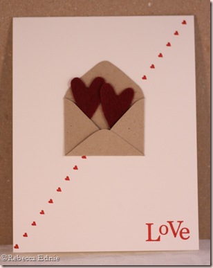
Heart Envelope for Whimsical Wednesdays

This is one of the simplest cards I’ve ever made. I am not exactly a CAS kind of girl most of the time. I like my bling and pearls and ribbon and…

envelope love diagonal
No, it isn’t just you, this card pic is out of focus. I have tried so hard to get sharp images, I think it MUST be camera shake (me) or the camera itself because I have been having a terrible time; the settings are all correct for how I like to shoot. I have to go back to the  store and get them to diagnose the problem.

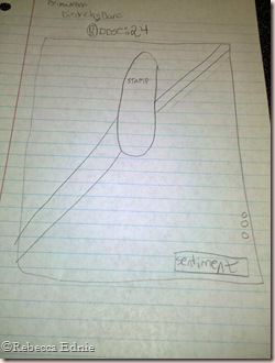
DDSC24Anyhoo, I made the template for this cute little envelope by reducing the size of a template from Wal-Mart on my printer/scanner. I used a punch out from the triple heart SU! punch as a template for the hearts which are cut from wool and acrylic blend felt from The Felt Girl on Etsy. Though based in the UK, the shipping was quite reasonable and the product is quite good quality! This card idea was inspired by a card made by Julie Ebersole. Her’s didn’t have the diagonal hearts, I added that to go with the sketch for this week by Madelynn. I made another  card more like Julie’s, it is shown below. This is a neat sketch huh? It leaves lots of room for many different techniques.

envelope love plainWAA HOO I hope you will all WELCOME Andrea Murdoch to our team!!! As you might have noticed from the notations on my sidebar, a couple team members have temporarily stepped down for a while. So, since Jess likes to keep  the team at 13 (not sure why), we are creeping up in numbers again. Be sure to visit her blog to welcome her to the TEAM! I can’t wait to see her FABULOUS work!! After visiting everyone, be sure to play this week’s sketch. Leave your DIRECT URL with Mr Linky so we can all see your work and if uploading to an online gallery, be sure to use DDSC24.

Last but not least, be sure to let me know which card you like best. I think I like the second one better but I really like both.

Enjoy, Rebecca

RECIPE
Stamp:
PTI mega mixed messages, background basics-hearts
Ink: ridinghood red-SU!
Paper: white, kraft CS-SU!
Accessories: wool felt, SU! triple heart punch (as template)

February 22, 2010

More Notepads

I just love making these, so cute and fun. You really have to try it.

notes-plum sage 
You could use any notepads really, you just cut your paper the length of the notepad plus the thickness of the pad plus about 3/8”. Score at the measurements you used to add up the length of paper needed and adhere the 3/8” strip to the back of the pad. That’s it!

notes-glitter paper

Enjoy, Rebecca

RECIPE
Stamps:
alphabet-CTMH
Ink: chocolate, perfect plum-SU!
Paper: (top) DP-DU!, (bottom) DP-MME, chocolate cs, (both)Vanilla CS-SU!
Accessories: PTI twine and buttons, scalloped circle nesties, Masterstroke ribbon, notepads-PTI

February 21, 2010

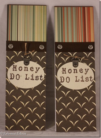
Honey Do Lists

That always cracks me up, Honey Do List! I made these notepads for my craft show.

honey do lists

I’m afraid there isn’t really anything interesting to say about these, they are pretty obvious. One thing I thought was cute, I used a + and a – screw. I know these screw head types have official names but to me they represent the positives and negatives of doing chores. You might hate doing them but you do feel mighty good when they are done!

Enjoy, Rebecca

RECIPE
Stamps:
alpha-UK
Ink: chocolate chip-SU!
Paper: Earth Love-Cosmo Cricket, chocolate-SU!
Accessories: note pad-PTI, hanger and brad-SU!, twine-Hemptique, screw head brads-stash, ribbon-stash, oval nesties

February 20, 2010

Loss of a Dog Sympathy Card

SCROLL DOWN FOR TWO MORE POSTS!

It is always so sad when a family looses a beloved pet. I’m so glad that several stamp manufacturers have acknowledged this.

empty doghouse sympathy
I  deliberately left the inside of the doghouse dark and kind of uneven. I don’t know about you, but it makes me look twice to see if there is a form of some sort in there. Like the way you look in your pet’s favourite places for them even after they are gone. Just because you were so used to doing it before.

Rebecca

RECIPE
Stamps:
paws-UK, doghouse-H&M stamps, sentiment-PTI
Ink: memento brown, chocolate-SU!
Paper: DP-stash, vanilla, chocolate CS-SU!, vanilla image CS-Taylored Expressions
Accessories: foam dots-Jody Morrow, button, twine-PTI, Copics, twill tape-stash

Lollipop Holders

SCROLL DOWN FOR A SECOND POST!
lollipop holders boySomeone in blog land, sorry, I forget who, made adorable little pouches for pixie  sticks and decorated them for their child’s class. I thought they were very cute but decided that with a little alteration, they could be  made shorter and wider for the average lollipop and I managed to even get 8 per sheet of CS! Bonus! I made some of these for my craft show and I will use some to send treats in my son’s lunch every so often too.

lollipop holders girl

I can send the template to anyone who needs it but basically you have to cut your CS into half then half again. Each quarter sheet, 4.25 x 5.5” will give you two lollipop holders. Each lollipop holder is made from an L shape. They measure 4 1/4” high, 1 3/4” wide with the folded over section measuring 1 3/4 x 2 1/8” with an additional 3/8” folded over to the back. If you draw that on a quarter sheet of CS, you will see the basic shape and how two nest together. Use strong adhesive to adhere these at the back.

I decorated mine with those cute little images and matching punny sentiments. I made sure they would fit inside a 1 1/4” punch for speed but the scalloped circle was done with my Cuttlebug as I don’t have a scalloped circle punch. Of course, when you aren’t making 60 of them, you can decorate them much more interestingly. I think some ribbon would be nice!

Enjoy, Rebecca

RECIPE
Stamps:
PTI
Paper: white, red, green, blue, blush CS-SU!, Girl DP-Basic Grey, Boy DP-Nana’s Kids, white punched paper-Taylored Expressions
Ink: memento black
Accessories: circle nesties, Copics

Rose Tent Topper Easel Card

I wonder, could this be a new invention? I’ve never seen a card that combines a tent topper and an easel before but that doesn’t mean it hasn’t been done. I wanted a design that would balance lilybean insp3 out the huge rose I used and I think this works. It took me longer to decide what to put inside to support the easel portion than the rest of the card!! The inspiration for this card came from a gorgeous picture on Melissa Phillips blog, LilyBean Paperie. I love her blog so much, she writes so beautifully about her life and the loves of her life, her daughter, hubby and new house and of course, her fabulous shabby chic creations. Click on the photo to visit her post.

rose tent easel standing

This card is large, 5” wide and 6” tall when folded flat. The rose itself is almost 1.5” tall and 2” in diameter. I stamped the damask background myself, it looks like vintage textured wallpaper or curtains because the CS has a linen texture.

I used 1/8” red line tape to adhere the half-back pearls and the heart charm thingie to the inside of the card, then I coated the remaining red line tape with gold glitter. I added a bit of glitter to the rose too. I debated on putting brads, buttons, punched cardstock, lace, trim, rhinestones, pearls or mini long-stemmed rose embellishments on the inside to support the easel. Whew! Nothing was elegant enough to go with the outside of the card until I thought of this.

rose tent easel folded

I did have a bit of an ivory vs. white war going on. The label 1 mat and the rose are cream. The damask stamping was done with white ink that I tried to vanill-ize with Antique Linen Distress ink but of course, pigment ink resists dye ink. The only reason I tried it is that the white ink I used is technically hybrid ink. Then I had to choose between white (a winter white) and ivory (yellowish) silk ribbon. Obviously from the picture, the white won. It does look much more cohesive IRL.

rose tent easel inside

The colour in the pictures is out some, well quite a bit really. The turquoise is brighter and the green is celery by SU! I tried so many different camera settings to get better colour and I tried some simple post-processing settings too but to no avail. I can’t figure out why some colours are so easy to capture and others are so difficult. The corsage pin isn’t very easy to see, I used a flower-headed quilting pin whose head I broke off. Then I glued a large pearl bead where the flower head had been. The other beads are Swarovski crystals plus one other pearl bead.

The ivory mat layer under the celery Label 1 is cut by embossing the shape into the paper, then cutting around the  largest indentation. This creates a perfect mat for a piece cut by die cutting normally. I hope you will take the time to be inspired by this gorgeous photo.

Enjoy, Rebecca

RECIPE
Stamp:
Gel-a-tins
Ink: PTI snow
Paper: celery, vanilla CS-SU!, turquoise textured CS-Bazzil
Accessories: halfback pearls and pearl beads-SU!, rose-Prima, Cuttlebug textile folder, red line tape-Jody Morrow, heart-Jesse James buttons, gold glitter-Art Institute Glitter, silk ribbon-May Arts, Swarovski crystals, Label 1 Nesties

February 16, 2010

Swinging “Whee” Card Tutorial for Whimsical Wednesdays

I started out not too inspired by this colour challenge. I am more into pastels, muted and jewel tone colours. With bright pink, pink, turquoise and grey-green, I was kind of stuck. I started with one of my new Pure Innocence girls from MFT and I found a pack of paper I had forgotten about with the required colours in it! No way, really? WAHOOO! Then I remembered a card by Jody Morrow where she had the girl actually swing back and forth on the front of the card. It was a fabulous tutorial but after I saw her card, I thought about it for ages, I was sure there must be a wee bit easier way to get the same effect.

swing tut final

As you can see, I DID IT!! Now my tree isn’t nearly as impressive as Jody’s which had many, many leafy punch outs to make her tree, with a trunk, she had a fence and grass… I decided to try going with a faster card and I’m glad because I am so pleased with it, my kids want me to make more! I am going to do  tutorial for you which also meant making another card so everyone is happy!

swing tut1Step 1. Stamp the image on white CS. If you want to colour with a specific medium, make sure the paper matches your choice of colouring tools. Stamp the ropes part of the image again. Leave a circle of cardstock at the top of the ropes. (mine isn’t trimmed into a circle yet, see next photo)
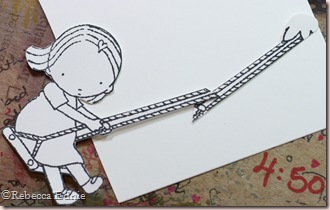
swing tut2 Step 2. Cut out the image, DO NOT cut out the space between the ropes. Cut off the hands on the ropes-only image (I did the final trimming after this photo), cut off the tree tufts on the full image. Colour, paper piece or embellish as you wish. You will see in my photos I left that for later but only because this is a tutorial. You will need to overlay the ropes, gluing them together to make them longer. You could of course just use the length of rope attached to the image but you will only get a very short swinging distance that way. The photo shows approximately how much overlap you need.

swing tut3 Step 3. Choose your background paper, in my case, I used cloud paper from MME. You can add grass or other ‘landscaping’ as you wish but keep them near the bottom so they don’t interfere with the swinging action. Lay your girl over the background paper. It may need to be quite large, especially if you want grass or a fence etc., my cloud paper alone is 4.25x5.5”. I know a lot of this photo is fuzzy but that is because I focused on the brad.

swing tut4 Step 4. Referring to the photo in step 3, notice the brad I have chosen is quite flat-headed. It is a diamond shape but I photographed it from the side to show how thin it is. Sorry I couldn’t get in closer, I don’t have a macro lens for my good camera. Notice too that there are now holes punched in the swin tut5papers. A small one, 1/16”, at the top of the ropes and a larger one, 3/16”, in the background paper. The larger hole must allow the brad prongs to swing freely, if you use a larger brad with larger prongs (this one has an 1/8” head and slightly smaller prongs) be sure to use a bigger hole if needed. Put the brad through the  holes attaching the girl to the front. Make sure you fasten the brad very loosely as seen in this photo but the prongs need to be flat. If needed, put a few layers of CS under each prong and press flat; the CS will prevent the prongs from tightening on the paper. See how loose it is from the front?

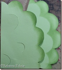
swing tut5 Step 5. Create your tree top. I just hand drew a tree top from CS. If you’d like the file, email me and I’ll send it to you. In the photo you can see the dud tree top I made. I thought I could make it more lifelike by cutting slits and lifting them up with foam dots to get some dimension but I hated it. So I cut another and the first one became a sponging template. First sponge all the entire tree top edges with a similar or slightly darker ink. Then placing your swing tut6 sponging template as shown, slightly askew, start sponging your ink. I just use a pouncing (straight up and down motion) with a bit of an angle away from the template. Continue sponging, moving the template back and slightly askew each time (so there aren’t perfect rows of leaves), until you are at the top of the tree.
swing tut7 Step 6. Now you need to add foam dots to the back of the background paper (clouds), one in each corner and one near the brad but not close enough to interfere. (Please ignore the white strip of CS near the brad, I goofed.) The tree also needs foam dots along the edges and I have carefully placed two as stoppers for the girl so she doesn’t swing off the edges of the card too much. It really doesn’t matter but as you can see, she has foam dots on the back of her too and those will catch as she swings off the edge and you have to fix her. Not as fun to play with. The foam dots on her are optional but I found that she swings better when the foam dots, WITH BACKING PAPER STILL ON!, because there is less friction against the background paper. I marked the placement of the ‘stopper’ foam dots buy placing the tree temporarily in its final location, swinging the girl as far as I wanted her marking the locations with a pencil. Then I added the foam dots to match. These pencil lines are ones I made to show you what I have done. The pencil lines you make will be on the front of the tree; mine were too small to photograph.

swing tut copic

Missing from this photo are the C-3 and the clear Spica I used to colour the dots (nails) on the swing. I used E00 and E21 for the skin with E93 for the cheeks. E08 and E37 for her auburn hair (I always use more than one colour). Pink Spica for her shoes, W-5 and E71 for an aged wood look for the swing. And finally RV19 for the heart in her hair.

That is the action part. Now all you do is adhere your tree as in the final card photo and finish your card. A couple tips. If you will be giving this to a small child were it will receive some serious playtime, consider backing your girl with the white chipboard from the back of paper packs or gluing a toothpick to the back of the ropes. Adding a penny to the back of the image will make her really swing quickly but I think she is quick enough. If using a penny, definitely reinforce the ropes. Can’t find a flat-headed brad? Use a hammer to flatten a round-headed one or use double foam dots to lift up the tree higher to clear the brad. Whatever you do, DON’T MAIL without some serious protection to make sure the brad doesn’t flatten. I accidentally flattened mine while feeling where the brad was on my finished card to locate it to make my tutorial card. I accidentally squished it and had to slide my bone folder underneath to loosen it up, NOT EASY!

Thanks to mom Jessica for the colour challenge this week. I actually like it when a challenge is a TRUE challenge for me sometimes and this was a good week for it because I started early. I hope you will blurf to see what awesome creations the other DareDevils have in store. I am always even more excited to see what they do when I start off struggling to think of what I am going to do! As always, be sure to leave them all some great comments. They work so hard every week making a commitment to bring you such fabulous artwork! Come on, you gotta try it! Visit Whimsical Wednesdays to see the colours, tag your project with keyword DDSC23 if you want to upload to an online gallery and return to the WW blog with a DIRECT link so we can all see your take on the challenge!

Enjoy, Rebecca

RECIPE
Stamps:
Whee Pure Innocence-MFT
Ink: memento black, Ancient page turquoise, celery-SU!
Paper: DP stripe, pink polka dot-SU! cloud DP-MME, white CS mat-SU!, white CS image-Taylored Expressions, sweet blush CS-PTI
Accessories: foam dots and circles-Jody Morrow, brad-SU!, ribbon-May Arts, flower eyelets-stash, ribbon tag trio die-Spellbinders
February 15, 2010

Love it or Hate it? the Saga of a Shaker Box

OK, heads up! This post is going to be long; I am not writing this later, I already know it. I’ve been trying to write shorter posts lately but this will have to be an exception.

PTI released a new Template, a set of Shaker boxes. Great, I love shaker boxes and unfortunately don’t have any real ones so paper versions are perfect! I wanted to combine a few challenges as well so I started with yellow paper to go with a baby theme. The template pieces printed beautifully and I was ready to cut them out. If you have ever tried to attach a straight piece of paper to a round/oval one, you know the round one needs a ton of tabs cut beyond the desired shape to fold down and glue to the straight piece.

duck shaker box top
So this was part of the lovin’ of this project. Don’t care about my idea? then skip this paragraph, just know that I came up with a clever idea to save time! I realized the last thing I wanted to do was to cut all those tabs from the template (I always trace templates even if they are supposedly printable directly to the CS or DP.) and then trace them and cut them from the cardstock. And they aren’t hard to cut freehand if you have guidelines.So,  I cut around the outer parts of the tabs on the piece, called a tabbed oval, not down around each one, then I cut double slits, very close together along the score line in a few places and I removed the sliver of paper. Next, I printed up a second set of ovals, from these I cut off the tabs, cutting on the score line.  After that, first, I traced the untabbed oval on the CS, second, I over laid the tabbed one, sighting the pencil lines through the slits and traced around it. So what I ended up with is two concentric pencil line ovals, now all I have to do it cut little v’s out of the paper, from the outer oval to the inner oval which creates tabs. I know, this  may not make sense but if you buy this template it might matter to you! If you want, I could take pictures of the pieces to show you.

duck shaker box front So here is the hatin’ part. I put the whole bottom together using the oval lid as the oval bottom. Not only didn’t the sides line up but even if I had chosen to leave it and cut a new oval lid, the lid wouldn’t fit! So I sat there for a few minutes wishing a bottle of Undu would miraculously appear in my hands and finally tried peeling it apart; yes this was crazy having used red line tape but strangely it sort of worked but the pieces ended up a bit mangled. Then I put it all back together, CORRECTLY.

duck shaker box side

Now I was back to liking the project at least. It looks really cute from the outside, the little blue brads I chose look cute on the yellow CS. Now all I have to do is put in the liner, seems easy right? Nope, for some reason, probably the amount of ‘distressing’ the parts of the box received before assembly, the liner wants to bulge in places and crease in others, seriously?? I finally had to cut the liner twice to make it fit and this was after it was red line taped in (not so forgiving on thin DP) so no, the edges do NOT overlap and the error is NOT hidden! I did look really nice from the outside though so I was back to loving it. It is amazing how closely it resembles a real Shaker box!

duck shaker box inside

But now I decorated it. Oh no. {{SIGH}} Do you have any idea how hard it is to get paper on straight when working with an oval? And I HAD to chose a graphic sketch to work with! I figured because it was a circle sketch it might work well. And it would have helped if I’d had a straight line as a reference. On top of that, I find it a bit boring, maybe because I am so used to popping up, Nestabilities, border punches, paper piecing and Copic colouring; none of which I used here. The good news is that I can still enter it in a Laurie’s challenge #2, CDBC2 on Clearly Delightful to use a duck on your project to get a gorgeous fluffy-looking baby duck digi image she designed but I know I won’t win! I encourage you to enter too! The sketch was for Mojo 123 and Stamp Simply Challenge #125 to make a baby project.

Thanks to anyone who made it this far!

Enjoy (maybe), Rebecca

RECIPE
Stamp:
stash
Ink: Scattered Straw Distress Ink
Paper: barely banana, white CS-SU!, DP-Dollarama
Accessories: buttons and twine-PTI, yellow trim-stash, SU! markers

February 13, 2010

Earth Love Welcome Home

SCROLL DOWN FOR TWO MORE POSTS!!

Another super simple card, this one I really love! Again, so simple but pretty!

cc earth love welcome home

Don’t the buttons match PERFECTLY? They are from PTI, lemon tart I think, and melon berry? The little bugs are a sticker and the Welcome Home is also. The buttons are threaded with twine from PTI also. The yellow one is threaded so the tails poke out from underneath. You just can’t see them against the natural coloured flower underneath.

Enjoy, Rebecca

RECIPE
Paper:
Cosmo Cricket Earth Love, CS-SU!
Accessories: Cosmo Cricket Earth Love stickers, PTI buttons and twine, Scrapbook Sally flowers

Earth Love Thank You

Not much to say about this little card. Just a quick, fun and EASY layout!

cc earth love thank you

I love the shape of this ‘thank you’ panel. It was part of the sheet of images that comes with the kit and I cut out just this portion. Unless it is one of the brand new ones, I don’t think Spellbinders makes one quite this shape yet. I hope they see it and add it to the next release!

Enjoy, Rebecca

RECIPE
Paper:
CS-SU!, DP-Cosmo Cricket Earth Love
Accessories: ribbon-Cosmo Cricket, Foam dots-Jody Morrow

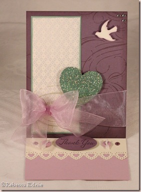
Plum Heart Easel Card

Oh man, I have to start this post by apologizing for not posting Thursday and Friday after I promised to post everyday this week! Sorry, but I am going to make up for it today!

plum heart easel card

I made this card for FOUR challenges. Clear Dollar Stamps has a blog, Clearly iStamp, and the challenge was to glam up your card. So I added glitter to my heart and rhinestones to the top corner. Sharon’s challenge #126 on her No Time to Stamp blog was to use green and purple, very springy colours. Of course here in Southern Ontario, we still have cold and snow and as we really haven’t had a BIG storm yet, I expect one, probably several still, any time really! Last year, the worst weather was in late March and early April after a very warm February. Anyhoo, the third challenge was the sketch on the new OCC sketch blog. The last was Flourishes Timeless Tuesdays challenge to make an easel card. No problem, I love this this last challenge can be applied to almost every card.

plum heart easel card open

This card is going to my son’s teacher. I let her know early in the year that because of our religion, he cannot participate in most popular holidays including Valentine’s Day. She not only remembered but added a note to the bottom of the Valentines’s Day class list.“Jameson doesn’t celebrate for religious reasons. But he would appreciate a friendship card.” Isn’t that so sweet? And even better, most of his classmates made special Happy Friendship Day cards for him with candy taped on just like a Valentine. It made me so happy, I almost cried. It is so unusual for anyone to go out of their way to make up for holidays we don’t participate in.

Because of the angle, it is a bit hard to see but there is an eyelet at each end of the heart punched panel and a silk-ribbon threaded button on either side of the Thank You oval. The dove is placed right above a similar bird stamped as part of the background. It kind of looks like the ivory bird is creating a shadow on the card!

Enjoy, Rebecca

RECIPE
Stamps:
SU!
Ink: perfect plum, eggplant, sage-SU!
Paper: DP and all CS-SU!
Accessories: MS heart border and dove punch, oval punch, buttons, eyelets-SU!, silk ribbon-May Arts, purple sheer ribbon-stash, rhinestones-Zva, Art Institute Glitter-Watercolour

February 10, 2010

Snowman Lovin’ for Whimsical Wednesdays

I super love these sweet Pure Innocence images from MFT. This cute little one was perfect for the weather around here! –5 degrees C or 23 degrees F. Yuck!!

PI snowmanThe colours are actually a bit deeper IRL; the photo is somewhat overexposed. I tried to adjust the exposure but the detail was blown out. (That means the pixels simply weren't captured so they can’t be brought out by adjusting the photo digitally.) Grrr! Which means it is hard to see the embossing within the scallops of this EK Success punch. And I totally goofed again, notice I forgot to colour her hair! I was rushing but I did have a few seconds to colour her hair, poor thing! One other thing, the Liquid Appliqué wasn’t dry enough to heat it, so it isn’t as puffy as it will end up. In case you can tell, I covered the BG coloured areas on the design with W-1 to deepen the shade because they were too  bright to match the paper. A great technique I learned from Debbie Olson; thanks Debbie!

PI snowman copics 
It seems this week we have a sweet sketch from the littlest Diedrich, Ava! I thought this was a great sketch and I had fun playing with it. In fact, I had TOO many ideas! Yeah Ava!

DDSC22Ava

I hope you will all welcome a new Team member, Sara Henton! I am DYING to see her project this week! But as I tend to get up a bit late, you will all get there first right? Because you are all going to visit all the DareDevils blogs to see their takes on the sketch right? Be sure to visit the Whimsical Wednesdays blog and leave some love for Sara, leave DIRECT links to your creations AND see who won the AWESOME FREE Unity stamps Jessica offered last week! Thanks Jess! Be sure to use DDSC22 when uploading to an online gallery. Please note: Jacquie N, Kris and Darla (or was it Debbie?? umm…) won’t be playing this week.

Enjoy, Rebecca

RECIPE
Stamp:
MFT
Ink: Sntique Linen Distress Ink, Memento black
Paper: Jolly by Golly, vanilla CS-SU!
Accessories: foam dots-Jody Morrow, Liquid Applique, Nestabilities, Copics, EK Success Embossing Scalloped Punch

February 08, 2010

Hearts and Music House

I absolutely loved it when PTI released their set Homemade and their template called Home Made. I saw several examples online of artists covering them in music paper so I started there. I didn’t want to print the roof with the scalloped shingle shapes provided because I don’t know how to change their colour so I went with another new set from PTI. Background Basics: Hearts. I coloured in some hearts with my Copic and glittered others. It is hard to see the glitter but if a heart looks unevenly coloured, it is probably glittered instead.

music house front

Isn’t it cute? The stamp set comes with window boxes but I thought the window ledge looked enough like small window boxes so to save me a step I added Flower Soft on directly. Because I used a punch on the roof edges, it ended up a bit short. I did add extra to compensate but I think the original template didn’t allow for any overhang which I would prefer. So I’ll add extra more next time.

music house side

I’ve really enjoyed using the templates in the past but if you are a perfectionist like me, be sure to check your printouts on copy paper for symmetry before starting. I’m note sure if it is the printer or the design, but I found a mat layer wasn’t perfectly even on all sides and one other template piece was out a bit too. I’ve used Ready, Set, Wrap, Cash or Charge Collection (gift card holders), From the Desk Of, Purse-onality Clutch and All Boxed Up. I always buy the unusual ones because I can find free templates or instructions online for the simpler ones or even figure them out myself.

music house lid askew I don’t print them out on the DP or CS because I can often get way more out of a sheet by rearranging the  pieces and I hate waste so I trace them! In fact, I made this ages ago so I don’t remember exactly which piece it was, but if I reduced the width of a tab meant to glue the parts together by just a tiny bit, I got both pieces needed out of one sheet of CS, instead of two!

I made another change too. The dormers are designed very well. When it came to the dormer roof though, I didn’t like that there was no way to attach it to the house roof, mine sat away a bit. So instead of cutting the angle on the template, I made it a full rectangular piece and SCORED on the angled lines. It is very easy and the extra bits you added can be folded in and glued to the roof itself and I think it looks more finished! Won’t make sense unless you download the template but it is VERY easy!

The last picture shows how the roof comes off so you can use it as a gift box. The paper on the side is from a vintage Dick and Jane children’s book. I can see it being cute with the windows cut out and an electric tea light  or mini lights inside so it can become a luminary. I hope you will try one of these fun houses and if you do, be sure to show me!

I was thinking I need to add something else to it. Let me know what you think!

Enjoy, Rebecca

RECIPE
Stamps:
PTI
Ink: pretty in pink, pink pirouette-SU! Antique linen Distress ink, Colourbox chalk ink
Paper: vanilla, pretty in pink-SU!, sweet blush-PTI, vintage music and children’s book paper
Accessories: punch-MS, Art Institute Glitter, Copic marker, Flower Soft, foam circles-Jody Morrow, vintage lace-stash, May Arts silk ribbon (coloured with G21), button-PTI

Truffle Boxes

I made these for my sale, I think I should have labelled them on the front because no one asked what they were or picked them up except one lady. Who muttered, “too expensive!” So many people expect to go to a craft sale and get things for less than they could at their local drug store. It is so sad that they don’t realize that handmade should mean more expensive! The chocolates inside are Lindt. They aren’t labelled Lindt because I got them at a bulk store but the wrappers are identical in every other way.

truffle box 1 open

This box design was by Katie Renz for Clearly iStamp, the blog for Clear Dollar Stamps. She made a clever set of dividers for hers creating 9 sections but I didn’t add them because they wouldn’t have fit with my chocolates and besides, I only bought 16 for two boxes so I couldn’t have used 9 sections!

truffle box 1Note: The box lid lookd ramped up at the back but really fits perfectly. But the chocolate wrapper ‘twisty parts at the ends’ wouldn't lay nicely. After being packaged for a while, they behaved and the lid stayed flat.  The lid is made with labels 1 Nestabilities but to make it large enough, you emboss the shape into your cardstock, then cut about a fat 1/8” beyond the largest outline. I think next time I will just reduce the size of the box by a tiny bit so I can cut around the largest outline exactly, but if I needed the dividers, I would do it her way again rather than redesigning them too. The DP is cut using the second largest label 1.

truffle box 2 TIP: One trick when making a box like this. Often the instructions read something like this, “cut cardstock to 5.5”, score at 1” then again at 4.5”, turn 90 degrees and repeat.” This clearly gives you a 1” score lines on each side. I find that if your paper isn’t perfectly 5.5”, the sides won’t line up smoothly; some corners don’t line up. I prefer to score at 1”, then turn 90 degrees and repeat 3 times. That way, each side is perfectly 1” from the outer edge so the corners line up.

Enjoy, Rebecca

RECIPE
Stamp:
PTI Mega Mixed Messages
Ink: regal rose-SU!
Paper: chocolate, white CS-SU!, DP-Basic Grey Bittersweet
Accessories: Labels 1 Nestabilities, tag trio (I think)-Spellbinders, pink grosgrain-SU!, button-PTI, satin ribbon-stash

February 06, 2010

And I thought I was busy before!!

I am sooooo busy now! I have made almost everything for the sale, just a few things to finish up. I’ve set up a table here at home to lay everything out so I know ahead where it goes and I’m going to take a photo to make it easy to remember. It didn’t take too long to set it out which was good so I don’t have to leave too much time on Sunday. Best part is the table looks full, maybe a wee bit too full, so I am not wishing I had made a ton more stuff. Seems like a good mix of cards vs 3-D items. I PROMISE, I will show you all of it including a photo of the set up in situ at the show.

I’m so sorry I haven’t posted more lately. My PVR (TiVo in the US) is full, house messy, I haven’t showered today (no, I don’t smell hee hee) and my craft room is a mess so it isn’t just you I’ve ignored! Sorry! I think I have about 50,000 boxes saved to transport all of this to the show. Hope I have enough!! :)

Thanks for sticking with me and especially to my subscribers, none of whom have unsubbed since my crafting rush/sicky time started back in the last week of December. You are all sweethearts! Wish me well!

Rebecca

February 03, 2010

Matchbook Post-It Note Holders

Yep, more craft sale stuff though I didn’t like one part of the first so I saved it for me! These were shown on SCS but I changed mine a bit.

grey blue matchbook notes

I kept tweaking mine until I got it perfect. On this one, I stapled it too low, hidden by the ribbon. Then I changed it but the scallops overlapped the post its and I didn’t like that. I finally settled on some measurements I really like so if you are interested, please email me. It is hard to see but the labels 8 die is stamped with French script and sponged.

hearts matchbook notes

The colours aren’t quite right on this one. The cardstock is Melon Mambo, the hearts are pretty in pink and pixie (I think) pink. It goes together sooo much better IRL. I couldn’t find any pink post its that were the right size, not in a HUGE package or pop-ups. So I settled on heart ones, cute right? Only problem is that they have adhesive down the center, not at the top! I added a strip of CS to the inside for the backing paper to tuck behind. Now the darn things want to fall out! And I’ve already marked them as refillable which they won’t be if I have to use redline tape to keep it in! Hmmm. Let me know if you have any ideas!

Enjoy, Rebecca

RECIPE - floral
Ink: chocolate, bordering blue-SU!
Stamps: chocolat alpha-CTMH, Life-PTI, French script-SU!
Paper: DP-MME, chocolate, vanilla CS-SU!
Accessories: ribbon-SU!, staples, Prima flower, Kaisercraft pearl

RECIPE - hearts
Ink: pretty in pink, pixie pink,
Stamps: chocolat alpha-CTMH, happy hearts-SU!, borders-hearts-PTI
Paper:  white, melon mambo CS-SU!
Accessories: ribbon-May Arts, staples

Vintage Angel Bear for Whimsical Wednesdays

So I had 20 minutes to complete this card to night. My first stop was my coloured images file. This little guy/gal? caught my eye and I started to trim the edges of the panel. In my haste, I chopped off too much leaving a scant 1/8” border which, of course, looked stupid! So I had to quickly cut it out, there goes one fifth of my time! Ahh!

vintage angel bear

I thought the bear looked sort of vintage and I had no time to search for paper so I checked out the few paper packs I have in my cardstock box right under my stamping table and another score! I found Parisian something or other from SU! and I was on my way. Right on top of my lace jar was the lace I used and it went on lickety split with Tim Holtz tiny attacher. The staples are so small, 1/4” long, they are seriously hard to see! The one only shows because the light catches it. Click on the photo to enlarge it and find the other two!

This is where my interpretation of the sketch went quite awry! I was going to center the image with ribbon underneath. But I had no blue ribbon I liked. Only a grosgrain matched and it wasn’t vintage enough for me. So I looked on my shelf to see my 1.5” (or is it 1.25”) silk ribbon from May Arts. Well that makes too big a bow for the image to be centered anymore. SIGH… but I had to finish this card and quick. So on it went with a bow made with my Bow Easy. The wings are double foam dotted so they tip forward a bit. If I had more time, I would have added gold glitter to the edges of the wings, I may yet do that. Oh and add some sponging.

DDSC21

So I guess this whole story is to make you feel sorry for me and just enjoy the card while ignoring my complete lack of relevance to the sketch! On top of that, I have a nasty headache caused by driving behind an ambulance with its extremely bright lights on for over 10 minutes. Even dropping back a bit, the lights were burning my eyes; I am glad my lupus doesn’t cause seizures. It was travelling pretty much the speed limit on a very low traffic road, it really could have shut the lights off for most of the way except at intersections. Before you criticize, remember, I am the wife of a paramedic! I know they can shut off lights when there is no traffic in the way, at least in the services around here.

So I know you ALL can do a much better job at the fun sketch by Jack this week than I did! Thanks Jack! I am looking forward to seeing how you all and the Team interpret those little heart shaped thingies right next to the main panel, you know, those ones I ignored! (ooops) Be sure to link up your card with Mr Linky and if you upload to an online gallery, be sure to use keyword DDSC21! I think we are supposed to announce our sponsor for this month next week. Please visit all the DareDevils, links on my sidebar, and leave them some lovey comments.

I can’t wait to show you some more of hte things I have been making for my craft sale. I have been having trouble finding time to blog them. Next week, you are going to have a post everyday I hope and sometimes maybe two because I feel I have to make up some posts for all you long-suffering readers out there who stuck with me through a depressing, almost post-less January.

Enjoy, Rebecca

For recipe, please email me. Head hurting…