May 27, 2013

Paris Wine Tote

I made this as part of my wedding gift to my sister. I made the pattern based on a picture I found on line so I’m afraid I can’t give you a link to it and I haven’t drawn it out yet but if you are interested let me know and I’ll try to do it sooner than later.

wine tote

It has some interesting features to it I didn’t photograph. Inside is an insulated sleeve that ties on with ribbon ties. It uses the same type of insulation used inside a lunch bag. This keeps the wine bag cold if you are taking it on a picnic or somewhere that you need it to stay cold.  The handle and the flower are made from ribbon I recycled from a package of something (don’t remember what). I sewed the beads in with black thread in rows of three or four then tacked the threads down in between each bead so they aren’t so obvious.

wine tote flower

Enjoy, Rebecca

May 26, 2013

Engagement Card for Max

Max is a wonderful woman who came into our lives as an autism consultant who, thank goodness, is paid for by a wonderful organization called Kerry’s Place Autism Services. She helps families navigate the difficult world of parenting a child with autism with kindness and a quiet dignity mixed with passion for insisting children’s rights are preserved. I recently found out she got engaged so I made this card for her; she deserves every happiness.

max engage

It is super simple so there isn’t much to say except to tell you how I got the variegated flowers. I used cube ink pads inking with autumn rose all over then with scarlet jewel very lightly in the middle then heavily only in the very center so I wouldn’t get distinct lines of where one colour stopped and another started. One flower, top left is all scarlet and one bottom right is all autumn rose. I’d switch those two if I made this again. IRL it is so pretty because I used REAL Swarovski crystals. They are so twinkly and amazing. I save them for the most special of cards. I hope she loves it!

Enjoy, Rebecca

RECIPE
Stamps:
rose-SU!, love sentiment-PSX
Ink: autumn rose, scarlet-PTI, Versamark
Paper: sweet blush, vanilla CS-PTI
Accessories: gold EP-SU!, foam dots-Jody Morrow, ribbon-stash, crystals-Fire Mountain Beads, Imaginisce ribbon cutter

May 25, 2013

Teddy’s First Scrapbook Pages!

I’ve been so overwhelmed with taking care of my autistic son and getting him the help that he needs that I’ve not done a single scrapbook page of my baby until National Scrapbooking Day! Then I finally managed to get a two page spread done which entered me in a few Studio Calico challenges to boot!

teddy newborn layout left side

This is the left side of the spread. Please click on it to enlarge it. The colour of the ‘precious’ is off, it’s a transparency over a piece of PTI melon berry cardstock but it looks icky brown here, eww. and the lace isn’t crooked. The page was leaning up against my backdrop and bowed a bit which made it look a bit warped in the center. Sorry! I promise it is my usual meticulously straight. Well, unless something is deliberately NOT meticulously straight! Ha! Like the patterned papers peeking out from under the photo. Thanks to Maggie Holmes’ video showing her process for the inspiration. I’ve always admired her designs and it was awesome to see her work!

teddy newborn layout left side2

I’ve since added our hospital bracelets to the pocket on the page. In this photo it only holds the tape measure they used to measure him right after he was born. The nurse makes a tiny tear in it at the head circumference and the length, writes on the weight and gives it to the mom to keep. Ours is now all safe in this cute little pocket! This page was entered in ‘Use something transparent’, ‘Use a pocket’, ‘Use 5 or more patterned papers’, Mixed Media’ challenges.
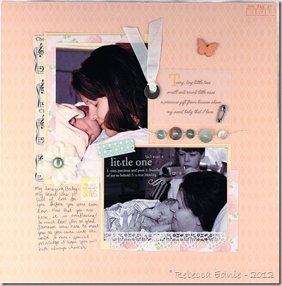
teddy newborn layout right side

In this one, you might notice that my older son is in the delivery room! Yep, he was there for both of his brothers being born at 6 and almost 11 years old. He did really well and I was so glad we decided to do it that way; incredible experiences he will never forget. This one was entered in ‘Use buttons’, ‘Use transparencies’, ‘Use ribbon’ and ‘Mixed Media’ challenges.

teddy newborn layout right side 2

teddy newborn layout right side 3

I’m really proud of these so I hope you enjoyed them!

Rebecca

RECIPE
Stamps:
CTMH
Paper: melon berry CS-PTI, DP-Webster’s Pages New Beginnings, DP-American Crafts, vintage music paper, shipping tag-stash
Ink: Berry Sorbet, Antique Linen (blended)
Accessories: crocheted flower-handmade by me!, pocket-Webster’s Pages, lace, silk flower, mother of pearl buttons, doily-stash, Tiny Attacher-Ranger, transparencies- , quote- , Boss lady mist, wood veneer-Studio Calico, twine-PTI, hug snug seam binding, metal embellishments-Making Memories, pearl brad-Recollections, foam tape-Jody Morrow, heart chipboard-Maya Road, Liquid Pearls, sepia pen-Micron
Mixed Media Quote Canvas

I am recently getting into mixed media. This canvas features one of my favourite quotes and was for a swap I hosted on Swap-Bot. It is only my second canvas ever (here is my first canvas- Friendship Canvas) so be kind but I was pretty happy.

oprah quote canvas

It was lacking a bit of depth I had hoped for as the second layer went on darker than I meant for it to and I had a technical problem with the glitter but other than that I am very pleased. The first layer on my 6x9” hard canvas covered board was a partial layer of gesso added mainly to the center, scraped on lightly over most areas but then added thickly in a few swirly shapes using a palette knife. They are hard to see in the photo but you can see the largest one under the U and R of Your.

Then I added a mix of three colours of acrylic paint, turquoise, mint and navy which I applied with my fingers getting a marbleized look. When that was dry, I adhered torn sections of French book paper (bottom right-seen below in close up, middle left, top towards the left.) To colour that, I created an acrylic paint and water wash with the turq and navy only. I applied it and realized I had WAY too much so I added it to the whole canvas so as not to waste it. I had deliberately not mixed it well so it had cool blobs in it and I loved how it puddled and pooled especially against my gesso swirls. You can see the pooling especially in the top left corner.

oprah quote canvas1

The next step was to check how large I should write my text on scrap leaving enough borders for embellishing. When I was happy, I drew similar wavy lines on my canvas and used an India ink pen to draw in my letters between the lines making them look uneven and whimsical. I added some accents using a chevron stencil and white pigment ink sprinkling on some vintage glitter while the ink was wet. Problem is, I had remembered this technique using paint, not ink and the glitter started falling off! Plus, I should have waited until after I had done my stamping to both stencil and glitter! So I brushed off as much glitter as I could (some did stick!) and used glossy accents to add the glitter back on. Fortunately, the stamping worked well right over the stencil/glitter combo.

I used only two colours for the stamping as they were the only colours other than black which I didn’t want to use which were dark enough. That’s why I was disappointed by how dark the base turned out. But I stamped off on some stampings to get a lighter tone for some variation. I’ve lightened the photos slightly to show the detail. I might have tried more lighter inks using pigment inks but most of mine are so old they are probably dried out and I don’t have reinkers. To be honest, it didn’t occur to me until now! I used a gilder’s paste to highlight the edges of the canvas (LOVE that stuff!) and added a key using a brad and Glossy accents. Finally, I stamped a patinated metal blank then covered it in acrylic paint to highlight the lettering, wiping off the excess so only the recessed areas keep any paint. I added beading wire and beads curling the ends to add interest and keep the beads on. It was added with foam tape.

I’d love hearing if this is off any interest to you. I will still post it anyways but perhaps with less detail of my process. Please feel free to comment either way, I won’t be offended if you only visit for the cards!

Enjoy, Rebecca

RECIPE
Stamps:
Tim Holtz
Ink: not quite and night of navy-SU!, cloud white-colourbox
Paper: vintage french book paper
Accessories: brad, key, metal punch-Tim Holtz, beads, wire, vintage glitter, acrylic paint-stash, metal plate-Vintaj, Faber Castell pen, Glue n Seal-Ranger, Gesso-Golden

PTI Blog Hop Pastel Smiles

PTI blog hop logo

Time for another PTI blop hop! This month the challenge was to pull out our favourite floral set and combine that with a colour palette featured on Nichole’s blog.

bouquet builder pti blog hop may 13

I’m afraid this isn’t my favourite floral set but my favourites don’t lend themselves to being stamped in multiple colours which is the second part of the challenge. I love larkspurs but it really works best in one colour and my other favourite is Sweet Life which could be stamped in multiple colours but I often find myself challenged to find three colours that work well to come up with one coordinated final blossom so trying to get them done in multiple colours seemed like too much work! It wasn’t until I started typing this that I thought about Life which would have been great, darn it! Oh well, this turned out really well even if it is CAS which isn’t my forte.

PTI may blog hop neutrals palette

I personally don’t think of these colours as neutrals as referred to on Nichole’s blog, they are lovely pastels! I didn’t end up using the fine linen though. The layered die cut technique is from JJ Bolton’s blog, if I wasn’t typing this at 3;30 am I’d happily link it! She was featured at the CASE Study blog recently which is where I found the link so that might help you find it.

bouquet builder pti blog hop may 13 2

I hope you enjoyed my card! If you’d like to see more of my work, be sure to visit again by subscribing by email, I have to get a new RSS feed thingie since I think mine is the type that is ending soon or bookmark me! Thanks so much for dropping by and have fun visiting some more blogs on the hop!

Enjoy, Rebecca

RECIPE
Stamps:
PTI
Paper: white CS-PTI
Ink: wisteria, lavender, moss-PTI, pirouette, eggplant-SU!
Accessories: tag die-Spellbinders, rhinestones-Dollarama, eyelet-WRMK, ribbon-Masterstroke ribbon, twine-Queen and Co, foam dots-Jody Morrow, eggplant marker-SU!

May 16, 2013

Hugs, You’ve Been Wonderful!

Waltzing Mouse Stamps is having a blog hop for teachers! We still have at least 5 weeks worth of school here but I like having cards made ahead of time! I’m also entering this in Deconstructing Sketches 101. I know this isn’t so teacher-y but I figure teachers are regular people too and probably get tired of teacher themed stuff. So I only added a subtle nod to a teacher theme with the printing practice lines paper.

WMS blog party logo]

WMS teacher blog hop

While making this I came up with a couple of tips. First, if you want to colour veneer shapes with mists, did you know you can just use the tip or side of the mister straw instead of getting out some sort of applicator or brush? I hate wasting product and even though it’s small, there is always some waste with an applicator. It worked perfectly and was quicker than I thought; I only dipped it in twice. Secondly, never sponge ink into your project with dirty scratch paper behind. You probably already know this but as I usually work with my paper in my hands, this didn’t dawn on me until the navy ink on my scratch paper started making my coral mist look very dirty. Bummer! Embellishment opportunity! Hello sequins!

WMS teacher blog hop2

Last, I needed a colour of red I didn’t have. First I tried second generation stamping, not right. Then a technique I love which is to stamp a strong colour that’s too strong and stamp off, then add another colour of ink to the remaining ink and use the blended ink. While this technique rocks, the result was a bit too pale. I settled for a pure red then regretted it, too bright. I continued making my card but really wasn’t happy. Then I got the fabby idea to overstamp with Antique Linen Distress ink, a deep ivory colour, to darken and remove the brightness. I took a deep breath and prayed that I would be able to line it up, stamped and yeah! Not only did I line it up correctly but the colour was just right, nicely muted but not too dark! So consider these three tricks when you don’t have the right colour ink!

deconstr sketch101

Like my embellishment? I wrapped the butterfly with wire threaded with some cheap crystals. I don’t often use good ones for cards. Here’s how to get the wrap tight without using pliers to twist the wire tight (which will mar the antennae). Fold the wire in half, thread with beads and place over the butterfly. Bring the front wire to the back and the back wire to the front keeping the wires straight. We aren’t going to twist the wires, just keep bring one wire to the front then the other, then one to the back then the other. The trick is to always start with the same wire and consistently work towards the same side otherwise you will twist and untwist the wire never getting anywhere.

Enjoy the hop. Please visit again and feel free to sign up by email subscription if you’d like. I also have RSS feed but I think it’s the kind that’s ending soon so I have to look into getting a new one.

Enjoy, Rebecca

RECIPE
Stamps:
WMS
Ink: real red-SU!, Antique Linen
Paper: kraft, white CS-PTI, DP-carta bella
Accessories: Studio Calico chevron stencil, boss lady, opaque white mists, butterfly veneer, beads, wire-stash, tag die (rotated and die cut twice to remove the tag top), twine-PTI, sequins-fabricland, foam dots-Jody Morrow,

May 09, 2013

Flip Card for Waltzing Mouse Stamps Challenge

Waltzing Mouse Stamps has a challenge right now to make a moving or interactive card. I decided to make a shaped flip card.

Flip card WMS challenge

I used a partial die cutting technique to cut the flip portion of the card. And I modified the card to make the center portion narrower which allowed more to show through the opening when the card is closed. The part the thank you is stamped on. I did a trial using the paper sizes and score lines used the tutorial on Splitcoast Stampers and there wasn’t enough showing to stamp on or to look right. Which also meant making the overall card smaller to maintain an overall size of 4.25x5.5”.

Flip card WMS challenge2

Other than that, I just decorated the card as usual. I was a bit tricky to mat the front of the card with patterned paper. I wish I had added it before doing the die cutting but I managed.

Flip card WMS challenge3

When the card is closed you can’t see this flourish but I added it because you can see it from the back where I will put my message to the recipient.

Enjoy, Rebecca