April 30, 2011

Vintage Wings Embroidery Floss Card for the OCC

Jenn had a great challenge for us this week. Use embroidery floss for something other than embroidery! Sounds like fun right? Our DT and Guest Designer did an AWESOME job AND PTI also gave lots of ideas in their March customer blog hop last month. So no excuse when it comes to inspiration. My entry for that blog hop is HERE. But this card is much nicer!!
embr floss challenge vintage wings
I decided against the typical uses like tying bows or threading buttons. It took me a while but I finally used the floss to cover these little wooden wings I bought on Etsy. I looped it so (hopefully) it would look like feathers! I hope I succeeded!
I heavily CASED Melissa Phillips’ card HERE

April 28, 2011

Button Boutique Fun

I absolutely LOVE Button Boutique by PTI! I spent ages experimenting with it and loved every minute. You’ve already seen one of them as I used it on my easel card this past Saturday. Here is a photo of all 4 I made that day.

button boutique fun

Aren’t they so pretty! They each use different stamps with no overlap (I think).

button card butterfly

This one uses the new dies with the hearts in the center. I also bought the hearts die and added the smallest heart to the center of the larger one. Then I sewed down the center; this is the only way they are attached, no adhesive, so the wings and edges of the heart lift up!

button card green pinked square

For this one, I used the pinked square die to create a fabric look background for the buttons but it’s only patterned paper. Sorry it looks a bit washed out, the focus wasn’t great. {{sigh}} The stamped buttons on this one were just raised on foam dots to make them look 3-D.

button card masc green brwn

This one started with the green banner at the top and the 25c panel to the left. after that, it looked so masculine, I decided to go with dark brown buttons. The larger ones are cut with a circle Nesties out of Craft-a-Board with a stamped cardstock circle layered over top. before adhering, I rolled the edges of the CaB in ink. The smaller ones are punched with a 1/2” circle and match perfectly; the large CaB circles are a bit too small, there is no perfect Nesties match for the stamped buttons. But they still look pretty good to me. This is the only one where I used the hang hole. I’m not sure how much I like it. It is hard to line up perfectly and when I used a glue dot to adhere the hole die to the main card die, it embossed very deeply including the small flaw on the outer edge I had hoped wouldn’t show. So I may not use that one much.

button card floss flower

This one doesn’t photograph all that well. The peachy button is pink IRL and matches much better. This is the one I used on Saturday’s card. There are more details there. One detail you must notice though is the little embroidered flower within the button’s holes. Cute right?

Enjoy, Rebecca

RECIPE
Stamps:
Button Boutique-PTI
Ink: Baja, cocoa, pale plum, perfect plum, bashful blue, bordering blue, chocolate, cranberry, pink pirouette-SU!
Paper: natural white-PTI
Accessories: Button Card dies, Love Lives Here die, Heart prints die, buttons-SU!, PTI, white twine-PTI, striped twine-Etsy, foam dots-Jody Morrow, Circle Nesties, 1/2” circle punch-SU!., Japanese screw punch-Lee Valley Tools, sewing thread sewing machine

April 23, 2011

Floral Frame–It’s a Blog Hop!

SCROLL DOWN FOR MY OCC EASEL CARD

Hello to everyone new to my blog today. At least I hope I’ll see some new faces because I’m participating in a Mother’s Day blog hop.  We are making some great projects that will hopefully inspire you to make some beautiful crafts for the lovely ladies in your life. If you came here from With All My Heart then you are in the right place. If not start at the beginning at Jamie's blog for all the wonderful projects lined up for you today. But make sure you come back!

mothers day frame

I don’t actually celebrate Mother’s Day but the lovely Jamie Rogers Moore who is running the show said no prob. Just create something you could give to a mom! Well, that describes 90% of what I create so I joined anyway! And I’m so glad I did as this frame was fun and easy to make.

The base is painted with chocolate acrylic paint. Then I adhered the DP to the front of the frame and glazed it lightly with PPA glue. The chipboard pieces and the DP all come from the Basic Grey Porcelain collection.

I ‘made’ the ribbon by scrunching it and dyeing it myself. I coloured it with R11 and RV10 Copic markers, just very messily, allowing the colours to overlap in places and not worrying about missed areas. Then I sprayed it with alcohol which blends the colours even more. The last step is to press it into a light brown ink pad while still wet to add some shabbiness and distressing to it. Then dry with your heat gun while scrunching and bunching it. I didn’t this time but if you want it really shabby, press into the ink again while dry. Twist it into a loopy bow and voila! Add some lace, a vintage button, twine and a few pearl sprays and all done!

Enjoy, Rebecca

Here’s a list of participants.

Jamie http://craftygirl21.blogspot.com/

Rhonda http://scraphappenswithRhonda.blogspot.com

Kristen http://www.fantabulouslypink.blogspot.com/

Court http://courtscrafts.blogspot.com/

Sonya http://sonyaspapertrail.blogspot.com/

Mari http://madebymomo.blogspot.com/

Amanda http://rickettscricuts.blogspot.com/

Tiffany http://sparkledmemories.blogspot.com/

Lisa www.lisascreativeniche.blogspot.com

Meighen scrappin3rdeeschik.blogspot.com

Helen http://www.craftingcricutmom.com

Liz www.mywhichcraft.blogspot.com

Jennifer http://craftycardgallery.blogspot.com/

Tere http://terecontodomicorazon.blogspot.com/

Rebecca http://www.EclecticEndeavours.blogspot.com That’s me!

Shawnee http://quiverofangels.blogspot.com

RECIPE
Paper:
Basic Grey
Ink: Antique Linen, Vintage Photo Distress ink
Accessories: chipboard-Basic Grey, pearls-Recollections, acrylic paint-Apple Barrel, seam binding ribbon-Etsy, vintage button and lace, Copic markers, frame-Michaels ($1!), twine-PTI

Button Boutique Easel Card for the OCC

Vicki has come up with a brilliant challenge this week. It’s amazing how one little extra piece of CS and a couple more embellishments create such a wow card when you create it with an Easel Fold.

button btq easel card

I really love easel cards; if you’ve never made one they are really easy. Create a top fold card base of your choice. It can be landscape or portrait. Score the card front only in half vertically. Now create your card front on a new piece of CS. Try not to have any brads or eyelets etc. sticking though on the top half. When you are finished, adhere the bottom half of the decorated card front to the bottom half of the plain card base front. When you fold on the score line, you get an easel card. The card base rests on a table and the top props upwards.

button btq easel card closeup

Now you need something to hold the easel in place. Almost any embellishment will do but I prefer something with a wee bit of thickness. I’ve seen cards propped open on little more than a layer of CS but seems to me that one little bump (I have kids after all) and it would pop shut. I’ve used charms, brads, lace, buttons, 3-D stickers and a sentiment strip on foam dots. Lots of choices. I don’t usually decorate the inside of my cards but this forces me to. I usually figure I work so hard on the outside, why on earth decorate the inside too?? but in this case, the result is worth the extra effort.

I absolutely had a blast creating with my new Button Boutique set by PTI. Those gals are geniuses! Check out that white button; see the little flower I made within the holes? The top is a French knot with lots of wraps and the stems and leaves are just stitched  with green embroidery floss in an arrow shape. I made 4 button cards, I didn’t use a single stamp twice and there were still stamps left! I also got the pinked die and the set that stamps little squares of ‘fabric’, I forget what it’s called. I stamped the gingham stamp on a little piece of silk I’ve had for ages from a set of swatches back from when I sewed a lot. Thank heavens I saved them because I was amazed how well the fabric stamped. To prevent bleeding, I heated the fabric right before stamping; this helps the ink dry before it can bleed AND hit it with the heat gun right after. Then I cut it with the little pinked die. I can’t wait to make more of these.

I hope you will check out the other DT members awesome projects over at the OCC blog. Make sure you leave time to play with us before the deadline of next Friday night at 11:50 PM EST. Hope to see you there!

Enjoy, Rebecca

RECIPE
Stamps:
PTI
Ink: Baja-SU!, white-PTI, Antique Linen, Vintage Photo Distress Inks
Paper: blue dots-MME, all the rest-Melissa Frances, kraft-SU!
Accessories: Vintage lace, buttons-PTI, SU!; pearl, white string (button threading)-Dollarama, flower-Michaels, brad-Basic Grey, MS eyelet lace punch, Cuttlebug polka dots embossing folder, twill tape-stash, button card die, pinked die-PTI, foam dots-Jody Morrow

April 20, 2011

Taylored Expressions Blast from the Past Blog Hop–Life is Like a Wave…

TE blast blog hop

SCROLL DOWN FOR MY DOODLE PANTRY POST

Another Blast from the Past blog hop; this month our theme was Clean and Simple. Not too hard right? Ugh, I agonized over it! I don’t always but this one was tough. Of course, I was super busy so that was probably why. Once my brain is revved up, I have a hard time thinking CAS.

te Life wave CAS

I’m afraid the colours aren’t super accurate, I am struggling with editing this week. The pink is Hibiscus Burst, the green background and in the sentiment is celery by SU! Every photo I’ve struggled with has had both pink and green in it so maybe that’s why?

Anyway, in case you can’t read the sentiment, it says, “Life is like a wave. You can’t change the way it breaks, but you can change the way you ride it.” The surf board was coloured with Copics and the bottom edge was cut with a PTI edge die.

I hope you enjoy the rest of the blog hop!

Enjoy, Rebecca

RECIPE
Stamps:
TE Hangin’ out at the Beach
Ink: pink-SU!, black Memento
Paper: Hibiscus CS-PTI, white CS-TE
Accessories: Copics RV04, YG03, BG05, SU! markers pink, celery, turquoise, foam dots-Jody Morrow, EK Success punch, PTI edge die

Daffodil Gift Card Holder for Doodle Pantry

MY TE BLAST FROM THE PAST BLOG HOP PROJECT WILL POST AT 11 AM.

Another GORGEOUS floral image from Laurie of Doodle Pantry. I’m not sure how accurate my colouring is but I hope there are daffodils this colour IRL. I know there are ones with the pink trumpets, just not sure if they come with creamy/peach petals!

daffodil gift card holder

I can’t wait to get my new ‘sunshine’ Copic marker; I can’t remember the colour number but it is perfect for adding a light, sunny background around white petals. This is a gift card holder, you can see the inside here.

daffodil gift card holder inside

I used most of a 6x6” sheet of DP to create the holder. It is so simple, just one punched edge, two pieces of adhesive and two scores! The lace is wrapped around the flap only, the ribbon goes around the whole thing to keep it closed.

Be sure you check out the rest of the new releases at the DP store. Laurie is starting a new program with this month’s release. She is going to bundle several of the new releases and when you buy the bundle, you will save about 25% off the regular retail price. This month, you can get  SUPER BIRDIE, DECADENT DESSERTS (outlines), and DAFODILL & SWEET PEAS (outlines) for only $6.50, regular price when sold separately, $8.50. What a fabulous deal!

Aren’t digis so economical compared to real stamps? And in many ways, they are so much more versatile! Print them any size, on any paper that will go through your printer. Print two or more for paper tole, run patterned paper through for paper piecing. and boy do they store in a small space!!

I’m also going to enter this in the Moxie Fab Gift Card Challenge. If you have time, why not play along!

Enjoy, Rebecca

RECIPE
Image:
Daffodil and Sweet Peas-Doodle Pantry
Paper: Porcelain DP-Basic Grey, white CS-Taylored Expressions
Accessories: green ribbon-Dollarama, button-Vintage, lace-May Arts, Labels 1 Nesties

April 18, 2011

Berry French Horn ATC for Doodle Pantry

I’ve been making lots of ATCs lately because I’m in a swap where I send my partner 20! WOW, I know! So I’ve been searching through all kinds of images I’ve printed, coloured, stamped whatever, anything that shaves a bit of time off of making them! I love this pretty image from Doodle Pantry called French Horn.

pink silver french horn ATC

I’ve been trying to make my Copic colouring more realistic so I heavily relied on Google images of French horns. Most are brass coloured but a few are silver and some are even funky colours! So, in the spirit of realism, I coloured this as though there are lots of reflections on the horn. It looks pretty flat on here but IRL, I coloured it with a clear Spica pen  so it looks nice and sparkly! I hope it doesn’t look to weird to those of you who haven't Googled French Horns lately!

French_Horn_store image
I guess I should have printed it a wee bit smaller but when I printed it, I didn’t have an ATC in mind necessarily. I meant to do the ‘Outside the Box’ technique on the bow but would you believe, I forgot? Seriously? In case you don’t know it, it is the technique where you pre-cut areas of the image that stick out beyond the die’s edges and keep them out of the way while die cutting. It is a great look, bummer huh?

Enjoy, Rebecca

RECIPE
Image:
French Horn-Doodle Pantry
Paper: DP-Kaisercraft, white CS-Taylored Expressions
Accessories: Copics YG63,67, C00,1,3,5,7, R11,20,22,32,35, E37, rhinestones-Dollarama, Spica pen, Labels 8 Nesties

April 16, 2011

Spring Treat Basket for OCC and Doodle Pantry

It’s time for another Our Creative Corner challenge and I used a Doodle Pantry image! I love when I can manage to combine my work!

treat basket

The OCC challenge from Vicki is Easter Wishes, make a 3-D Easter project. Now I don’t celebrate Easter so I just made a 3-D spring project. Last spring, I intended to make this project, taking advantage of all the cute pastel candy available in the spring; I didn’t get it done then so this year I made sure to. For a year I saved these yogurt containers; they come in packs of 12 with 2 sets of 6 stuck together. I snapped off two, leaving these 4 you see here.

They are covered in DP from PTI, I even covered the top. I traced the outer edge and even though the holes weren't round but I cut holes slightly smaller using a circle die anyway. It won’t hold up to heavy use but really, how much use is this going to get?? LOL. The ‘grass’ is made from a kraft envelope I crimped then sliced into skinny strips and bunched into curls.

baby chick store image

The little chick is a Doodle Pantry image. The butterfly clothespin I found at the $ store, 8 for a buck! Great real right? The vintage lace is from Etsy and I made the cute little crocheted flowers, not bad for a first try (new pattern, I’ve crocheted before). I’m really into Glue Arts adhesives lately, I used Ribbon adhesive to glue the lace and Extreme Tac to adhere the handle and the DP. It comes as a taper runner refill for the Glue Glider Pro and as squares on a roll. I used the tape runner for the DP and I cut the squares smaller for the handle.

I hope you will play with the OCC this week! There are so many awesome templates out there, it shouldn’t be too hard to come up with something cool to create or alter something you’d otherwise toss. Seems covering boxes to use as gift bags has gotten pretty popular. What about repurposing a jar!? You have until Friday April 22nd to play.

Doodle Pantry is going to have another release this month in just a few days, April 20. There will be a new challenge too! Visit the DP blog to learn more. You still have time to take advantage of the digi grab bag deal so check out it out at the DP Specials page.

Enjoy, Rebecca

RECIPE
Image:
Doodle Pantry
Paper: PTI, white , pale plum CS-SU!, kraft envelope, clear CS-PTI (under sentiment)
Accessories: butterfly clothespin-Dollarama, MS eyelet border punch, circle Nesties, vintage lace, Copics Y21, YR04,23, R02,05, crochet thread, brads-Kioshi BasicGrey, Quickutz Ali Edwards font dies

April 12, 2011

Clean and Simple? Really??? Cute Little Typewriters

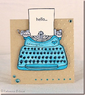
OK, so I know I don’t do clean and simple much. But I just love the way it looks. I drink in everything Jennifer McGuire makes, most of which is pretty clean and simple, at least to me, shabby chic lover! So when I started making these 3x3” notecards, I knew not too much would fit on them so I needed to go pretty simple. Jennifer had an adorable  typewriter card on there recently so that was my inspiration.

type card set

It’s hard to see in this photo but there is a cute little box under the pink card. I had a card box sized to hold 3x3” cards but these are a bit taller with the tent topper style of the typewriter placement. So I created a bottom extension for the box, placing adhesive on the bottom and bottom flaps which are left untucked.

type card set boxed

Now my cute little cards have enough room! I added a little label and some rick rack with button accents.

type card set turq

Each little card is embossed on one side only and the bottom row of dots have a tiny touch of Copic to accent them.

type card set pink

This one is much pinker IRL. Not sure why it looks so blotchy and washed out. Oh, and I made envelopes too but they are plain white with hello in a matching ink; they don’t fit in the box though (forgot about that when I designed the box).

type card set red

type card set yell

I’m entering this set in the Moxie Fab World Card Set Challenge. Wanna play? See you there! The deadline is April 21.

Enjoy, Rebecca

RECIPE
Stamps:
Stamping Bella
Ink: Memento black 
Paper: white CS-Taylored Expressions, kraft CS-SU!
Accessories:  foam dots- Jody Morrow, box-Clear Dollar Stamps, Cuttlebug embossing folder, Copics Y21,35,38,  R20,32,35,37,89, BG10,15, 19 (the darkest of each were used to colour the rhinestones) C1,3,7,100, Clear Spica pen,  rhinestones-K&Co, Dollarama

April 09, 2011

It’s Tea Time for the OCC

Sharon challenged us to create a tea-themed project. Isn’t that fun! I have several tea and coffee themed sets so I got to choose. I settled on a tea set by CDS because it is so delicate and girly looking.

tea party

There really isn’t anything to tell you about you can’t figure out from the photo. Well maybe except the ribbon. I recently learned a trick to give ribbon an aged look. Smoosh brown ink on an acrylic block or your craft sheet. Spray your seam binding ribbon with water and spray the ink too. Then dab your crumpled ribbon into the brown ink. the ribbon looks old instantly!

I hope you will play along with us at the Our Creative Corner this week! Be sure to visit at least to see all the fabulous projects the design team has prepared! All the projects are gorgeous!

Enjoy, Rebecca

RECIPE
Stamps:
Tea-rrific-CDS
Ink: Vintage Photo, Antique Linen, Worn Lipstick, Memento black
Paper: natural white-PTI, DP-Melissa Frances
Accessories: seam binding ribbon-Miss Alaynneah (Etsy), mini roses, vintage buttons, corsage pin, heart pin, flower spacer, pink bead-stash, MS punch, Labels 14 Nestabilities, Kaisercraft pearls (Copic coloured), doily-Wilton, Copics G21, R81,83,85, W1, E29, twine-PTI, stick pin pearl-SU!, Crop-a-dile

April 05, 2011

Daisy Hat Card for Doodle Pantry

Wow, it is SPRING already, well technically anyways. Our weather hasn’t been great but my bulbs have started poking their green little heads up and the sap is running so we get pancakes with fresh syrup soon. I can’t believe it is already April 5 and time for another fabulous release from Doodle Pantry!

hat smile card wm

Isn’t this hat so springy and pretty!?! Click on the photo for a better look at my colouring. In case you don’t colour, this image is available PRE-COLOURED too! How nifty is that! Don’t forget, Doodle Pantry has a challenge this week too! You must use a Doodle Pantry image for the challenge and you can win a Free Image! Don’t have any images yet? Just Grab a Freebie! There are 10 available!

hat smile card closeup

I normally link you up to the image in the store but it isn’t up yet so you will have to wait for the release. Be sure to check out the DP blog for all of the Design Team’s AMAZING latest cards based on the FABULOUS released images.

I used the latest CPS sketch; I rotated it 90 degrees then mirrored it. I really liked how much space was left at the bottom for the punched edge, I all too often add a punched edge as an after thought or at least as a middle thought and don’t leave space for this gorgeous large punch. This time I started with the punch!

sketch109

Click on the sketch to link to the CPS blog.

Enjoy, Rebecca

RECIPE
Image:
Floral Hats-Doodle Pantry
Stamps: PTI
Ink: celery-SU!
Paper: saffron CS-SU!, DP-American Crafts, white CS-Taylored Expressions
Accessories: yellow ribbon-Masterstroke, pearls-Dollarama, green striped-May Arts, button, twine-PTI, MS punch, Copics Y21, Y31, YG 63, G21, C1, E21,31,33,50, 00, foam dots-Jody Morrow, Labels 8 Nestabilities, tag die Quickutz

April 02, 2011

Ribbon Flower Gift Box for the OCC Challenge

This week was a fun challenge! Sharon challenged us to create a card, 3-D project, scrapbook page, etc. on the theme of Girl Power. Let's show our feminine side and make something girly!  There are requirements: include a hand-made paper flower, ribbon and some bling.  Doll it up!

ribbon flower gift box

Well, I got the paper flower part, sort of, I am ashamed to admit that I missed the handmade part of the paper flower. I mean, I started with the handmade part. I made the base and then made some really pretty handmade, scrunchie, scalloped circle flowers. Only problem is they looked too drab for my project even though I made them from paper that matches the colours in the DP. Funny thing is, I have no idea why. I made one peach and one yellow but they looked the same colour and much too boring to match the project.

ribbon flower gift box2

After that, the paper flower idea got stuck in my head as I searched for a substitute, only as I type this am I realizing I forgot the handmade part. I decided to use a chipboard flower and cut the petals off, covering them in my favourite green ombre ribbon to make them look like leaves. They are handmade I guess, they are a type of paper and they used to be flowers. Do you think that counts?? LOL!

ribbon flower gift box3

I really like this template. I love how the paper you use for the flap shows at the back! And since I used pretty DP, it makes it that much better! It is by Lauren Meader of My Time Made Easy; I’ve been somewhat critical of some of her templates in the past, loving the shape and design but not loving the imperfections and occasional asymmetry. This one is pretty much perfect! YEAH! I didn’t change a thing AND I will ribbon flower gift box4make it the same way next time so I was very happy constructing it.

I made the flower from ribbon (a la Monica Geller, “I KNOW!”) but I can’t tell you how yet as that will be my video tutorial for my May Arts Design Team application. I used Distress Crackle Paint on the Maya Road flourishes.

I’d love to see your name over at the OCC blog! This one is pretty easy so there are no excuses! And of course, when you visit, you can see the other AWESOME gal’s work! I’ve seen it, it is TOTALLY worth surfing by!

Enjoy, Rebecca

RECIPE
Paper:
American Crafts Botanique, natural white CS-SU!
Accessories: May Arts ribbon, tulle, beads chipboard flower-stash, chipboard flourishes-Maya Road, pearls-Dollarama, labels 14 Nestabilities, Velcro-Wal-mart, Crackle paint-Ranger