Showing posts with label CTMH. Show all posts

December 03, 2014

Snowman Canvas

I was super inspired by the lastest Friday Mashup to make a project related to the weather.

snowman cuddle canvas2

The background was painted with gesso then while it was wet, i picked up some spray mist and swirled it in. I added some stars and dots with stencils. The snowman is hand cut. I could have used dies but I wanted a more organic look. The circles are made from cardstock over coaster board then I airbrushed them. The hat is covered in big snow-like sprinkles.

fm187

I’m afraid I got a quote from Frozen wrong, it should read ‘good’ before the ‘time’ but oh well. It wouldn’t have fit anyway. I added some periods from the glitter alphabet, snowflakes, sequins and a few wood veneers painted with gesso. The letters, snowflakes and veneers were covered in Matte Medium and fine glitter.

10012564_10103376122924492_974722431371940658_n

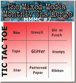
I’m also entering this in the Mixed Media Monthly Challenge #7. Tic Tac Toe. I used a Die (snowflakes), glitter and stars (both veneer and stencilled in the sky).

Enjoy, Rebecca

March 06, 2013

Miniature Doll Bedroom with Matchbox Bed

doll bedroomAs I’ve mentioned before, I swap quite a bit with Swap-Bot. I love getting fun mail, it makes an ordinary day much happier. I run a smaller subgroup which allows like-minded people to have even stricter rules and swap specific themed items which is fun but lots of work. One of my groups is Matchbox and More and I hosted a swap to make a doll bedroom.

doll bedroom2

The requirements were to use a matchbox as a bed, make a floor and two walls, one with a window and decorate the window and the room in general. And make or buy ‘someone’ to ‘live’ in the room. The matchbox used is approximately 2x1.5x0.5” so it’s pretty small. I used swatches from an online fabric store to make the sheet and blanket. The bottom of the blanket is loose so the drawer can come out then tuck back in. The headboard is actually part of the matchbox sleeve that folds up.

doll bedroom3

The room was sent flat so it is hinged on two sides but only temporarily adhered on the third side. The table is designed to fold flat too. The doll is made from felt and her features are sewn on using  thread as even one strand of embroidery floss was too thick! The curtain rod is part of a BBQ skewer and the curtains are more sample fabric with brad tie backs. The outer part of the window was cut with a square die but I didn’t have a die that perfectly cut the inner squares as the muntin bars would have been too thick so I used a die to cut the outer part of the square then trimmed the rest with an x-acto knife.

doll bedroom4

If you ever decide to join Swap-Bot, look me up. My username is thebragal.

Enjoy, Rebecca

RECIPE
Paper:
Spring Moss, ivory CS-PTI, floral DP-Cosmo Cricket, wood DP-MME, chocolate CS-scrap, wall art-Little Darlings-Graphic 45
Accessories: all stash unless otherwise listed, brads-CTMH, square Nestabilities

February 05, 2013

Interactive Card Zipper Card for PTI Challenge

PTI 6 ann

Nichole challenged us to make an interactive card in honour of their 6th anniversary. We were to be inspired by one of the team’s projects. Seeing Jessica’s fridge magnet with a photo of her son on it made me think of my son whose 12th birthday is today.  And I loved how Heather used die cut letters on one of her projects. While we don’t celebrate birthdays, this rather important milestone was on my mind. I guess the inspiration is a rather loose interpretation but still…

j is 12

So I made this card for him. Inside it has the following words. Energetic Fun Silly Caring Friendly Amazing. I won’t give it to him for a while so it doesn’t seem like a b-day card. It isn’t easy to line up the stamping underneath the tear strip unless you plan ahead so I’ve got a tutorial below showing you how I do it. It isn’t too hard but I have a couple of tips.

The grey keyboard keys are actually off a flexible keyboard. The kind you can roll up. My 5 yo tore it apart so I saved the keys for embellishments! At least something good came of it. The numbers at the bottom are from Boy Basics-Out of this World. I taped off most of the numbers so I count just ink some numbers individually and stamped the additional numbers to create an 11 and a 12.

So here’s how to line up whatever you hide beneath the tear strip.

1. Die cut your tear strip die (aka zipper die) and choose a scrap to use underneath the tear strip. Using a pencil, draw two parallel lines just less than 1\2” apart. Using slightly less than the width of the tear strip will ensure your stamping doesn’t touch the edges of the zipper opening on the finished card since they won’t be smooth and straight. Place the paper with the lines on it under the die cut, line it up with the tear strip and trace the notched end. Slide the paper so your notched pencil line disappears slightly under the die cut. Trace the other side of the die. Again, by making your pencil marks slightly smaller than the die cut opening, you ensure you leave space where the zipper strip attaches in case the recipient doesn’t tear it off completely.

tear strip interactive card tut5

2. Stamp your choice of images or sentiments within the pencil lines. Then erase your pencil lines so you can barely see them. I didn’t trim the notched end now because it makes it hard to line up later.

tear strip interactive card tut2

3. Add Scor-Tape or other strong adhesive to the back of the die cut close to the tear strip. As close as you can place it. Remove the backing except for the small portions shown.

tear strip interactive card tut1

4. Line up the stamped scrap using the faint pencil lines. Make sure no stamping shows from either end and you need to leave enough room to trim your notch.

tear strip interactive card tut3

5. Trim off the straight side flush with the die cut and trim out the notched end while looking at the back. Because you left the backing on close to the notched end, it is easy to get your scissors in. When you are satisfied with the trimming, remove the last bits of backing. You could cut the notched end in advance but it would be hard to line up the scrap. If you wish to cut it ahead of time, I recommend you use a larger scrap and when you draw the lines, mark another where the bottom of the die cut would be so you can use that to line it up. (Next time I’ll be more careful and cut it smoother.)

tear strip interactive card tut4

6. Add more Scor-Tape. You want to be sure that tugging the strip doesn’t pull the die cut off the card! For the top portion, I just used my usual adhesive. Burnish the adhesive well. Apply to your card or project!

tear strip interactive card tut6

I hope this helps you line up your die cuts!

Enjoy, Rebecca

RECIPE
Stamps:
tag and words (inside) CTMH, countdown numbers, ink splotches-PTI
Ink: Walnut Stain, Vintage photo Distress, Teal Zeal-Memento, pumpkin pie-SU!
Paper: kraft, natural white, chocolate CS-PTI, DP-MME
Accessories: foam dots-Jody Morrow, stencil letter dies-Sizzix, interactive die-PTI,

January 07, 2012

Snowman Gift Card Holder

Scroll down to see a photo of my NEW BABY!!

Even though I haven’t been posting here, I have been crafting still. Just too tired and/or busy to blog-sorry! This was for a swap I hosted on Swap-Bot to make a winter themed Gift Card Holder (GCH). I thought that by making it winter themed, it would work for any holiday or celebration.

snowman GCH

It is a trifold holder that' I’ve used before and it has a curved part (under the snowman) that can tuck into a slit cut in the lower half but I chose to omit the slit this time and use a Velcro coin to hold it closed. I can’t tell you how often I’ve made a gate fold card or a holder like this and I inevitably forget and add adhesive to the area that shouldn’t have any! Yeesh!

The snowman is stamped in three parts, one for each ball but the lower one also has the snowflakes included. I really think they should have included a large ball without the snowflakes so they could be stamped in different colours. So I stamped it in baja then traced the large ball with a black marker to match the other balls. They were stamped separately rather than masking where they overlap and adhered together. The hat was done separately too. I used Stickles in white and blue to accent the snowflakes both on the base of the snowman and on the blue base and the hat band.

Enjoy, Rebecca

RECIPE
Stamps:
Close to My Heart
Ink: baja breeze-SU!, Memento black, silver pigment ink
Paper: NQN, white CS-SU!,
Accessories: Stickles, Velcro-Walmart, Copics B11, 100 (black), C3,5,7, E39, YR16

May 18, 2011

Taylored Expressions Blast from the Past Blog Hop-Worst Day at the Beach

TE blast blog hop

Welcome to another TE blog hop! I hope you’ve enjoyed all the projects before mine! The theme this month was masculine cards. I have to admit, I used to be afraid of them but when you live in a house with 3 guys you have to get good at them pretty quickly!

te masc beach card

The sentiment came out a bit light, in case you can’t read it, it says, “The worst day at the beach is better than the best day at work.” AMEN! So, how do you make a beach themed card without using any beach themed stamps? Well, you start by using the boxers from the Hangin’ Out set and stamp them on patterned paper to make swim trunks. Then you steal the worst day sentiment from the Crafty Expressions set. And since ‘at the beach’ isn’t an fill-in option, you use JustRite stamps! Cool huh?

If you like my card, I hope you will visit again to check out my work; I have subscription thingies on my sidebar. If you’d like to see some of my blog hop projects from previous months, just click on the Blast tag at the bottom of this post. I love your sweet comments, I’m feeling yucky today and almost didn’t participate so even a short comment would make my day!

Enjoy, Rebecca

RECIPE
Stamps:
TE, JustRite
Ink: chocolate, not quite navy-SU!, Vintage Photo Distress ink
Paper: all DP and CS-CTMH
Accessories: border strip-PTMH, Labels4, square Nesties, foam dots-Jody Morrow, Copic B45

May 31, 2010

Clear Dollar Stamps Sneak Preview – Gone Fishin’

What an awesome set for guys! Perfect for the outdoorsy type! We all know bows and flowers won’t work for the men in our lives.

gonefishinRE1
Nothing too interesting to say that you can’t figure out from the picture. So this is part one of this gift set…

gonefishinRE2
This is part two. I used the tool box template from My Time Made Easy to make this great gift box. Inside is an instant coffee jar repurposed with a covered lid with trail mix inside. I meant to add some other stuff but I didn’t get it done in time. And even though it doesn’t include the images from this stamp set..

dad tackle box
Here is part three! A fishing tackle box with…

dad tackle box open

…a drawer inside! I was going to put gummy worms and candy bugs inside but hubby forgot to buy them on his trip to the store. Bummer! I figure between the tool box and the tackle box you could package so many things for the guys in your life. Both boxes are large enough for a tie (of course!) bath and body products, jewellery, snacks, baked goods or candy, fishing items (not that I know what they are called beyond weights or lures) and CDs or movies would fit in the tool box!

I hope you are inspired to make something great for the guys in your life! Today is the last day for the reveal by Clear Dollar Stamps for June! But there are more posts coming up for two other great guy stamps, so don’t miss them! Be sure to visit Clearly iStamp to see the other team members who are revealing this stamp set on their blogs and to see the full set!

Enjoy, Rebecca

RECIPE for card and tool box
Stamps: Gone Fishin’-CDS
Ink: Memento black, Antique Linen and Vintage photo Distress inks, chocolate chip-SU!
Paper: white CS-Taylored Expressions, kraft, artichoke, burgundy CS-SU! DP-CTMH
Accessories: hardware-SU!, hemp twine-stash, foam dots-Jody Morrow, letter stickers-Basic Grey, Nestabilities Labels 3, Copics: W3,5, E00,35,47,49,71, YR04, R59,89, BG96, G94,99, B32,39,45,93,95,97, C3,5,7

for tackle box
Stamps: BG wheel-SU!
Ink: Antique Linen Distress, cocoa, choc chip-SU!
Paper: cocoa, choc chip, ivory CS-SU!
Accessories: ribbon-May Arts, ‘dad’-sticker EK Success, jumbo eyelets-WRMK, hardware-SU!, foam dots and red line tape-Jody Morrow

May 26, 2010

Glittery Lateness for Whimsical Wednesdays!

OMW, in a year and a half, I have never FORGOTTEN a Whimsical Wednesdays (formerly Twinkling Tuesdays) post! So much has been happening that is other than my normal routine I seem to have been thrown a curve ball!

This week’s challenge, by Emilie and Kaeli, was to use lots of sparkle and glitter on your project. I made this cute little ATC that will go to a kid in a swap I am hosting, Kids Love ATCs.

ballet ATC
I added pink glitter to her tutu, white glitter to the DP using red line tape and Taylor’s Tiny Twinkles to her bun. I hope that is glittery enough for ‘s girls.

I’d like to send a HUGE thank you to Sweet Pea stamps for their generous gift of three stamps this month! They were an AWESOME sponsor! And much thanks to Randi for organizing the whole shebang!

So for June, we DareDevils are taking a break every week except next. But we have a HUGE prize package for anyone who plays next week’s challenge. And when I say HUGE, I mean HUGE!!!  Best thing, you may enter as many times as you like and you have ALL MONTH to play! Sound good? Tune in next week for the challenge and the hugest prize we’ve ever had!!!

Make sure the DareDevils get some love this week; be sure to visit all of their blogs and leave a nice comment. And don’t forget to play this week too! Upload using DDSC37 and link with Mr Linky using the DIRECT link to your project!

Enjoy, Rebecca

RECIPE
Stamps:
CTMH
Paper: riding hood red CS, DP-SU!, white CS-Taylored Expressions
Ink: riding hood red, Memento black, white-PTI (to tone down the DP brightness)
Accessories: Tiny Twinkles, Art Institute Glitter, foam dots-Jody Morrow, Copics: R20,22, E00,21,31,33,35,37,93

March 31, 2010

Where the Love Is for Whimsical Wednesdays

We have another  great sketch from the Diedrich gang this week. Thanks to Jack, I think, for the sketch I worked from but as it was on my iPhone I can’t show it to you. Wonder why? I like to keep my iPhone handy at all times. That includes reading emails while I soak in the tub. I know, it sounds crazy to have my beloved mini computer next to water but it has worked for over 1.5 years. Today, the baby picked it up while standing in the tub. I panicked and tried to grab it from him and I/we/he dropped it. It seems fine but we have it sitting in a container with silica just in case any water seeped in, so hopefully it will be OK. So I’m sorry but I can’t share the sketch with you.

home is where love is
The stamps for this card are actually a set with separate door, windows, clouds etc so you can kind of design a ‘scene’. I airbrushed the background, masking my clouds as needed. The flower stems are a dotted line stamp that I think was designed to be used as smoke from the chimney. The leaves were made with a heart stamp. I coloured the scene with Copics, the colours were on my iPhone too, sorry. I’m listing the ones I can remember: W 1, 3, 5 V95 (it was V9_) R 06, 81, 83 G21, 63, BG 10 B 12, 23,32, 4_, 91, 93, best I can do!

Thanks to The Character Cafe for their sponsorship this month. Visit next Wednesday to find out who the new sponsor is! Please visit the Whimsical Wednesdays blog for the sketch this week; I’m so sorry I can’t show it. I hope you will visit all of the DareDevil’s blogs; I’m sure they have FABULOUS projects to show you! Once you are done your take on the sketch, leave a DIRECT link using Mr Linky on the WW blog so the team can all see your work. Want to upload to a gallery? Please use DDSC29.

Enjoy, Rebecca

RECIPE
Stamps: CTMH
Ink: navy-SU!, black-Memento
Paper: blue (not sure which RR blue), navy CS-SU!, white CS-Taylored Expressions, DP-CTMH
Accessories: Copics, Copic Airbrush system, clear Dew Drops

March 14, 2010

Pink Dandelion Thoughts of You Card

This was a very fun card to make. I saw someone in blogland, I think it was Nichole Heady, make a card with the focal point embossed in white with ink swirled around the image. I just had to try it though I used a coloured ink instead of the white craft ink she used.

pink dandelion thinking of you
Isn’t it soft and pretty? This card is for a woman on a message board who has cancer. I haven’t been active on that board in over three years but I still get some notices sent to me directly and this request was one of them. I hope she likes it. Apparently, this lady is the first to send cards to others in need so I felt this was a great cause. It is also for CPS 158.

pink dandelion thinking of you closeup
Enjoy, Rebecca

RECIPE
Stamps:
dandelion and swirl verse-CTMH, thoughts sentiment-Our Craft Lounge
Ink: fresh snow-PTI, regal rose, pretty in pink-SU!,
Paper: sweet blush CS-PTI, white CS-SU!
Accessories: white pearls EP, velvet ribbon-stash, cuttle bug die, flower brad-Making Memories, pink EP (to colour brad)-SU!

January 26, 2010

Masculine Love Cards

It’s hard to make lovey dovey cards for guys right? I just got this great set from CTMH that made it so much easier. I’m making these for my craft sale so the attributes listed don’t reflect any particular person in my life but selected ones of course apply to my boys and hubby.

checklist1My instinct was to distress these so much more but I’ve read that a lot of people at craft fairs think distressing looks dirty rather than antique! Bummer!

checklist2I checked with hubby and he says these are guyish enough for even the manliest man.

checklist4

checklist3My almost 9 y o son thinks this last one is the coolest. He likes the screw head brads and the corduroy ribbon. It is really soft and fuzzy, I am having fun working with it.

I am so sorry I haven’t posted lately. I am just now, three weeks later, getting better from a cold. I don’t think I’ve ever had a stupid cold that has lasted so darn long. I hope to make up for it in the next week or so. Thanks for hanging in with me.

Enjoy, Rebecca

RECIPE
Stamps:
CTMH
Ink: chocolate, riding hood red-SU!
Paper: DP and coloured CS-CTMH, vanilla CS-SU!
Accessories: brads-stash, corduroy ribbon-May Arts, foam dots-Jody Morrow, buttons and twine-PTI, twill tape-stash, brown ribbon-stash

August 29, 2009

S’Mores Kit

This was a super fun project. My bff reads my blog so I couldn’t post it until I gave it to her. She and her family are camping this weekend at Sibbald’s Point Provincial Park. They don’t go often so this was a big deal for them. So I decided to surprise them with my version of a s’mores kit; in case you are wondering, my version includes peanut butter and chocolate chips instead of chocolate bars (cheaper too!) I spread the peanut butter on the graham crackers and dip that into a bag of chocolate chips. The rest is made as usual. Fun and Yummy, right? I also added bag clips to seal leftover crackers and marshmallows as well as knives to spread the peanut butter.

smores kit 01

I used a photo box as the base. I stamped trees all around the bottom using a modified rock n roll technique. I used olive over all, chocolate chip for the ground and tree trunks and artichoke for the tops of the trees. I say ‘modified’ rock n roll because normally the whole stamp is rolled in a single colour; here not only did I use two colours but I used them in selective areas.

smores kit 02

I put woodsy looking ribbon all the way around the lid and then went to work on the top. I used the SU! colour spritzer to add cocoa fly-specking to he lid. The rectangular chipboard was painted with acrylic paint, then sponged with close to cocoa ink and the dots were stamped with chocolate chip ink. The marshmallows were tricky; first I cut the edges off of circular chipboard pieces, then painted it white with acrylic paint. Then I tried Copics and dye ink sponging for a toasted look but it didn't look quite right. So I added a thin coating of Liquid Appliqué with a paint brush. OMW, then the dye ink started soaking through and I thought they were ruined but after I heated them, the ink that soaked through just made them look toasted, how I wanted them in the first place! YEAH!

The chocolate chips were stamped and individually cut out and foam dotted on. TO make the fire, I stamped a solid log stamp in cocoa ink on cocoa and caramel paper. For more interest, I stamped several logs with the stamp curved on the block. The flames were cut by hand, edges were DTP inked and I added some lines with a marker. The fire was assembled with clear pop dots. The lettering was done with foam and rubber alpha sets, with large letters in acrylic paint and the small ones in dye ink.

I am so sorry that I haven’t been posting regularly. I expect to go back to my regular schedule of at least 4 posts a week starting this week. A weird set of circumstances led to not much posting. For those of you who just subscribed, thank you and I promise, the postings will increase!!

Enjoy, Rebecca

RECIPE
Paper:
pumpkin, mustard, cocoa, ruby red, chocolate chip
Ink: cocoa, chocolate chip, caramel
Stamps: log-CTMH, small alphabet-SU!, large foam alphabet-Heidi Swapp, chocolate chip-Baked with Love by CHF, Lovely as a tree-SU!, Background stamp-Itty Bitty Backgrounds-SU!
Accessories: Liquid Appliqué, foam dots-Jody Morrow, clear dots-Zots, brown, white and red acrylic paint, chipboard-SU!, Ribbon-Stash (Michael’s $1.50 bin)

May 12, 2009

His and Hers Cards End Up Being TROUBLE

I decided to make cards for the current Flourishes challenge to make two cards, similar or the same layout, one for her, one for him. For the ‘hers’ card, I used CTMH cardstock because of the white core. I should have used it as a layer, not as a card base because it is too thin IMHO. Sorry Janet! (my girlfriend who sells CTMH!) The white core was great for dry embossing and sanding hersthough! I struggled on both cards trying to decide what to use as a focal image. Everything I wanted to use was horizontal not vertical and I had already added other elements preventing me from turning the card. At least, it didn’t look right to me the other way. So I ended up using a sticker by Melissa Frances and put baby powder on the back to prevent it from sticking to the card where there are no foam dots. Super technique!

his For the ‘his’ card I tried hard to find CS that would match. None of my basic SU! colours matched and that is pretty much all the CS I have. So I tried colours I don’t use much and found that the retired River Rock worked perfectly! Now that I think about it, Kraft might have worked nicely too! Why do I always think of this stuff later? UGHHH!! I had no buttons that matched in my button jar but Basic Grey Bittersweet buttons were perfect! Again, all the images I wanted to use were horizontal, same as the ‘hers’ card. Included in the Lil’ Man paper pack were some stickers. This card is actually for my hubby and I wanted the sentiment to say ‘Thank You’ but none of the stickers were anything close, I assume because it is meant to be a scrapping kit. Cosmo needs to do something similar to Basic Grey and come up with small versions for card makers. Oh well, ‘Hi’ works and I’ll just write ‘thank you’ inside. I also baby powdered the back of this sticker. I would have stamped thank you instead of using the sticker but I don’t have any ink that matches either!! This is the trouble with using mainly one brand of cardstock and stamps; everything matches perfectly until you insert the monkey wrench of another brand of paper!!

photoNow remember, this is a Flourishes challenge, that’s right- A STAMP COMPANY! URGHHHH. How could I have done that!! I rarely make cards without stamping and NEVER TWO IN A ROW!! I double checked the ‘rules’ and it doesn't officially require stamping. It does say you can use Flourish stamps but it isn’t required. I'm sure that means you can use other stamps, not NONE, but it doesn’t say ‘stamping required’!! I hope that if by some freak of nature I am chosen, they don’t notice that I didn’t use stamping and choose another random number. I don’t expect them to read this far down!! This layout’s origin is unknown because I saved it to my iPhone’s photo album and obviously the designer did not include a website or keyword. Let me know if you recognize it so I can give credit where credit is due. Did you also notice I forgot the three dots at the bottom and placed my oval and stripe at the midpoint of the card? I noticed my cards seemed a bit empty this way but did I check the layout? NO and now I wish I had imitated the layout more carefully. This challenge was nothing but trouble. If I get time, I am going to do it again properly! With a new layout and I am going to START with stamping!!

Enjoy, Rebecca

RECIPES

HERS
Ink:
cocoa-SU!
Paper: CTMH
Accessories: Melissa Frances sticker, ribbon-SU!, hemp twine, key-UK, Oval Scalloped Nestabilities, Cuttlebug Textile Folder, Foam Dots-Jody Morrow

HIS
Paper:
River Rock and Riding Hood Red CS-SU!, Cosmo Cricket Lil’ Man scrapbooking kit
Accessories: foam dots-Jody Morrow, Buttons-Basic Grey Bittersweet, hemp twine-UK, Cuttlebug Swiss Dots Folder

March 19, 2009

Silver Snowflake Card

This is the third and final So Sketchy card I did for my Guest Designer position for March! Again with this card, I chose to do something other than use the two vertical panels on the sketch. I used a single piece of patterned paper and split it down the middle with pleated ribbon. This ribbon isn't very wide and any adhesive I ss2 winter might use would gum up my needle and since I am using my $2800 sewing/embroidery machine, I am not about to screw it up with adhesive. So I started the ribbon with a backstitch, then as I sewed I used a bamboo skewer to push the ribbon under the foot thereby pleating it! I deliberately wanted it uneven. TIP: A bamboo skewer is a sewers best friend because unlike other tools meant for assisting while pushing or adjusting things under the foot, it will not break your needle! If the needle hits it by accident, it will split the skewer and you can simply remove it!

The nifty stitch is actually called a lightening stitch and is one you get on mid- to higher-end machines. It is actually used as a stretch fabric stitch for very stretchy areas like adding ribbing to cuffs and collars! I just thought it looked cool!

I do wish this card was a bit better proportioned. Had the start been larger and the ribbon wider I would have liked it better. The vellum circle is edged in silver ink and looks much better IRL!

Enjoy, Rebecca

RECIPE
Stamps:
CTMH
Paper: Aspen paper pack-CTMH, navy CS-SU!, vellum-UK
Ink: navy-SU!, silver
Accessories: silver snowflake charm, white snowflakes, ribbon-UK, pewter brad-SU!, thread-Mettler, foam dots-Jody Morrow
Techniques: sewing, pleating