March 29, 2015

Bird and Nest Bathroom Sign

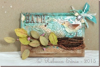
I’ve been wanting to make a bathroom sign for a long time. We have two doors close together and even when we direct someone to the washroom, they aren’t sure which door to open.

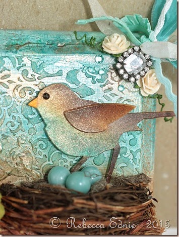
bird sign

We had a nasty computer paper printed sign in the ugliest font ever since our annual BBQ last summer. I was so sick of looking at it! So I pulled out a plaque that hubby brought home from work. Ya know those ‘employee of the month’ type cheapie plaques?  Yep, one of those. It’s not real wood so I sanded it down enough to let gesso stick and covered it in 4 coats.

bird sign3

Then I covered part of it in the damask stencil using molding paste. I allowed that to dry then added white crackle paste in a fairly thick layer to the unstencilled areas. After that dried, I added the roses stencil over the crackle. So much glorious texture! (check out the area under the BATH letters in the above photo) Then I added some mists over top. I added a mist to the bottom too but I didn’t like the colour so I over coloured it in Copic airbrushing. That was much better, a warmer colour.

bird sign2

Next I started to work on the nest and branch. The nest was premade but I had to cut it in half first. Before cutting it, I applied some gel medium to the area where I planned to cut it. Not such a good idea. It didn’t dry completely clear so I had to colour it and cover it up with some raffia. What a pain! I’d recommend white glue if you ever need to do something similar. To make the branch, I used some wire covered in some sort of natural twine type stuff. I twisted 5 pieces together, shaped them and glued on the leaves and buds.

The bird was made from 5 layered ivory die cuts coloured with Copic airbrushing. I used a black rhinestone for the eye. I added 3 beads to the nest for eggs. Then last but not least, I added the copper Perfect Pearls, the letters and the rhinestone and ribbon bundle along with some bling. The rhinestone already had a loop on it and that’s how I tied on the ribbons. I really wish you could see this in person; it’s soooo much prettier! I’ll try to add some closeups later.

mmmc10

I made this for the Monthly Mixed Media Challenge. This month’s theme was Birds of a Feather. Click the graphic to visit the challenge.

Enjoy, Rebecca
Roses Thanks Card for Mojo Monday

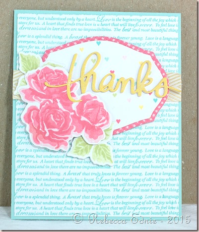
This week’s Mojo Monday was to make patterned papers with stamping and mix them together to make a card.

thanks roses mojo mon

I used my new MISTI tool to line up the text stamping and it works sooo well! Yeah! I ordered one and in the two weeks it took to get it, I noticed many times when I wished I already had it! It’s a truly amazing tool. The only drawback is that my magnets don’t work well through the foam so my paper can shift. But it’s not too hard to line it back up again.

My thanks die cut is made from a total of 5 layers of cardstock one yellow and 4 white. I wanted to lay it over the roses but as they were popped up, I was stuck because I didn’t want the die cut to be uneven; popped up on one end but not on the other. So I trimmed away the white layers behind the yellow thanks die to help even it out. It worked perfectly!

Enjoy, Rebecca

RECIPE
Stamps:
PTI BB: Hearts, BB: gingham, sweet life
Paper: white, blush, aqua, harvest gold CS
Ink: berry sorbet, harvest gold, aqua mist, spring moss, Hawaiian shores,
Accessories: foam dots-Sticky Stuff Store, ribbon-May Arts, Thanks die-Mama Elephant, other dies-PTI, wink of stella marker (on thanks die cut)

March 28, 2015

12 Tags of 2015 - March

I thought this month’s tag was quite doable. And quite pretty even though I decided to use lighter background colours.

TH tag 03 15

There are quite a few different techniques involved in making this tag; an acrylic paint background, masking, adding texture paste and embossing that texture paste. Be sure to visit Tim’s Blog to see the whole tutorial. I made mine pretty much the same except I chose not to mask my images. I just worked around the images mostly. I actually liked them overlapping some.

Enjoy, Rebecca

RECIPE
Stamps:
Tim Holtz
Ink: Archival black-Ranger
Paper: ivory CS-PTI
Accessories: various brands of acrylic paint, Golden acrylic paint, washi tape, stencil-Tim H., gold EP-SU!, Liquitex embossing paste, butterfly charm-Making Memories, other metal embellies, hand dyed seam binding ribbon, gold twine-stash

March 18, 2015

Thanks Card Set

Sadly my great-uncle is in the hospital dying. My poor great-aunt has been there as many hours as is humanly possible. Lots of people have been helping out, bring food etc. So I figured she will need some thank you cards shortly.

sweet sketch thanks

This first card is for the Sweet Sunday Sketch. I liked the wonky panel. I like my banners to point to the right though so I flipped the sketch. The banner is actually made from white CS swiped with Tattered Rose ink. It took ages because my pad is a bit dry. But the colour was perfect with this Theresa Collins paper.

260

This next one is one of my favourite CAS sketches. I die cut the Thanks and coloured it with Copic markers. I only used two so the ombre isn’t that pronounced but it looks nice. W5 and 7. Very simple but interesting.

ombre thanks

The last card layout was one I stumbled upon. I started by trying out the colours I was thinking of using on a scrap in the bottom. I didn’t like the colours so I stamped another bunch of hexagons higher up. This colour combo was much better but when I looked at my scratch paper, I had a much more interesting layout than the single cluster I had planned. I added two more clusters, to balance everything out, and ta da!

hex thanks (2)

I had one more happy accident. I had planned for a totally flat card. Very mailable but boring. But I couldn’t think of what to add. Then I goofed and inked the stamp I always stamped in yellow in the aqua ink and stamped. Not a pretty colour, NUTS! So I stamped it on scrap paper, cut it out and added it with foam dots.

hex thanks set

The top left and bottom right most hexagons are up on foam dots. I hope my aunt likes these. I kept her in mind when I made them as she loves soft colours and quilting. I think the hexagons look like quit squares, don’t you?

Enjoy, Rebecca

RECIPE

Thanks for Your Support and Ombre Thanks
Stamps:
Thanks all ways-PTI
Ink: cup o joe-HA, tattered rose, frayed burlap-Distress
Paper: Theresa Collins DP, kraft, white CS-PTI
Accessories: die-Mama Elephant, W5, 7

Hex Thanks Cards
Stamps:
Hexagons, Thanks all Ways-PTI
Ink: harvest gold, sweet blush, melon berry, aqua mist-PTI
Paper: white, harvest gold, sweet blush, melon berry, aqua mist CS
Accessories: foam dots-Sticky Stuff Store

Butterfly Shaker Card

This is for the latest CAS(e) this sketch Challenge.

butterfly shaker

I immediately thought about the center rectangle as a recessed area leaving the outer edge was a frame rather than elevating it as a panel. So what to fill the frame with? Of course, a shaker pocket!

CTS_Sketch_114

I used Lawn Fawn and Pretty Pink Posh sequins along with Martha Stewart heart glitter which is so big it’s more like small confetti pieces. The inner panel was cut from the middle after stamping. It was a bit tricky getting the inner panel aligned correctly after adding all the foam without letting the sequins fall out. So I closed the back by replacing the panel and attaching it to the foam on the frame with a piece of copy paper. Then I added the entire thing to the card base.

Click on the sketch to visit the challenge.

Enjoy, Rebecca
RECIPE
Stamps:
Altenew
Ink: chocolate, hawaiian shores, hibiscus burst, raspberry fizz-PTI
Paper: white, aqua mist, hibiscus burst CS-PTI
Accessories: foam tape-Dollar store, sequins-as above, rectangle die-Spellbinders, Wink of Stella pen, love you die-SSS

March 15, 2015

Watercolour Smooshing for Make It Monday

rainbow smoosh

I have to be honest, I prefer this technique with Distress inks but it was fun using some bright new colours. I’ve actually been doing this technique for a long time as it’s pretty much the same as Tim Holtz’ no wrinkle distress technique. I tried it on regular card stock and I’ve got to tell you, I didn’t like the result. The paper was all bumpy and yucky. No idea why, I used good cardstock!

I placed this panel on a hibiscus burst notecard which you can’t tell from the front view. I forgot to take a side view. It’s quite a fun surprise when you open it! To get the gold edges without using a big piece of pricey gold paper, I used a gold paint pen on the edges of the card base (disguising the bright pink from the front) and on the white panel under the aqua mist panel. It’s hard from this view to even see that it’s another panel and not just a gold edge on the aqua one but trust me ;)

I’m entering this in Make It Monday.

Enjoy, Rebecca

RECIPE
Stamps:
Thanks all Ways-PTI
Ink: hibiscus, melon berry, harvest moon, blueberry sky, winter wisteria-PTI, certainly celery-PTI, versamark
Paper: W&N watercolour paper, white, aqua, hibiscus CS-PTI
Accessories: Krylon gold paint pen

Runway Inspired Card with Smooshing

I was inspired by the most beautiful dress on the Runway Inspired blog. It reminded me of the rose gold Pearl Ex have had for so very long but never used.

rose gold love this card

I started with a 4x5.5” panel of watercolour paper. I smooshed it in a combination of pink watercolour paint and gold pearlescent watercolour paint. Shame it doesn’t show up more but it’s the perfect colour. Then I stencilled on some transparent embossing paste mixed with rose gold Pearl Ex using a diagonal line stencil. It looks so pretty. I’m amazed my picture shows it off at all! Then I die cut a piece of white cardstock covered in Scor-Tape. Next time I will try the new Ken Oliver thin adhesive and or thinner cardstock because it took me ages to get through both thick layers and the backing paper.

oscar

I mounted the panel to a pink card base with gold glitter tape on one side then covered the die cut liberally with warm micro fine glitter and burnished it well. I mounted it on foam dots, leaving a couple of leaves adhered to the background directly and a few with a double layer. This gives it a more realistic feel than if it was all on one layer. Last but not least was the gold embossed sentiment and a few sequins.

I’m entering this in the Runway Inspired challenge.

Enjoy, Rebecca

RECIPE
Stamps:
SSS Love This
Ink: versamark
Paper: Windsor and Newton watercolour paper, blush CS-PTI
Accessories: gold EP-SU!, clear sequins-Pretty Pink Posh, W&N paint, Niji pearlescent paints, Wendy Vecchi translucent embossing paste, rose gold pearl ex

March 14, 2015

Rainbow Butterfly Canvas

I was inspired by the Simon Says Stamp Monday challenge blog to make this canvas. The challenge was to make something starting with the letter B.

rainbow butterflies canvas

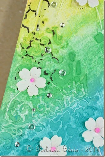
Then the Wednesday challenge’s theme was Things that Fly. How perfect! I used a canvas board from the Dollar store that I prepped a while  ago. I started with some patterned paper strips which you really can’t see but they do add some texture. I covered that with gesso. Then I randomly added some texture paste using three different Prima stencils. Then I experimented with the new Prima line of art supplies, using the white crackle paste to apply a thin, splotchy, uneven layer over the canvas, adding a bit more in blobs near the edges. I left it that way until I decided what I wanted to do with it.

rainbow butterflies canvas closeup

I’m a big fan of Laura Bassen and her love of rainbows has worn off on me. So I went with a bold fun paint scheme. Usually when I do mixed media art, I use Golden Fluid Acrylic paints which are much higher quality than craft paint. But I didn’t have all the colours I needed so I went with some craft paint. Wow, what a difference. Besides the opacity (fluid acrylics are somewhat translucent), there was a huge difference in drying time and workability.

rainbow butterflies canvas closeup purple

I can keep adding water and move the fluid paints around almost indefinitely while the craft paints didn’t react to the water in the same way. You can see the difference near the stencilling. In the purple and pink areas, the fluid paint pooled nicely just like I wanted it to. But the craft paint didn’t thin out in the same way so it covered everything more equally for a less dynamic effect. But if you want opacity, the craft paints are great!

rainbow butterflies canvas closeup pink

I randomly stamped a couple background stamps without using a block which makes it patchy and uneven. The butterflies were created by stamping on die cuts of Art Parts Clear Film. I made the stamp using Quikutz stamping foam which I die cut using a Memory box die. Then I cut the art film with the matching solid die and stamped it with Staz-On ink. Then you form the butterflies into any shape you want with a heat gun.

You can’t keep it too close or it will start to shrink but it can take quite a bit of heat from a bit further back. The die cut bodies and antennae from black cardstock and covered them with black Liquid Pearls. The middles sunk for some reason but I liked how it looked anyways. More insect like and less perfect. The word was hand drawn, cut from cardstock and covered with white Glossy Accents.

If you have any questions, let me know. I’m also entering this in the Crazy for Challenges #277 to bring on the bling. I used rhinestones, Liquid Pearls and sequins on this.

Enjoy, Rebecca

RECIPE
Stamps:
French Script-SU!, Moroccan background-A.Muse
Ink: Staz-on black, Archival black
Paper: Basic Grey Curio
Accessories: rhinestones-Taylors tiny twinkles, sequins-Pretty Pink Posh, Clearly for Art Film, Quickutz stamping foam, Liquid Pearls-Ranger, various craft paints, Golden Fluid Acrylic paints, flowers-stash, Liquitex embossing paste, Prima stencils, Golden gesso

March 09, 2015

Whimsical Baby Card

The Friday Mashup for the next two weeks is a combination challenge. You have to choose two old challenges and use one or two elements from each. I chose #4 which is Make a Baby Project and Use Punches. And #7 to make a Feminine Project with Ribbons/Pearls. And just for kicks, I added the sketch from #21.

fri mashup 200 ann baby card

I used the punch to cut the scalloped edge at the top of the dotted panel. I used a pearl pen to ‘colour in’ the doodled lace on the onesie. I think the other elements are pretty obvious. I layered the heart and the word. The ‘baby’ die cut has all pink layers underneath. It looks so cute from the side. Same with the heart. I used a micron pen to doodle.

10959302_10203549997739255_7045455550433877867_n

Thanks for so many great challenges Friday Mashup! Click on the photo to go to the challenge.

FM22LesleyF

Enjoy, Rebecca

RECIPE
Paper:
Echo Park New Baby Additions and Dots n Stripes, aqua mist CS
Accessories: baby, heart and onesie die-Echo Park, epoxy hearts-MME, ribbon-unknown, EK Success Scalloped punch,

March 08, 2015

Howdy Neighbour

I made this card for a family I know who is into horses. I haven’t seen them in a while so I thought they might appreciate this card.

howdy neighbour

I think this was also for a a sketch challenge because this isn’t exactly a card layout I’d think up myself. But as happens about 50% of the time, I forgot to link it up in time. sigh…

Dontcha love those wooden embellies? I love using wood veneers, but especially on more rugged themed cards. The twine was supposed to look like a lasso. Did it work?

Enjoy, Rebecca

RECIPE
Stamps:
MFT
Ink: cup o joe-HA, (don’t recall the other colours)
Paper: DP-MME, kraft CS-PTI
Accessories: twine-May Arts, wood veneer stars-Studio Calico, Copic marker (circle around horse head and colouring veneers), circle dies-Spellbinders, lace-vintage, wooden dots-MME

Masculine Thinking of You Card

Sadly my great uncle is sick in the hospital. I knew he would love a card but most of my get well cards were too young for him. So I set to work.

masc get well

We are both very religious so I knew he would appreciate this stamp with a scripture on it. While it doesn’t exactly say ‘get well’, I don’t think it needed to. The buttons look too bright for the card colours but IRL they are a perfect match. This is a pretty basic card so there isn’t much to tell you about. Click on sketch to visit the challenge.

mojo387

Enjoy, Rebecca

RECIPE
Stamps:
SSS
Ink: Grey Flannel- Memento
Paper: light grey CS-SU!, dark grey, ivory CS-PTI, DP-MME
Accessories: buttons-Basic Grey, embossing folder-Sizzix

Lace and Roses Mini Pail

This is for the Shabby Tea Room Challenge this week.

lace and roses pail

I took a basic pail I got from either a dollar store of the Dollar Spot in Target and added some metallic rub-on to the outside. I quickly realized that, even with heat setting, it wasn’t going to set. Bummer. So I added some workable fixatif. Bad idea. It seemed to work but if rubbed to hard, it came off. Then I tried adding some red line tape to attach the lace. The first piece of tape wouldn’t stick at all and removed the rub on and fixativ from the area I was taping and a bit beyond. Seriously? I decided to embrace the uneven nature figuring it lent to the distressed look I was going for.  At least the second piece of tape stuck.

TSTR _247

Next I added a Spellbinders fancy label which I stamped and distressed with more rub-on. I used ribbon to attach the label and added some pearls. I didn't have quite the right colour of roses so I added some Copic airbrushing to them. Perfect! These were adhered over top of some mini ivy die cuts. I used Copic markers on white paper to get just the right colour. Click on the photo to link to the challenge.

Enjoy, Rebecca

RECIPE
Stamps:
SU! french script
Ink: Cup o joe-HA, melon berry-PTI
Paper: ivory-PTI
Accessories: vintage lace, raspberry rickrack-stash, roses-Really Reasonable Ribbon, pearls-Dollarama, pail-dollar store or dollar spot, ivy die-Memory Box, rub-on metallic paste-stash, Krylon workable fixatif, label die- Spellbinders