April 25, 2015

Navy and Pink PTI Blog Hop

pti blog hop logo

Welcome to another PTI Blog Hop! My card was made when I was very tired this morning, I got up early because I couldn’t sleep, so please forgive a lack of inspiration. Overall though, I think it’s a pretty card worth posting.

navy pink PTI hop 0415

I really wish PTI made a cardstock that was about halfway between blush and hibiscus and not peachy/coral like Melon Berry and Berry sorbet. Then I would have used that for the sentiment panel and the flowers would stand out more. IRL the sponging on the edges of the flowers shows more and they stand out from the background a bit better.

04 15 PTI hop insp

Such a gorgeous inspiration photo right? The flowers were made with a die from Memory Box and I took the time to shape them nicely before adding them to the card. I should have sponged them before shaping them though so I will make a note to myself for next time. Not only did they not sponge very smoothly but the tiny tab used to keep the flower 3-D

navy pink PTI hop 0415 2

I love making lots of types of cards but I find myself using get well and thanks most so I love having lots of choices of sentiment in these two categories. This set, Healing Touch Sentiments, has lots of options. I am dying to get a Get Well die though. Anyone know of one? The only one I can find, from Hero Arts, isn’t in a font I like too well.

_121

I used Cardabilities sketch 121 for this card. Isn’t it awesome? They have the best sketches for all cards but especially shabby chic ones.

Enjoy the rest of the hop! Rebecca

RECIPE
Stamps:
fancy flourishes, Healing Touch sent-PTI
Ink: Paris dusk-Memento, hibiscus burst
Paper: DP-MME, cardstock all PTI
Accessories: Cherry Blossom die-Memory Box, Labels 8-Spellbinders, leaves die-SSS, gem-stash, border die-PTI
Tools: MISTI, Embossing stylus
April 14, 2015

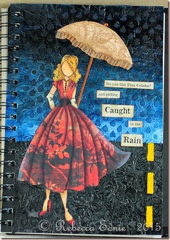
Do You Like Piña Coladas?

And getting caught in the rain? If you’re not into yoga and… Ha! Remember that old song? Once I got this page almost done, I just couldn’t think of any title that worked better!

pina colada journal page

I started with the challenge by The Monthly Mixed Media Challenge: April Showers. Then the Wednesday prompt for the Simon Says Stamp blog was April Showers and/or May Flowers. So I went to work. First I added crumpled tissue with gel medium then raindrop stencilling to the top of the page and large roses to the bottom. When it came time to add colour, I was a bit stuck. I already made a canvas using another Julie Nutting Doll with a clear blue sky and nice green grass. I didn’t want to repeat that. So I thought of a night sky! I used Golden fluid acrylic paint to cover the page.

pina colada journal page2

On the bottom, I added silver rub on metallic paste to the raised areas. You don’t even realize it is there but it makes the road look shiny and highlighted. I coloured and paper pieced my doll. I made my own stencil to make sure that the road lines were the same size and shape. At this point, I realized that this elegant lady probably wouldn’t be out in the rain without an umbrella. and I started thinking of the title. Even if you like getting caught in the rain, you might not want to get wet!

pina colada journal page3


Her umbrella is made from white cardstock and lace which I sewed to add the ruffle. Then I sprayed it with Colour Bloom spray. The handle is a bamboo skewer split down the middle and shortened to make it fit better. Her dress is much brighter and more dramatic IRL. For some reason, it looks really washed out. The necklace is made of tiny rhinestones.

11059541_10103758810041442_6189866901523683071_o

Finally, I printed the sentiment using a font called Old Newspaper. Since the song is about a personal ad in the paper, I sponged on faded burlap distress ink on the whole piece and vintage photo lightly on the edges. It does look like old newsprint.

Enjoy, Rebecca

RECIPE
Stamps:
Prima
Paper: journal page, printer paper, Basic grey paper pack, Georgia pacific white CS
Ink: black memento
Accessories: Prima stencils, golden paints and gel medium, big brush marker, Copic markers, Liquitex light moulding paste

April 13, 2015

Messy Wire Wrapped Bangle and Earrings

I’ve been making jewellery again! I find it really creatively inspiring to try making something other than paper crafts once in a while.

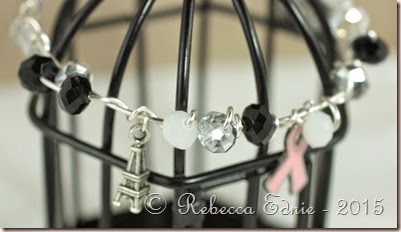
messy wire wrapped bracelet1

I started with a typical wire bangle but used much more wire. When I finished the first round of wire, I made sure it fit me perfectly then just kept wrapping! Some of the beads were added to the bracelet at the beginning and some in the subsequent wraps. I added the charms last. This may seem difficult but I assure you it isn’t. If any one would like to know how, maybe I’ll make a video!

messy wire wrapped bracelet2

There is room for more charms if I want to add more. I also made some earrings to match.

messy wire wrapped bracelet3

The earrings are made from silver sheet that I sawed myself. Then I textured the metal with a ball peen hammer. I also made the ear wires. The Chinese Crystals are from ZnetShows. They have the most gorgeous beads. These arrived in a mix of the black, clear and white. Some of the clear ones however, have a silvery coating on half the bead. They are so shiny! I have also made a barefoot sandal using these beads but I need a pedicure before I can photograph it.

messy wire wrapped earrings

They also make the best cultured sea glass beads, pendants and pieces. Full disclosure, I was provided with these beads but I wouldn’t use them unless I thought they were high quality.

Enjoy, Rebecca

April 12, 2015

Vacation Island for Mojo Monday

I got some new Kaisercraft paper and it was so fun to play with it.

my island mojo

My mojo has been a bit low lately; I’ve been doing so much organization, it’s kind of sapped my creative energy. But as I worked on this, I just got more and more happy. I have to make a note to myself that anytime I’m not inspired I should go to this paper pad!

Mojo392

Click on the photo to visit the challenge.

To make the sun set background, I used Distress Markers. To make sure that the colours blended, I spritzed the stamp then dabbed off the area where the colours meet. Then I spritzed again. I love the effect! I stamped on the island using my MISTI to line everything up. It wasn’t perfect but it was user error. The MISTI placed the stamps exactly where I aligned them. I love this tool and it is totally worth the cost.

The card was sprayed with gold Glimmer mist when I was done and it looks great! Shame it doesn’t show up. I also added a few brushstrokes of Rock Candy Distress Crackle Paint. You can’t see it very well as the angle isn’t right and the cracks are very fine but it does add a bit more texture. The button was don a while ago so I don’t remember what I did too well but I remember adding Copic airbrushing to change the colour. Then the ink stayed tacky so I covered it with, I think, Glossy Accents. The finish ended up kinda cracked and textured which was really cool. The charm is covered in Sharpie paint pen to change it from silver to gold.

RECIPE
Stamps:
My Island-WMS
Ink: chocolate-PTI
Paper: kraft CS-PTI, DP-Kaisercraft
Accessories: shell ribbon-May Arts, shell charm-Fire Mountain Beads, button-PTI, gold and white thread, Copic Markers, faded jeans, broken china, marmalade Distress markers, Rock candy paint, Sharpie paint pen