May 31, 2009

Clear Dollar Stamps June Guest Designer Application

Here it is! My card for my application. The rules for this Supply Challenge were as follows: Brads, Designer paper, Ribbon, 1 stamp set for images and sentiment or one stamp set and computer generated sentiment. Other suggestions: keep other embellishments to a minimum, use CD stamps of course.

I have been wanting Clear Dollar Stamps for ages; I have several sets on my wish list. I sadly have not gotten the $ for them yet. **SIGH**  So I hope they will forgive me and notice my entry anyway. TO THE JUDGES: I don’t know if you have time to read anyone’s text in their posts. But just in case you read this, I will really work hard to fulfill all responsibilities involved in being  your Guest Designer. Please see the rest of my blog or my SCS gallery (no fancy user name, just Rebecca Ednie). Thank you.

cd stamps june guest designer2 
 Enjoy, Rebecca

RECIPE
Stamps:
SU!
Ink: Memento brown, celery, pretty in pink-SU!
Paper: celery CS-SU!, Taylored Expressions-Choice White CS, Basic Grey Porcelain
Accessories: ribbon-May Arts, brads-Basic Grey, Copic markers, pearl-SU!

May 30, 2009

Blog Candy Alert

Woo Hoo! Bety of Iralamija is celebrating 500 blog posts. I haven't
followed her blog for long because I just found it but it is GREAT!!
Have you noticed my vintage/shabby chic style lately? Bety and Melissa
Phillips of Lily Bean's Paperie have inspired me so much. So go visit http://iralamija.blogspot.com
and leave a comment to be entered!

Rebecca

May 29, 2009

Dad Card for Etsy

This card goes with the ‘You’re a STAR’ gift box I posted a couple days ago. Most of it is pretty straight forward. The star was painted with espresso acrylic paint, crackle medium and a blend of tan and white paint on the top. I just love crackle, don’t you?? I prefer the Tim Holtz one-layer crackle paint for convenience but the crackle is much more interesting when you use the three-layer method, so I do use it when I have time or don’t have the colour I want in the one-layer version. How I did the button is kinda interesting. It vintage dad cardwas already carved in the swirl pattern you see. I covered it in currant alcohol ink but it was a bit too dark so I took a nail file I keep for crafting purposes (and taking care of the occasional broken nail when I am too lazy to get up from my desk!) and lightly sanded it! Perfect and much more interesting! I threaded 4 thicknesses of very fine hemp twine I found in a little art store in The Beaches (a cute little neighbourhood along Lake Ontario in the east part of Toronto), knotted all 4 strands together rather than an overhand knot. If you try this type of knot and have trouble getting it close enough to the button, slide the tip of any large needle or fine-tipped tweezers into the knot and coax it towards the button BEFORE allowing it to tighten. The distressing worked well everywhere except the ivory panel with DAD on it. I tried using the cotton ball I had soaked in alcohol ink to do the button and it didn’t go on as smoothly as I had hoped. I still like the card over all though.

Enjoy, Rebecca

RECIPE
Stamps:
alphabet-SU!
Ink: caramel, cocoa, artichoke, ColourBox dark brown chalk ink
Paper: kraft, artichoke, confetti ivory, chocolate CS, DSP
Accessories: star chipboard-UK, Button, ribbon and hemp twine-UK, Making Memories white and tan acrylic paint, Folk Art crackle medium, Ranger Paint Dauber espresso paint, jumbo eyelets-WRMK, Ranger alcohol ink currant

May 27, 2009

You’re a Star Box-Dad or Grad

I don’t usually make items specifically for Etsy but since nothing has sold yet, I figured I’d make a couple things specifically for the season. Hoping to get more traffic! This box was created with my slightly altered version of Papertrey Ink’s Timeless Template called Ready, Set, Wrap. I found that it was NOT symmetrical which I found very annoying but it wasn’t hard to remedy by folding it both ways and fixing it. Still worth the $5.

dad grad box
dad grab box back
The base is close to cocoa sponged with the same ink. The side panels are stamped with vintage images and sponged with close to cocoa also as well as both front and back paper panels. The chipboard star is covered with cardstock and stamped with a crackle background stamp.

Enjoy, Rebecca

RECIPE
Stamps:
rough edges alphabet, weathered background stamp, various stamps from Office Ephemera and Travel Post
Ink: close to cocoa, riding hood red, old olive, Adirondack black, night of navy, chocolate chip, bravo burgundy, creamy caramel
Paper: kraft, close to cocoa, confetti ivory, riding hood red CS, DSP
Accessories: button-Basic Grey, hemp twine-UK. All products by SU! unless otherwise noted.

May 25, 2009

Vintage Baby Shoe Card For MTTSC 24

I have to get out of Etsy mode to write this post! I just added 4 things to my store and I get into sort of an advertising mode of writing to try and entice people to buy my stuff. I’m sure it doesn’t make any difference as most people certainly choose what to buy based  on photographs but it can’t hurt to point out all the vintage baby shoe cardlittle  details, right? That is if they ever even hit on my store. There are so many stores, if anyone had any ideas for attracting traffic, I’d love to know!! I love making baby cards, babies are the nicest sort of people aren’t they? It is pretty obvious how to make this card so I don’t bore you with the details.

clip_image002This is yet another wonderful sketch from Madelynn. She made it easy this time; I only omitted the vertical ribbon. I do hope you will try out this sketch! Upload your card to SCS or PCP with MTTSC24 or to your blog then link it up to Madelynn’s Twinkling Tuesdays blog so we can all see your work.

Enjoy, Rebecca

RECIPE
Stamps:
Tagger’s Dozen
Ink: blush
Paper: blush, sage, confetti white CS
Accessories: Melissa Frances sticker, hand and foot embellishments-Jesse James, pearls-Kaisercraft, gathered ribbon, ivory ribbon-UK. All products SU! unless otherwise noted.

May 24, 2009

Shabby Chic Box for Gal Pal Challenge #4

My challenge to Cassie was to make a box with at least one side that is NOT rectangular or square. Cassie added that we must use a border punch. Interesting considering that border punches only punch in straight lines! I decided to use a Timeless Template gal pal 4 called Ready, Set, Wrap. Looks like a bowling ball bag to me; very unusual shape. I decided to go with a very shabby chic look, it ended up being a bit shabbier than I expected but once I decorated it, I decided I really like it. I have no particular use for it so look for it in my Etsy store!! The heart chipboard was coloured with a Copic. I wish I had used glimmer mist! I will have gal pal 4 back
to try and take it off and add it! The twill tape was dyed with tea to get a mottled vintage effect.
 
The butterfly was punched twice from patterned paper. I glued them together using the floral as the top butterfly and the solid brown s the bottom butterfly, in the photo, it just looks like a shadow but I wanted the contrast underneath to separate the butterfly from the background. The papers are sponged with creamy caramel ink. The flower is one my friend Rebecca made, it was white with a yellow center but I coloured it with a SU! pale plum marker. The pearl in the center was coloured with a Copic marker.

Enjoy, Rebecca

RECIPE
Stamps:
flourishes-Autumn Leaves
Ink: close to cocoa, creamy caramel
Paper: DSP-, kraft, confetti white CS-SU!
Accessories: chipboard heart, Copic marker, flower-Rebecca Wu, Pearl-Kaisercraft, twill tape-UK, butterfly and border punches-MS

May 23, 2009

Mini Shaped CAS Card

Another quick and easy little card. This measures a bit less than 4x4” I think. It is the largest of the Label 1 Nestabilities dies.  Instead of cutting a full layer of the stripes and then cutting it to size, I marked the die with permanent marker and lined up my paper cutting only the piece I needed. Saves paper, right?!

butterfly grateful card
I used Eclipse tape to hold the die and paper to my Cuttlebug plates so they wouldn’t shift. For beginners info, Eclipse tape is basically a roll of paper with repositionable adhesive used for masking; it comes in several widths. That way you don’t have to use repositionable adhesive or press normal tape to your pants or carpet to get fuzz stuck to it reducing it’s stickiness. The problem with repositionable tape is that it can transfer from the surface you adhere it to and get on your final work. I was making a one-layered card with lots of masking; I added repositionable adhesive to the mask. As I brayered over my mask, the adhesive transferred to my card. I tried to remove it but I couldn’t find my adhesive eraser and so the card ended up in the round file :(  I haven’t tried Eclipse tape for this but I hear it works. Normal tape isn’t too bad for holding paper and a die in the Cuttlebug but if you misjudge how much fuzz you need, your tape can be too sticky and can tear your paper. And of course, it simply doesn’t work for masking. Eclipse tape does both!! For a tutorial teaching you how I made the shaped card, Click HERE.

Enjoy, Rebecca

RECIPE
Stamps:
grateful
Ink: pretty in pink
Paper: white, pretty in pink CS, stripes
Accessories: pretty in pink ribbon, MS butterfly punch. All products by SU! unless otherwise noted.

May 20, 2009

Two Announcements!! Super Easy Monochromatic CAS Card

Announcement #1 My fab gal pal Rebecca (yeah, I know it is weird, same name) is going to be selling those wonderful crocheted flowers that are so popular right now through my blog. Not only will they be slightly cheaper than available elsewhere (Canadian dollar rates give you about a 15% discount) but she/we will be taking orders for colours and styles! No buying unknown colours in a pack like SOME stores! Almost any colour is available by using embroidery floss; you can request a specific colour by number if you wish. She is also going to make some special ripple-y petalled and double-layered ones!  For example, a typical single-layered, 5-petal flower 1” will be $1. You can request slightly larger ones, about 1 1/4” for layering. Double layered with connected centers will be $2. I will be adding photos with prices soon!

Announcement #2 I now have an Etsy store, link at the top of my sidebar! I know a lot of you reading this make your own cards and are here looking for inspiration and ideas but if you don’t make enough for friends or relatives, I’d love some referrals.

plum CAS prayer card Oh yeah, baby! It doesn’t get any easier and quicker than this! Easy Peasy Lemon Squeezey!! LOL! I was inspired by the CAS  blog(Clean and Simple). Two colours of paper, two punches, two inks, two embellishments, three stamps and three adhesives.

Enjoy, Rebecca

RECIPE
Ink:
Perfect plum, pale plum-SU!
Stamps: posies-SU!, sentiment-UK
Paper: white, pale plum
Accessories: foam dots-Jody Morrow, flower-Rebecca, rhinestone-K & Co, Ticket corner punch-SU!, border punch-MS

May 18, 2009

Shabby Chic Moments Card for Twinkling Tuesday

I LOVE this card. It just makes me happy to look at it! No special purpose for this one; just more practice at shabby chic. Hope you like it. I LOVE the sentiment most of all, it really sums up the time I spent with my babies. My ‘baby’ is now just a few days from being TWO. While I still consider that a baby, I know a lot of people don’t. **SIGH**

Today I played with a few ink pads I’ve had for ages but have never or rarely used. Instead of acrylic paint for the white on my shabby porcelain measured breathsKraft CS base, I  used VersaMagic, a white pigment-based ink instead. Almost the same look with less mess and clean up. I started by swiping the pad over the CS but it wasn’t as opaque as I had hoped for. So I pressed the pad straight down on the CS and after getting enough coverage, I swiped it to remove any lines caused by the edges of the foam pad. Then, knowing I would have to use a pigment ink to get any brown distressing, I got out a Colour Box Cat’s Eye brown chalk ink. For beginners info, virtually all pigment inks act as a resists to dye inks. While you clip_image002might have gotten some decent coverage from dye ink, it would rub off on everything it touched including me and other papers and embellishments I was using because the pigment ink prevents the dye ink from soaking into the CS. The chalk ink worked well. On the pink layer, I used Distress inks – frayed burlap and tea rose – to distress and sponge it, same with the blue layer. The swirls and sentiment were stamped with the same Colour Box pad. The card opens to the right, I cut a slit in the spine to accommodate the twine.

This great layout is from Madelynn’s lil’ brother Jacky for Twinkling Tuesday! Fun sketch right?? We all hope you will play along! Create something fabulous using this sketch-doesn’t have to be a card!!-and upload to SCS or PCP using the keyword MTTSC23 or upload to your blog. To be sure we all get to see it, come on over to Madelynn’s blog, Twinkling Tuesdays and link us up so we don’t miss it!! Be sure to visit all the other Twinklettes and leave ‘em all some fabulous comments. (PS I love comments too!)

Enjoy, Rebecca

RECIPE
Stamps:
sentiment-Verve, Swirls-Autumn Leaves
Ink: Colour Box dark brown, Distress frayed burlap and tea rose, VersaMagic cloud white
Paper: Kraft CS-SU!, pink-Porcelain by Basic Grey, blue dots-UK
Accessories: foam dots-Jody Morrow, roses, lace and twine-UK, button-Basic Grey Eva, SU! bashful blue marker

Dreamy Dancer Scrapbook Page

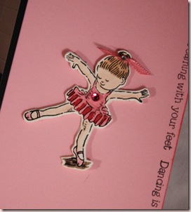
I had a friend/student over last night to play with some ideas to help her scrapbook with a bit more pizzaz. She is currently using stickers, borders and some patterned paper but wants to get into using some larger focal pictures and more techniques. We started by creating a 12x12” page of custom patterned paper which we were going to use on this layout but it didn’t look right because dreamy dancer
the images were too large with this many photos. It was time consuming because we coloured the images but worth it because she is going to use it on another page. I’ll show you the paper another day. Here is the page we worked on. A few of the photos  aren’t the greatest quality because she was using her mom’s  camera and wasn’t used to it but they are so cute, they were worth using. Sorry my photography isn’t great either. My photo booth isn’t much bigger than the page so it is hard to get the lighting right.

We stamped the base page with the phrase, “Dancing is like dreaming with your feet.” around all 4 sides. The stamps are clear so it wasn’t too hard to line up. The stamps on each end were dreamy dancer closeupstamped first to allow the middle ones to be centered nicely without measuring.  Shawna is going to add rhinestones to the corners of her black mats to bring out a bit more sparkle in her page. Now that I look at it again, I think Shawna could also draw in an oval around the chipboard accent in pencil and add maybe 5 rhinestones at both the top and bottom of the oval. Sort of framing her without using too many rhinestones. Basically an arc above and below her. The ballerina accent is actually stamped on vanilla CS with Stazon, then glued to an ivory chipboard coaster, coloured, cut out, then sanded smooth. I saw Lauren Meader do this a few posts ago, her blog link (My Time, My Creation…) is on my sidebar if you want to take a look. She has a video teaching you how but definitely start with light-weight chipboard for this. Mine was medium-weight and I spent ages cutting it out. Isn’t she so worth it though? Thanks to Karen for NOT asking for this set back yet! Shawna, I promise new content tomorrow!! Already pre-posted!

Enjoy, Rebecca

RECIPE
Stamps:
ballet dancer-CTMH
Ink: Stazon black, regal rose-SU!
Paper: black, vanilla and pretty in pink CS-SU!
Accessories: Chipboard-UK, SU! markers, ribbon-Offray, Rhinestone in hair-Taylored Expressions, rhinestone on chest-UK (Actually, I am too tired and lazy to go look! It’s late and I just exercised on my Wii Fit for 20 minutes dontcha know. If you don’t know, read my previous post!)

Wii and Wii Fit

ATTENTION ALL COUCH POTATOES! You know who you are!! You need a Wii Fit (or a good friend with one hint, hint)! I exercised for 20 minutes today for the first time probably since I walked all day at the CNE (Canadian National Exhibition in Toronto) last August and I HAD FUN!! ***GASP  *** CHOKE  *** SPLUTTER*** Can it be true? ACTUALLY FUN?? YEP!!!

It is really fun, especially when you **{SMOKE}** your hubby at the games!! HA HA and he is a paramedic while I have lupus, fibromyalgia and am on serious pain medication!! Don’t worry, he NEVER reads this! OK OK, so he would smoke me at the strength stuff but I rock when it comes to balance and yoga (no meditation or religion involved, just exercises) and I just started. And unlike other exercise equipment, I can’t forget it because my kid is going to remind me by asking to play it EVERY SINGLE DAY, probably SEVERAL THOUSAND TIMES!! It is seriously fun and great to see your scores go up as you continue to practice. It does calculate your weight and BMI, ***NO FUN*** but ya need to know this stuff so you can be healthy right?? If you can’t afford one, SAVE UP!

This message is brought to you by your world wide web International Health Department paid for by donations from the Couch Potato League.

May 13, 2009

My FIRST BLOG AWARD

Thank you so much to Cassie from The Art of It who gave me this fabulous award, the GIFT of LOVE Award. I don’t know much about it and a Google Search resulted in 36 million hits! Hmmm! Either way, I am thrilled and honoured to get this. I am nominating 6 bloggers loveawardI love for this award.
 
1. Melissa Phillips of Lily Bean’s Paperie
2. Joan Fricker of Joan’s Gardens
3. Sharon Johnson of No Time to Stamp?
4. Debbie Olson of Thinking Inking
5. Bety Jennings of iralamija
6. Anna Wight of Sweet & Sassy Notes

May 12, 2009

His and Hers Cards End Up Being TROUBLE

I decided to make cards for the current Flourishes challenge to make two cards, similar or the same layout, one for her, one for him. For the ‘hers’ card, I used CTMH cardstock because of the white core. I should have used it as a layer, not as a card base because it is too thin IMHO. Sorry Janet! (my girlfriend who sells CTMH!) The white core was great for dry embossing and sanding hersthough! I struggled on both cards trying to decide what to use as a focal image. Everything I wanted to use was horizontal not vertical and I had already added other elements preventing me from turning the card. At least, it didn’t look right to me the other way. So I ended up using a sticker by Melissa Frances and put baby powder on the back to prevent it from sticking to the card where there are no foam dots. Super technique!

his For the ‘his’ card I tried hard to find CS that would match. None of my basic SU! colours matched and that is pretty much all the CS I have. So I tried colours I don’t use much and found that the retired River Rock worked perfectly! Now that I think about it, Kraft might have worked nicely too! Why do I always think of this stuff later? UGHHH!! I had no buttons that matched in my button jar but Basic Grey Bittersweet buttons were perfect! Again, all the images I wanted to use were horizontal, same as the ‘hers’ card. Included in the Lil’ Man paper pack were some stickers. This card is actually for my hubby and I wanted the sentiment to say ‘Thank You’ but none of the stickers were anything close, I assume because it is meant to be a scrapping kit. Cosmo needs to do something similar to Basic Grey and come up with small versions for card makers. Oh well, ‘Hi’ works and I’ll just write ‘thank you’ inside. I also baby powdered the back of this sticker. I would have stamped thank you instead of using the sticker but I don’t have any ink that matches either!! This is the trouble with using mainly one brand of cardstock and stamps; everything matches perfectly until you insert the monkey wrench of another brand of paper!!

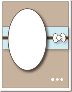
photoNow remember, this is a Flourishes challenge, that’s right- A STAMP COMPANY! URGHHHH. How could I have done that!! I rarely make cards without stamping and NEVER TWO IN A ROW!! I double checked the ‘rules’ and it doesn't officially require stamping. It does say you can use Flourish stamps but it isn’t required. I'm sure that means you can use other stamps, not NONE, but it doesn’t say ‘stamping required’!! I hope that if by some freak of nature I am chosen, they don’t notice that I didn’t use stamping and choose another random number. I don’t expect them to read this far down!! This layout’s origin is unknown because I saved it to my iPhone’s photo album and obviously the designer did not include a website or keyword. Let me know if you recognize it so I can give credit where credit is due. Did you also notice I forgot the three dots at the bottom and placed my oval and stripe at the midpoint of the card? I noticed my cards seemed a bit empty this way but did I check the layout? NO and now I wish I had imitated the layout more carefully. This challenge was nothing but trouble. If I get time, I am going to do it again properly! With a new layout and I am going to START with stamping!!

Enjoy, Rebecca

RECIPES

HERS
Ink:
cocoa-SU!
Paper: CTMH
Accessories: Melissa Frances sticker, ribbon-SU!, hemp twine, key-UK, Oval Scalloped Nestabilities, Cuttlebug Textile Folder, Foam Dots-Jody Morrow

HIS
Paper:
River Rock and Riding Hood Red CS-SU!, Cosmo Cricket Lil’ Man scrapbooking kit
Accessories: foam dots-Jody Morrow, Buttons-Basic Grey Bittersweet, hemp twine-UK, Cuttlebug Swiss Dots Folder

Shabby Chic for Twinkling Tuesday

So I took the plunge. I have admired shabby chic cards for ages, drooling over Melissa Phillips blog LilyBean’s Paperie since I  started blogging in August. I have asked Melissa if she teaches and she does but not anywhere near here. I hope she writes a book mttsc22 shabby chic
one day! I found another very similar blog called iralamijas by Bety. Please do not ask me how to pronounce it! She also does some fabulous shabby chic and she has a workshop you can pay to join until May 15th; the workshop is open until the end of the month. I have been analyzing what elements make a card shabby chic so I finally got brave enough to try it. Hope you like the result. I would link you to the specific card I CASEd but it is part of the workshop and you need to be registered to see it.

Kimmie’s son Nicky was our Temporary Twinkle this week and chose a colour challenge-Blue, Orange and Purple. WHEW! That one really threw me! I never use bright colours-Hello, who said you had to use the bright versions of those colours? OK, technically light orange is called peach but close enough! Do I really have to use peach anyhow? I planned to use pink instead. So I chose my papers, both Basic Grey and layered them on a Kraft card edged in white paint. All layers are sponged with cocoa or caramel ink. The chipboard is painted with pink and covered in white Stickles (boy that stuff takes ages to dry!) Then I got to the flower which was pale yellow. It was an ordinary silk hydrangea that I took off the stem. Then I realized I could add Copic marker and make it peach fulfilling the ‘orange’ of the colour challenge. I added YR00 to the soft pink brad also to make it more peachy. Overall, I’d prefer a pink flower there and I may still change it. What do y’all think?? Keep the peach or swap out for pink?

Be sure to play along with the Twinklettes! Upload to your blog or SCS/PCP with keyword MTTSC22 and link to Madelynn’s Twinkling Tuesdays blog so we can all see your creations! Don’t forget to visit all the other Twinklettes to see their fabulous work!! Have a great week!

Enjoy, Rebecca

RECIPE
Stamps:
NONE!!
Ink: caramel and cocoa-SU!, Versa Magic white ink
Paper: Basic Grey LilyKate and Gypsy DP, kraft CS-SU!
Accessories: sticker-K&Co, Tim Holtz shell pink paint dauber, Making Memories white paint, ivory Mettler thread, hot fix rhinestones-UK, Pearl-Kaisercraft, sheer ribbon-SU!, brad-UK, Stickles, chipboard-RiffRaff Designs, flower-UK

May 10, 2009

Spencer Inspired Chocolate Card

So here is another funny past about my baby. In case you are wondering, yes, my other kid does funny stuff but more of it is the kinda thing where you had to be there. My baby loves to go to bed late, really, REALLY late, early-the-next-morning late. We manage but I have learned the hard way when he is ready for bed, he sleeps better and longer if he eats right before bed. So I gave him a banana and while I was in the fridge (getting a drink, not the banana! LOL), I noticed we still had some chocolate cake! Hmmmm, midnight snack! OK, later than midnight but it's an expression people!

So I ask him if he wants some, of course he does but I love to see how excited gets for chocolate! Normally he says, ‘yummy, yummy, yummy’ but today he pulled out another new word (he is very slow to talk) saying, “Happy, happy, happy!” Chocolate spencers chocolate card
lovin’ kid after my own heart, eh? So we share the cake, bite for mommy, bite for baby, as long as he is ready for it. So he gets the second last bite and I start to scrape some errant icing off the plate to go with the last bite, which is supposed to be mine if all’s fair! As I go to eat the last bite, he looks up at me and says, “Happy?” Awwwwww! How could I resist? I mean, I did think about it but my kids are marginally more important to me than chocolate. HA HA LOL! Y’all know I'm kidding! Of course I gave him the last bite!!

So this card was inspired by Spencer! I decided to make a mini box of chocolate for the front of the card. Each chocolate inside is spencers chocolate card closeup1 paper pieced with silver paper with silver embossing for the foil wrapper and chocolate chip ink on cocoa paper for the chocolates. I cut the chocolate out with some extra at the bottom. Then I actually slit the silver layer in a zigzag pattern (like the edge of the foil wrapper) and put the ‘chocolate’ inside it so it is a bit more 3 dimensional. Oh, man! I just thought of an even better way to do the chocolates! I am going to replace the plain inked chocolates with chocolate embossed ones so they look shiny! I finally found dark brown embossing powder at ScrapFest. It is too late to make new chocolates now so I will add a photo of them later today. The box itself is made from three heart shapes cut with my Coluzzle. The inside heart is cut smaller to look like the liner. I’ve never actually received the cheesy heart-shaped box of chocolates so I had to guess what they look like inside!

The bottom heart is scored 1/8” down from the bumps and I applied glue on the scored section only and adhered the lid. The spencers chocolate card closeup2 whole box is up on foam dots. So when you lift the lid, the bottom of the box flexes back at the score line. This method may not make sense at first but it allows the top to lift even though it isn’t scored. I was going to add liquid pearls and a rhinestone to the top of each chocolate as icing but there isn’t room inside. I wish I had realized that sooner, I would have tried to come up with another method of attaching the lid that allowed more room. **SIGH**

Enjoy, Rebecca

RECIPE
Stamps:
Rubber Baby Buggy Bumpers except ‘happy’ by SU!
Ink: chocolate, cocoa, riding hood red
Paper: Chocolate, cocoa, riding hood red, pink pirouette
Accessories: brown grosgrain ribbon-SU!, foam dots and circle red line tape-Jody Morrow, Copic marker (colour ribbon), white taffeta ribbon-SU!, striped ribbon-Sharon Johnson,  tab punch-SU!
Techniques: paper piecing, paper tole, sponging
May 08, 2009

Rose Edged Card Tutorial for Gal Pal Challenge

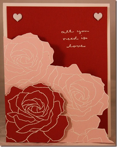
Here is Gal Pal Challenge #3 – Cassie challenged me to make a monochromatic card using a favourite In Colour (they are retiring soon!) and I added the requirement to use metal. I can’t wait to see Cassie’s card; I always love her work. I decided to write a tutorial for this card as I went. Hope you enjoy it!

Step 1. Choose where you want your roses to fall on your card. I fifth tut1 wanted a diagonal line across the card but not right up to the top corner. I sketched in my line using pencil on the cardstock I will stamp on, pink pirouette. I laid my CS on my cutting mat so you can see the dimensions. Be sure to note that the card is offset by 1/2” so you could see the numbers if you wish to copy this step of my card. The stamp is only in the photo to help the camera focus because for some reason it was having trouble. I just tossed the closest thing I could grab on there that was small enough to not be in the way.

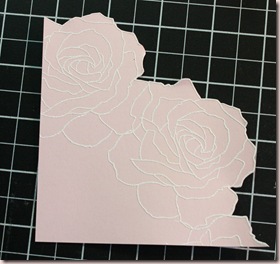
Step 2. Stamp the rose along the edge in Versamark ink and fifth tut2 emboss with white embossing powder. Erase the pencil marks after the powder has cooled and trim the edge closely around the edge of the roses. I chose not to fill in the bottom left corner because it will be covered in the next step. You could fill in this area for an even simpler card if you wish.

Step 3. Stamp and emboss a single rose in the corner of riding fifth tut3 hood red cardstock as in step 2. Trim around the edge. Apply adhesive to the straight edges. Add a foam dot to the trimmed edge so you get a bit of dimension between the layers.


Step 4. Cut and fold a standard CS card. Place the roses over the fifth tut4 card front but offset by 1/4” to 3/8” to the bottom left. Trace around the cut edges. Replace the roses on the card the way they will be adhered and check that your pencil line is all hidden. Correct any areas as needed.


Step 5. This shows the pencil line, fifth tut5corrected where needed and shown  without the roses. Cut along your pencil line to the fold, then up to the top of the card along the fold.


Step 6. Adhere the roses to the trimmed/shaped card front. fifth tut6Finish the card as desired. At this point I got stuck; I thought about several different options but none were great. I felt it needed something else but I didn't want to ruin the simple elegance I had created. I tried adding ribbon around the fold of the card from the top of the pink CS with a tie over the red rose but it just didn’t look right. I tried a pale pink book plate in the upper right threaded with ribbon (come on, I HAVE to use ribbon!) but it didn’t look right and the fifth tut7
bookplate was too heavy. **SIGH** Ribbon buckle,  no… half-back pearls, not metal… URGH!! So I went back to my source of inspiration, a card made by Patti as seen on Julie’s blog, Paper Pleasing Ideas. I added the riding hood red panel on the inside of the card and added two round rhinestone brads. The original brads were square and I didn’t think there was much difference but when I looked at it after placing them, it looked more like headlights. OOOOPS! LOL! So out they went. Then I decided on METAL, white-painted, heart-shaped brads. MUCH better!! Funny, that sentiment looks straight IRL-WEIRD!! I really like the result. Very quick and easy with a very short supply list! Great for beginner stampers!

Enjoy, Rebecca

RECIPE
Stamps:
Fifth Avenue Floral, sentiment
Ink: Versamark
Paper: pink pirouette, riding hood red, white CS
Accessories: 1/16” hole punch, foam dot-Jody Morrow, white EP-UK, heart brads. All products by SU! unless otherwise noted.
Technique: heat embossing

May 05, 2009

No Small Miracle for Twinkling Tuesday

Yeah! I got the stamps I won from Verve for THIS card I entered for Mojo Monday! I love the sentiments in the stamp set I chose. I can’t wait to use some more of them. It wasn’t until I sat down to type this that I realized I probably had a subconscious reason for using this sentiment. Last night I watched the first few minutes of an Oprah show I had PVR’d. The topic was Madelyn McCann, the little British girl who was kidnapped in Portugal 2 years ago while on vacation. I went to bed after and hugged my no small miracle
baby’s little body so tight and stroked  his soft skin. He is a difficult baby sleep wise (loves to stay up into the wee hours of the morning) but I have always said I will never regret the parenting style I have chosen. Sure my baby hates being alone and that can get very annoying at times. But I LOVE sleeping with him and if I died tomorrow (heaven forbid), I would never regret one minute I spent cuddling him, letting him nap on me (while getting nothing done of course) or allowing him to sleep in our bed! He truly is our small miracle or as the song from Charlotte's Web says, “Just another ordinary miracle today!”

This card features ribbon from Sharon Johnson’s Stamp Simply store. She is featuring cards made by others with her ribbon so I am happy to oblige. This ribbon is so wide it can be used as a layer! You have got to get some; she is also now selling a cheap clip_image002little tool to help you tie perfect bows plus other fun stuff! Her store links are just above her blog header.

Another fun sketch from little Madelynn for Twinkling Tuesdays. She sure comes up with some interesting sketches. I really loved this one. Not much to tell, all pretty obvious. Oh, there was one fun thing. I didn’t cut into a single full-sized sheet of paper for this card! All scraps! WOOO HOOO! I hope you will play along! Upload using MTTSC21 to SCS or PCP or your blog an link to the Twinkling Tuesday blog. I hope you will visit all the other Twinklettes (links on sidebar) and be sure to leave them some LOVE! Oh, and don’t forget to give your own miracles a hug!

Enjoy, Rebecca

RECIPE
Stamps:
Sentiment-Verve, Stork and alphabet mini background-SU!
Ink: Memento rich brown, SU! bashful blue
Paper: bashful blue, white, celery, banana CS-SU!
Accessories: Cuttlebug swiss dots folder, Copic markers, foam dots-Jody Morrow, ribbon-Sharon Johnson, scallop punch-SU!

May 04, 2009

Happy Lady!

Boy, I wish I was this happy all the time (and had perfectly coiffed hair and groomed eyebrows…)! But I can’t tell, is she saying ‘Ah, ha!’ or ‘No you don’t!’? I can’t tell but I think she is too happy to be telling someone off so I am going with the ‘Eureka’ theory! She is from a Crafty Secrets sheet. The brown flower is coloured with Glimmer Mist, I sure wish you could see the lovely fine glitter but it is way too fine to photograph without a macro lens for my camera. I believe the journaling card in the background is by Prima and was sold inside the white and black polka dot box I recovered for Earth Day in my post HERE. This is one of 4 cards I completed at ScrapFest.

happy lady scrapfest 

Enjoy, Rebecca

RECIPE
Stamps:
none!
Ink: Stazon brown
Paper: Card-Strathmore, brown paper-UK, journaling card-Prima, pink paper-UK
Accessories: ivory flower-Dollarama, Brown flower-Prima, Glimmer Mist, Crafty Secrets Retro sheet, ribbon and brad-UK

May 02, 2009

No Card Again!

So sorry guys. I've been busy decorating 26 chipboard letters, yep, A-
Z! And ALL DIFFERENT techniques! I'm using them as part of a quiz I am
running tomorrow at a local crop, hoping to drum up some business for
my at-home teaching and crop services! The gals have to guess the
technique/products used- most right wins! Wish me well! I will show
them to you a few at a time, along with the techniques and recipes.
And I still have two ScrapFest cards to show you, just too tired and
busy tonight to photograph and blog them. Have a great weekend.
Hopefully I'll have enough energy to post tomorrow night!

Rebecca