I’ve been inspired by many bloggers I follow who have been getting into mixed media art lately. After all, many of us already use quite a few different media in our work so it isn’t that big of a leap to venture into what is traditionally known as mixed media artwork. We card designers already combine ink, paper, ribbon, metal, sometimes paints, chalk, pencils, spray ink, fabric and more. By adding a more permanent base than card making affords and mixing these media in new ways, voila! Mixed media art!
This is a crazy long post so grab a cuppa and get comfy. If you don’t have time to read it all now, I really hope you will save it and come back later. I have a great tutorial, a mini flower tutorial and some awesome tips all for you below. Plus a way to win by commenting!
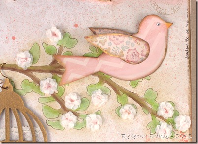
To make the bird, I drew the template myself, basing it loosely on Tim Holtz bird from the bird cage die I used. It was too small so I wanted to enlarge it and couldn't be bothered figuring out how to make my printer scan and enlarge it. I’d normally get hubby to do it but he was watching the baby so I just winged it (get it, winged it! hee hee) The chevron stripe was lovely but too prominent for me so I painted over it with Porcelain doll MS acrylic paint. A pretty pinkish-ivory off white colour which toned down the paper nicely. I also used some pink paint in places to give the bird some depth and keep her from looking flat. Then she also got some Vintage Photo Distress ink and gilder’s paste on the edges. The wings got Porcelain Doll paint only on them, again to tone down the pattern.
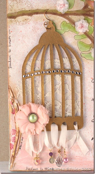
The bird cage was cut from grunge paper and gilded with a tube of gilder’s paste. Use it sparingly! I also used this on the edges of the canvas and on the torn/pushed back edges of the paper along the edges. Gilder’s paste is wax based gold you can apply with your finger or a sponge or a q-tip. It is very shiny (hard to tell from this angle but check the last photo with the flower) but I did buff it so you may be able to get a less reflective finish depending on how you work with it or the surface it’s applied to; I don’t know as I don’t have a ton of experience with it. I love how it turned out. I used wire and head pins to attach the beads at the bottom to silk ribbon which I threaded through the holes in the bottom of the bird cage. They are so much more twinkly IRL. I’ll talk about the flower later.
I was looking though my vast selection of junk stuff goodies when I came across some vellum quotes and this one really resonated with me. I’m a very direct, outspoken and honest person and people who aren’t drive me CRAZY! I’ve never understood why everyone can’t be the same! I’ve had huge problems with making and keeping friends, especially as a teen and it took me a long time to figure out I was trying to make friends with the wrong kinds of people. So now I have friends who are near and dear to my heart, who truly listen to me and understand me, who I can really be open with and not think so hard all the time if they will judge me for what I’m about to say, I can just breathe and say what’s on my mind; this is one of the things in my life I cherish most. So I knew this quote had to be translated into something that I could see everyday, keep it close by and in a place where it could help me remember to always appreciate those friends.
I chose the font, Scriptina Pro, which I found for free, then I typed out the quote and formatted it until I was happy with the spacing and size etc. and I printed it out. I transferred the text to my canvas and went over the transfer with permanent, lightfast, archival pen. Then I thickened the lines in some areas to add more interest. It was looking a bit flat and boring with all the same thickness of lines. Be sure not to use a water-based marker for this kind of work as it will fade much too quickly. (In retrospect, I used water-based inks in other places and probably shouldn’t have for the same reason but it’s going in a place with minimal sunlight. Pigment inks are more lightfast.) I don’t have a photo tutorial for this transfer technique but it’s a great way for getting the text onto your canvas and it’s not hard to describe.
Pencil Transfer Tutorial
- Print your wording or design on regular copy paper.
- Flip your paper over on a light table or bright window. Using a wide pencil like 0.7mm lead or wider (regular is 0.5), trace your design. Make sure you cover everything. Going outside the lines a bit is ok, just make sure everything is covered.
- Trim any excess paper around your design if needed.
- Tape your paper to your project making sure it is lined up perfectly. Use repositionable tape like Scotch brand or washi tape, Eclipse tape or painters tape but if you are unsure if these may lift up any previous layers of colour/media you’ve added (like chalk, charcoal, pastel or Pan Pastel), please check in an inconspicuous area.
- Trace your design with a pencil. What size you use will depend on the thickness of your lines. For fine lines like mine, not only did I use the finest pencil lead I had which was a 0.5 mechanical pencil, I kept rotating the lead to always have a sharp point. If your lines aren’t so fine, this may not be so important. You could also use some other writing tool as using a pencil isn’t crucial.
What you are doing is transferring the graphite on the BACK of the paper to the canvas (or other surface) so anything that applies smooth, even pressure could work so experiment. Maybe an embossing stylus? Tip of a bone folder? The line you will get is quite faint so if your eyesight is poor you may need magnifying glasses, a strong light, a magnifier attached to a lamp or otherwise or this technique may not work for you. Because the surface of a canvas is fabric (of course) and not stable, I did have to jam some stiff cardboard into the space between the fabric and the wood to get a hard surface to write on. Several pieces actually. I used laminated pieces that some with Spellbinders dies and they were perfect and slid in nicely due to the lamination.
This is a version of a technique I learned as a kid on school. We covered the back of what we wanted to transfer in pencil by scribbling back and forth very heavily. The con of this technique is that is leaves a lot of hand smudges as you do the transferring. With my technique, there is so little graphite on the back of the paper, I didn’t notice any smudging at all.
I hand cut the corner by tracing a template I bought from Tattered Angels AGES ago, back when spray misting was in it’s infancy, and cutting it from grunge paper. I then painted it with highly lustrous pearl finish white paint by MS and covered it with Vintage Photo Distress ink which turned it into a cool metallic look. However, the ink isn’t stable on the paint despite two coats of fixativ so I don’t recommend this and I won’t be doing it again. Next time, I’d mix colour into the paint or buy a pearl finish paint in the colour I want rather than trying to alter it after it was dry. Then I added various beads to the nooks and crannies which was shamelessly CASEd from Gabrielle P, a designer for Maja Designs.
Another shamelessly CASEd part of my canvas are the torn bits with contrasting paper underneath. To do this you must moisten the paper quite heavily and treat it firmly but gently while pushing it back and expect it to crack in at least one place. You can mist your paper but I used a q-tip to control the amount of water more carefully. Then start to wrinkle the paper. Start as if you only want a tiny area pressed down, don’t try to do too much at once and add more water often if you need it. If the top layer of the paper starts to pill, you have too much water, up to that point, you can’t have too much water. Gently scrunch it until you have the look you want. Many artists I’ve seen cover up the broken/torn area with flowers or ribbon but I liked it and felt I had enough going on with out adding any more.
I made this flower and it came about rather serendipitously. I was trying to replicate another type of flower but changed too much and it didn’t work out well. I wasn’t happy with it at all so I decided to hit it with the heat gun and all of a sudden, I though it was so pretty! So, I will refer you to the original tutorial then tell you what I did differently. Firstly, I used sheer fabric called georgette, not tulle and I cut them with pinking shears, not the way she called for and I cut 9 circles. I folded them like she did, in half first but then but I overlapped them in the center a bit more almost into thirds. However, this allowed all 9 of them to fit next to each other when sewn onto the backing. At this point, I really didn’t like the finish that the pinking gave the edges. To me, it just looked sloppy. So I hit the flower with the heat gun. At times, I separated one little section from the others so it wouldn’t melt too much or so I could melt it more as it seemed to get missed. In the end, it almost seemed like those flowers made from lots of little blossoms and I really liked that.
The base of the canvas was prepped with acrylic paints on the sides in pink, turquoise and porcelain doll. Then I added some script stamping and toned it down with more porcelain doll dry brushed on. The base of the canvas is hard enough to see IRL and almost completely lost in photos. I used a lovely lace pattern DP then added some spray mist in Boss Lady which is much brighter and more dominant than I had hoped. Two light sprays from far away and my background was almost gone. You can see a wee bit of it above. The lower right corner is a mix of Life stamps in various Distress inks and a few PTI colours along with some Hexagon stamps which you can see in the photo with the lettering.
The tree stencil was tacked down and sponged around the outside using Antique Linen Distress ink then traced around using the same pen I used to trace over the lettering. Then I used PTI inks to dry brush the colour onto the tree. To do this, you literally pick up colour from an ink pad with a dry watercolour brush, yes, it does take a long time but it game me the soft look I was going for. Then I die cut a TON of tiny white 5 petal tissue paper flowers and glued them together, I think 10 layers or so. Then I glued them to the tree, added chalk to the centers and fluffed them up to create spring flowers. This can all be see in the photo with the bird.
I hope you stayed with me this long! If so, you are a real trooper and deserve a medal! Thanks so much! I’m entering this in the Spring Home Decor Challenge in the Moxie Fab World. It’s randomly chosen so I have as much of a shot as the next person but I’m so proud of this I can only hope maybe there could be an Honourable Mention of something. If you like it, I hope you will leave a comment. If you do, you could also win a prize as one of the ways to win this challenge is to leave comments for participants! Click the link to learn all about it. Not long left so be sure to join in the fun!
Enjoy, Rebecca


4 comments:
I think the bird cage is my absolute fave part of this!
Gorgeous project. I really love that birdie!
Fantastic - you should definitely dabble more with mixed media! I particularly love the ribbon and beads on the birdcage (may have to case that!) and the gorgeous blossoms. Also love the distressed paper and pattern emerging - in fact I love it all!
Beautiful project - I'm inspired to try some mixed media myself.
Post a Comment