February 26, 2011

Cowboy Hero for Our Creative Corner

Our Challenge this week is to De-Stress by Distressing while using the Sketch Sarah designed.

coyboy hero card

I started by flipping the sketch and substituted ribbon for the panel on the left side because I didn't want to cover up all that great DP that already had distressing ‘built in’! Then I sponged the panels with ink and scratched up the edges of the card and the DP panels. The edges of the chipboard sticker were sanded and inked too. I also used an ink spritzing tool from SU! to fly speck my card. That thing killed my hands, now I remember why I stopped using it. I am longing for another can of air for my Copic airbrush system! I just finished it earlier this week. Maybe I’ll get out our compressor and see if it will work. I always had air so I haven’t tried it out.

FEBOCCsketchbySarahGough

I hope you will all play with us at the OCC this week! Thanks to Sarah for a great challenge and we are so glad she is safe from the devastation caused by the earthquake in New Zealand; thankfully her family is safe too. Don’t forget to visit the OCC blog to check out all the FANTASTIC projects from the DT! They are just YUMMY!

Enjoy, Rebecca

RECIPE
Stamps:
Sentiment PTI
Ink: Distress Antique Linen, Vintage Photo, Frayed Burlap, chocolate chip-SU!
Paper: Wanted-Cosmo Cricket, chocolate chip, vanilla CS-SU!
Accessories: Sizzix embossing folder, foam dots-Jody Morrow, Circle Nesties,  Cosmo Cricket Wanted Chipboard, hardware-SU!, ribbon-stash, hemp twine-stash

February 24, 2011

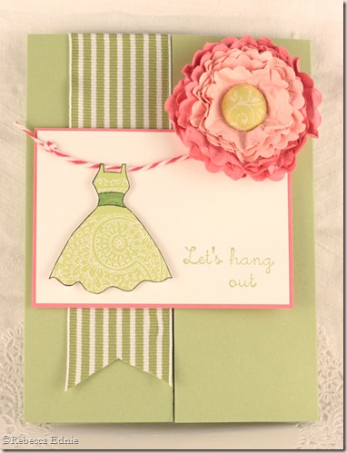
Let’s Hang Out! ~ TE Feb Blast from the Past Blog Hop

TE blast blog hop

Another fun blog hop for Taylored Expressions! This month the theme was Go Green.

lets hang out te blog hop

I’ve been looking through my mom’s decorating magazines and found one with the most lovely room done in a lively yellow-green, soft pink and bright pink with lots of white. I would show it but I am getting a migraine and just want to post quickly and go to bed.

The flower was made from 4 die shapes; I split each in 2 for an 8 layer flower. After splitting, I punched a hole, spritzed with handmade spray using Perfect Pearls and crumpled them. Then I partially dried them with my heat gun. I gently uncrumpled them and recrumpled them where I needed more creases then I continued to dry them. I flattened them just a bit and threaded them on to a long pronged brad. All that was needed was a bit of fluffing and you get the flower you see here! I used both sets of circle Nesties using 4 of the 5 smallest, excluding the very smallest.

clip_image002

The card is a gatefold card which made getting the ribbon on straight very easy! Once I glued on the flower, the panel underneath needed a notch cut from it so it would slip under the flower neatly so I cut a notch using an oval Nestie. I wanted foam dots under the whole panel but of course, I didn’t want the right side to stick to the card or it wouldn’t open. So I added the foam dots and punched little flowers out to place over the adhesive. This way they don’t stick to the card and it still looks nice from the other side when open.

Don’t forget to visit the other blogs in the blog hop! If you enjoyed this post, I hope you will subscribe to my blog, you can become a Google Follower, sign up for RSS feeds or receive emails in your inbox, all on the sidebar. You can also click on the Blast from the Past TE blog hop tag at the bottom of this post to see my other blog hop projects. Thanks for visiting.

Enjoy, Rebecca

RECIPE
Stamps:
TE Hangin’ Out
Ink: memento black, celery-SU!,
Paper: celery, pretty in pink, white CS-SU!, Hibiscus Burst CS-PTI, DP-DCWV
Accessories: foam dots- Jody Morrow, oval and scalloped circle Nesties, Copic G24, brad-stash, ribbon-May Arts, Perfect Pearls, Divine Twine-Etsy

February 21, 2011

Winged Matchbox

Another Swap-Bot swap to make a matchbox with a focal point that has wings.

t bear mb front

I just love this little bear. And don’t those wings look so cute stamped in gold embossing?

t bear side

There isn’t too much to say that isn’t answered by a recipe.

Enjoy, Rebecca

RECIPE
Stamps:
TE Beary Special
Ink: Antique Linen and embossing Distress inks
Paper: brown DP-SU!, Aqua DP, pink CS-PTI, kraft CS (sleeve base)-SU!, tracing paper (wings)-stash
Accessories: gold EP-SU!, Brown EP-stash, foam dots-Jody Morrow, heart brad-TE, Copic E71

Daffodil Challenge Card

I managed to get 3 challenges into this one.

daffodils challenge card (3)

This is for Mojo 179.

And Papertrey Ink’s Make it Monday challenge 3 : Glitter Strips with Scor-Tape.

Untitled-1

And JustRite Stampers 49: Direct to Rubber. This one is the hardest for you to see. I used two colours with the Rock n Roll technique for the sentiment but it is really hard to photograph. I don’t have a macro lens for my DSLR and so I can only get so close and my crop in isn’t so hot, shame because it looks so pretty IRL. I used green for the base colour and rolled the bottom edge only in purple. So to help you see it, I edited the photo with WAY too much saturation, it looks silly but you can see it at least!

daffodils challenge card closeup (2)

I love colouring jugs like this in silver like galvanized steel. I always add a bit of rust using E08. I start with a base colour of cool grey then add the ‘rust’. Then I continue colouring the jug so the brown blends in to look like just like rusty spots.

The purple on the tulips is intended to NOT blend in. I was colouring them like these.

Don’t you just love them? I am really in to pink centered daffodils so I coloured them like the one here.

pink daff

Enjoy, Rebecca

RECIPE
Stamps:
sentiment-Everyday Button Bits, flower-JustRite stampers
Ink: celery, amethyst-SU!, memento black, brown, Distress ink Antique Linen, Frayed Burlap
Paper: coral, ivory DP-Crate Paper, green, purple DP-Wisteria Basic Grey, baha breeze, natural white CS-SU!,
Accessories: punch-EK Success, lace-vintage, foam dots-Jody Morrow, Scor-Tape, SU! glitter, MFT doily die, lacey circle, oval Nesties, Copics Y21, YG63,67, R10,22, G21, 24, V00,09,15, E08, C00,1,3,5,

February 19, 2011

Swinging from the Chandeliers?? For the OCC and Mojo.

Now we can’t have that can we? Hee Hee!!

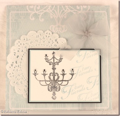
chandelier friends

Nope, we’re all about elegance here! Although this card doesn’t have a huge immediate impact with it’s soft colours, it sure looks pretty IRL! The chandelier is embossed in silver and there are many rhinestones on it, 15 in fact. The ribbon is really a soft silver, not grey, which matches the chandelier. The sentiments were stamped in baha breeze ink which is several shades darker than what you see but I used generation stamping to remove some of the ink to lighten the impression.

I used Mojo Monday’s latest sketch and this week’s OCC challenge. Be sure to visit the OCC blog if you think stamping repeatedly to create your own layer or background sounds fun! And be sure to check out the inspiration provided by some of the best designers in the business!

Enjoy, Rebecca

RECIPE
Stamps:
Sent-SU!, chandelier-Crafty Secrets
Ink: Distress embossing, baha breeze-SU!
Paper: DP-Kaisercraft, doily-Wilton, soft sky, white, black CS-SU!, natural white (card base)
Accessories: foam dots-Jody Morrow, large rhinestones-Zva Creative, small rhinestones-Taylor’s Tiny Twinkles

February 15, 2011

Vintage Fruit Matchbox

Here’s a cute little MB that almost missed being posted.

vintage fruit MB

I am typically quite critical of my work but at least this time, there is a point to it! I didn’t notice at the time but I am now seeing that the strawberry is completely lacking in highlights which doesn’t match with the other fruits. Also, the shadow is on the opposite side. While I didn’t plan it, I just coloured them, it does look odd all together. I’m actually happy with the cherries, the bright shiny highlight suits the smooth skin; the peaches have softer highlights because the skin is fuzzy muting the brightness of the highlight.

Strawberries are hard to colour because you have to colour around the seeds and that can throw off the best plans you might have for shading, shadowing or highlights. I don’t consider the yellow area a highlight, that is supposed to be where the berry isn’t quite ripe yet which often happens on the side away from the sun. The highlight would actually be on the opposite side, facing the sun at the same angle as on the other fruits. I know that some people like to colour over the seed then reclaim the colour with a colourless blender and then add the yellow for the seeds. I’m not stuck on that technique but I think I might have tried it here because the sees aren’t really showing up as a different colour.

So here’s what I would do if I were colouring this again. I’d make sure the highlights and shadows were consistent on all the fruits. I’d darken the shadows and add some serious highlights on the strawberry and try to add some more life to the leaves. I’d really work to make the seeds yellow. The peach leaf needs more blending to make the leaf look smother.

Enjoy, Rebecca

RECIPE
Stamps:
Fruits-Flourishes, text bkdg-not sure, maybe PTI BB:Hearts?
Ink: memento black, cocoa-SU!
Paper: white CS-Taylored Expressions, cocoa CS-SU!
Accessories: vintage lace-stash, Dew drop, foam dots-Jody Morrow, Copics-sorry, I don’t have the colours, this was from September

February 14, 2011

New Video! Making a Matchbox with a Scoring Board and an Adorable Nurse Matchbox

As most of you know, I make a lot of matchboxes for Swap-Bot. I started out using s template but I quickly found that tracing it over and over not only took too much time but wasn’t precise enough for my perfectionist soul. So I figured out a way to make one quicker and neater using my Scoring Board!

PI nurse mb

Then I made a video!

I hope you enjoy it. While you are there, please take a look at my other video for Copic colouring.

PI nurse mb w stand

I really wanted to make a matchbox using this little PI girl but of course, she is much too large. Not to be defeated, I designed a swap for matchboxes with elements that hang off the edges. I attached her with a magnet and created a little stand. The photo below shows the side view of the stand so you can see how I created it. My little guy wanted to keep her so bad (but I made him something else instead)!

PI nurse mb stand side

Enjoy, Rebecca

RECIPE
Stamps:
Best Medicine MTF
Paper: white CS-Taylored Expressions, red CS-SU!
Ink: memento black
Accessories: magnets-Basic Grey, Copic markers (sorry, it was months ago so I don’t remember the numbers), MS scoring board

February 12, 2011

Happy Mail for the OCC

This week’s challenge is to fussy cut! You can cut out your image, paper piece, hand cut some shapes, anything you like!

Happy Mail

I hand cut the little girl, her dress and her pockets. And since I couldn’t get my $%^&* die cutter to work properly, I ended up trimming and hand cutting my mail box template too. GRRR! It sure is cute though isn’t it? Smile I am not going to give a link for the template because it didn’t assemble properly. I’ll try it again and if it works, then I’ll link it.

happy mail cupcake stand

The cupcake stand is made from…. guess what?…. a ribbon spool from May Arts! Cool right? I wrapped the center with a strip of DP. Then I traced the top onto another piece of DP. I punched a strip of DP (it is coloured on the other side), stamped it, scored it then glued it to the top of the stand. The fold aligns with the top edge of the ribbon spool. When you get to the corners, clip the paper so it will fold neatly. Then glue the top on. I didn’t have a cupcake (though I found a new bakery just today!) so I filled a small tin I had handy with Hershey’s Cherry Cordial Kisses.

happy mail closeup inside

Here’s a close up of the mail box showing the interior. You can’t see it but the floor inside is also covered in DP that matches the top of the cupcake stand. It is filled with Hershey’s Mini Chocolates.

Enjoy, Rebecca

RECIPE
Stamps:
little girl, sentiment-PTI, Sweet-Mixed Messages PTI
Ink: memento black, rose, pretty in pink-SU!
Paper: DP-Bittersweet Basic Grey, white CS-Taylored Expressions, pink, chocolate CS-SU!
Accessories: Spellbinders tag die, lacy circles, Copic Markers R21,81,8385, E00, 11, 21, 31, 33,93, Y21, B14, flower-Prima (I think), dotted ribbon-stash, seam binding ribbon-Masterstroke, brad-Basic Grey, MS punch

February 11, 2011

Love and Gift Links

Craft Critique is having a Blog Carnival coming up soon. So I picked out my favourite pink, love and gift idea posts for your inspiration. Click on each picture to go to the original post.

Fizzy Bath Salts – Sorry, no photo but these are THE BEST!

shabby house neighbours

love candy test tubes

music house front

love kit 1

pretty pink bird shabby

envelope love plain

cookie box front

truffle box 1 open

hearts matchbook notes

puppy box

lollipop holders boy

dino lolli cover

purse box main

hot choc jar
Sorry for the terrible photo but it’s a FABULOUS recipe!

gift box pearls and flowers

winter gift set pad

te blog hop bear box

sour cream container favour

February 08, 2011

Seaside Journal

Boy was it hard to part with this one. I may have to make another for myself. I joined a very long intensive swap called “Theme a Day Journal”.

seaside theme a day journal cover

The swap assigned 30 questions or topics for you to answer. Anything from your 10 favourite people and why to your bucket list to your goals for this year and where you expect to be in 10 years. Very soul searching! So I finally finished it and realized I had a huge chunk of all the things I care about in there. SO I asked hubby to copy it for me so we have it somewhere. I hope my kids enjoy it in 20 years or so because they are in there a LOT!

In addition to the journaling, it was recommended to doodle on or decorate the pages and a requirement to decorate the front and back covers. The back cover has the same stamped cardstock as the front but nothing else. The binding is covered in a fabric self-adhesive tape I’ve had for ages. To my mind, it doesn’t really match but it was all I had. I later found out that many people just cover it in CS. Why didn’t I think of that? Minus the binding, I adore how this turned out. I am CRAZY about the seaside, not a dumb old lake but the OCEAN. Shame I live thousands of miles away.

If you’d like read the topics or complete a similar journal, you can see all of the topics here http://www.swap-bot.com/swap/show/60624. I really found it thought provoking. Even if you don’t journal all of them or any in fact, it still makes you think and can even bring some perspective to a busy schedule.

Enjoy, Rebecca

RECIPE
Stamps:
SU!, JustRite alphabet
Ink: chestnut-ColorBox chalk, Antique Linen, Vintage Photo Distress
Paper: saffron, kraft, confetti white CS-SU!, DP-Graphic 45
Accessories: Labels 8 Nesties, MS starfish/sand dollar punch, fabric tape-Making Memories, composition notebook-Dollarama, sandpiper charm-Jesse James buttons

February 06, 2011

My Username ATC

Funny story. Everyone on Splitcoast Stampers chooses a username when registering. I, having not signed up for such a thing before, chose Rebecca Ednie. Novel and cutesy dumb right? Yeesh. So whenever anyone asks for my username to look at my gallery, they always say, “I didn’t think to look for that!” Well of course not! I am the only one there without a typical username! Smile So after that, I chose a better username. Now at the time, I was transitioning my main hobby from sewing to stamping and paper crafts though I didn’t know that at the time. (My fabric stash must be so lonely! Most wouldn’t be so great for cards.) So I went with something representative of my business at the time. Sewing Bras! Yes, you heard read correctly, BRAS! Real, proper, store-bought looking bras. With better fit, fabric and techniques of course but we aren’t talking about a bra top or a sports bra. I know, most of you didn’t know that you could even make those at home. Anyway, my ‘clever’ username ended up being thebragal.

thebragal ATC

So here is an ATC that represents my username which I use most of the time. I made for a swap on Swap-Bot, ‘Represent Your Username ATC’, where my username is also thebragal, even though I don’t really sew many bras anymore. I found I mush prefer to teach others how to make them. Problem is, no one knows I do that so I get few clients, especially since I live in what Torontonians think is the boonies (country) .Sad smileOh well! Hope you like the ATC and if you’d like to learn to sew your own bra, I teach classes online!

Enjoy, Rebecca

RECIPE
Stamps:
unknown, zigzag-Hero Arts
Ink: pretty in pink, chocolate-SU!
Paper: brown dots-not sure, maybe SU!, pink-Basic Grey Porcelain
Accessories: Copic marker, foam dots-Jody Morrow, ribbon-stash, rhinestone-Zva

February 05, 2011

CAS Masculine Tree Card for the OCC

I’d like to thank everyone who has congratulated me on my OCC design team acceptance. I’m glad you are excited too! I’m also getting close to 50,000 blog hits. While that may seem tiny compared to those who get millions of hits, I am proud because for so long the numbers were really tiny. BTW, the counter at the bottom of the page isn’t accurate because my old one was close to 30,000 hits the last time I looked, then it crashed. Might have  been much more but I’m going to go with 30,000. Hopefully this counter won’t crash!

CAS tree masculine card

This week’s challenge is to create a card or other project using Clean and Simple design principles and use a tree. CAS is far from my normal style but the whole reason I love challenges is for, wait for it… the Challenge of it. If it was too easy, it wouldn’t be as fun right?

Well, I’m not a huge collector of tree stamps, the only ones I have are very small, so I’m really glad I recently purchased some PTI stamps second-hand. Since the set I used was designed for manly cards, naturally I went with a masculine card. I used masking and sponging an top of my stamping to get a faux board look. I wanted to use something as nails but I just couldn’t think of what to use that wouldn’t overpower, look cheesily hand-drawn or look too large. Any thoughts for next time?

Please be sure to play along at the OCC blog this week. We’d love to have you and maybe you can even win one of our Talent Awards! I know you’ll enjoy the team’s work, such FABULOUS designers!

Enjoy. Rebecca

RECIPE
Stamps:
Men of Life, BB: Woodgrain, Father Knows Best–PTI
Ink: Antique Linen, Shabby Shutters-Ranger, olive, artichoke, cocoa, chocolate-SU!,
Paper: chocolate, cocoa, confetti white CS-SU!
Accessories: foam dots-Jody Morrow, tag die-Spellbinders, twine-stash, embossing folder-Cuttlebug

My Favourite PTI Project of 2010

There is a contest right now at PTI to post or re-post your favourite PTI project.

shabby house neighbours

Check out the original project to see a list of the PTI ‘ingredients’! Shabby House Warming Gift.

Enjoy, Rebecca