June 30, 2009

Wisteria June Rose for Clear Dollar Stamps

This is my last Clear Dollar Stamps post as June Guest Designer. I’d like to thank both Lori and Laurie of CDS for their faith in me, the great stamps and warm welcome! Thanks to all of the Team Members too who came by to leave lovely comments on my cards. I had a great time despite how insane June turned out for me overall and I hope you think I gave your stamps a good workout!

I just love this rose image. It is so delicate and lovely! And you can kind of see where to shade with this stamp. For me, the more petals, the easier it is to shade. For someone new to stamping, each petal can be coloured darker away from the light and lighter cdswisteria june rosetowards the light source. After some practice, you can add shading within each petal, at least the ones large enough to do so. I’m afraid my colouring looks too washed out here. I used reinkers to watercolour with for the first time! It takes several layers and an almost dry brush to colour like this. You can click to get a larger photo. It is so much prettier IRL. I can’t wait to take my photography course. We tried resetting the white balance on my camera as all my previous  photos were slightly sepia toned and now it is a bit too blue-grey. I will get it right eventually!

Back to the card!! hee hee!! I embossed my image to make colouring even easier. It is much harder to accidentally slop colour on a neighbouring petal and sure looks pretty too! The shine actually showed up this time and so did the rhinestones in the corners of the card! The bow was made with the Bow Easy and I threaded another ribbon through the back so it appears to be tied from pieces of ribbon coming from each side of the card. The only drawback to doing it this way is that the bow skews slightly to one side. I promise, it is even! I used the text stamp in the set for the background.

Enjoy, Rebecca

RECIPE
Stamps:
June Rose by Clear Dollar Stamps
Ink: VersaMark, eggplant
Paper: Wisteria-Basic Grey, eggplant, white CS-SU!
Accessories: gold EP and ribbon-SU!, rhinestones-Zva, Bow Easy, pale plum, prefect plum, mellow moss reinkers
Technique: reinker watercolouring

June 29, 2009

Peaches Tag for Twinkling Tuesdays

THIS IS THE SECOND POST FOR TODAY, BE SURE TO SCROLL DOWN.

This week, Madelynn gave us an inspiration challenge. What a beautiful and tasty photo!clip_image002

peaches tag I only have one citrus stamp and I didn’t feel like using it. I need to use Bold Brights ink for most citrus fruits and I just wasn’t in a BB mood. So I opted for another fruit. PEACHES. My favourite fruit, well maybe along with raspberries. The two together mixed with frozen yogurt is AWESOME! This tag came together quite quickly! AND I used all scraps! WOOHOO! The tag was cut with a Coluzzle template, it was a bit too tall for my scrap so I shimmied it up part way through the cutting to make it shorter. I stamped the image with Stazon brown on confetti vanilla and then again with apricot ink and again with olive ink. I cut out the peach and leaves and layered them on the main image. I added a bit of shading with pumpkin and regal rose markers.

As always, be sure to play along with us! Make a card or other project using the photo to inspire you and upload to SCS or PCP using MTTSC29 or post to your blog. Be sure to link up to Madelynn’s Twinkling Tuesdays so we can all see your creations. Visit all the team members blogs to see their work and we all love reading your sweet comments so be sure to leave some love!

Enjoy, Rebecca

RECIPE
Stamps:
peach label image and canvas-SU!
Ink: olive, apricot-SU!, Staz on brown
Paper: confetti vanilla, apricot, celery
Accessories: button-stash, hemp twine-Hemptique, twill tape-stash, Coluzzle template, foam dots-Jody Morrow, ribbon-Masterstroke, celery, pumpkin, regal rose markers-SU!

Wisteria Pretty Perches for Clear Dollar Stamps

Really quick post this time. Love Wisteria paper by Basic Grey. This card reminds me of the song, “I’m just a bird in a gilded cage.” Yep, really old, no wonder you haven’t heard of it! This card used Pretty Perches by Clear Dollar Stamps.

cdswisteria pretty perches

I cut the patterned paper edge with scalloped scissors and edged it with my gold paint pen. The bird was stamped with eggplant ink and then I overstamped the cage with Versamark and embossed with gold EP. The patterned paper beneath the birdcage is cut with Labels 3 Nestabilities die and also edged with the gold paint pen. I thought the upper right corner looked a bit naked so I added a few halfback pearls. The ribbon was tied with my Bow Easy, the other ribbon isn’t attached, just glued in behind.

Enjoy, Rebecca

RECIPE
Stamps:
Pretty Perches by Clear Dollar Stamps
Ink: eggplant, VersaMark
Paper: wisteria-Basic Grey, vanilla, eggplant CS-SU!
Accessories: gold paint pen-Pilot, Labels 3 Nestabilities, foam dots-Jody Morrow, green ribbon-stash, champagne pearls-Kaisercraft

Welcome Home for Clear Dollar Stamps

AWWW, the one birdie is coming home to roost with the other birdie is anxiously peeking through the birdhouse hole. After all, it is spring and the babies could hatch any day! At least that is the story I created in my head while making this card! This set just screams, “make a scene”! No, not like a grumpy diva, like a pretty picture! Especially with a set called Pretty Perches!

This was a pretty easy card to do, for the most part anyway. The clear stamps make it easy to line up and stamp the two-part bird removed for DT appl house. I used my largest punch to open up the doorway and another smaller one to make a hole in the roof. The chain is part of a bracelet extender chain from my jewellery making stash. The hardest part was getting the chain to stay through the slit I cut for it along the tree branch and then getting the chain to stay in the hole in the bird house along with foam dotting the birdhouse in the correct place. Fiddly but so worth the effort!

The blossoms were stamped with the a two-flower stamp in the set, I coloured in the centers with a pretty in pink marker. I drew in little stems for the flowers and sprigs with a celery marker. The branch was stamped full-length using a thumping technique in which you bounce the sides of two different coloured markers on your stamp to get variegated colour. It ended up great but the lightest brown was a bit too light so I just coloured over it again by hand. Perfect! I also stamped portions of the branch twice more so the tree looks denser. The last step in the image was to sponge some blue ink lightly to show the sky. I kind of made up the layout, using a bowl to cut the DP into a neat curvy shape. The ribbon is silk and sprayed with Glimmer Mist (are you seeing a theme lately?) to make it brown and sparkly.

Enjoy, Rebecca

RECIPE
Stamps:
Pretty Perches-Clear Dollar Stamps
Ink: Memento brown, Staz on brown, riding hood red-SU!, ColorBox brown chalk ink, Pink pirouette-SU!, SS blue-SU! ( I forget the colour name and am too tired to get up to check!)
Paper: vanilla, confetti white, chocolate, DSP-SU!
Accessories: jewellery chain and flower-stash, brown button-basic Grey bittersweet, white button-SU!, silk ribbon-May Arts, Glimmer mist-Tattered Angels, pretty in pink, cocoa, celery, chocolate markers-SU!, foam dots-stash

June 28, 2009

Charlie Horse Thank You for Dad-Clear Dollar Stamps

My dad generously paid for the ponies we hired for out BBQ on Saturday. Thanks DAD! (Not that he reads this or anything!) I can’t wait to sit down and look at all the pictures but Design Team commitments await. (I will post some soon!) Besides, my stamps were getting lonely and I was missing them too! I had a lot of fun putting this card together. I am kinda getting into the whole western theme since I got this stamp set.

cdssaddle up charlie

This sweet little horse is from Lean on Me Charlie by Clear Dollar Stamps. Remember, I used him on my lasso card earlier this month? The largest star is from SU!, their first pack of chipboard whatever it was called. Who remembers these things!?!? I covered the star with western-themed paper and cut it out with an x-acto knife. I stamped Charlie on the star and on white CS. I managed to position him on the star just right so his arms and legs didn’t need to be cut out! YEAH! I coloured Charlie’s body and hooves on the white CS and cut them out and popped them up with foam dots. The two hooves that are off the star required extra layers of foam dots to give them enough height. I got a little carried away with the Glimmer Mist I was using on another card so I decided to spray the small chipboard stars heavily and the card base lightly too. OK, not typical on a Western card especially one for a guy but the final result is subtle, especially since the stars are largely covered by this oversized brads! I wish the brads were a bit smaller but they were so perfect for this theme that I used them anyway. And the card base looks speckled, not sparkly. Under the stars are ovals punched out and folded over the edges of the card.

The layer of brown star paper is distressed with white pigment ink, brown chalk ink and Heidi Swapp distresser, the one that looks like a pink Pac-Man. I came up with a tip while using it. If you use the distresser at a 90 degree angle to the paper or cardstock, I find the distressing is fairly fine, it kinda fuzzes up the edge. However if you lay the disk down somewhat so it is closer to being parallel to the paper, it can take out bigger chunks! Who knew? (Besides Heidi!) The next layer is sage CS heavily distressed with first sage ink, then chocolate chip ink and then hit with the distressing tool. The sentiment was stamped then cut out with the word window punch. I reinserted the punchie into the punch from the bottom to remove some the length. Custom word window length!

Enjoy, Rebecca

RECIPE
Stamps:
Lean on Me Charlie-Clear Dollar Stamps
Ink: memento brown, chocolate, sage-SU!, Cloud white-VersaMagic, ColorBox chestnut brown chalk ink
Paper: white CS-Taylored Expressions, sage, chocolate, kraft, DSP-SU!
Accessories: chipboard: large star-SU!, small stars-Sassafrass Lass, Brads-stash, oval, word window punches-SU!, Glimmer Mist-Tattered Angels, Heidi Swapp Distresser, silver paint pen-Pilot (horseshoes), foam dots-Jody Morrow and stash

June 27, 2009

June Rose for Clear Dollar Stamps

Finally, I got time to make more cards! I was busy all week preparing to have 50 guests over for a potluck BBQ plus I was sick because I tried changing medications and the new dose was too low. On top of all of that, hubby is on STRIKE! This has been one H*** of a month! Fortunately, as a paramedic, he is an essential service so is only down to 75% of shifts rather than none but that is still 75% pay. Hard to deal with when we only have one income! **SIGH** Tonight, I got to sit down long enough to make THREE cards, look for the other two soon.

cdsjune rose

I coloured this image, June Rose from Clear Dollar Stamps,  so long ago I can hardly remember doing it. Probably three weeks ago now! Isn’t it gorgeous!! It is hard to see but I made my own Glimmer Mist for the music background. It was already aged to start with. Of course, as with all things shimmery, it looks much better IRL! For this very pale colour I used 1/2 of a mini mister of water, one drop cameo coral reinker, same of pretty in pink and enough Aztec Gold Pearl Ex (or Perfect Pearls) that would cover a dime about 1/16” deep! I mean seriously, how do you measure an amount so small, maybe 1/16th of a teaspoon? My measuring spoons only go to a 1/4 teaspoon! If I were to do it again, I would use maybe 2 drops of coral and 3 of pink to get a deeper colour.

The image is coloured with Copics; I really tried hard to leave more highlights this time. I find that the hardest thing for me. The june rose copics ribbon is coloured with R32,a peachy rose colour that I also used to outline the rose panel and for the roses themselves. Other Copic colours in the photo. The panel behind the rose is kraft CS heavily sprayed with a dark brown Glimmer Mist, I forget the colour name. It is again, really pretty IRL! I wish I could photograph it so you could see it!

Enjoy, Rebecca

RECIPE
Stamps:
June Rose-Clear Dollar Stamps
Ink: Memento brown
Paper: white CS-Taylored Expressions, kraft and chocolate-SU!
Accessories: Copics as pictured, seam binding ribbon-stash, Kaisercraft blush pearls, music-vintage, cameo coral and pretty in pink reinkers-SU!, Aztec Gold Pearl Ex, Mini Mister-Ranger, frayed burlap Distress Ink, Bow Easy-Stamp Simply Store, Glimmer Mist-Tattered Angels

June 25, 2009

Canadian Eh??

Yep, I AM CANADIAN! (from a beer commercial, I don’t even drink beer!) This super quickie card is for Three Clovers Designs Challenge to make a card that represents where you are from. Nope, I don’t expect to win anything, not even sure if there is a prize! I just had to use the $1.50 bin stamp I bought from Michael’s ages ago. I just unmounted and EZ Mounted it two days ago so it was fresh in my mind. The tie makes the whole thing canadian ehlook crooked because it is very thick and the tie warps the ribbon spanning the card. And seriously, can I make a card without making a mistake? I covered the goof with white gel pen but even though I heat set the red ink on the focal panel, it smudged! How did that happen??

Enjoy, Rebecca

RECIPE
Stamps:
maple leaf-SU!, eh!-Michaels bin
Ink: real red-SU!
Paper: white and red CS
Accessories: foam tape-$ store, ribbon-SU!

Masculine Gift Card Holder Tutorial

I needed a gift card holder for my son’s gymnastics coach. I’ve only seen him a few times as I usually drop Jameson off letting him go in by himself and he comes straight out to the car after. That way I don’t have to take the baby out of the car. It is hard to watch anyways because unless you lean against the glass and cup your hands around your eyes, the glare on the glass prevents you gift card holder coach final closeupseeing into the gym. Which means watching the baby is impossible! But today I got to go in and take pictures in the last 10 minutes. Not enough time and Jameson refused to show me his best skill because he was scared. GRRR! Anyway, I figure this poor guy deserves something for trying to teach my ADD kid in an environment where he can run, jump and play! Almost impossible to keep him focused! So I bought him a Tim Horton’s (THE donut shop in Canada, there are a few in the US) gift card. I had so many choices of how to present it but could I be bothered to look up the tutorial for the style of gift card I chose? NO WAY! I am getting ready this week for a BBQ for 60 people this weekend so quick and easy was required. Once I get on to the computer, I can get lost for hours. So I came up with my own tutorial! I am going to share it with you here.

Gift Card or Gift Certificate Holder Tutorial
makes a 4.25x5.5” card

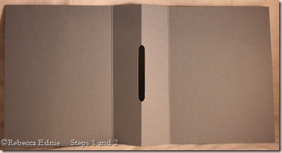
Step 1. Cut Cardstock 5.5x11”. Score at 4 1/4”, 5.5” then turn the paper 180 degrees (turn, not flip) and score again at 4.25. ( I have a Scor-Pal and 4.25” has its own channel so it is easier to turn it than figure out where to score again!) Fold with bone folder as shown below. Two valley folds and one mountain fold.
gift card holder tut1
Step 2. Mark the width or length of your gift card/certificate on the mountain fold, centering it. Add 1/4” at each end. (Whether you use the length or width depends on which way you choose to put your gift card in. Either way will work.) Use your word window punch to punch the center of the mountain fold. Only insert the paper into the punch a bit less than half way. You will probably need to punch twice to cover the distance. Just line the punch up with the previous hole for the second punch. If you don’t have a word window punch, try using a 3/8” hole punch on each end, paper only inserted to bit less than the half way point of the circle, punch. Then connect the tops of the two circles with your paper cutter or a ruler and craft knife.

Step 3. Flip the cardstock over and apply adhesive to the fold as per the photo below. Do not remove the backing yet!
gift card holder tut2

Step 4. If you wish to stamp directly on the front of the card, do so now.
gift card holder tut3

Step 5. Remove the adhesive backing, close fold and finish the card front.
gift card holder tut4
Now I have to explain something. I am totally creeped out by anything supernatural including vampires. I know there are a TON of you out there who are crazy for these books and movies. However, I am not. I only have this card because I was given it when I returned something. I didn’t notice what was on it until later and I didn’t notice which card I had picked out of my wallet until I looked back at these pictures. If I still had the gift card holder I would have changed it and if I knew how, I would blur it out. I apologize to anyone else who is a strict Christian like me.

Here’s the finished card. This is an AWESOME way to use up scraps. And so easy to make!
gift card holder coach final
There is a foam dot under the chocolate circle at the top and the ‘graph’ paper at the bottom. I used the second and third from the smallest of Nesties large and small circle dies and my SU! 1” punch. Here’s a tip. My paper was double-sided so I placed the pieces side by side on my Cuttlebug plate. I put one of the circles I had chosen on each paper and one underneath each paper. Make sense? Two on top and two below. I cut 4 circles in one pass!

Enjoy, Rebecca

RECIPE
Stamps:
rough edges wheel, letterpress alphabet, everyday phrases
Ink: Java (scented ink)-Ranger, bordering blue
Paper: bordering blue, vanilla and chocolate CS, DSP (actually only two pieces of double-sided paper)
Accessories: Nestabilities circles, chocolate eyelets-CTMH, foam tape-dollar store. All products by SU! unless otherwise noted.

June 24, 2009

Baby Pail Tutorial

Jameson’s teacher is having a baby due  in August. So instead of a teacher-themed gift, I decided to make a baby gift. I mean after all, teachers aren’t just teachers, they are people too! I emailed baby pail1 her to ask the gender of the baby but I didn’t get an answer in time so I made it yellow, white and green. Funny thing is, I am tickled pink about it! I just love it! I am going to add a few gender-appropriate coloured ribbons to the handle because now I know! I guess I can list it here because my son doesn’t read my blog. The teacher is going to keep it a secret from them and have them guess-boy or girl. Since I love this project so much, I decided to make a tutorial for covering and decorating the pail. (Sorry about the picture, I took at least 20 pix with different settings. The colours are too grey, especially the celery front panel, the shadows too dark and the handle is blurry, don’t worry, there is a close up of the handle later!)

Step 1: Choose your paper. For this type and size of pail, you will need 2 sheets of 12x12 designer paper (DP) to cover the pail, 1 sheet of a coordinating paper and three colours of 8.5x11” cardstock. I think I ended up using 2 of each celery and white and one of banana. You could use two different patterned papers to cover the pail, but then you will have to be WAY more precise with your placement to get it even on both sides. I don’t recommend it.

Step 2: I started with my lid. Use a circle cutter or appropriate sized circular item to trace and cut cardstock. Cut another, baby pail lidslightly smaller, circle from the single sheet of DP. (I ended up using two different kids bowls from IKEA to cut mine.) Cut the largest of the large set of scalloped circle Nesties from cardstock. I embossed mine with a Cuttlebug embossing folder. It just fits the width of the folder! Cut another from the largest of the small set of plain circles. Stamp a background on it or embellish it with stamping or die cuts. Adhere in layers as shown here. I used a SU! bear which I sponged to give him more depth and rosy cheeks.

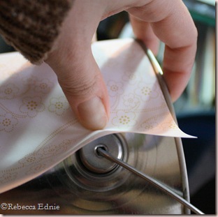
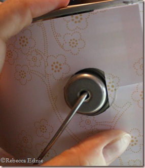
Step 3: Cover your pail. This part can be a bit tricky. Measure your pail height in several places, average them and cut both of your sheets of DP . Be sure to cut them both with the same side up. My pattern isn’t too directional and I noticed after that I had cut mine differently! I added ribbon to the top and bottom of my pail so I didn’t have to be too careful. But I recommend you try to be baby pail tutorial1accurate because it gives you more room for goofs! Mark your paper where the handle goes. You can see my marks in the photo. I placed the smallest small Nestie circle (I think) under the paper because I didn’t have a punch the right size. The paper is too large for my Cuttlebug so I simply pressed my finger over it and it gave me an impression strong enough to see and cut along. Even if you use a punch or a have a larger die cutter, you still need to make a small slit from the edge of the paper into the circle. Mine baby pail tutorial2needed a fair bit of trimming (larger) but I finally got it PERFECT! Wrap your paper tightly around the pail, making sure the paper doesn’t slip from it’s position over the handle attachment. Mark the edge of the paper with your fingernail, pressing it right down into the groove between the pail and the handle attachment. (Photo below) Use this mark as the starting point for marking the placement of your second baby pail tutorial3circle cut out. Measure down from the top the same amount as you did on the previous circle, mark and cut. Because I had to trim so  much in addition to the size of Nestie shape I cut for circle one, on the second side, I tried using one size larger Nestie and it was too big. GRRR! It also ended up a bit off  (photo below) so make sure that your wrap tightly, I must have had it a bit too  loose when I marked baby pail tutorial4mine. Now you can do it your own way, but I will deliberately offset my cut circle slightly next time! And I figured out how to get the perfect size circle  between sizes. This time I layered and pressed BOTH of the Nesties I had used before  into a scrap to repair my handle, I found that by cutting EXACTLY between them gave me the size I needed. I slipped my scrap underneath and you wouldn’t even see it. So don’t stress if it isn’t baby pail tutorial5perfect the first time. You can fix it unless your patterned paper is difficult to match. Next step is to cover the back of the pail first. I think the seams should face to towards the back, therefore  hidden from the eye which they will be if the front overlaps the back. So the back paper goes on first. The back piece will be cut to the length between the handle attachments.  No more cutting out the circles! Stick it on with red line tape or similar adhesive. I used several small pieces rather than one large one. It made it more manageable when applying it and was easier to keep it straight.  Now apply the piece with the holes. If you wish, you can trim the second side to match the first as the holes will likely be different distances from the paper’s edges. I didn’t bother. Apply with adhesive the same as the back. Tricky part over!
Step 4: Create the front panel. The green cardstock is 8.5” wide and the white is 7.5” wide but I don’t have the other baby pail front closeup measurements and the punch took some off anyway. This is the fun part!! Decorate this panel anyway you like. I used a Sizzix alphabet to cut my letters. You could of course stamp them, use letter stickers or rub-ons. TIP: If your letters are small enough, put several dies through on one ‘crank’. I managed to do all those letters with only two passes. I lost the dot for the letter ‘i’ so I cut the prongs off of a brad, used dimensional glaze to fill in the back and once it was partially set I added it to the white panel. Not only did I forget to put the brad through the paper until after the layer was adhered, of course! but I also wouldn’t want the brad prongs to show through. My BFF makes these gorgeous Irish crocheted flowers. Email me if you want to order some of these. We haven’t set up the official post yet but she is almost ready to make more. Any colour, minimum order of $8 CAN. (There are other styles too, mix and match) We can match floss to SU! or PTI colours or send us the floss colour numbers you want.

Step 5: Finish any other decorating you choose. Maybe add a ‘Made by…” tag on the back or add ribbon to the top and bottom edges like I did. I put my ‘made by’ tag on the inside of the lid. Along with my contact info, I’d love to make these to sell!

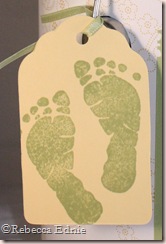
Step 6: Decorate the handle. I chose to use a bunch of tags but you can use ribbons or any little embellishments you can glue to baby pail tag right ribbon. I suppose you could glue them right to the handle too. Buttons would be cute… I made a special tag with a poem I wrote on it. Please feel free to copy and share it but please put my name at the bottom. (yeah I know my handwriting sucks)

Memories never seem to last,
Kids grow up quick, much too fast.
Put special things into this pail,
Come back later, they’ll tell the tale,
Of how they were when they were small,
And then you will remember all.
Rebecca Ednie

(Feel free to replace ‘they were’ with ‘he was’ or ‘she was’ if you wish, I didn’t know the gender.)
baby pail tag left reverse baby pail tag left
baby pail handle tags
The middle tag is a bit too big (I already trimmed it some) but I like it anyway. I used SU! markers to colour the images.

That’s it! I hope you like it as much as I do. One last thing, open up the pail and you get this…
baby pail thank you card bundle tied …8 cards with matching envelopes! I also wanted to add a small notebook with pages listing special dates, occasions and ‘firsts’, kind of like a baby book but just for her to write in things quickly before she forgets. She can scrapbook them or write them in a proper baby book later.
 baby pail thank you card

Enjoy, Rebecca

RECIPE
Ink:
Memento brown, banana, celery, pretty in pink, pink pirouette
Stamps: various SU! baby sets, baby set by Fiskars,
mini heart background-Hero Arts
Paper: celery, banana, pink pirouette, white CS, DP
Accessories: ribbon-Offray, striped ribbon-Taylored Expressions, Nestabilites, Cuttlebug embossing folder, Markers, word window punch, large and small tag punches, Crop-a-dile, green and baby shoe brads-stash, Sizzix alphabet. All products by SU! unless otherwise noted.

June 23, 2009

Always Wedding Card for Twinkling Tuesday

Madelynn’s challenge this week was to use rhinestones! YEAH! I love rhinestones! And nice and easy ‘cause I could use rhinestones on so many different cards! I had a wedding set by MFT on my desk because I stamped some images for Kimmie so I used that. Easy Peasy right? We’ve been invited to a wedding in October so I can save it until then.
wedding bride
You can’t tell from the picture (YEAH) but there is a small goof. For some reason, my Copic clear blender makes my Adirondack ink bleed. AHHH! It is very slight because I only used a tiny bit of it along the right edge of the bride’s dress so I could blend in a tiny bit of B00 shading. I have no idea why it is bleeding when it never used to. Frustrating. It didn’t bleed when I coloured the hair or bouquet. The paper is shimmery white and the other layer is gold. You can just see that I embossed a rectangular Nestie into the top layer. It was so easy. Just beware that the Eclipse tape I used also left an embossed mark. It is faint but there (goof #2). Next time, I’ll have to get a magnetic sheet by Wizard to keep it in place. (Not for a while, my hubby is on strike. CRAP!) I will also use a darker pink or gold embossing on the sentiment next time. I used 6 pale pink rhinestones on the card, 5 clear Tiny Twinkles on the dress and one soft green Twinkle in her hair. Gotta love those little Twinkles!

Be sure to visit all of the Twinklettes to see their beautiful cards. We’d love it if you’d play along! Be sure to upload to SCS or PCP with MTTSC28 or upload to your blog. Then link to Madelynn’s blog, Twinkling Tuesdays so we can all see your work! I sure hope you will play along.

Enjoy, Rebecca

RECIPE
Stamps:
MFT
Ink: Adirondack black, SU! pretty in pink
Paper: shimmery white and gold-SU!
Accessories: Nesties, Zva rhinestones, Tiny Twinkles-Taylored Expressions, Copic markers

June 21, 2009

Pink Peony for Clear Dollar Stamps

This is one of 4 sympathy cards I made for family members recently. This one is for hubby Tim’s mom, it was her mom who died. Doesn’t this beautiful flower work so well for this? I enjoyed making it though I wasn’t stuck on my watercolour technique on this one. I find it hard to make very pale colours look right. Oh well. I wasn’t sure what to do for a sentiment but after thinking cdspink moss peony about it, the included sentiment worked for this particular occasion because grandma was an avid gardener. I decided to put it inside the card after all, rather than on the front but it reads, “When a flower blooms, so does hope.” Lady Bird Johnson. The button used to be vanilla from SU! but I coloured it pink with a Copic, R21 I think. I traced around the flower using the outer edge of the second largest Labels 4 Nestabilities die. Clearly it isn’t perfect but I like the result and will do it again. I wish Spellbinders would make another set or the Labels dies and Mega Rectangles including intermediate sizes like they do with rectangles, circles etc

I used my bow easy to create this cute little bow AND I threaded in the ribbon that goes across the card while making it. I don’t like just plunking a bow on top of the ribbon across the card. Because it isn’t puckered, it gives away that you ‘cheated’! Yeah, I know it isn’t really cheating, if it looks good there is no cheating, but I really like the ribbon underneath to be puckered so I throw in a second ribbon before tying; it is really easy. I hope to do a photo tutorial on it soon as well as some other bow tying and Bow Easy tips. If you are interested in a Bow Easy, visit Sharon Johnson’s blog and click on her Tools page way up high by her blog header. Super cheap and easy to use.

Enjoy, Rebecca

RECIPE
Stamps:
Peony by Clear Dollar Stamps
Ink: Stazon brown, mellow moss-SU!
Paper: Basic Grey DP, mellow moss CS, watercolour paper-Strathmore
Accessories: ribbon-Masterstroke, Button-SU!, green buttons-Basic Grey, foam dots-Jody Morrow, Labels 4 dies, mellow moss marker-SU!
Technique: watercolour

June 19, 2009

Joy Fold Seaside Card

This was a really fun card to make. It really is one normal-sized card with one side shortened and one mini card put together seaside joy fold1 overlapping each other. The little crab keeps the mini card  closed. So cute! I chose this card so I could use Card Directions again! Such a cute little set and at $1.99 how can you pass it up?

  I used Shore Treasures to make the main part of the card. I LOVE this set!! The style of the illustrations are so perfect for  seaside joy fold closeup watercolouring! Kinda wispy and flowing. Yeah, I know my watercolouring is far from perfect but I have such fun doing it and I wasn’t going for perfect. I think I should have stamped my waves at the edge of   seaside joy fold open1 the sky and the water and a line of sand at the edge the sand and the water. Oh well. Unfortunately, the colours are cdsseaside joy fold open2 somewhat washed out, even with no flash. ***SIGH*** You also can’t see the PearlEx I used for the shell and the sand.

  I took photos of the stages involved in opening this card above. Plus a close up of the watercolouring. I was actually quite pleased with the crab. I think he really looks like the sun is hitting his right side. I’m not sure I have ever seen a real crab so forgive me if the colours are wrong!

Enjoy, Rebecca

RECIPE
Stamps:
Shore Treasures, Card Directions
Ink: Stazon brown, bordering blue-SU!
Paper: DP-Bella Bella, bordering blue and chocolate CS-SU!
Accessories: foam dots-Jody Morrow, watercolour crayons-SU!, tag die-Quickutz, Aztec Gold PearlEx, Hemp twine-Hemptique, artichoke marker-SU!, watercolour brush
Technique: watercolouring

Etsy Store Update

I have updated my Etsy store, Precious Paperie. The cards have all been on this blog before but it would be awesome if you, my faithful readers, could pass along the link to family or friends who don’t make cards! www.PreciousPaperie.etsy.com I know I just have to stick with it, just like I did with this blog when it was new. It’s just hard because I haven’t sold anything yet. Thanks for your support.

etsy

June 18, 2009

Flower Pot with Torn Petal Flower Card

This was a fun card to make. I’ve seen quite a few flower pot cards around lately. I couldn’t be bothered trying to find the directions so I made up my own pot and flower with leaves. So here is a tutorial!

  1. Start with cardstock for your flowers. I worked with a sheet of cardstock that I made using instructions for Wrinkle-Free Distress. I used vanilla paper with blush, pink pirouette and pretty in pink ink. Much prettier IRL!
    flower pot card1
  2. Cut your paper into squares. Mine were 2 each about 3”, 2” and 1.5” but I didn’t measure them. Then tear them into rough 5 petal flower shapes. I drew the shape on the smaller layers because I found it hard to get 5 petals instead of only 4. They do not have to be perfect. Mine sure weren’t. Now crush the paper, fold it over and over until it is really soft. I found that my paper was softer then usual from the wrinkle-free distress technique which helped fold and crush it. Don’t worry if your flowers are oval or squarish rather than round or if your petals are bizarre shaped! Curl the edges up.
  3. Make a few smaller flowers from darker paper. We all have noticed that the center of flowers are deeper coloured. I used plain pretty in pink cardstock. I used my MS hydrangea punch and since the edges weren’t torn like the other petals, I heavily distressed them with my scissors. Then I split the card stock into two layers and used them with the unfinished side up.
  4. Punch a hole in all layers. Layer all your petals and insert a brown brad. Turn the layers until the petals look good to flower pot flower closeup
    you. You want the petals to fit between each other rather than aligning them which won’t look realistic. I tore a couple of petals a bit smaller to make my peony more circular and tore a deeper groove in a couple places.
  5. Make a few matching leaves. I tore mine and laid them on the straight edge of my ink pad and pulled to create the look of a vein. Crush and fold them until soft. Curl edges up.
  6. Make a flower pot. Mine was a bit small so these are the adjusted flower pot card2measurements. Cut your cardstock 3.75” wide by 8.5” long. Your pot will look more proportionate than mine (mine is a bit too tall for the width I think). Score in half and 0.75” from each end (mine is 0.5” but I wish I had used 0.75”!). Slant the edges. I just put mine in my paper cutter and chose a diagonal that looked good. Use the cut off paper to cut the second edge or just look carefully where the points of the paper fall and align the second edge the same way. I did the latter. Use a corner rounder on the corners and fold the edges down. Distress or stamp the pot if desired. I deliberately made mine very messy. You could also use a border punch on the folded edge if you wish. Use 1/8” strong adhesive (red line adhesive or Scor-Tape) to glue the diagonal edges of the pot.
  7. Cut an insert that matches the size of the pot with a bit flower pot card3 extra at the top to attach the flower and leaves. Mine is already attached but the measurements are listed, click on the photo to see it larger. I wish mine was a bit higher to cover the brad so change the height if desired. I used a scrap of the distressed paper I made for the petals. I will probably make a cardstock back for my insert that will cover the pencil marks that didn't quite erase well and will rise higher to cover the brad.
  8. Put the insert in your pot and mark where you want the flower and leaves. They should overlap the edge of the pot. Remove the insert to glue them on.
  9. Add a tag with ‘pull up’ to your flowers so the recipient knows how to ‘open’ the card to read. The word ‘up’ isn’t cdsflower pot card5 included in Card Directions so I used a marker to get a ‘u’   and a ‘p’ from other words. Your message goes on the insert. You could make the insert larger for more writing if desired by cutting a folded piece of cardstock for the insert. I am still considering adding a ribbon to the pot. You certainly could embellish your pot more than mine!

The great thing about having this Card Directions set is that it inspires me to make unusual cards. I think I might have to store it somewhere I can see it often so I remember to have fun with my folds more often!

Enjoy, Rebecca

RECIPE
Stamps:
Card Directions by Clear Dollar Stamps
Ink: cocoa, blush, pretty in pink, pink pirouette, mellow moss-SU!
Paper: cocoa, vanilla, moss, pretty in pink CS-SU!
Accessories: tag die-Quickutz, hemp twine-Hemptique, craft sheet-Ranger, brad-CTMH, MS hydrangea punch
Technique: Wrinkle-free Distress, Torn Petal Flower

June 17, 2009

Sympathy Card for Hubby

I know, I don’t have to make a card to show my hubby that I am sorry his grandmother died and that I care. After all, I passed up going to the Creating Keepsakes Convention in Buffalo three Saturdays ago to go with him to see her in the hospital. It was the last time we saw her awake and happy so I’m very glad I went. I didn’t make a card for almost two weeks because he was too stressed to watch our very sweet but patience-trying baby for tim beach sympathy
very long (I am not a quick card maker). I supported him in every way I  could. But after all, I am a card maker and if I don’t make cards for the most important people in my life, what is the point of making cards at all???

Oh, and this rubber was new!! LOL Hee Hee! (OK, enough, this is supposed to be a very serious post about a sympathy card. Smile wiped off face…) This set is called Coastal Wished by Our Craft Lounge. I bought it specifically because I have been having trouble making guy cards for guys I don’t know well. Sure if you know what they like you can make a card that suits them but to me the beach for guys seems to be the equivalent of flowers for women. Works for everyone. I can’t think of a single woman I wouldn’t send a floral card to; I can’t think of a single guy I wouldn’t send a beach card to. Perfect! It just seems harder to get universal images for guys. If you have any other themes that fit the bill, please leave me a comment or email me to let me know!! And don’t say ties or soap-on-a-rope!! (Ooops, having fun again, back to serious!!)

This card couldn’t possibly be simpler so I have very few comments on it. First, this is two stamps, just so you know. I lined up the horizon line on my second image with the grid line on my block so I would know where to stamp so they would connect, these being rubber, not clear polymer. Second, I love watercolouring and I used watercolour paper because the washes warp normal paper. Third, this card is an unusual size. 6x3 3/4” I think. Last, I used markers to enhance the tree and tufts of grass, so much easier than trying to use a fine brush and watercolour paint. Mixed Media YEAH!!

Enjoy, Rebecca

RECIPE
Stamps:
Our Craft Lounge
Ink: Stazon brown
Paper: watercolour paper by Strathmore, ruby red and not quite navy CS-SU!
Accessories: waterolour crayons, watercolour brush, markers-all SU!
Technique: watercolour

June 16, 2009

BBQ Invitations

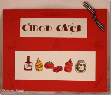
I made 41 of these cards. Not as fancy as I would have made them if I there was only one of course, but still cute I thought. Lots of work to hand colour them all. Jameson helped with some and he did a seriously good job. When he didn’t want to go to bed tonight, he said he wished he had more colouring to do! AWWW! So Cute!
BBQ 09
I coloured the images with Copics and the stamp set is from Our Craft Lounge.

Enjoy, Rebecca

June 15, 2009

Purple Peony for Twinkling Tuesday

So sorry I missed last week’s sketch! Everything was so crazy around here between when Grandma died Sunday morning and the funeral Saturday. Now things have calmed down and I am back to some serious card making! YEAHHHHH!!! This card is also cdspurple peonythe first one I made for my Guest Designer time with Clear Dollar   Stamps (might end up being the second one published though). It was so frustrating to not be able to use them right away. So since I couldn’t make cards, I at least could watch the baby while I coloured. My shading isn’t as smooth as it could be and my lights aren’t as light as I would have preferred them because of terrible lighting in the family room. I got the frame idea from Becca Feeken of Amazing Paper Grace. She does this kind of thing all the time.

The grosgrain ribbon looks kinda brownish here but it is  really purple peony copicsdeep eggplant. Did you notice what I did with it? It didn’t look right over the stem so I cut along side carefully with my xacto knife and slid the ribbon underneath. Much better! I goofed a bit and stamped the sentiment right over a darkish spot in the pattern. It made the words hard to read so I used the tip of my sanding files to scrape the colour off the paper inside the letter ‘e’ and along side the ‘h’ beside the ‘e’. Now you can read it just fine!!

This great sketch is by Madelynn of Twinkling Tuesdays. She is only 9 but produces a sketch for us grown-ups nearly every week. clip_image002Play along with all of the Twinkle Team (links on sidebar) by producing your own awesome version of the sketch. Be sure to upload to PCP or SCS using MTTSC27 or your blog. Leave a direct link at Madelynn’s blog so we can all see your creation.

Enjoy, Rebecca

RECIPE
Ink:
Memento brown, almost amethyst and eggplant-SU!
Stamps: Peony by Clear Dollar Stamps
Paper: Almost amethyst and ?BB purple CS-SU!, DP-Basic Grey
Accessories: Copics as pictured, Kaisercraft pearls bliss, ribbon-Masterstroke, grosgrain ribbon-SU!, Nestabilities Mega rectangle, foam dots-Jody Morrow

Howdy, Howdy, Howdy!!!

If you have ever seen the Rescuers Down Under, you should know exactly where this title comes from. Frank, the little frilled lizard?? Anyway, it seemed like the perfect sentiment for this little Charlie horse card. This new June set from Clear Dollar Stamps is called Lean on Me Charlie. You must go and see it! Now Charlie is designed to lean on the barrels or a saddle on a saddle rack cdshowdy howdy included in the set but I thought he looked like he was being cocky, with a hoof on one hip and the other in the air practicing with his lasso! I decided to leave the lasso close to, but not over cdshowdy howdy closeup the barrels, leaving you wondering if he will make it! The next photo shows the lasso over the barrels; I designed it so it would fit if I felt like sending it that way.

I wanted to use an interesting card fold to highlight the other Clear Dollar Stamps set new this month, Card Directions. What a clever set! Now the recipient of all those super cool, nifty fold cards we make will know what to do!! It isn’t super obvious but it says ‘lift’ on the buckle portion of this Buckle Card. I haven’t made one of these in AGES!!! Cute though, huh??

Charlie is stamped on Kraft paper and coloured with Copics. I took a photo of the Copics I used but some were used for the cdshowdy howdy copics saddle which I coloured but didn’t include on this card so omit at least E04 and 08. The metal around the barrels and Charlie’s horseshoe were coloured with pencil crayons as well as some shading on Charlie’s tummy. The cardstock inside the card was too bright compared to the DSP so I toned it down with DTP inking with both brown and after white ink to match. Which is why the second ‘Howdy’ is a tiny bit smudged. The white pigment ink seemed to make the paper a bit slippery.

Enjoy, Rebecca

RECIPE
Stamps:
Lean on Me Charlie, Card Directions by Clear Dollar Stamps
Ink: Memento brown, Burlap Distress ink, VersaMagic cloud white
Paper: DP and CS-SU!
Accessories: foam dots-Jody Morrow, Copics as pictured, Jute Rope, coloured pencils

Glitter Sale

Just thought I’d pass this on to all my readers!

Art Glitter

ARE YOU GA GA FOR GLITTER? GET YOUR GLITTER FIX NOW AND RECEIVE 25% OFF EVERY JAR OF GLITTER ORDERED THROUGH JUNE!*

*Place your order and purchase at least six 1/2 ounce jars of Art Glitter's Ultrafine colors now through June 30th, 2009 and save 25% off that glitter! Just mention in the comments area under your credit card details that you are GA GA FOR GLITTER and we will apply your discount to your total! Order more 1/2 ounce Ultrafine glitter and get more off!
*Special applies to retail orders only. Not valid with other offers.
Microfine, Vintage Glass Glitter, Glass Beads and Gala Glitz do not qualify for discount.
Must purchase at least 6 jars of the 1/2 ounce size for glitter to be eligible.
Discount only applies to 1/2 jars of Ultrafine glitter.

June 06, 2009

Family Issues

ETA: Grandma died Sunday at 5am. We will miss her. The service is on Saturday.

Please forgive me if I am postingly challenged the next little while. My husband’s grandmother is dying and needless to say, life has been a wee bit stressful! My 8 year old son, Jameson, understands she is dying, but only sort of. Great-grandma is well  gramma harris and baby J alt over 80, has had a bad heart forever, she’s been dying of an aortic aneurysm ever since I have known my husband - 12 years, has recently been diagnosed with lung cancer and suffered a massive stroke a couple days ago. Poor kiddo still thinks living is better than dying even though she is mostly comatose and almost completely unresponsive, not eating or drinking and certainly not gramma harris and baby s enjoying life. He doesn’t understand that death is welcome at this stage and the baby is just plain scared even though there are no scary medical devices at this stage, in palliative care. Jameson decided today, after much deliberation, to see her even though she doesn’t really look like she did, even a week ago when we visited. I think seeing her like that was scary but he was brave and did well as can be expected of a little guy. I haven’t asked yet but maybe he understands better now that she isn’t really there. Last time she was happy, singing and definitely gramma harris and baby s2 enjoyed our company. She watched Jameson reprise his 70’s song and dance from the spring concert at school, asked for a drawing for her bulletin board and was laughing while smackin’ high fives with Spencer. Today there is nothing of her real self left.  I feel so bad for Jameson, he is such a sweet, sensitive little soul! If anyone is interested in sending a card to cheer him up, let me know and I’ll pass along our address; he’d be thrilled!

Pictures: TOP Anne Harris with Jameson as a baby in 2001, MIDDLE &  BOTTOM Anne Harris with Spencer as a baby in 2007.