December 31, 2008

Have an Extra Card or Two??

A sad story, a young mom found out she had cancer when she was pregnant, even requiring chemotherapy treatments before the baby was born. Scary! She beat the odds for a while but she died when the baby was three. Now that baby girl is 5 and has cancer herself. How sad is that.  Click HERE to send a card to help.

One more. This young boy's cancer is back, needs a bone marrow transplant and his Chemo Angel would like to send him an extra large package of love. Send a card and be entered to win a big box of blog candy!! Click HERE to learn more.

Feel free to pass this on using your own blogs!
Thanks, Rebecca

So Sketchy Flowers and Dots Card

WHEW!! Right in under the deadline for the So Sketchy Design Team! I don't usually leave things like this until the last day but it has been so busy with my son home from school! I really find these sketches really inspirational so I will do them more often even if I don't get on the DT; but I course I sure hope I do! {{GRIN}} Pretty Please!!!flowers and dots

I got these papers from Sweet Pea Scraps. They are a great little company supplying fabulously well matched papers, ribbons and bellies for a great price with none of those nasty rules of other bigger kit companies. Need to skip a month? Just say please! You get a cheaper price for committing to 6 months, but again if you need or want to skip a month, no big deal. Now that I am no longer a SU! demo, I am trying to branch out into other paper companies and this helps me decide where to start looking.

Anyway, that is my little plug for them, just 'cause they are so nice. Back to the card. The layout is pretty simple and easy to put together. The flower is stamped with chocolate brown ink using a French Script stamp. It is actually kinda hard to stamp a slightly 3-D object but I like that it didn't stamp perfectly; gives it more character! The button is clear backed with a scrap of the same paper as the label 1 Nestabilities die cut, just the reverse side. But there is a small surprise under the Label.
FLowers and dots hidden flap

TA DA!! I {heart} the pop of colour under there!! I deliberately cut out that portion of the paper because I liked the swirl. I did the same with the floral panel under the label die cut. In sewing, carefully cutting to get a specific portion of a design is called 'fussy cutting'; like when garment using an animal patterned fabric has one of the animals perfectly centered on a pocket. Or a pocket perfectly matches on a plaid shirt. Do we paper crafters have a name for it? I think the same expression works equally well here!! The So Sketchy sketch actually called for that flap, I love sketches with a little something extra like that. I tried adding more ribbon somewhere but it just didn't work; whadda think?

Enjoy, Rebecca

RECIPE
Paper:
Crate Paper Blue Hill Collection
Stamps: sentiment unknown set, French Flair - SU!
Ink: Chocolate chip and Close to cocoa for distressing, Regal Rose -SU!
Accessories:
brad - unknown, Flower - Scrapbook Sally, clear button and sheer ribbon - SU!, foam dots, Nestabilities Label 1 die

December 30, 2008

So Sketchy Purple Hydrangea Wedding Card

The So Sketchy Team is looking for new DT members so I made this card, following one of their sketches, to enter the search.

purple hydrangea wedding card1

Looks simple enough right? The original sketch can be found HERE. Cool sketch but I decided to make it a bit more interesting. Instead of treating the half circle as a layer on top of the card, I decided it needed to be a layer UNDER the card! Watch...


purple hydrangrea wedding card 2
The lowest brad is actually a hinge allowing you to pull the insert out. The edges of the white CS insert are stamped with 'Always' as is the shimmery white CS tag. The insert gives you room to write without having to find a light coloured gel pen. I have tons of them but can I find them when I need them?? Of course not {{GRRR}}. The circle cutout was done with Nestabilities. In case you want to try this, the outer card is square then folded in half. Your insert should be 1/4" smaller both ways than the folded card. This allows you to align the insert with 1/8" clearance at the top and bottom and 1/4" clearance at the folded edge. If you do not have this, the corner of the card will snag as you try to rotate it. Another solution would be to deeply round the corner nearest the brad. BTW, it does swing out the whole way, this was just the easiest way to photograph it.

To get the ribbon loops under the bow, I made holes in the ribbon at roughly equal intervals so the loops were long enough to peek out from under the flower. The loops are formed one at 12 o'clock, then one at 6, then at 2, 8, 4 and 10. Hope you can understand that. If not, let me know, maybe it's worth a tutorial!

Enjoy, Rebecca

RECIPE
Stamps:
floral background, 'always' Fancy Flexible Phrases
Paper: eggplant, shimmery white, white CS
Ink: eggplant
Accessories: flower - Michael's, brads - probably Making Memories, Big Bite, Quikutz tag die, silver cord, purple ribbon - unknown, rhinestone brad - unknown, Nestabilities. All products SU! unless otherwise noted.

December 29, 2008

Twinkle Team Blog Candy! Spring Shaker Card

I decided to do three challenges in one! OCC had a Clear Thinking challenge to use something clear on your card. I immediately thought of an acetate window, then thought of Miss Madelynn's sketch for the Twinkle Team. SCS had a Limited Supplies challenge 200 to make anything but a Christmas card & no green, no red so this works for that too. COOL {{GRIN}}!! Very easy for me, not really owning any X-mas stamps or sentiments, though it was hard to not use celery on this card. The colour, not the vegetable!! HEHE

mttsc3 shaker

This week, if you play along with the Twinkle Team and try out Madelynn's sketch, you can be entered to win blog candy!
MTTSC3 (3) So upload your version of the sketch to SCS or PCP with the keyword MTTSC3 or to your blog, then leave a comment at The Whimsical Butterfly to enter (leaving a note as to where she can find your card). Be sure to visit the entire TWINKLE TEAM to see more inspiring versions of this week's sketch. Links on sidebar.

This card is pretty easy, the pale plum CS layer was embossed using the d'vine swirls folder. The shaker box was made using special foam squares from Jody at Confessions of a Ribbon Addict. The banana and pale plum layers over the shaker are cut with Nestabilities dies. Inside the shaker are two sizes of punched flowers, glass micro beads and glitter. The base of the shaker is white CS stamped with a flower and leaves from  stamped in Adirondack ink coloured with Copic colours V 04, 09, 12 and YG 67 and G 21. The little flowers are actually from a daisy chain fibre but two nipped off the end quite nicely; I'd been afraid they would unravel.

Enjoy, Rebecca

RECIPE
Stamps:
   SU!
Paper: pale plum, perfect plum, banana, white CS - SU!
Ink: Adirondack pitch black
Accessories: shaker box foam - Jody Morrow, daisies - unknown, Nestabilities - Spellbinders, punches - EK Success, Glitter and micro beads - unknown, Copic markers, embossing folder - Cuttlebug, ribbon - basic grey

December 27, 2008

Hero Arts Sketch Contest - Snowflakes

I WANT to WIN! The Hero Arts Contest has a $50 prize! Cool! I am starting to love doing challenges, especially ones that may result in candy - I have such a sweet tooth! {{{LOL}}} You can see the Hero Arts Sketch here. I also included a Limited Supplies Challenge for Splitcoast Stampers LSC 197 - Let it Snow, let it snow, let it snow. The rules were to make the card monochromatic, use glitter or bling and snowflakes, not snowballs, snowforts, snowdrifts or snowpeople! ONLY snowflakes. Alrighty then! Snowflakes it is!

let it snow1
let it snow closeupcorner The snow swirls are embossed with white, blue and iridescent ice embossing powders (EP). The snowflakes with white and iridescent ice; the letters with silver and iridescent ice. then I added stickles to the middle of every snowflake and to all 6 points of each larger snowflake. Both the circles and scalloped circles were cut with Nestabilities. I love that you can actually see the sparkles from the glitter in the snowflake card closeup circle lettering (click to enlarge if need be) and even in the swirls! The circles were harder to photograph for some reason and didn't show the glitter {{sigh}}. The brocade blue cardstock is also stamped with a snow swirl and snowflakes using Versamark ink for a subtle pattern. I wish I had edged the card base and brocade blue panel with a silver paint pen, oh well, it would be too hard to take apart now. Off I go to enter! Wish me well...

Enjoy, Rebecca

RECIPE:
Stamps: All Decked Out and Chocolate alphabet by CTMH
Paper: whisper white, night of navy, brocade blue CS
Ink: Versamark
Accessories: silver, white, blue, iridescent ice EPs in various combinations, silver ribbon, foam dots. All products SU! unless otherwise noted.

Cute Boy Stamps

New stamps are being released in January from Spiral Whisper in the UK.  Click here to see them. If you have a blog, post about their release and be entered to win them!

December 26, 2008

Another Blog Candy Alert

Go to Kath's Blog and enter to win a whole grab bag of cool stuff. Click HERE to link directly. Be sure to visit by 7pm EST December 30th. I checked out the stuff, pretty nice! Hope somebody who links through here wins. Unless of course I win!! {{{LOL!}}}

Floral Anniversary Card

Ever go back, I mean way back, to when you first started stamping, looking at the photos of your past work?? Well I did that today in my quest to find scrappable photos, tag them and get them printed. Wow, did I ever create some scary stuff. {{GRIN}} LOL! OOOH baby, it was sooo not good!  What is that expression, "We've Come a Long Way Baby"? Yeah, I know it was originally for a politically incorrect company but the sentiment stands. This one isn't from so far back, only 2 years ago.

floral anniversary Unfortunately, I took the photo on the dining room table; I wasn't blogging then and only took the photo to save the idea. DH was kind enough to blur away the edges for me removing the table but a bit of the card edge as well. Originally, it was edged in gold paint pen just like the love sentiment layer; nothing else is lost. The washer in the center of the largest flower was originally silver coloured metal, I dabbed gold paint pen on it to match the rest of the gold on the card. The 'love' sentiment is stamped in Versamark and gold embossed on pale pink CS. The French Flair background stamp is also gold embossed on a white CS base. The pink ribbon with gold edging is leftover from my wedding bouquet (I made it). Hope you like it, this is one golden oldie I was really glad I found!

Enjoy, Rebecca

RECIPE
Paper:
whisper white CS - SU!, pink CS - unknown
Stamps: French Flair - SU!, Love sentiment - unknown, maybe Stampington?
Ink: Versamark
Accessories: pink ribbon with gold edge - unknown, large brad  unknown probably Making Memories, small brads - SU!, paper flowers - unknown, gold embossing powder - SU!, gold paint pen-unknown, foam dots - SU!.

December 25, 2008

A Giveaway

Hello. I'm afraid I don't celebrate Christmas so no holiday message. However, I do hope all of you finish out the year happy and safe.

Not to be a bad sport, but personally, I hate winter weather and am looking forward to summer and flowers like this peony from my garden!

yellow peony

If you are interested in entering to win a set of Frosted Card Blanks from Short Cuts, click HERE. The contest is open until December 27th 12mn CST.

Rebecca

December 23, 2008

Art and Soul

I love the vintage/shabby chic/collage look but I am not very good at that. The reigning queen of that style, IMHO, is Melissa Phillips of Lily Bean's Paperie. I tried to emulate her style making this card art and soul but I probably shouldn't even tell you that because you will see her work and laugh at me! It is vintage and collage-y but I lack her elegant style. Oh well, I kinda like it. What do you think? The only thing I might change (or can change now) is adding something to balance out the celery coloured button and flower. ONe row of sewing thread matches but it is very hard to tell what colour it is. To me it seems to leave the viewer wondering "Why did she stick that colour in?"

RECIPE:
Stamps:
art verse - Stampington I think, architecture -unknown, flourish - Autumn Leaves, French script- Stampin Up!
Paper: Iron orchard designs by Prima, confetti ivory, not quite navy and celery cardstock
Ink: Baja breeze, not quite navy, Stazon brown, Versamark
Accessories: flower ribbon and yarn unknown, buttons unknown, celery and turquoise sewing thread-Mettler, flower punch unknown, gold gel pen- Sanford, sewing machine, ivory embossing powder- unknown, Crop-a- dile, glue dots, foam dots

Enjoy, Rebecca

December 22, 2008

Precious baby card aka the monkey card!

Sneak Peak revealed! This baby card was made for a baby I heard about here. She is full term but very sick because she inhaled meconium in her mother's womb. Meconium is a baby's first poop that isn't supposed to be released until after birth but stressed babies can release it too early. It is very sticky and once inhaled, prevents the lungs from opening fully and it holds on to bacteria, causing infections.

precious babyThis baby is so sick, she is on a heart lung machine to oxygenate her blood. I really feel for the poor family so I am joining the group who are all sending cards. That's why I used a monkey image and 'hang in there' for the sentiment. Seemed appropriate for a new baby girl, respectful that this is a time of mixed emotions for the family yet not too somber. If you want to play along click the link above. A chance to win a TON of blog candy is being offered to each person precious baby close up to sends a card. Deadline: must arrive in Bloomfield MI by December 30st so hurry up, make a card, then go hug your own kids! (OH, don't forget to mail it too!)

This card was made using Madelynn's Sketch #2. To see the full  sketch click here. Upload to SCS using MTTSC2. The strips of paper with 'precious' are hand stamped with pretty in pink ink on white CS. The curved rectangle Nestabilities panel is sponged with pretty in pink ink. If I made this card again I would stamp the monkey in regal rose ink on pretty in pink CS so it would stand out more but I am not cutting out 16 more monkey fingers and toes, especially since I had to finish this card with a squirmy 18 month old on my lap!

Enjoy, Rebecca

Stamps: cute converse, monkey business, dots and daisies background, rough edges alphabet
Paper: pink pirouette, pretty in pink, whisper white
Ink: pretty in pink, rose red
Accessories: pink and white grosgrain, heart punch-Marvy, sponge, Nestabilities, foam dots, oval punch, rose red marker

December 20, 2008

Fizzy Bath Salts

I promised about a week ago on Splitcoast Stampers that I would post my favourite bath salts recipe. Sorry I don't have a photo right now but I am working on some gift packaging so stay tuned.

Ingredients:

1 cup baking soda
3/4 cup citric acid

2 cups salt, this can be any combination you like of: coarse, rock salt, specialty salt like Himilayan or Hawaiian, normal table or Epsom salts. Do NOT use water softener salt! I use half Epsom and half coarse salts.
Scent. I prefer pure essential oils. My favourite combos: lavender and lemon, rose and lavender, lemon/ orange/ grapefruit. I use about 20 drops total.  You can also use synthetic bath grade scents. DO NOT use potpourri or candle making scents or home spray scents. These MUST be for body/ bath products. Small bottles go a long way. They usually recommend on the website or the bottle how much to use, I think I used about 20 drops.
The following are optional.
Colourants: again only use food colouring or soap making colourants. Gel icing colouring apparently works better than liquid food colouring. if you use re-inkers your washcloth, grout and even your may be coloured forever (OK, not your skin)!
Pretty Stuff: dried flower petals or leaves (organic or from your garden with no pesticide, Mike's has some selection in their soap making area), candy hearts (Lush puts these in their bath bombs, just one or two as a surprise) or even those fake petals you throw at weddings. I would wash and dry them first.

Directions:

1. Add colourants to salt. If you are using liquid or gel colourant, allow salt to dry for several hours before continuing. I usually can't be bothered so I leave them white. You can deeply colour only some of the salt if you wish, you just add the coloured salt later and it looks pretty. If you add only a very small amount, you can usually get away with mixing right away.

2. Mix scents with salt, cover immediately or you will lose the scents more quickly. I usually put mine in a Ziploc bag for now.

3. In a very dry bowl, mix citric acid and baking soda. Any moisture will start the reaction, even excess humidity in the air can start the reaction at a level that cannot be seen. You will have less fizzy salts as a result so try to do this on a dry day.

4. Mix salt with baking soda and citric acid. Add 'pretty stuff' if desired.

5. Seal in air tight containers. Leave for two days before using. I use about 1 cup per bath but most people would use about 1/4 cup.

TIP: All ingredients are readily available at health food or bulk food stores, except the bath grade colourants and scents. You can go to Mike's or Google soap making supplies to get tons of hits. Choose a place that sells small quantities.

TIP: I don't recommend buying Epsom salts at the drug store; they are about double the price than if buying bulk.If you are trying to save $, check the prices carefully; some essential oils are quite reasonable, others are VERY expensive, the bottles are so small they are not always labelled.

Enjoy, Rebecca

SPECIAL ANNOUNCEMENT!

I am on the Twinkle Team! This is a Sketch Challenge by  Jessica's monkey teaserdaughter, Madelynn. Click here to see her mom's blog and last week's  sketch. She is only 8 years old but she is going to produce a sketch every week for all of you to try. I will be preparing mine ahead of time along with 9 other gals to provide inspiration! I have already done mine, here is a sneak peak. Come by on Tuesday for the full card and recipe! Be sure to check her site then too to see all of the Team's work.

December 19, 2008

Dance Box Cards

These are super easy cards; they go in the box posted Thursday. Great for mass production! I used double sided papers so I mixed and matched the patterns, card base colours and ribbon colours, making each card a bit different. There were 8 in total; I am showing my favourites below.dance box card3
RECIPE
Stamps: Damask Monogram-Just Rite
Ink: close to cocoa
Paper: pretty in pink, white, chocolate chip and cocoa CS, retired DSP, cocoa DSP
Accessories: foam dots, chocolate and pretty in pink grosgrain ribbon, glue dots, Nestabilities
All products SU! unless otherwise noted. Enjoy, Rebecca

dance box card monogram

dance box card2
dance box card1

December 18, 2008

Dance Card Box

My 7 y.o. son decided he wanted to try dance lessons this fall. He wanted hip-hop but I didn't think I could stand the attitude! I would have loved for him to try ballroom but I knew he wouldn't go for that so we compromised on acrobatics; sort of dance and gymnastics combined. He has already been to gymnastics classes so he agreed. His teacher is a lovely bubbly lady who truly loves to teach kids. She deserved a gift to say good bye as we are not continuing next session (Too hard to drag everyone out in the cold and snow. My disability makes me very sensitive to even short amounts of time in the cold.) I had just ordered a Just Rite Stampers Monogram set; thankfully it arrived in time to make monogrammed cards for her. I decided to put them in a dance box fronthandmade box. I will post the cards shortly. This also works for Ways to Use It 193 - Pearls The stamps are from CTMH. I wanted the images to look soft so I used grey ink, I wasn't sure if that was a good idea wondering if I should use brown instead to go with the brown of the box. I decided to colour the image anyway and see what I thought. I decided I liked it just fine.
dance box ballerina
Thank heavens considering I am new to Copic markers and it took me half an hour to colour the ballerina alone! I added some bling to her; the tiara is coloured with sparkly pink gel pen. The necklace is created with several stitches worth of silver thread for the chain and a heat set rhinestone for the pendant. The tutu is accented with Perfect Medium and rose gold Pearl Ex.
dance box shoes
The shoes were a challenge. They had shadows around them so I coloured them in. When I cut the image out, I couldn't decide where to trim; it didn't look right leaving the shadows on, so I trimmed close to the image instead. The paper is folded and the Nestabilities die was placed just over the fold to create a tag with two pages. I added the tag with a short thank you message; it felt weird to put a thank you card in with a gift of cards!
dance box belly band
This box uses the stretchy belly band technique to hold the ribbon on. This keeps the receiver from struggling to retie a bow or replace the ribbon and allows you to decorate the bow! For instructions, click HERE!
dance box side
For a final accent, I stamped Dance on each side. This was tricky because I had already made the box! I made it work though! The images are adhered with foam dots, the ribbon has a half pearl in the center. Last but not least, the Copic colours I used are in the last photo.

RECIPE
Paper:
pink pirouette, pretty in pink and close to cocoa cardstock; ballet paper-Karen Foster
dance box copicInk: regal rose, going grey, close to cocoa
Stamps: CTMH Dancing Dreams
Accessories: silver stretchy cord, white organza ribbon, foam dots, half back pearl, Nestabilities, Copic markers
All supplies by SU! unless otherwise noted.

December 17, 2008

Blog Template Changes

As much as I loved the background I used to have, I understand that it can be hard for some computers to download if they are not using high speed internet. I had a custom banner made but apparently, I don't know how to upload it correctly. So please bear with me as I continue to make changes to get just the right look! Feel free to leave comments letting me know what you think! Thanks, Rebecca

Baroque Sympathy Card

Not too much to say about this card. I hate having to make sympathy cards for obvious reasons. It is pretty easy to see how it goes together so no real instructions. I used Mojo Monday sketch week 64 from Poetic Artistry.

baroque sympathy

Card base is river rock, the next layer is close to cocoa with retired DSP on top. The scalloped strip is vanilla with scallops cut with SU! scallop edge punch. All layers are distressed or sponged (or both)with either chocolate chip ink or old olive ink. The card base is 5.5 x 7.5" scored in half, simply because that is what I had available! The sentiment and floral panel are popped up with foam dots; the flower and three dots are stamped on a separate piece of CS and cut out, the flower only is also popped up.

RECIPE
Paper:
close to cocoa, retired DSP, river rock, vanilla
Stamps: Warmest Regards, Stippled Stencils
Ink: chocolate chip, old olive, bravo burgundy
Accessories: Foam dots, 1 3/8" square punch, two way glue pen, sheer ivory ribbon, scallop punch. All products SU!

December 14, 2008

Pony Party Scrapbook Page

I created this page quite a while ago, my 'baby' in the photos is now almost 8 years old! Isn't he cute? The party was a great success; we invited all of his little friends and they all rode ponies for an hour and a half, then played with water the rest of the afternoon. I am posting this page now because I am hoping to get on the Jacksonbelle Embellishments Design Team. Wish me well. I love this page because it represents who I am as a scrapbooker while showing a range of techniques and products.
pony scrap
Please click on the photos to get a better look. The border at the bottom is stamped and distressed. The mare and foal are stamped and water coloured. The 'pony party' and 'pony up' letters are die cut. The cowboy lettering is a vellum sheet. The 'leather' on the left side of the right hand page is a sticker as are the cowboy boot and the horseshoe. The photo corners are created with hemp twine. There is a metal plate on the upper right photo on the left hand page. Photo corners hold an interactive element with journaling underneath.
pony scrap interactive element
I am not going to include a recipe because I did this so long ago, I really cannot remember; the cardstock, scrapbook paper and stamps, watercolours and ink are Stampin' Up! The stickers, book plate, photo turns and vellum quote I can't possibly know anymore, sorry! pony scrap page1
pony scrap page2

Hot Chocolate Blend Gift

I got the idea for this gift from another blogger, sorry, I forgot who. After getting all of the ingredients I had to decide how to layer it in the jar and how much to put in each jar. The recipe called for large amounts to be premixed then poured into each jar. I just figured it out somehow; I'm not sure but I think I used algebra! Who ever said you'd never use it again after high school!
hot choc jar The original recipe didn't use chocolate chips or marshmallows. All of the ingredients are so pretty; I had to layer it! In addition, it contains fruit sugar (texture in between granulated sugar and icing sugar; dissolves faster then regular sugar), hot chocolate powder, instant coffee and non-dairy creamer (you could use milk powder). The food recipe is below. You will have to figure out how much room you have in your jar, then divide it into 15, then what ever number you get, multiply it by the 'parts' number listed below. I prefer working in metric (come on now, I am Canadian!) so if your measuring cups use both, this is the time to try it out. If you prefer I will put approximate amounts below.

OK, now for the paper crafting. The lid is covered with cocoa DSP and the edges are wrapped in white twill tape glued with white glue at the seam,  then a chocolate grosgrain ribbon is wrapped around and tied. The twill is held on with 1/8" red line tape around the bottom only, the grosgrain isn't glued; the lid has a lip on the bottom edge, between that and how tight I tied it, it isn't going anywhere. The label is cut with Nestabilities in chocolate chip and white CS. I used the Nestie as a stencil and sponged on cocoa ink. The white layer is popped up with foam dots. In the corner are a button and caramel gingham ribbon both held on with glue dots.

I spelled out the words with letter stamps, they are REALLY tiny. TIP:To get them straight, I used a ruler as a stamping block! Because they are clear, I could see through them to the ruler line to make sure the base line of the letter, not the extra around it was on the line. You don't have to be out by much to really see it with such tiny letters. they are about 1/4" high, the lower case a bit smaller. One funny thing, this was to be called Mix not Blend but there is no lowercase X in the set, a manufacturing error!
ruler letter stamping block 
ribbon thru mat 
I slit the mat of the label so the ribbon could pass through.  You can also see how I clip the ribbon ends to hold them while the glue sets. This photo didn't work out last time. Do not put the clips directly over the glue or it will spread beyond where you put it, possibly sealing your loop.
belly band jar
This shows my stretchy belly band technique. This will allow the recipient to remove the label if needed. I would recommend this when adding the mix back into the jar; it needs to be mixed up before use otherwise the first two cups will me nothing but chocolate chips and marshmallows! Actually, why am I complaining?.... :)You can see directions and more photos here. I figured it out roughly and this gift costs about $6 Canadian to make, not including paper crafting supplies. Although the $60 we spent on ingredients and $1 for each of 12 jars at Dollerama was nothing to sneeze at, when you realize how much this makes it is a pretty cheap gift. I can't even imagine how much some of you spend at Christmas! I just realized I should probably add the ingredients, how much to use and directions to mix before using so I will fold cardstock in half and cut out with a circle nestie leaving a tiny bit of the fold uncut as a hinge and write everything in there. I have some coffee and chocolate word stamps so maybe I will collage stamp those on the CS before I cut it. Hopefully I can just do a whole row of these down a sheet of cardstock and after writing in them, I'll simply glue them on the lid.

Enjoy and happy stamping! Rebecca

Paper RECIPE: Paper: chocolate chip and white CS, cocoa DSP
Ink: close to cocoa Stamps: Williamsburg font Letter Stamps by Technique Tuesday Accessories: red line tape, foam dots, glue dots, white glue, chocolate grosgrain and satin ribbons, button, cocoa gingham ribbon. All by SU! unless otherwise noted!
Food RECIPE: in order of layering from bottom-hot chocolate powder 4 parts, non-dairy creamer or milk powder 4 parts, instant coffee 2 parts, fruit sugar 3 parts, handfuls of chocolate chips, white chocolate chips, marshmallows. if you want it really easy, fill about 1/4 with hot choc powder, 1/4 with the creamer or milk powder, a bit less than 1/3 of what is left with coffee, a bit less than half of what is left with sugar and top with goodies!

December 12, 2008

Random Stamping Tutorial

"Come on, now", I hear you say, "why do we need a tutorial on random stamping. Isn't it supposed to be, well RANDOM!" Well, yes and no. random stamping is supposed to be random and hopefully will still look that way but to get it looking really great takes just a wee bit of planning. Because we are used to so many straight lines, our random stamping tends to end up like that, no longer looking random. I suppose if we all lived in the woods and looked at fewer things that are perfectly straight, this might now happen. Any whoo, here goes. To see the final project, click HERE. (I posted it over the post with the baby gift card holder I decided wasn't worthy!)

The tricks to this are always stamping in triangles and stamping off the page when necessary.

Step 1. (click on any photo to see it larger) Stamp one image in the random stamp1top corner. Stamp another near it, not directly beside or directly below or at 45 degrees to the first. I may have broken my own rule, I think this may be close to 45 degrees. OOPS! But how much space do you leave? That depends on how dense you want the stamped images and whether or not you want other images to go in between later. For a looser stamping, Leave 1 - 1.5 times the stamp width, for a tighter grouping, leave half the stamp width. Closer stamping is very hard with stamps that have a distinct shape rather than being mostly circular, square or oval, like words. one way to handle these is to rotate the stamp a bit with each stamping. If you are using more than one stamp, always stamp the larger images first. The smaller images will fit between a set of three larger ones.
random stamp2
Step 2.  So now we have a third image. Notice it is roughly equal distance to each of the other two. Try to keep all the distances roughly the same (after all, it is random stamping!). Refer back to the original three stampings if you need to, especially if you are stamping a large project with a small stamp.
random stamp3
Step 3. Continue to add more stamps in the same manner.

random stamp4
random stamp7
Be sure to stamp some off the edges of the page. If you wish, you can see that there is room for a smaller stamp in between each triangle. You do not need to stamp in between in each triangle however. To see the whole project and 'recipe', click here.

HTH, Enjoy, Rebecca

December 11, 2008

Cranberry Roses Note-a-lope

I was inspired to make this by a Splitcoast challenge, Envelope It. A lot of the gallery items showed envelopes that matched the cards.

Great idea but I wanted to do something different. I remembered I had saved instructions from Michelle's Rubber Room for a note-a-lope, a slightly goofy name for a really cute project (Michelle, I apologize if the slightly goofy name was your original idea:0 ). Perfect for this challenge!

cran note front The instructions start with a sheet of patterned scrapbook paper, I chose a retired paper with roses on it. I consciously decided not to use chocolate brown to go with it even though that seems to be my go-to colour lately, I am trying to expand my colour palette. I used mellow moss ink for the flower medallion and the same colour paper for the insert and scalloped square. The flower is stamped on vanilla and adhered with foam dots. The scalloped layer on the insert is retired cranberry crisp with a vanilla panel, both cut with Nestabilities.

cran note flap up The roses were stamped in cranberry crisp, I used generation stamping to get two tones of ink because I didn't think any of the ink colours I have would look quite right. TIP: In case you aren't familiar with generation stamping, you stamp the image repeatedly WITHOUT reinking. Each stamping is progressively lighter, up to 3 or 4 times. How long you hold the stamp to paper makes a difference too. The longer you hold the stamp down, the deeper the colour you get and the lighter each subsequent stamping will be. I masked the roses and stamped the leaves in olive and moss. cran note rose panelThen I used the Nestabilities die as a stencil to sponge ink on the inside of the vanilla panel; I repositioned the die over the panel and used a piece of foam held by a small binder clip to add first caramel, then cocoa ink. TIP: Don't tap the sponge on the paper; swirl the foam from outside the edge of the die over and on to the paper, over and over in circles until you get the depth of colour you want. When you ink the sponge, swipe it back and forth over the pad rather than tapping it.

Start with a light colour of ink first and go darker if you need to; you can always layer on more colour, you can't take it away if you think it is too dark. Don't forget to use your stamp washing system to clean your Nesties.
cran note close up

I adhered the scalloped cranberry panel to the moss insert with foam tape. I planned to put the ribbon on the side with the panel only but then the ribbon ends would show on the back, which is the inside of the note where you write. So I wrapped it around the whole thing, putting the ribbon ends under the cranberry panel.

Finally, I stamped leaves onto the insert with moss and olive ink.

cran note inside When I close the envelope, I hold it closed with a shaped clip from bronze hodgepodge hardware as well as tucking the envelope tip into the folded diamond pocket.
cran note clip

TIPS (based on things I changed from the instructions): After folding the paper, the edges do not align perfectly; I adhered the layers together, then trimmed the edges. Be sure to stick the adhesive between the layers while the envelope is folded (as much as possible, when you open the envelope the layers shift). I cut the insert a bit smaller, 5.5x7.5" so there would be a border of patterned paper showing on all sides, not just the left and right sides. I folded both sides in the diamond shape because I liked it symmetrical.

RECIPE
Paper:
retired rose DSP, moss, vanilla and cranberry crisp cardstock
Stamps: wild rose, carte postal
Ink: cranberry crisp, old olive, mellow moss, creamy caramel, close to cocoa
Accessories: Nestabilities, ivory sheer ribbon, foam tape, 1 1/4" circle punch, bronze hodgepodge hardware oval clip, sponge. All products SU!

Enjoy, Rebecca
December 10, 2008

Snowman Gift Card Holder

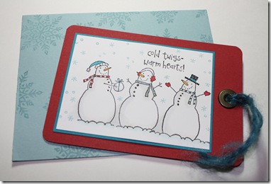
I seriously hated the project that used to be in this space so I am doing a new gift card project  right over the old one. This one is so much better. I was hesitant at first to use a card stock colour I pretty much never touch, Taken with Teal, but I decided to try the Colour Challenge 196 this week on Splitcoast Stampers. The other colours were Baja Breeze, Riding Hood Red and white.
snow giftcard 2

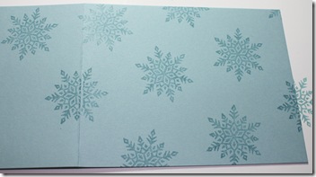
This gift card holder style has been floating around the blog world for a while. Basically you take a simple long card fold, glue the sides and add a tag inside to hold a gift card. I random stamped the pocket for the gift card holder in baja breeze with the same colour ink. It measures 4.25 x 11" scored at 5.5". If you want to stamp both sides, I recommend you do it first, before adhering. (A post on Random Stamping will follow in a couple days.)
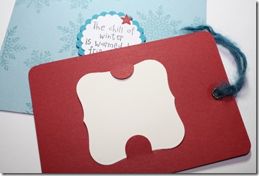
snow giftcard1 Use red line or other very sticky adhesive to close the sides and form a pocket. Be sure to leave the short end open! Make your tag. I think mine measured about 2.75x4". Be sure it will fit into your pocket before decorating just in case your glue took up more width than you thought! (Also do not start your tag decorations  until you continue to read the directions!) Even though I had measured and left extra ease, it is still a snug fit. The more layers the tag has, the more 'ease' you will need. snow giftcard3

Before adhering your layers, be sure to use a slit punch or Basic Grey notching tool to create little flaps to hold your gift card. I suppose you could trace something and use an X-acto knife if you don't have either. Since you do not want your gift card flaps to show on the decorated side of your tag, plan around these slits! Do not put adhesive on them from the other side either. It's all in the planning folks. If it sounds hard, it isn't, you just have to do everything in the right order.The photo below shows the 'gift card' in place on the back of the tag. Yeah, I know I isn't really a gift card! Miscut Nestie shape to the rescue!
giftcard snowman copicsI stamped the white panel with the snowmen using Adirondack ink  and coloured them in with Copics, colours I used are in the photo. Once I finished everything else, I realized the pocket was way too plain. I dressed it up with a medallion made from teal and white CS, adhered with foam dots, cut with Nestabilities. The star is from the snowman set, on riding hood red CS stamped with the same colour ink and cut out. The sentiment is also from the snowman set, stamped in the same black ink. Finally I dressed up the tag with an eyelet and fibre. TIP: if you are going to use a really large eyelet, plan to leave extra space on your tag beyond your layers or make sure your top layer leaves enough space so your stamped image isn't going to be partially covered by the eyelet.

Enjoy, Rebecca

RECIPE: Paper: Baja breeze, white, taken with teal and riding hood red CS Stamps: Snowflakes, It's Snow Time Ink: Adirondack pitch black, baja breeze, riding hood red Accessories: Copic markers, foam dots, Nestabilities, fibre-unknown, jumbo eyelet-We R Memory Keepers, corner rounder punch

December 09, 2008

Happily Ever After

I haven't used this stamp set in ages. The images are so small and my tastes have changed so it sits on the shelf. However, this sketch suits little images. Splitcoast Sketch Challenge SC205.

happily ever after
I started with so saffron DSP from last year on a standard chocolate card base. Fortunately, a lovely blogger Dannie figured out the dimensions for the three panels! She included sizes for both the panel and a mat, I just used the mat size because I couldn't decide what colour to use as a mat but later I wished I had matted the saffron panels for visual interest. Anyway, I stamped the little wedding car on vanilla and cut it and the scalloped chocolate mat with Nesties. I used a combination of Copics, SU! markers and a silver gel pen to colour the image.

I added a chocolate ribbon across the card and tied a second ribbon around it for a tie. You all know that trick right? TIP: Tie a small ribbon around one stretched across the card, adhered at both ends, instead of tying one ribbon from the left with one from the right together for a tie. That way you can adjust the tie easily if it isn't exactly where you want and you don't have to struggle to get it tight enough either, holding one finger in the middle while you tie it a second time. If you are mailing the card, the tie isn't so lumpy either because you only need to tie it once, not twice! 2nd TIP: The thicker the ribbon, the more slack you should leave when adhering the first ribbon to your card or when you add the tie, it will be to tight and pull the card front into a curve. Ask me how I know!

I used black foam dots to adhere the car layers to the card over the ribbon. Now it looked way too boring. This is where the trouble started! I got out my flourish stamp from Autumn Leaves and stamped it in close to cocoa ink. Well, the stamped image was spotty at best. The ink didn't adhere well and puddled in spots, leaving others with no ink at all. Ughhhhh! So I tried stamping over it. Nope, didn't line it up right. So I ended up taking the top two panels off, recutting them and restamping. Before I restamped I tried to condition the stamps by sanding them. The test stamp on the dull side of the chipboard that comes with scrapbook paper looked OK so I stamped it in chocolate, this time on the card. Helped but not enough. Dang it! I am guessing the difference is the absorbency or surface texture of one paper vs the other. So I ended up using a chocolate marker to go over the areas where the spotty ink problem was most prominent. I still thought it needed something at the bottom but I was hesitant to add another flourish. So I went with the sentiment that goes with the little car; I rather like that font. Now I am relatively happy with it. Hope you think it is at least OK. In case you noticed, I swear the ribbon was trimmed perfectly at one point. I must have brushed the angled cut end the wrong way, rats! Don't yajust love the country song "(It Doesn't Have to Be) Perfect" by Sara Evans!

RECIPE

Paper: chocolate chip, very vanilla cardstock, so saffron DSP Stamps: elegant flourishes by autumn leaves, Greetings Galore Ink: Stazon brown, chocolate chip
Accessories: chocolate ribbon, black foam tape-unknown, silver gel pen-unknown, Copic markers, SU! Markers. All supplies SU! unless otherwise noted.

Enjoy, Rebecca