September 03, 2012

Pretty Bees Card for Mojo Monday

I liked the sketch for this week’s Mojo Monday so much, I decided to make a second card using it!

bee mojo

I just bought this stamp set second hand and I was thrilled that it went so well with some new paper too! The yellow hexagons just screamed bee to me! I  LOVE the shape of this bee; it is realistic without being creepily so. I have a huge bug phobia but it looks sweet stamped right? And no icky, overly detailed eyes (I find totally realistic eyes especially creepy). The stamp set includes a body stamp to make the bee yellow but I have no ink that even approaches a colour that would coordinate with or match this paper. So I paper pieced it instead which also gave it a sweet yellow halo! I LOVE how it looks. Can you tell this card is going to be hard to part with? {{ GRIN }}

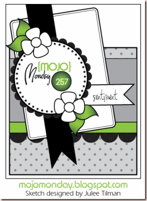
Mojo257Sketch

Did you notice what I stamped directly on the patterned paper? They already had ‘be.’ on the paper; I added the ‘Bee’. I thought it made for a cute play on words! Then I added a little ribbon tab in place of the flag in the sketch. If you ever like to enter the M0jo Monday contest, be warned that I’ve found the judges are particular about seeing you not deviate from the sketch too much. Sure you can swap out the shapes and add a layer or two as matting but they really like to see all the elements and in the same places and relative proportions. I won in July and made sure every element was on there! I added a bit of washi tape sticking out from under the largest panel for a bit of interest.

Enjoy, Rebecca

RECIPE
Stamps:
PTI
Paper: MME DP, kraft, rustic white-PTI, vintage music paper
Ink: Archival black-Ranger, London Fog Memento, Bordering blue-SU!, Old Paper, Vintage photo Distress
Accessories: roses-Prima, button card die-PTI, lacey circles, circles dies-Spellbinders, WRMK corner rounder, EK Success mini scallop punch

Steampunk Balloon Card

I love this week’s Mojo Monday sketch. It is detailed, asymmetrical and includes elements I love.

steampunk ty mojo

I used the train pattern on the paper to enhance the bottom of the card. Very masculine right? This is such a great paper pack I had a blast choosing which papers to use! I won a mystery box from PaperCrafts Connection blog (YEAH!) and it had THREE stamp sets with hot air balloons!  This vintage one is from Studio Calico and I thought it went perfectly with this paper.

Mojo257Sketch

Click on sketch for link to blog.

The only thing I wasn’t too sure about was the flowers, which of course didn’t suit the style of this card. So what else to use in their place? I dug into my Tim Holtz embellie jar and found these cool metal leaves and game spinner arrows. Fun right? The stamps on the green card are from button boutique!  Who says that this set can only be used on girlie cards! It’s hard to see but the layers are all distressed, looks very vintage IRL.

Enjoy, Rebecca

RECIPE
Stamps:
Studio Calico, PTI
Ink: Memento Espresso Truffle, Vintage Photo
Paper: My Mind’s Eye designer paper, Kraft, chartreuse CS-PTI, ivory CS-Taylored Expressions, brown CS-SU!
Accessories: metal accents-Tim Holtz, foam dots-Jody Morrow, button card die-PTI, accent die-Cuttlebug, pinking shears, sewing machine, Copic markers

August 31, 2012

Pretty Strawberries for August SFYTT

flour strawberry sfytt
 
Sorry about the terrible photo that used to be here. I hope you like this much better! I got a new computer! YEAH! My old one was so slow it was positively painful. I can’t believe how few times I posted last month. So sorry!
 
flour strawberry sfytt closeup
 
I used Copic markers to colour the image, I airbrushed the background but only masked the berries and flowers. So much easier than cutting out the whole image. I have a trick for colouring the seeds so easily! I colour over the whole strawberry, ignoring the seeds. Then I add a tiny bit of white gel pen on the seeds and when dry, I colour over with a yellow Copic. Hasn't bothered by Copics at all and the seeds look so nice and bright. Even better than colouring them yellow with the white of the paper underneath I think.
 
sfyttaug2012sketch
 
Enjoy, Rebecca
 
RECIPE
Stamps: Flourishes
Ink: Moss, Kraft-PTI, antique linen Distress, Memento black
Paper: Moss CS-PTI, white CS-XPress It, light lace DP-Basic Grey Nook and Pantry, coral dots DP-Cosmo Cricket Be Happy, blush CS-SU!
Accessories: doily die-PTI, hug snug seam binding, Quickutz tag die, twine-PTI, charm, lace-stash, pearls-Dollarama, oval Nesties dies

August 25, 2012

Warm Woolies for Papertrey Ink August Blog Hop

PTI blog hop logo
This month the challenge was to be inspired by warm fall fabrics and textures. I knew what to use right away. My sister gave me a sweater she accidentally shrunk so I knew I would incorporate it’s soft fuzziness. In that box was some denim I cut off from some jeans and so my card was born.
pti aug blog hop woolies
I ironed some Heat n Bond onto the back of the sweater fabric. Then I removed the backing and glued it to some thin acid free paper. Then it was easy to die cut. The denim was a bit harder but I did get a line to trim along. I placed foam dots under some of the petals for dimension.The white spot under the rose button will eventual go away. It is some white glue that dries clear and doesn't yellow. I even left the card and blogged it returning to take the photos, hoping it would dry but I guess it takes quite a while since it isn't exposed to the air. While this isn't my favourite card of all time, it sure looks prettier IRL!
pti aug blog hop woolies closeup
Have fun on the rest of the hop. If you liked my project, I hope you will visit again! I have email and RSS subscription thingies on my sidebar!
Enjoy, Rebecca
RECIPE
Stamps:
Ticket-PTI
Paper: kraft, rustic white-PTI
Ink: pink pirouette-SU!, vintage photo Distress, Aqua mist-PTI
Accessories: vintage and rose buttons, burlap flowers-stash, Hounds tooth embossing folder-Cuttlebug, pearls-Rubber Café, foam dots-Jody Morrow

August 10, 2012

Scrapbook Steals August Blog Hop–Mr. Huey’s Mists

I am thrilled to be participating in my first (and hopefully not last) blog hop for Scrapbook Steals! If you aren’t familiar with Scrapbook Steals, it is my Number 1 FAVOURITE place to buy scrapbook supplies at a HUGE discount! And they often have products I’ve not even heard of or used before. Plus their sister sites for Kids, Babies and She for women are just as AWESOME! Their blog is amazing too so if you haven’t been there, be sure to start the blog hop there! I have a card and a scrapbook page for you today!

I received Taxi, a bright yellow Studio Calico Mr. Huey’s Mist to work with. Now if you know my blog, you know I am not so into bright yellow so the challenge was on. I used it to mist a sunset scene that this bright yellow was practically made for!

mr hueys sunset sympthy

I started by masking off the bottom portion of the card. Then I mixed the mist with a bit of water to dilute it in a spray bottle and misted the top portion. Then I masked off the sun area as well, added some pumpkin reinker and misted again. Then I misted a third and fourth time adding a few drops of rust red reinker each time until I was happy with the look.

Absolutely lovely coverage and it mixed very well with the reinker. I reversed the masks covering my sky and added a second torn mask to make the shoreline. I sponged in aqua ink for the ocean. Then I tore another mask similar to but not the same as the first. I applied this mask over the ocean leaving a small section to look like the froth of the waves breaking against the shore. Then I used several brown inks to sponge in the sand.

For the palm tree, I stamped it on very dark grey card stock and cut it out. Then I added ink direct to paper from the ink pad so it became a solid black silhouette. I added a sympathy sentiment and I was done! I think a sympathy sentiment was very appropriate as the sunset can symbolize the end of a life. Sad but sympathy cards are very needed and appreciated.

I have several other brands of mists and this is by far the easiest to mix. Thank heavens. Some of the other ones need several minutes of shaking before they are ready to use. And with Mr. Huey’s the colour you see is the colour you get. The others separate and become a gross colour so  you have to shake it in order to see the real colour if you forget what it looks like. Not very convenient if you ask me!

For my next project, I used a mask to create an interesting scrapbook page background. As I usually only create cards, I only bought a 6x6 mask. So I added it to opposing corners to add interest to the ‘white’ space I planned to leave on my layout. I added some water and white reinker to soften the colour somewhat. I also added some touches of a pink mist. I love how many ways you can use these mists!

mr hueys swim day

I was inspired by a layout by Maggie Holmes to use a banner across the page but I don’t have a banner die. Helloooo ingenuity! I looked at my dies to try and decide if I could cut down a square or a rectangle or… when my eyes settled on an ice cream die. Yeah! The cone makes a PERFECT banner! That was the most fun especially since I used up lots of scraps!

mr hueys swim day date closeup

I added the date ‘wheel’ to the top right but felt I needed to add some more round elements to the page. So I added the medallion stamped once on the right side of the larger photo and again in white on acetate under it. Made a nice triangle I thought. I try to keep design principles in mind more so when I scrapbook because it doesn’t come as naturally to me as card making. But I keep at it because I love the results!

mr hueys swim day title closeup

Adding things in odd numbers and in triangles tend to keep your layout more balanced. So I have three photos, pointy shapes in three places (stars in each corner and the banner), orange in three places: one photo, the title/banner and the date wheel; three circle elements and words in three places: the title, date wheel and journaling.

mr hueys swim day journaling closeup

I hope you enjoyed my project. If you’d like to visit my blog again, please sign up for updates by email or RSS feed; links are on my sidebar. Now, you are off to visit Julie Odil! Have fun on the rest of the hop! And be sure to sign up for emails from Scrapbook Steals while you are there. If you get lost, the whole line up is below!

Thanks for visiting, Rebecca

1. Scrapbook Steals

2. Rebecca Keppel  http://www.myclutteredcorner.com/

3. Joan Borgelt http://thegovsplace.blogspot.com/

4. Dana Tatar http://datatar.blogspot.com/

5. Laurel Geisbush http://laurelz75.wordpress.com/

6. Rebecca Ednie http://www.eclecticendeavours.blogspot.com/ YOU ARE HERE!

7. Julie Odil http://muddypawsinkyfingers.blogspot.com/

8. Patricia Flores http://harmonyhealthandfaith.blogspot.com/

RECIPE

Sunset Sympathy
Stamps:
tree-Taylored Expressions, sentiment-PTI
Ink: Mr. Huey’s Taxi spray mist, pumpkin pie, ruby red reinker, baja ink pad -SU!, Old Paper and Vintage Photo Distress, archival black ink-Ranger
Paper: grey cardstock-PTI, white cardstock-TE, Accessories: mask cut with circle Nestabilities, foam dots-Jody Morrow

Swim Day Page
Stamps:
Label Basics-PTI, date wheel-CTMH, Medallion-Clear Dollar Stamps, Smash adjustable date wheel (year)-K&Co
Ink: Mr.. Huey’s Taxi spray mist, Bermuda bay-SU!, black archival, Staz-On white, October Afternoon mist, white dye ink reinker
Paper: DP-Splash by Echo Park, white CS-Taylored Expressions and Bazzil, clear cardstock-PTI, Doublemates aqua matting cardstock, Epson photo paper
Accessories: foam dots-Jody Morrow, Letter stickers-Making Memories, Divine Twine, Staedler journaling pen, label die-PTI, circle Nesties, ice cream cone die-PTI, mask-Crafter’s Workshop, Copics (highlighting the date wheel), foam dots