I’m really happy with this pastel shabby chic get well card AND I managed to incorporate 3 challenges!
I love this sketch. I much prefer asymmetrical designs; with symmetrical ones I always feel boxed in for some weird reason.
I’m terrible for buying these gorgeous big flowers then hoarding them so I’m proud I used one. Silly huh? LOL! I used some tiny white flowers, silk ribbon and tiny die cut leaves to complete the cluster.
The stamping on the panel ended up being slightly lighter than I’d prefer but my other inks were too bright. I also didn’t account for how much the base colour of the paper would dull the colour or I might have tried a brighter ink. oh well, I like the soft look but it is a tiny bit hard to read if your eyesight is less than perfect. It is still visible though. I stamped too close to the edge of the paper so I had to cut it out by hand and then layer it on a die cut panel.
The fabric panel with the pearls is a leftover from a ring pillow my mom made for a friend. She stippled a larger panel then cut out what she needed. I got the leftovers! I sewed on individual pearls to accent the lovely silk fabric then distressed it with Antique Linen Distress ink.
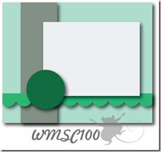
I used the WMS sketch this week. They are celebrating 100 sketches and looking for Guest Designers. I’d love to be a Guest Designer so if you are reading this… pretty please! Did you know my needle case was mentioned as one of the top three projects from last month’s Blog Party. Yeah! (Click on sketch to visit the blog.) Did you notice I finally actually followed a sketch without changing it? I rotated it sure but I included all the elements and didn’t move any or rearrange any layers! WOW!
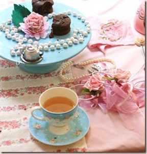
I’m also entering this in the Shabby Tea Room challenge this week to use pink, aqua or teal and brown. As long as kraft counts as brown (and I’m sure it does), no problem! Click on graphic to visit blog.
Click on the graphic to go to the blog. In case you can’t see it, I sponged the white flowers with apricot ink. It looks a bit too yellow but I promise, it is peach!
Enjoy, Rebecca
RECIPE
Stamps: WMS
Ink: Soft Rose-Hero Arts, Antique Linen, Vintage Photo Distress inks, AL Distress Stain
Paper: kraft CS-SU!, Miss Caroline Fiddlesticks DP-My Mind’s Eye
Accessories: Labels 4 Nesties dies, vintage lace, silk ribbon-May Arts, mini flowers, pearl beads-stash, Rose creations leaf die, flower-Prima, Mettler sewing thread, silk fabric scraps, foam dots- Jody Morrow


7 comments:
Beautiful lace, pearls and soft colors on this pretty card!
So sweet and feminine, Rebecca... love it! Thanks for joining us for the 100th sketch!!
Beautiful!
Love the way you flipped the sketch...
and that lace and those flowers...
gorgeous!
(And BTW...I hoard WAY too much too...*giggle*)
Such a great take on the sketch...
and so glad you could play and celebrate with us on our 100th! :)
This is just a victorian dream card! I love the flower and roses and pearls.... so feminine and romantic. Just beautiful!
Rebecca, this card is so pretty. I love the label and the way it has that shabby vintage feeling (my favorite style). And that flower...love it! Thanks for joining us this week during the Waltzingmouse festivities!
Such a beautiful and 'soft' look to this card. Love it!
What a beautiful card! Love the shabby design! Thanks for joining us at the Color Throwdown this week!
Post a Comment