Showing posts with label Tips. Show all posts

January 04, 2014

Asian Lady Card for Unscripted Sketches

So this week I actually made something for Unscripted Sketches that has a full, proper name!! hee hee!! I got a gorgeous embossing folder but it was hard to use until I got some Asian paper to go along with it.

Asian lady get well

As you can see, this embossing folder wouldn’t suit a lot of designs as it is very Asian. But also very lovely! I needed a couple of get well cards for some classy ladies so this was a perfect design. The gold accents are just an ink pad swiped across the edges of the paper and over the embossing.

Here’s a tip for you. I didn’t want to raise the sentiment panel on two layers of foam dots. But the embossing underneath raised the lady panel up on one side so she would sit lopsided if adhered flat on the left. So I added scraps of the embossed panel under the lady panel on the left so it was balanced but still not higher than the foam raised panel above it.

Asian lady get well2

I also used the WRMK envelope maker to make a matching envelope out of one of the busier patterns I’m less likely to use. I’m like most and have way too much paper so I’ve got to use it up! There’s always another new gorgeous paper pack on the horizon!

238

Please come on out and create something lovely with our super talented team this week at Unscripted Sketches! You can create anything your crafty heart desires from any type of artistic or creative endeavour! Just make sure we can still ‘see’ your use of our sketch. You can rotate, flip, turn and change proportions in any way you see fit and also change one shape for another. Have fun with it, take a pic and link it up! You don't have to have a blog to play!

Enjoy, Rebecca

RECIPE
Stamps:
PTI
Ink: Encore gold pigment, rose shadow ink-HA
Paper: G45 Bird Song, Blushing Bride CS-SU!
Accessories: ribbon-American crafts, lace-vintage, Embossing folder-Spellbinders, rhinestones-TE, corner chomper, envelope maker-WRMK, foam dots-Jody Morrow

June 17, 2013

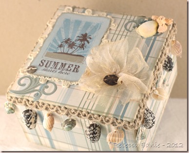
Waltzing Mouse Stamps Blog Party–Summer Shells Box

WMS blog party logo]

This month’s challenge was Summertime Fun. Since I won a free set from some challenge back in October and I finally chose it (I had been waiting to order some stamps at the same time and get a deal on shipping, never happened… ), I had fun using My Island.

summer starts here box

I absolutely ADORE the beach and hot weather so this set and this challenge is so perfect for me! I wanted to do something more than just a card but I hate trying to decide what to do. As I looked around my craft room, this little box was just sitting there asking to be decorated!

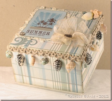
summer starts here box2

I pulled out some favourite old MME papers which colours remind me of the beach and started covering the box and stamping.

summer starts here box3

I have a LOT of cool beach related items so choosing which to use was the hardest part! The shell trim has been waiting patiently for just the perfect project. It is too thick for a card and kind of big with the shells spaced too widely. But it looks amazing here dontcha think?

summer starts here box4

I used my new compressor and Copic markers to add colour to the coral and shell I had hanging around in my stash. They were both so boring before. That reminds me, have to turn it off and bleed the tank before I go to bed…

summer starts here box5

I used some very sheer gold ribbon to make a big bow using my bow easy. Then I distressed it using my heat tool. TIP: To get the bow to fluff up really well, instead of just wrapping the ribbon around and around the tool, pass it through the slit each time. You may need to scrunch your ribbon to make it all fit but that’s ok. If this means patterned, one-sided ribbon no longer shows the correct side up, just flip it in the middle! Works soooo much better than just wrapping it. The loops always separate correctly my way.

summer starts here box6

I am also entering this in Ribbon Carousel 82 Fun in the Sun.

ribbon carousel 82

I hope you enjoyed this post and if so, I’d love to hear from you. I treasure each and every comment. Ok, except for those weird spam ones… :) If you’d like to come back, maybe email updates would help? I have a subscription widget on my sidebar. I think my RSS feeder is ending soon and I don’t know how to replace it so if you do, I’d love to know how. Anyway, thanks for reading.

Enjoy, Rebecca

RECIPE
Stamps:
My Island-WMS, flourishes-PTI
Ink: moss, baja-SU! chocolate, kraft-PTI, frayed burlap Distress
Paper: DP-MME
Accessories: flourish die-PTI, foam dots-Jody Morrow, ribbon, loopy wired twine trim-May Arts

March 24, 2013

PTI Blog Hop–Larkspur Sequinned Bookmark Card

PTI blog hop logo

This month’s theme is all about sequins. It was harder than I would have thought to find sequins. The ones at Michaels were horribly gaudy! I phoned to ask if they had any and the clerk went to look. I had already told her I wanted pastels and she came back to tell me they had two packs and where they were. When I found them, they were in super metallic Christmas colours – red, green, blue, silver and gold! Seriously, they need new staff!

sequin larkspur PTI blog hop

I finally found a roll a white iridescent sequin trim in the bridal section and removed the string holding the sequins together then airbrushed them for colour. Unfortunately, they aren’t faceted like many I’ve seen people using lately and I wish they were but they will have to do.

I embossed and coloured the larkspur first without a clear idea what I was going to do to make it into a card. I used Distress markers to watercolour it using a loose, painterly technique and not necessarily staying in the lines. Though I have to admit, that is outside my comfort zone so I sort of coloured in the lines first then added some colour outside the lines after. Then while the colour outside the lines was still wet, I added the sky/background colour.

sequin larkspur PTI blog hop2

TIP: Leaving white around the outside of the image and not taking the paint to the edges of the paper adds to the ‘painterly’ effect. Sorry the picture is a bit dark, it was the only way you could see the lighter painted areas at all.

Once I trimmed out the image on the sides, I realized it was pretty tall and thin. I could have trimmed the top but I got the idea to make it into a bookmark. I needed a card for a young friend’s recent baptism and then thought about this sentiment and it all fell into place! (We baptize as teens or young adults, not as babies.) She is quite the artist and paints a lot so I knew she’d appreciate it. To hold the bookmark in, I used an old tool, the Basic Grey Notch and Die tool, to cut the circular notches.

I hope you have fun looking at the rest of the projects on the hop. If you’d like to visit again, be sure to sign up for RSS or email subscriptions on my sidebar. Thanks for visiting.

Enjoy, Rebecca

RECIPE
Stamps:
Out on a Limb Sentiments, Year of Flowers Larkspur-PTI
Ink: Versamark, Archival black-Ranger, lemon, lavender, wisteria, chartreuse, moss-PTI
Paper: watercolour paper-stash, rustic white-PTI
Accessories: Distress Markers-Ranger, sequins-Simplicity, Copics and airbrush system, Notch and Die tool, Masterstroke seam binding ribbon, white EP-stash, Crop-a-dile

March 01, 2013

Friends Forever–Verve Sketch

This card was for Feb week 4 of Viva la Verve Sketches. The ones they post at SCS. My kids spilled water on my computer so we had to let it dry out before I could post it here. I don’t know if you have to use Verve to qualify to win or if you can only win if you have played all 4 sketches but I liked the sketch so I played anyway. (ETA: yep, all 4)

friends forever verve sketch

I am really proud of this one. It’s been ages since I used my old stand by of pink and brown. Feels good to come back home! I have a few tips for you in achieving this shabby look.

Tip 1: To get a beautiful distressed edge, add water before rolling, squishing and pressing the paper. It’s a softer look that just shredding the edge with a distresser or scissors or your nail. The opposite side of the paper will show which is a lovely, shabby look. I used a Q-tip and water with Perfect Pearls in it. Never pass up an excuse to add some pearlized water! but you can add some ink in it to colour the white edges if you wish, either to match your paper or a brown for distressing. If you want some torn sections, do that before or after because it won’t tear well while wet! See photo below for some close up areas.

Tip 2: Spritz with diluted colour mist using pearl water. Just a little bit gives it an aged, stained appearance. It can be subtle but really helps bring the card together. I used it on all the corners except the ribbon banner corner. Fill a Mini Mister by Ranger  about 1/8 full with water and to 1/4 full with ink. Test and adjust until you like the intensity. You may need less darker inks and more lighter ink.

friends forever verve sketch2

Tip 3: When you look at a sketch, think beyond your initial impression of what items should be used for a particular component. The horizontal element in this case was a scalloped strip. I could have gone with a scalloped punched paper strip or a scalloped edge ribbon which would have been even more interesting. But this ribbon treatment is miles above both of those IMHO. And if you immediately thought of ribbon for the banners, try thinking of ribbon next time. Or vice versa. What is even more interesting is combining them!!

Tip 4: Stamp on non-traditional surfaces and in layers. Stamping on the doily didn’t turn out perfect but that's what I wanted. The tips of a couple letters ended up on the holes and the texture isn’t perfect (part of the stamp too) but it looks vintagey! I also stamped the music on the striped paper which already had some texture on it from the manufacturer. If it hadn’t, I would have added some texture or script or something to it.

Tip 5: This isn’t specifically a shabby tip but a general tip. Cut apart or unmount that wheel stamp you never use! They are cheap and a great source of images. I now have 12 different words and 2 or 3 images! I wouldn’t have used that wheel hardly ever! (I bought it knowing I would cut it apart based on someone’s recommendation) The music image I used is also a wheel I unmounted. I leave it naked, no EZ Mount even, so I can apply it freehand which gives it a shabby or grunge look depending on how much ink I use and how dark the colour is.

VLVFeb13Week4Sketch_

Do you like the tips? The angled photo with props? These are also changes I’m considering trying out though it may seem slow to adopt as I use up some older photos. Let me know. Only though feedback can I make sure you get what YOU want out of this blog!

Enjoy, Rebecca

RECIPE
Stamps:
music wheel, friendly words wheel-SU!
Ink: spray ink-Mr. Huey Boss Lady Studio Calico, chocolate-PTI, melon berry (stamped off)-PTI
Paper: chocolate CS-PTI, vintage typing paper for doily-stash, dp-MME
Accessories: perfect pearls-Ranger, pearls-Dollarama, flowers-stash, leaves-unknown silk cut smaller with rose creations die-Spellbinders, Doily die-PTI, ribbons-stash, sewing thread, foam dots-Jody Morrow, Scor-Tape, Ribbon-May Arts

February 05, 2013

Interactive Card Zipper Card for PTI Challenge

PTI 6 ann

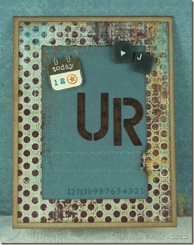
Nichole challenged us to make an interactive card in honour of their 6th anniversary. We were to be inspired by one of the team’s projects. Seeing Jessica’s fridge magnet with a photo of her son on it made me think of my son whose 12th birthday is today.  And I loved how Heather used die cut letters on one of her projects. While we don’t celebrate birthdays, this rather important milestone was on my mind. I guess the inspiration is a rather loose interpretation but still…
j is 12

So I made this card for him. Inside it has the following words. Energetic Fun Silly Caring Friendly Amazing. I won’t give it to him for a while so it doesn’t seem like a b-day card. It isn’t easy to line up the stamping underneath the tear strip unless you plan ahead so I’ve got a tutorial below showing you how I do it. It isn’t too hard but I have a couple of tips.

The grey keyboard keys are actually off a flexible keyboard. The kind you can roll up. My 5 yo tore it apart so I saved the keys for embellishments! At least something good came of it. The numbers at the bottom are from Boy Basics-Out of this World. I taped off most of the numbers so I count just ink some numbers individually and stamped the additional numbers to create an 11 and a 12.

So here’s how to line up whatever you hide beneath the tear strip.

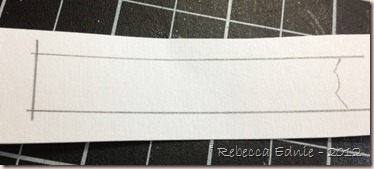
1. Die cut your tear strip die (aka zipper die) and choose a scrap to use underneath the tear strip. Using a pencil, draw two parallel lines just less than 1\2” apart. Using slightly less than the width of the tear strip will ensure your stamping doesn’t touch the edges of the zipper opening on the finished card since they won’t be smooth and straight. Place the paper with the lines on it under the die cut, line it up with the tear strip and trace the notched end. Slide the paper so your notched pencil line disappears slightly under the die cut. Trace the other side of the die. Again, by making your pencil marks slightly smaller than the die cut opening, you ensure you leave space where the zipper strip attaches in case the recipient doesn’t tear it off completely.
tear strip interactive card tut5

2. Stamp your choice of images or sentiments within the pencil lines. Then erase your pencil lines so you can barely see them. I didn’t trim the notched end now because it makes it hard to line up later.

tear strip interactive card tut2

3. Add Scor-Tape or other strong adhesive to the back of the die cut close to the tear strip. As close as you can place it. Remove the backing except for the small portions shown.
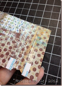
tear strip interactive card tut1

4. Line up the stamped scrap using the faint pencil lines. Make sure no stamping shows from either end and you need to leave enough room to trim your notch.

tear strip interactive card tut3

5. Trim off the straight side flush with the die cut and trim out the notched end while looking at the back. Because you left the backing on close to the notched end, it is easy to get your scissors in. When you are satisfied with the trimming, remove the last bits of backing. You could cut the notched end in advance but it would be hard to line up the scrap. If you wish to cut it ahead of time, I recommend you use a larger scrap and when you draw the lines, mark another where the bottom of the die cut would be so you can use that to line it up. (Next time I’ll be more careful and cut it smoother.)

tear strip interactive card tut4

6. Add more Scor-Tape. You want to be sure that tugging the strip doesn’t pull the die cut off the card! For the top portion, I just used my usual adhesive. Burnish the adhesive well. Apply to your card or project!

tear strip interactive card tut6

I hope this helps you line up your die cuts!

Enjoy, Rebecca

RECIPE
Stamps:
tag and words (inside) CTMH, countdown numbers, ink splotches-PTI
Ink: Walnut Stain, Vintage photo Distress, Teal Zeal-Memento, pumpkin pie-SU!
Paper: kraft, natural white, chocolate CS-PTI, DP-MME
Accessories: foam dots-Jody Morrow, stencil letter dies-Sizzix, interactive die-PTI,
December 01, 2012

Snowman Card with Gift Card Pocket

As soon as I saw this sketch, I thought of adding a gift card pocket to the front of the card. And I had paper that was perfect!

deconstr79 snow gift card

The snowflake is made from 5 or 6 layers of cardstock glued together. It makes for quite a nice sturdy embellishment! In the center is glued a perfectly matched rhinestone! I know red is an odd choice for a background for a snowy scene but it popped much better than any of the aquas or blues in the paper. Brown was out and so was pure white so red it was!

deconstr79 snow gift card2

Here you can see the inside of the pocket a bit. It is a simple folded cardstock piece with a small flap that folds up from the bottom to secure the card and it adhered on  one side only. Let me know if you’d like the pattern. I trimmed the pocket a bit so the cover closes well and rounded the inside left corner. It is stamped with snowy flourishes. The metal snowflake accents? They are bead caps I wasn’t using because they weren’t working with my jewellery style. Too pointy and big. But flattened out, they make perfect snowflake accents!

deconstr79 snow gift card3

I added a few fun textural touches to this little scene. Nuts, I just noticed that the silver cord is over the scarf and pompom on the hat. Oops! It just needs to be slipped back underneath! The snowman is sporting Liquid Applique on his hat and the little girl has Pearl Pen added to her hat. The hats, scarves and coat are paper pieced. The buttons are dotted with Enamel Accents to make them raised and shiny. The snowman nose and the hill behind the scene, which I hand drew, are accented with Crackle Effects to make them look like they are covered in cracked ice. Lastly, the scene and the paper piecing are coloured and shaded with Copics. Oh, and the colour of the snowman hat is deepened with Distress ink. I had so much fun coming up with ways to enhance this cute little scene!

deconsketch79-332x286

Click the sketch to visit the blog post. Since this layout comes up over and over, I’m making a note that will help me and maybe you too. If your card is 4.25 x 5.5” and you want 1/8” borders and spaces between the panels, each one needs to measure 4” x just under 1 1/4” wide.

I’m also entering this in the Simon Says Stamp Challenge  ‘Anything Goes’ and the Cute Card Thursday challenge 245 to use snowflakes.

Enjoy, Rebecca

RECIPE
Stamps:
girl-MFT, snowflakes-CTMH
Ink: Fired Brick, Antique Linen Distress, Memento black
Paper: DP-Echo Park, white CS-Taylored Expressions, Navy, red CS-SU!
Accessories: silver cord-SU!, foam dots-Jody Morrow, Copics and Multiliner, Crackle Effects, Enamel Accents-Ranger, cream Pearl Pen, rhinestone-stash, Liquid Applique

November 30, 2012

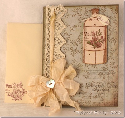
Vintage Parfum

I am in a challenge on Swap-Bot to use one stamp three different ways.
This was one of my projects. I am entering this in Unscripted Sketches 186 and Simon Says Stamp challenge ‘Anything Goes’ as well.
vintage violette parfum

Sorry the formatting is messed up. I sent this via email and when I edited it in Live Writer, it seems a bit odd. The flowers are coloured with some Copics I rarely use but they look so pretty with these vintage colours. V91 and 95. I wonder if they make another V90 something… Incidentally, the stamp I used was the bottle and it conveniently has several different things you can stamp within the label! This one is definitely my favourite.

unscripted sk-186

I dyed the seam binding myself. I added several drops of blush reinker and a tiny, less than a drop, amount of Antique Linen to some water. It’s hard to see but the ribbon is unevenly dyed which makes it look old and stained. TIP: To achieve that effect, I added the blush reinker directly to the water but smeared the Antique Linen directly to the bag. I smushed the ribbon in the water and squeezed it dry. Then I dragged the wet ribbon into and through the AL. Means the ribbon gets unevenly dipped in the AL and a stained look. Perfect!

vintage violette parfum2

Isn’t this bottle so pretty? I stamped it on a solid coloured paper from the pack. Then I shaded both the label and the bottle but subtly. I twisted the ribbon that goes around the card because I didn’t like how much it covered the lace. I like the look!

vintage violette parfum3

I’m also entering this in the Shabby Tea Room Challenge to use Neutrals as well as twine or ribbon and a sentiment. Mine is little but it is there, on the tag. Click on the photo to visit the challenge post.

TSTR _142

Enjoy, Rebecca

RECIPE
Stamps:
Graphic 45 Olde Curiosity Shoppe
Ink: chocolate-Papertrey Ink, old Paper, frayed burlap distress. perfect plum-SU! (envelope)
Paper: true thyme CS-SU!, ivory CS-scrap, DP-Capella Basic Grey
Accessories: Copics, tag die-Quickutz, HugSnug Seam Binding, blush reinker-SU!, Antique Linen reinker, vintage MOP button, lace-stash, foam dots-Jody Morrow, twine-PTI

November 18, 2012

Thanks, You’ve Been Wonderful

WMS blog party logo]

This is a triple challenge post. For this month’s WMS blog party and this week’s WMS sketch challenge. And Friday Mashup #85 to make a Project Saying Thank You.

WMS thanks MME amazing

I’m afraid my photography is suffering today from the bright light in my craft room, not bright enough for no lights but bright enough to add a strange colour cast to the lights I do have. Grrr… In addition, I have a cold so I am a bit shaky so the focus is off. bummer. So sorry.

I have a die cutting trick for you. I always hoard my favourite sheets of DP. So I was loathe to cut into another sheet of this paper for the label. But in my mind, nothing else really suited. So I worked out exactly where I would place the final focal tag. Then I traced it. Since the larger mat would cover over the area below, I was free to ‘steal’ it for my label! Cool idea right? I had one small problem in that the card base showed through the holes in my die cut. This is only a problem with this ribbon treatment and not normally an issue. I solved it easily with a snippet of paper in a similar colour from the same pack! The spots are so tiny you definitely cannot tell.

WMSC124

It was awesome to find a paper that already had words in the corners a la the sketch! But not so overwhelming that I couldn’t add my own sentiment as the focal image. My sister and I finally agreed on the style of her wedding favours and this is the ribbon treatment and tag style we are using so I had them in mind when I made the card.

fri mashup 85

(Click the sketches to visit the blog posts.)

The favour is biscotti so they will be individually wrapped in bags intended for pretzels then wrapped in patterned paper. Then the tag will be added in a similar fashion but instead of tying the ribbon the way mine is above, the holes will be punched on the other sides and the ribbon will wrap around the biscotti and paper. The paper will probably have scalloped edges if I can figure out a way to do it that won’t take forever or require multiple punches due to dulling them because of so much use. 200+ favours is a lot! I’ll be sure to show you when I make them.

Thanks for visiting, if you like what you see, be sure you don’t miss anything by subscribing. Subscription thingies for RSS and email are on my sidebar!

Enjoy, Rebecca

RECIPE
Stamps:
sentiment-WMS, music-Skipping Stones Designs
Ink: Berry Sorbet, Chocolate-PTI, Antique Linen, Vintage Photo Distress
Paper: MME Be Amazing, kraft CS-SU!, melon berry CS-PTI
Accessories: pearls-Dollarama, foam dots-Jody Morrow, ribbon-SU!, label dies-PTI, flower-stash,

November 17, 2012

Vintage Teacher Thank You

At the end of the last school year, I made two card fronts for my son to choose from. This was the one he didn’t choose. I had it kicking around my craft room for ages when all it needed was a base! Do you ever do stuff like that?

teacher vintage thank you

I love the butterfly paper. Isn’t it interesting? Once it is gone, I am going to try and make my own. TIP: I’ll stamp text in black on cream cardstock. Then clear emboss butterflies in a not-too random pattern. Then sponge or brayer over the whole sheet with black ink. I’ve used this technique before and it turns out really cool. The only thing is that the brayering or sponging takes a while.

Enjoy, Rebecca

RECIPE
Stamps:
Clearly About Teachers-MFT
Ink: Memento black, antique linen, vintage photo Distress ink
Paper: Graphic 45 Olde Curiosity Shoppe, 7 Gypsies Conservatory, kraft, vanilla CS-SU!
Accessories: May Arts Ribbon, Recollections flower

April 22, 2012

Cherry Blossom Anniversary Card

I recently bought the coolest flower die. It makes gorgeous cherry blossoms. I made them in an unusual colour combo but I love that I can personalize them!

grimble ann 12 card

The colours of this card are epecially unusual to anyone who knows me well. Orange is one of my least favourite colours but I have been know to use it under the right circumstances like as an accent, when I love the paper pack or when the person I am making the card for loves bright colours! The latter is the case this time. Oh, and my blonde little guys look awesome in orange so you might see it on a scrap  page at some point!

grimble ann 12 card cherry blossom closeup

Making the blossoms is easy. Die cut all the pieces. I cut all of mine from ivory card stock. Then I coloured the star shaped piece with an apricot marker. Same for the center of the sunburst shaped piece. The little ‘sticks’ I coloured in blush and the tips are pumpkin. The sticks and tips are coloured on both sides. The flowers are sponged with blush ink.

memory box cherry blossom die graphic

To make the flower 3-D, you glue the tab to the back of the next petal. However, I found it was hard to get the tab to stay glued as it is tiny, less than 1/8” long! When I make it again, I won’t glue the tab first. To prepare the center, use an embossing tool and a foam or embossing mat to cup the star piece. Repeat for the sunburst. Then adhere the sunburst to the inside of the star. Now you want to curve the petals and squeeze the flower into a cup shape. Then add adhesive to the outside of the cupped center and the tab and add the center to the flower. While holding down the flower center with the embossing tool, make sure the tab is touching and hold until it is dry. All done!

apr2012SFYTT

I’m entering this in the Joan’s Gardens challenge this week and this April’s SFYTT (turned 90 degrees). Joan is offering 6 guest designer spots for participants! I’m really hoping I get a chance!

Enjoy, Rebecca

RECIPE
Stamp:
PSX
Ink: memento black, Apricot, blush, celery-SU!
Paper: Picadilly-Basic Grey, saffron, vanilla, punpkin-SU!
Accessories: foam dots-Jody Morrow, lace-WMS, die-Memory box, markers: apricot, pumpkin, blush-SU!, ribbon-Masterstroke Ribbon, Kaisercraft rhinestones

February 21, 2012

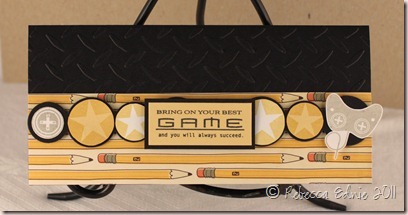
Game On for Jameson

My 11 yo son came home with a relatively good report card last week so I wanted to congratulate him with a card. Poor kid really struggles with ADD and we are reluctant to medicate him so this means a lot. He got all Bs and Cs (though without ADD he’d get As and Bs) when last report he got some Ds so this is a big improvement.

Gamer card for J

I am sooo happy with how this turned out! I didn’t use a sketch which is rare and even though it is a CAS card, I like the simplicity. Usually when I make a CAS card I feel like it needs more or that it is boring. funny because I LOVE other people’s CAS cards!

It is pretty simple so really not much to say. The recipe will explain most of it. This card is 3.5 high x7.5” long. This means the whole thing wouldn't fit into my Cuttlebug without being folded. EMBOSSING TIPS: If you are trying to emboss a card and it must be folded, cut off the excess plastic border from around the pattern on lower portion your embossing folder only. Don’t cut off both. That allows you to get very close to the fold line. And I needed to emboss twice to get the whole thing. On the second pass, line up your plates so that the edges exactly match the patterned part of the embossing folder (not the edge of the plastic). That way the plates and the folder won’t crush the part which was already embossed. You will get a tiny faint line where the folder ends but very little and no crushing of the design. You could also cut off the excess plastic but trust me, never cut off both pieces or the line will be even worse that uncut.

Enjoy, Rebecca

RECIPE
Stamps:
Boy Basics: Simple Circles, Game On-PTI
Ink: saffron, sahara sand-SU!, Memento black
Paper: DP-Boyfriend Cosmo Cricket, white, saffron, black CS-SU!
Accessories: circle die-PTI, foam dots-Jody Morrow,
Cuttlebug embossing folder, Circle Nestabilities

November 30, 2011

Paris ‘Challenge Me’ ATC

As any of my regular readers knows, I trade quite a few craft items on Swap-Bot. This one was for a swap I designed called ‘Challenge Me’ ATC which was quite new and different. In order to make the ATC, the sender had to list  their favourite 10 crafting supplies or tools in the comments section.

Paris challenge me ATC

The recipient would choose 5 of those that the sender HAD to use to make the ATC. The recipient would also look over the sender’s profile and choose a theme from things that the sender listed as likes. Then the sender created the ATC with the 5 items chosen (basic supplies like scissors, cardstock etc were givens for everyone) plus one additional item from the list of 10 and 2 other items of choice.

I made this a couple weeks ago so I’m not sure I'm 100% but I think the 5 were DP, ephemera, punches, dies and ribbon. The scalloped border is a punch, the doily a die. The ephemera is the music paper, background is DP. I used a stamp as an additional item from my list of 10. And I added pearls. The theme my partner chose was Paris but could I find my Eiffel Tower stamp? UGH! Took me ages! And I know I have 2 but I never did find the 2nd one.

I dyed the silk ribbon with Copic ink and distressed it with Vintage Photo ink. I used a Bow Easy to make a nice tidy bow. TIP: Did you know that if you wrap the ribbon in a figure 8 around the ‘legs’ rather than wrapping around the outside of the ‘legs’ of the Bow Easy and  you put a twist in the ribbon in the center, the bow loops will fluff much more easily? Especially with lots of loops. I forgot to do so here and you can see that my loops will stay out to the sides and not fan all the way into a nice circular shape. I don’t have enough loops to make a full circular shape anyway but if I did, they would always try to stick out to the sides unless you figure 8 wrap the ribbon.

Enjoy, Rebecca

RECIPE
Stamps:
unknown
Ink: Vintage Photo, Antique Linen Distress, Memento black
Paper: Graphic 45 Romantique, white typing paper (doily), vanilla, black CS-SU!, vintage music paper
Accessories: doily die-PTI, punch-EK Success, May Arts Ribbon, Bow Easy, Copic, Kaisercraft Pearls

September 23, 2011

Recycled Gift Card Holder

So, what do you think I recycled to make this project? Yep, a flattened toilet paper tube! Cool right? This was for another swap on Swap-Bot. I joined a group called Somerset swappers that uses Somerset brand magazines as inspiration for all swaps. In case you aren’t familiar, these magazines feature different hand made items from recycled projects to doll art to shabby chic deliciousness to vintage items to aprons to whimsical artsy altered projects.

somerset toilet paper tube

The design is pretty basic. The outside is wrapped with patterned paper held on with adhesive and the bottom is stapled closed. I also held the lace on with staples and covered them with the scrunched seam binding. I tried something new with this ribbon. Sharon (I can’t remember if it was Harnist or Johnson, oops, sorry) had on her blog that she ties the ribbon, then spritzes and scrunches it. I tried that because I wanted flat ribbon around the tube to better hide the top of the lace and the staples but a scrunched bow. Worked out very well! I used gold Perfect Pearls Mist that I made and spritzed the whole project.

TIP: I don’t use hat pins much anymore for beading because it is too expensive. Instead I use corsage pins or head pins made for jewelry. The head pins are best in some ways because almost any bead fits on the smaller ones, even those with small holes but they bend too easily and you have to work them into the bow rather than stab them right through the middle of the knot because they are blunt tipped. The corsage pins have thicker metal so fine-holed beads don’t work but they are sharp tipped.

Enjoy, Rebecca

RECIPE
Stamp:
Button Boutique-PTI
Ink: Vintage Photo Distress
Paper: My Mind’s Eye, vanilla CS-SU!
Accessories: lace-stash, mini pearls-Melissa Frances, pearl beads and crystals-stash and Swarovski, seam binding-Hug Snug, ribbon-Offray, corsage pin, Spellbinders tag die

July 25, 2011

Papertrey July Blog Hop Challenge–Polaroid Technique Butterflies

Thanks for visiting! I’ve had a hard time playing along with the PTI blog hop the last few months. I wish they would publish the theme a week or so in advance as a reminder! Anyway, this month, I managed to find time to play!

PTI blog hop butterfly polaroid technique

This month, the theme was an inspiration photo. I’ve used the colour combo somewhat substituting yellow sponged with apricot for the orange, kraft for the natural tone of the shades and I also used the butterfly motif from one of the pillows.

PTI july 11 insp

I tried out Nichole’s Polaroid technique from one of the Make it Monday posts from last month, modifying it a bit. I masked off the center of my card and sponged white ink all around. Then I overstamped with the leaf image from Life. I cut a CS panel to fit inside the masked area and stamped around the edges of it with a scroll image from Vintage Labels. Then I die cut and sponged butterflies and circles as accents. Last I added a label I cut using oval Nesties and attached using a technique from one of the Stamp-a-Faire challenges, notching my card for the twine.

One thing to notice is that I used negative space several times on this card. The negative space from the masking, also the negative hearts inside the dies and the negative space created when I die cut and removed the rickrack. I just thought it gave an interesting look without adding another layer or another colour.

Here’s a die-cutting TIP for you. I was having trouble getting my die cuts out of my dies. Then I put one of my dies up in the corner of the cutting mat. It fell right out! I guess the less used the mat the easier it falls out of the die. Maybe the paper isn’t pushed in so far? Not really sure but I am going to make note of this and keep doing it!

I hope you like my card! If you enjoyed this post, please feel free to leave a comment or subscribe to my blog. Both RSS and email options are on my sidebar.

Enjoy, Rebecca

RECIPE
Stamps:
Life, Vintage Labels, Mega Mixed Messages-PTI
Ink: white-PTI, celery, apricot, olive, baja-SU!
Paper: soft sky, kraft-SU!, DP-PTI
Accessories: dies, twine-PTI, oval Nesties, thread, foam dots-Jody Morrow, rhinestones-Kaisercraft, notches cut with Crop-a-dile

February 15, 2011

Vintage Fruit Matchbox

Here’s a cute little MB that almost missed being posted.

vintage fruit MB

I am typically quite critical of my work but at least this time, there is a point to it! I didn’t notice at the time but I am now seeing that the strawberry is completely lacking in highlights which doesn’t match with the other fruits. Also, the shadow is on the opposite side. While I didn’t plan it, I just coloured them, it does look odd all together. I’m actually happy with the cherries, the bright shiny highlight suits the smooth skin; the peaches have softer highlights because the skin is fuzzy muting the brightness of the highlight.

Strawberries are hard to colour because you have to colour around the seeds and that can throw off the best plans you might have for shading, shadowing or highlights. I don’t consider the yellow area a highlight, that is supposed to be where the berry isn’t quite ripe yet which often happens on the side away from the sun. The highlight would actually be on the opposite side, facing the sun at the same angle as on the other fruits. I know that some people like to colour over the seed then reclaim the colour with a colourless blender and then add the yellow for the seeds. I’m not stuck on that technique but I think I might have tried it here because the sees aren’t really showing up as a different colour.

So here’s what I would do if I were colouring this again. I’d make sure the highlights and shadows were consistent on all the fruits. I’d darken the shadows and add some serious highlights on the strawberry and try to add some more life to the leaves. I’d really work to make the seeds yellow. The peach leaf needs more blending to make the leaf look smother.

Enjoy, Rebecca

RECIPE
Stamps:
Fruits-Flourishes, text bkdg-not sure, maybe PTI BB:Hearts?
Ink: memento black, cocoa-SU!
Paper: white CS-Taylored Expressions, cocoa CS-SU!
Accessories: vintage lace-stash, Dew drop, foam dots-Jody Morrow, Copics-sorry, I don’t have the colours, this was from September

January 24, 2011

Glitter Masking Technique

I decided to do a cool technique I read about somewhere and since I can’t remember where it came from, I decided to show you the technique here.

glitter tut 4

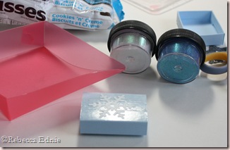
Here is the finished product, a matchbox cover. The awesome snowflake pattern is all glitter. You need some wide, flat adhesive; I’ve used Scor-Tape. Then you need to die cut or punch your image from adhesive backing. If you don’t have any on hand, maybe you have some stickers you don’t like or some of those free address labels you can put on envelopes ahead of time. You also need two colours of glitter.

glitter tut 1

Here you can see how I’ve applied the Scor-Tape. Instead of ripping the edges, cut them so they are smooth and finished. You can also see the adhesive backing has been die cut. Ooops, how did my favourite flavour of Hershey’s Kisses get in there… LOL!

glitter tut 2

Here I’ve placed the adhesive backing die cut in place. Be careful to place it with the waxy, shiny side down. I started to do it wrong and while it came off, it might not if I’d left it longer.

glitter tut 3

Here I’ve added the first colour of glitter. TIP: Press down on the glitter to help it stick to the adhesive. You can see there is no glitter yet on the snowflake. The last step is to remove the snowflake and repeat with the last colour of glitter. Don’t forget to press it down too. This can be done with strips of various widths of adhesive. You could do multiple shapes and colours too. It’s a great technique for one layer cards!

I hope you enjoyed this tutorial!

Enjoy, Rebecca