Showing posts with label May Arts Ribbon. Show all posts

June 29, 2015

Last but not Least, TSTR DT Application 4!

I went all out on this one. Shabby but bold!

tstr gold foil

I started with a rather painstaking process of learning how to use foil. My first three attempts failed miserably despite following directions from several different prominent crafter’s blogs! Grrr… But I finally got results I could use even if I didn’t love it. I applied Versamark through a stencil and clear embossed it. Then I added foil and ran my paper through my laminator. It melts the embossing powder so the foil can stick. Unfortunately, it also flattened the melted embossing powder causing it to spread out. So my pattern is a bit more messy than I had hoped for but hopefully that just enhances the shabby chic-ness.

pp251

I made the small white flowers, I realized that I hadn’t use the baby’s breath as inspiration at all so I made the closest flowers I could! I think they softened an otherwise quite bold card. I used the yarrow die set from Susan’s Garden. Sizzix used to manufacture them but now I believe you can get them from Elizabeth Crafts. I used the Paper Players sketch 225. and of course The Shabby Tear Room DT call.

Enjoy, Rebecca

The Shabby Tea Room Design Team Application 1

I have loved this challenge blog for years now. I’m so excited to see if I am chosen as a Design Team member!

The inspiration photo is below.

tstr tea card

I love the tea theme and colour combination found in the inspiration photo. I paper-pieced and Copic-coloured the tea pot and cups.

June 2015 DT Call

Isn’t this gorgeous? I had such fun working on cards for this DT call. I am posting 4, yes four! cards tonight so please forgive me for not posting a RECIPE like I normally do. Feel free to email me if you have any questions regarding the supplies I used.

Enjoy, Rebecca

April 12, 2015

Vacation Island for Mojo Monday

I got some new Kaisercraft paper and it was so fun to play with it.

my island mojo

My mojo has been a bit low lately; I’ve been doing so much organization, it’s kind of sapped my creative energy. But as I worked on this, I just got more and more happy. I have to make a note to myself that anytime I’m not inspired I should go to this paper pad!

Mojo392

Click on the photo to visit the challenge.

To make the sun set background, I used Distress Markers. To make sure that the colours blended, I spritzed the stamp then dabbed off the area where the colours meet. Then I spritzed again. I love the effect! I stamped on the island using my MISTI to line everything up. It wasn’t perfect but it was user error. The MISTI placed the stamps exactly where I aligned them. I love this tool and it is totally worth the cost.

The card was sprayed with gold Glimmer mist when I was done and it looks great! Shame it doesn’t show up. I also added a few brushstrokes of Rock Candy Distress Crackle Paint. You can’t see it very well as the angle isn’t right and the cracks are very fine but it does add a bit more texture. The button was don a while ago so I don’t remember what I did too well but I remember adding Copic airbrushing to change the colour. Then the ink stayed tacky so I covered it with, I think, Glossy Accents. The finish ended up kinda cracked and textured which was really cool. The charm is covered in Sharpie paint pen to change it from silver to gold.

RECIPE
Stamps:
My Island-WMS
Ink: chocolate-PTI
Paper: kraft CS-PTI, DP-Kaisercraft
Accessories: shell ribbon-May Arts, shell charm-Fire Mountain Beads, button-PTI, gold and white thread, Copic Markers, faded jeans, broken china, marmalade Distress markers, Rock candy paint, Sharpie paint pen

November 13, 2014

Shabby Roses Thinking of You Card

I made this cad for the Wednesday SSS challenge that just ended. Nuts, when am I going to learn I have to post these right away! Ugh!

shabby rose TOY card

This card was a struggle that I don’t often find when making shabby cards. I started by using a fancy tag die that I recently bought. It needed to have a larger middle part for stamping the sentiment so I partially die cut both ends leaving a gap in the middle that I hand-cut to connect them. But it just didn’t work right with the lace and ribbon I REALLY wanted where I arranged it. The fancy end on the left just didn’t fit well. It’s a pretty big die cut. So I ended up cutting off the fancy ends. After all that finicky die cutting!

The vellum I used was too white so I airbrushed it with an E53 Copic marker. Then I still felt it didn’t stand out enough so I edged it first with a Wink of Stella glitter pen but that didn’t look right, too uneven. So I finally swiped the edges of the vellum with embossing ink and dipped it in embossing powder. Why the uneven EP looks good but the uneven Stella didn’t, I’ll never know. The ribbon doesn’t appear to match but it does IRL.

If you look really carefully, there are a few tiny mirrored bits on the lace. The light only reflected on two of them, they look like dark dots. They are the centers of bright shiny gold sequins. I thought they were pretty so I am going to use them here and there. There are two on the sentiment panel too. The sequins were given to me AGES ago and I ignored them until now. I even forgot I had them! I’m so happy I didn’t throw them out!

Enjoy, Rebecca

RECIPE
Stamps:
a.muse studio background script stamp (hard to tell it’s not part of the paper), SSS sentiment
Ink: Memento cocoa, Versamark
Paper: MME Record it, spring moss CS-PTI
Accessories: May Arts silk ribbon, lace-Fabricland, button-OA, twine, Foam Tac clear dimensional adhesive, gold EP-SU!

April 19, 2014

Darling Freestyle Collage Card

I’m not usually a huge fan of diagonal lines on my cards but I love this tilted panel layout.

darling love card (2)

I don’t celebrate Valentine’s day and these papers were meant to be used for v-day. So I had to adapt the papers and tags to a simple love card. This is easily one of my fav cards I’ve made all year.

Enjoy, Rebecca

RECIPE
Paper:
DP and tickets-Jan SSS kit, white CS-PTI, doily-local restaurant
Accessories: rickrack die-PTI, MME enamel dots, pink ribbon-May Arts, veneer word-Studio Calico,

Baby Thank You Card Folder for Unscripted Sketches #253 and Giveaway Winner

I love using the sketch for something other than basic cards. This week I was making cards for a friend who just had a baby and the sketch worked beautifully a folder to hold the cards.

RebeccaEdnie253

I used some Webster’s Pages papers to make this. The yellow ribbon looks so pretty. I love that shade of yellow and the chevrons are awesome.

baby folder open

This is the inside of the folder. I designed it myself so if you like it and want the dimensions, let me know.

baby folder close

Here’s a closeup of the embellishments. The arrows are made from Craft-a-board then covered with white cardstock and washi tape.

baby folder matching card elephant ty

This is the card I designed. Sorry that it’s hard to read the tag; it says ‘thanks’. I made the card narrower than the usual 4.25”. It is only 4” which helped because I wanted to get the most from a scrap of 12” wide paper and of course, 4” fits across 3 times but 4.25 only fits twice. That also allowed me to hang the trunk off the edge and still fit into a regular envelope.

253

I hope you will join us at Unscripted Sketches this week. Be sure to check this week’s post to see if you won one of our prizes! I look forward to making the jewelry I am giving away. My winner is Monika Reeck so please email me in the next 48 hours to claim your prize.

Enjoy, Rebecca

RECIPE
Stamps:
Mega Mixed Messages, Bitty Baby Blessings-PTI
Ink: Harvest gold-PTI
Paper: lemon tart CS-PTI, Baja Breeze CS-SU!
Accessories: foam dots- The Sticky Stuff Store, Copic BG72, seam binding ribbon-Masterstroke Ribbon

February 22, 2014

Shabby Baby Boy Card for Unscripted Sketches #245

I made a baby girl card last week so this week I had to balance it out and make a boy card! I wanted to play with The Shabby Tea Room challenge this week too so I merged the challenges.

RebeccaEdnie245

The papers are from Webster’s Pages, I deepened the aqua and blue paper with some blue ink because I wanted more contrast. I started with a yellow card base and inked both the base and yellow paper with Harvest Gold ink but the look was brighter than I wanted. So I saved that base and paper for another card and started again with an ivory base and inked both the paper and base with Frayed burlap ink. Ahh, much better.

welcome baby boy 2

For the Baby die cut, I layered and adhered 4 cardstock die cuts before adding the final patterned paper layer. It’s about 3/16” thick (between 1/8 and 1/4”) so about the same as if it was chipboard. I made the ribbon rosette by putting red line tape on a circle of scrap cardstock but it still overlapped in enough places that it didn’t want to stick everywhere. So I added a few staples between the layers just where it wouldn’t stick and one at the end  right under where the blocks ended up. I knew I was going to place something in the middle that would cover.

245

Wow, I finally made a card without changing the sketch much at all! I think the only think that is different is I rearranged the layers a bit. But that’s the awesome thing about Unscripted Sketches! You can do with it whatever you like! Follow it to the letter, change it, rotate it or flip it! It’s up to you! And remember, it’s not a card challenge blog, make whatever you like! I hope to see you there!

Photo inspiration _206

Enjoy, Rebecca

RECIPE
Stamps:
PTI
Ink: frayed burlap distress, night of navy, bashful blue-SU!
Paper: yellow, light blue DP-Webster's Pages, navy DP-American Crafts, ivory base, white scraps CS-PTI
Accessories: metal accent-Making Memories??, ribbon-May Arts, twine, tag die-PTI, baby die-Marianne, heart die-SSS, trim-vintage stash

February 15, 2014

Blingy Baby Love for Unscripted Sketches #244

This has to be one of the cards I’ve made that I’m most proud of lately. It suits my signature style of simple shabby (shabby without too many layers or embellies) and my favourite category of cards – baby!

love and bling baby card

No special techniques here to explain. I kinda enlarged one of the circles on the sketch and omitted one but I think you can still see the inspiration! I enlarged an angled view of the sentiment. I drives me nuts when I use lovely gold EP and it photographs really dark, even black!

love and bling baby card3

I hope you enjoy playing with this sketch like I did! It’s really fun when you realize that you don’t have to use each element as you see it. Change the shapes, sizes, proportions, flip; rotate, mirror, whatever you like!

love and bling baby card2

We’d love to have more people play our sketch so be sure to come by Unscripted Sketches this week!

244

Enjoy, Rebecca

RECIPE
Stamps:
Graphic 45
Paper: Graphic 45
Ink: Versamark, Vintage photo distress
Accessories: pearls-Recollections, oval die-Spellbinders, ribbon (chevron and silk to thread buttons)-May Arts, buttons-ebay, lace-stash, focal stickers-G45, foam dots-Jody Morrow, gold EP-SU!

February 06, 2014

Roses Sympathy Card

A dear friend of mine’s mother died back in the Philippines and poor thing wasn’t able to go back in time for the funeral. She will be going just not right away. She displays my cards for months or longer so this one had to be a really good one!

roses sympathy

The colours aren’t quite right, a bit too yellow, but I had to make sacrifices to get the white to look white. The background colour is Soft blush which is practically the same as pink pirouette, much pinker than it looks. I shamelessly CASEd Debbie Olson so I have to give credit where credit is due. This is one of the stampy-est cards I’ve very made! It was super fun though!

Lining up these stamps takes some practice but when I got these stamps I practiced until I got it right. Then I kept the best ones in the case with the stamp set and marked the points I found easiest to look at while lining up. I marked these same points in the actual stamp too. Now I look at the stamped images I saved for a few seconds and I’m ready to go!

roses sympathy2

Choosing colours is hard too. This time I got brave and used a bright red (poppy for PTI fans, real red for SU!), berry sorbet and blush. I was surprised that it was bright but not garish. I save combos I like on the back of the same practice stamped images. I also like autumn rose with blush, stamped off once for one layer.

I pretty much copied Debbie’s card by looking at the photo so you can do the same by looking at mine! Foam dot layering is the key along with not adhering the edges so you can curl them forward slightly to give a realistic look. Thanks for visiting!

Enjoy, Rebecca

RECIPE
Stamps:
PTI
Ink: chocolate, melon berry, chartreuse, moss-PTI, pink pirouette, real red-SU! antique linen distress
Paper: ivory, blush CS-PTI
Accessories: labels 8 Nestabilities, foam dots- Jody Morrow, silk ribbon-May Arts

December 26, 2013

Elegant Anniversary Card

I made this a very long time ago, maybe a year and a half. Sometimes I browse my photos and wonder if maybe a card has been missed. Now I have a ‘Not Posted’ File so that helps but when I’m in a hurry, it’s so hard to keep track!

elegant anniversary card snelling

Originally I designed this layout as a ‘thank you for your business’ card, without the pearls and with black and gold or black and ivory paper on bottom, for a friend’s business. My BFF saw it and much to my delight, went on and on about how it was hte prettiest card she’d ever seen and how she’d frame it. So of course, I obliged making her one. Then I had the opportunity to make it again for a very classy couple for their anniversary . I thought adding the dancing couple was a nice touch.

I’ve made this as multiples so I know it isn’t that hard and I think it would also make great monogrammed stationery. It would also make amazing formal shower, wedding, anniversary party or any formal invites

Enjoy, Rebecca

RECIPE
please email for details. Most manufacturers are found in the tags.

November 30, 2013

Snowman Shaker Card for Unscripted Sketches #233

I decided to make a shaker card for this week’s Unscripted Sketches. It’s always fun to make something beyond a basic card!

RebeccaEdnie233

In the shaker box I added white glitter, tinsel glitter and microbeads. Microbeads are idea because they heavy enough to not stick to the acetate window. The tinsel glitter doesn’t stick much either but the regular glitter sure does! The snowman is popped up on foam dots so my shaker is two foam layers thick.

un scr sk 233

I die cut the frame but since my dies weren’t quite the right size, I partial die cut both ends of the rectangle. It’s a great way to get more use from your dies. I used mirrored paper to cut the big snowflake and I used heat n stick powder to add glitter to the white one.

RebeccaEdnie233a

Please come and play with us at Unscripted Sketches this week! We’ve been a bit down in numbers lately so that  means there’s an even better chance of your project making the top three! It’s such a good feeling to be chosen!

Enjoy, Rebecca

RECIPE
Stamps:
SU!
Ink: not quite navy-SU!, Memento black
Paper: CTMH, not quite navy-SU!
 Accessories: snowflake dies-MFT, snowflake ribbon-May Arts, rectangle nesties, tinsel glitter, microbeads-MS, Stampendous white glitter,

October 20, 2013

Pink Rose and Flourish Card

Once again, I missed linking this up to a challenge. Fortunately, I made it for two challenges, one of which isn’t over yet! Yeah!

pink rose flourish

Not much to tell here. I used last week’s Retro Sketches for the layout. The other challenge is Joan’s Gardens weekly challenge to use pink and white only, something curvy like a flourish or vine and a flower of some kind. Check, check and check! I added some colour to the vertical piece of DP because it was too much like the background using a blend of Tattered Rose and Spun Sugar Distress inks. The colours don’t look like they match so well in this but I promise, they do IRL. The stamping isn’t at all peachy like it appears. Wish I knew more about photo editing.

Enjoy, Rebecca

RECIPE
Stamps:
music wheel-SU!
Paper: Melissa Frances DP, white CS-PTI
Ink: as above
Accessories: Quinn flourish die-Memory box, ribbon-stash, lace-May Arts, MOP button-ebay, rose-Really Reasonable Ribbon, foam dots-Jody Morrow

September 08, 2013

For Baby Card

So, I had to give this 10 minute thing another shot. Let’s just say I failed miserably (but I did get quite a bit closer, more like 14 minutes). Even though I prepped the heart embellie in advance… that’s not cheating right? :) I can’t do anything quickly apparently. Sponging even takes me a long time! I think there’s a reason why you don’t see shabby chic cards among the 10 minute craft dash team cards or in the linky creations!

for baby card

This time I used this week’s deconstructed sketch 117. The basics of it anyway; I didn’t follow it to the letter. I now see I put the rounded edges at the top and I didn’t layer the two main panels the same way but I hope it’s close enough. When I set about to colouring the image, I realized I hadn’t used chocolate anywhere yet so the blanket ended up dark brown. And I added a chocolate button too. It’s a bit hard to see under the twine but it’s there.

for baby card2

I die cut the heart out of corrugated cardboard then added a soft yellow/ivory paint to the edges. While it was still wet I added some micro fine white glitter. Then I added glue to the very edges and gold opaque glitter. The button threaded with twine tied in a bow was the finishing touch.

10 minCraftDash_25

Enjoy, Rebecca

RECIPE
Stamps:
Crafty Secrets: baby boy postcard set, background stamp-Hero Arts?
Ink: Memento Espresso Truffle, frayed burlap Distress
Paper: kraft, ivory-PTI, yellow stripe DP-MME lavender, blue DP-Simple Stories
Accessories: heart die, button, twine-PTI, paint-buttermilk Americana, warm white glitter-Glitter Ritz, gold glitter-Art Institute, ribbon-May Arts, foam dots-Jody Morrow, corner rounder-WRMK, lace-not sure, maybe WMS?

Baby Boy Bundle of Joy Card

I am NOT a quick card maker. I could be but I just don’t like to be. I always want to add one more thing or colour something instead of just solid stamp. So when I tried to make it under 10 minutes for the latest Craft Dash challenge… well, they don’t call it a challenge for nothing!

bundle of joy mojo

I used the latest Mojo Monday sketch for the basic bones of the card. And I rushed, or tried to. I’d never used this solid stamp before and did I remember to try it out first or condition it? Of course not. So when the Memento ink I’d set out didn’t seem to give good coverage, I pulled out my brown Archival ink and inked up the stamp, d’uh, I wiped it off because I planned to Copic colour it. More wasted time.

So I finally chose my new, never tried but much touted (by Jennifer McGuire and Kristina Werner) Hero Arts Shadow ink in Cup o Joe. It still didn’t stamp cleanly! Ugh! I will give the ink another chance with a better conditioned stamp. I wasted like 4 minutes on that fiasco though and fixing the bad stamping with a marker. Overall, took me at least 25 minutes to make this card. I’ll still link it up because the rules say you can anyways and I loved the colour combo. You’ll see in my next post, I tried again and got closer but still didn’t make it. UGH!

My other challenge was the placement of the little mobile hanging things. I thought the stamp was designed so that you could stamp them in one shot. But when I went to stamp them, they just didn’t look right. So I test stamped them. This was well after the I shut the timer off in frustration. I realized I’d have to cut them apart to stamp them and match the hanging strings exactly. Sure look cute though don’t they? :)

Mojo309Sketch

Click on either photo to visit the challenges.

10 minCraftDash_25

Enjoy, Rebecca

RECIPE
Stamps:
Taylored Expressions: crib, sentiment-PTI
Ink: cup o joe (crib)-HA, blueberry sky-PTI
Paper: saffron, natural white CS-SU!, simple stories DP
Accessories: baby outfit button-Jesse James buttons, ribbon-May Arts, foam dots-Jody Morrow, labels 1 Nesties, Copics

June 17, 2013

Waltzing Mouse Stamps Blog Party–Summer Shells Box

WMS blog party logo]

This month’s challenge was Summertime Fun. Since I won a free set from some challenge back in October and I finally chose it (I had been waiting to order some stamps at the same time and get a deal on shipping, never happened… ), I had fun using My Island.

summer starts here box

I absolutely ADORE the beach and hot weather so this set and this challenge is so perfect for me! I wanted to do something more than just a card but I hate trying to decide what to do. As I looked around my craft room, this little box was just sitting there asking to be decorated!

summer starts here box2

I pulled out some favourite old MME papers which colours remind me of the beach and started covering the box and stamping.

summer starts here box3

I have a LOT of cool beach related items so choosing which to use was the hardest part! The shell trim has been waiting patiently for just the perfect project. It is too thick for a card and kind of big with the shells spaced too widely. But it looks amazing here dontcha think?

summer starts here box4

I used my new compressor and Copic markers to add colour to the coral and shell I had hanging around in my stash. They were both so boring before. That reminds me, have to turn it off and bleed the tank before I go to bed…

summer starts here box5

I used some very sheer gold ribbon to make a big bow using my bow easy. Then I distressed it using my heat tool. TIP: To get the bow to fluff up really well, instead of just wrapping the ribbon around and around the tool, pass it through the slit each time. You may need to scrunch your ribbon to make it all fit but that’s ok. If this means patterned, one-sided ribbon no longer shows the correct side up, just flip it in the middle! Works soooo much better than just wrapping it. The loops always separate correctly my way.

summer starts here box6

I am also entering this in Ribbon Carousel 82 Fun in the Sun.

ribbon carousel 82

I hope you enjoyed this post and if so, I’d love to hear from you. I treasure each and every comment. Ok, except for those weird spam ones… :) If you’d like to come back, maybe email updates would help? I have a subscription widget on my sidebar. I think my RSS feeder is ending soon and I don’t know how to replace it so if you do, I’d love to know how. Anyway, thanks for reading.

Enjoy, Rebecca

RECIPE
Stamps:
My Island-WMS, flourishes-PTI
Ink: moss, baja-SU! chocolate, kraft-PTI, frayed burlap Distress
Paper: DP-MME
Accessories: flourish die-PTI, foam dots-Jody Morrow, ribbon, loopy wired twine trim-May Arts

April 26, 2013

Elegant Floral Sympathy Card

Sadly I needed a sympathy card last week. An old fellow from my congregation passed away at over 90 years old after nearly 67 years of marriage, a pretty good run huh? He had a long, good life. The weekend before he passed he was at a party listening to us all sing karaoke! Apparently not his thing even though we tried to get him to join!

elegant floral sympathy

So this card was for his sweet wife. I tailor the card to the recipient, I don’t base it on the gender of the deceased. Is that what you all do? I layered ribbon, twine, leaves, small flowers and a larger rose then tucked in a tied bit of tulle. It made for a lovely embellishment cluster. This is such a heartfelt sentiment isn’t it? It really sums up how I feel when someone I really care about loses someone close.

Enjoy, Rebecca

RECIPE
Stamps:
JustRite
Ink: chocolate-PTI
Paper: dk green, red SU!, light green, ivory CS-PTI, DP-Webster’s Pages
Accessories: rose-Prima, white flowers, tulle, ribbon-unknown, twine-PTI, oval Nestie dies, May Arts lace

April 25, 2013

Soft and Shabby for PTI Angled Blog Hop

PTI blog hop logo

The challenge this month is to place some elements on an angle. This wasn’t too hard! I enjoy asymmetrical designs and most angled designs are.

apr 13 pti blog hop graphic

soft n shabby for PTI hop

I made all three of my flowers on this card. I used a Cheery Lynn Dye for two of them and a tutorial from Pretty Little Mess blog (see sidebar) for the third.

I also used this week’s Deconstructed Sketch. Click on it to visit the blog post.

deconstr sketch99


I’m also entering this card in this week’s Joan’s Gardens Challenge to use the word Tulips as an acronym for items used in the card.

T-Trim, I used lace
U-Upside Down, I used the corsage pins facing down rather than up like I usually do. (this one is really hard)
L-Lavender, I used lots on the card
I-Items from Joan’s Gardens, the Cheery Lynn Die I used for the flowers
P-Pearl tips on the corsage Pins, also designer Paper and Perfume bottle
S-Sentiment

I hope you enjoyed my card. If you have any questions, feel free to email me and don’t forget to subscribe by email or RSS if you’d like to visit again and be sure to not miss future posts.

Enjoy, Rebecca

RECIPE
Stamps:
Mega Mixed Messages
Ink: Winter Wisteria-PTI, Frayed Burlap Distress ink
Paper: MME DP, kraft CS-PTI
Accessories: May Arts ribbon, corsage pins-Michaels, flower making die-Cheery Lynn, perfume charm-Jesse James buttons, hexagon, circle dies-PTI, lace-Fabricland, ticket corner dies-SU!, Bow Easy

April 07, 2013

Summer Floral Journal

This journal is for the Summer Home Decor Challenge in the Moxie Fab World. Make some time to play along won’t you? I’m planning on making it part of a desk set for a partner I’m swapping with so she can keep it out as part of her summer decor.

summer floral journal

I started with a nice but too plain journal from Michaels. The cover had a purple binding, lilacs and yellow stripes with the scallops and cut outs and that’s it. I added the music paper, lace, ribbons, flowers, pearls, doily, stick pins with beads and buttons. This also makes a great hostess gift; I took one with me last night when I was invited out since I made two!

Enjoy, Rebecca

RECIPE
Paper:
vintage music paper-stash, white CS-PTI
Accessories: corsage pins-Michaels, gingham ribbon-SU!, green ribbon-Masterstroke, rose-Prima, lace-May Arts, purple bead-Swarovski, doily die, scalloped edge die-MFT, pearls-Dollarama, twine-PTI, if not noted, from my stash

Friendship Canvas–My First Try at Mixed Media!

I’ve been inspired by many bloggers I follow who have been getting into mixed media art lately. After all, many of us already use quite a few different media in our work so it isn’t that big of a leap to venture into what is traditionally known as mixed media artwork. We card designers already combine ink, paper, ribbon, metal, sometimes paints, chalk, pencils, spray ink, fabric and more. By adding a more permanent base than card making affords and mixing these media in new ways, voila! Mixed media art!

This is a crazy long post so grab a cuppa and get comfy. If you don’t have time to read it all now, I really hope you will save it and come back later. I have a great tutorial, a mini flower tutorial and some awesome tips all for you below. Plus a way to win by commenting!

think aloud canvas 1a

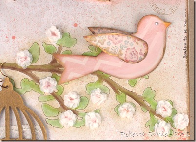
To make the bird, I drew the template myself, basing it loosely on Tim Holtz bird from the bird cage die I used. It was too small so I wanted to enlarge it and couldn't be bothered figuring out how to make my printer scan and enlarge it. I’d normally get hubby to do it but he was watching the baby so I just winged it (get it, winged it! hee hee) The chevron stripe was lovely but too prominent for me so I painted over it with Porcelain doll MS acrylic paint. A pretty pinkish-ivory off white colour which toned down the paper nicely. I also used some pink paint in places to give the bird some depth and keep her from looking flat. Then she also got some Vintage Photo Distress ink and gilder’s paste on the edges. The wings got Porcelain Doll paint only on them, again to tone down the pattern.
think aloud canvas 3a

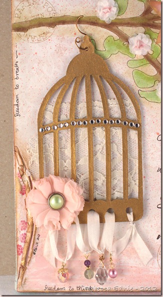
The bird cage was cut from grunge paper and gilded with a tube of gilder’s paste. Use it sparingly! I also used this on the edges of the canvas and on the torn/pushed back edges of the paper along the edges. Gilder’s paste is wax based gold you can apply with your finger or a sponge or a q-tip. It is very shiny (hard to tell from this angle but check the last photo with the flower) but I did buff it so you may be able to get a less reflective finish depending on how you work with it or the surface it’s applied to; I don’t know as I don’t have a ton of experience with it. I love how it turned out. I used wire and head pins to attach the beads at the bottom to silk ribbon which I threaded through the holes in the bottom of the bird cage. They are so much more twinkly IRL. I’ll talk about the flower later.
think aloud canvas 2a

I was looking though my vast selection of junk stuff goodies when I came across some vellum quotes and this one really resonated with me. I’m a very direct, outspoken and honest person and people who aren’t drive me CRAZY! I’ve never understood why everyone can’t be the same! I’ve had huge problems with making and keeping friends, especially as a teen and it took me a long time to figure out I was trying to make friends with the wrong kinds of people. So now I have friends who are near and dear to my heart, who truly listen to me and understand me, who I can really be open with and not think so hard all the time if they will judge me for what I’m about to say, I can just breathe and say what’s on my mind; this is one of the things in my life I cherish most. So I knew this quote had to be translated into something that I could see everyday, keep it close by and in a place where it could help me remember to always appreciate those friends.

think aloud canvas 6a

I chose the font, Scriptina Pro, which I found for free, then I typed out the quote and formatted it until I was happy with the spacing and size etc. and I printed it out. I transferred the text to my canvas and went over the transfer with permanent, lightfast, archival pen. Then I thickened the lines in some areas to add more interest. It was looking a bit flat and boring with all the same thickness of lines. Be sure not to use a water-based marker for this kind of work as it will fade much too quickly. (In retrospect, I used water-based inks in other places and probably shouldn’t have for the same reason but it’s going in a place with minimal sunlight. Pigment inks are more lightfast.) I don’t have a photo tutorial for this transfer technique but it’s a great way for getting the text onto your canvas and it’s not hard to describe.

Pencil Transfer Tutorial

  1. Print your wording or design on regular copy paper.
  2. Flip your paper over on a light table or bright window. Using a wide pencil like 0.7mm lead or wider (regular is 0.5), trace your design. Make sure you cover everything. Going outside the lines a bit is ok, just make sure everything is covered.
  3. Trim any excess paper around your design if needed.
  4. Tape your paper to your project making sure it is lined up perfectly. Use repositionable tape like Scotch brand or washi tape, Eclipse tape or painters tape but if you are unsure if these may lift up any previous layers of colour/media you’ve added (like chalk, charcoal, pastel or Pan Pastel), please check in an inconspicuous area.
  5. Trace your design with a pencil. What size you use will depend on the thickness of your lines. For fine lines like mine, not only did I use the finest pencil lead I had which was a 0.5 mechanical pencil, I kept rotating the lead to always have a sharp point. If your lines aren’t so fine, this may not be so important. You could also use some other writing tool as using a pencil isn’t crucial.

What you are doing is transferring the graphite on the BACK of the paper to the canvas (or other surface) so anything that applies smooth, even pressure could work so experiment. Maybe an embossing stylus? Tip of a bone folder? The line you will get is quite faint so if your eyesight is poor you may need magnifying glasses, a strong light, a magnifier attached to a lamp or otherwise or this technique may not work for you. Because the surface of a canvas is fabric (of course) and not stable, I did have to jam some stiff cardboard into the space between the fabric and the wood to get a hard surface to write on. Several pieces actually. I used laminated pieces that some with Spellbinders dies and they were perfect and slid in nicely due to the lamination.

This is a version of a technique I learned as a kid on school. We covered the back of what we wanted to transfer in pencil by scribbling back and forth very heavily. The con of this technique is that is leaves a lot of hand smudges as you do the transferring. With my technique, there is so little graphite on the back of the paper, I didn’t notice any smudging at all.

think aloud canvas 4a

I hand cut the corner by tracing a template I bought from Tattered Angels AGES ago, back when spray misting was in it’s infancy, and cutting it from grunge paper. I then painted it with highly lustrous pearl finish white paint by MS and covered it with Vintage Photo Distress ink which turned it into a cool metallic look. However, the ink isn’t stable on the paint despite two coats of fixativ so I don’t recommend this and I won’t be doing it again. Next time, I’d mix colour into the paint or buy a pearl finish paint in the colour I want rather than trying to alter it after it was dry. Then I added various beads to the nooks and crannies which was shamelessly CASEd from Gabrielle P, a designer for Maja Designs.

think aloud canvas 5a

Another shamelessly CASEd part of my canvas are the torn bits with contrasting paper underneath. To do this you must moisten the paper quite heavily and treat it firmly but gently while pushing it back and expect it to crack in at least one place. You can mist your paper but I used a q-tip to control the amount of water more carefully. Then start to wrinkle the paper. Start as if you only want a tiny area pressed down, don’t try to do too much at once and add more water often if you need it. If the top layer of the paper starts to pill, you have too much water, up to that point, you can’t have too much water. Gently scrunch it until you have the look you want. Many artists I’ve seen cover up the broken/torn area with flowers or ribbon but I liked it and felt I had enough going on with out adding any more.

think aloud canvas 7

I made this flower and it came about rather serendipitously. I was trying to replicate another type of flower but changed too much and it didn’t work out well. I wasn’t happy with it at all so I decided to hit it with the heat gun and all of a sudden, I though it was so pretty! So, I will refer you to the original tutorial then tell you what I did differently. Firstly, I used sheer fabric called georgette, not tulle and I cut them with pinking shears, not the way she called for and I cut 9 circles. I folded them like she did, in half first but then but I overlapped them in the center a bit more almost into thirds. However, this allowed all 9 of them to fit next to each other when sewn onto the backing. At this point, I really didn’t like the finish that the pinking gave the edges. To me, it just looked sloppy. So I hit the flower with the heat gun. At times, I separated one little section from the others so it wouldn’t melt too much or so I could melt it more as it seemed to get missed. In the end, it almost seemed like those flowers made from lots of little blossoms and I really liked that.

think aloud canvas 7a

The base of the canvas was prepped with acrylic paints on the sides in pink, turquoise and porcelain doll. Then I added some script stamping and toned it down with more porcelain doll dry brushed on. The base of the canvas is hard enough to see IRL and almost completely lost in photos. I used a lovely lace pattern DP then added some spray mist in Boss Lady which is much brighter and more dominant than I had hoped.  Two light sprays from far away and my background was almost gone. You can see a wee bit of it above. The lower right corner is a mix of Life stamps in various Distress inks and a few PTI colours along with some Hexagon stamps which you can see in the photo with the lettering.

think aloud canvas 8

The tree stencil was tacked down and sponged around the outside using Antique Linen Distress ink then traced around using the same pen I used to trace over the lettering. Then I used PTI inks to dry brush the colour onto the tree. To do this, you literally pick up colour from an ink pad with a dry watercolour brush, yes, it does take a long time but it game me the soft look I was going for. Then I die cut a TON of tiny white 5 petal tissue paper flowers and glued them together, I think 10 layers or so. Then I glued them to the tree, added chalk to the centers and fluffed them up to create spring flowers. This can all be see in the photo with the bird.

I hope you stayed with me this long! If so, you are a real trooper and deserve a medal! Thanks so much! I’m entering this in the Spring Home Decor Challenge in the Moxie Fab World. It’s randomly chosen so I have as much of a shot as the next person but I’m so proud of this I can only hope maybe there could be an Honourable Mention of something. If you like it, I hope you will leave a comment. If you do, you could also win a prize as one of the ways to win this challenge is to leave comments for participants! Click the link to learn all about it. Not long left so be sure to join in the fun!

Enjoy, Rebecca

