Showing posts with label masculine projects. Show all posts

September 24, 2018

Numbers Celebrate

This week at Crazy 4 Challenges we were asked to make a birthday card with numbers on it. If you have been reading my blog for a while, you probably already know that I don’t celebrate birthdays so I made a basic celebration card instead.

c4c 18 numbers celebrate

The sketch is Sketch Saturday #531. It’s a great basic sketch that was easy to work with . I grabbed some older paper, sorry but I don’t remember the names of the packs. I used an Altenew set, Label Love, for the Celebrate sentiment. The twine I tied around the panel loops through the eyelet in one way for the first wrap and through the other way for the second wrap. I like how it balances out the tag so it doesn’t twist funny. I adhered it with some foam tape.

Thanks for joining me this week! You have 5 more days to play along with this challenge so pop on over to the C4C blog to join us!

Enjoy, Rebecca

May 05, 2018

Dad Hero Card

Our challenge at Crazy 4 Challenges this week was to make a super hero card! I was a bit stumped by this one! I have one super hero stamp but it’s really old so I pretty much gave it to my son who loves it. Sure, I could have used it anyway but I don’t have any papers that would go with it either! Not really my style as you know!!

c4c 18 dad hero

So I looked through my stash and found a hero sentiment. Perfect! The Fun Fasts paper is a journaling tag from Basic Grey; the papers are from the same collection all of which I received in a Simon Says Stamp kit from ages ago. I love the floral paper; it’s pretty but not so much that it can’t be used on a masculine card.

c4c 18 dad hero2

I used the shadow stamping technique for the sentiment. With dark ink like I used, you can just shift your paper and stamp again with the lighter ink. However, if you want to use a lighter ink for the main image or sentiment, you will need to emboss it to keep the shadow ink from overlapping. I didn’t want a shiny sentiment so I used some WOW matte clear embossing powder. I didn’t really need to emboss because my main ink was dark but better to do it when I don’t need to then forget when I do need it!

Have you got some cool super hero supplies? Come on over and play our latest challenge with us!

Enjoy, Rebecca

Time for Fiesta!

Last month Hero Arts sent a really fun Mexican-themed card kit. When I first saw it, I was hesitant as it really isn’t my style. But I get card kits for a reason, to challenge myself, and the images looked fun to colour. Also, the large ornate die was amazing!

Time for Fiesta chibi card

My kids had been begging me to make a Chibitronics card so I combined the kit with some fun lights. The concept was that in the day, the sun in the desert is so hot, it’s practically white hot. But later in the day, it glows orange as it sets. The mouse is coloured with Rather than colour the cacti, I used Distress inks, some Oxide, some regular, to sponge on some colour. After, because the Oxide somewhat covered the stamped lines, I re-stamped using my MISTI.

Time for Fiesta chibi card2

In this photo, you can see that pulling out the tab both completes the sentiment and actives the lights with a switch. I’m not thrilled with the obvious three lights rather than an overall diffused light so I may try to add some vellum over the two layers of tissue I used to see if I can get it to diffuse more. Once you get the switch set up properly, it works really well.

I’m not into scrapbooking much anymore though I always intend to go back to it some time. I kind of stalled out after my second son turned about 18 months. I never got a decent photo of him because he was obsessed with my camera; so every photo has his face next to the lens, massively blurred out, his arm in front of his face as he reached for the camera or was crying from being told he couldn't have the camera! But it is International Scrapbook Day so I thought I’d wish you a good one!

Enjoy, Rebecca

April 21, 2018

Seaside Happy Retirement Card

Do you love the sea? The beach is my favourite place! It’s where I would go if I was to retire so I often make retirement cards with this theme. This week at Crazy 4 Challenges we were asked to use a sketch so I managed to combine the two.

c4c 18 seaside retirement

The paper is from a pack by Prima. It’s an unusual collection of florals, vintage ephemera and masculine papers. These papers were ones with a definite masculine feel so they were perfect for a guy card. Only problem is that most of the wording on the ephemera images was love based. Not exactly perfect for a card for hubby to give to a colleague! ha! I’ve recently been redoing and reorganizing my craft room; in the process I found this awesome tag I saved from a pair of Nevada Jeans. I had to cut off the top of the tag as it was too big but this part of it was perfect and just the right size to fill the spot that had a very obvious lovey sentiment!

Do you  love sketch challenges? Be sure to pop on over to our blog to see the main sketch (my version is a bit of a take on the sketch, not exact) and link up your own version!

Enjoy, Rebecca

June 07, 2017

Repeat, Repeat, Repeat Retirement Card

Repeat, Repeat, Repeat! Can you repeat that please? That’s the theme of the week at Crazy 4 Challenges! You can repeat any shape, die cut, embellie, image or sentiment as long as you repeat something at least 3 times!

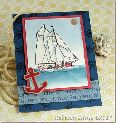
sailboat retirement

Hubby is constantly needing retirement cards, mostly for men, at work. So this was the perfect opportunity to repeat some images! The banner at the bottom was repeatedly stamped with Happy Retirement (PTI) on some old Basic Grey paper. It’s a great way to use a smaller sentiment as the repetition allows the sentiment to stand out and adds emphasis. The focal image is stamped on watercolour paper and watercoloured with my hodge podge of professional paints. (many different brands)

c4c sailboat retirement2

I love how both the sky and water fade out towards the bottom! For the foam of the ocean near the boat, I layered my watercolouring. Each layer made the water darker, I started out with a pale wash, but I made sure to vary the top edge. Click on the photo to see it larger. It then gives the illusion of the texture of the water as the boat moves through it. A touch of gel pen helped to add more white to the white caps. If you look carefully at the sails, you will see I added the shadows of the rigging. It seemed like a nice touch to add. It isn’t perfect as I would have liked; I faded out the shadows of sails (on the other sails) when they should be crisp lines but oh well.

Don’t miss a thing! Stay tuned for more colouring, vintage, shabby chic cards and fun tips. Subscribe to get my posts in your in box!

I also used repetition on the background, stamping the captain’s wheel, a companion image to the sailboat, over and over in a ‘random’ pattern. It’s not truly random, start at one corner and stamp in triangles, not straight lines, but it looks random-ish when you are done. This is an awesome and fun challenge. Pop on over to the C4C blog for more inspiration on this theme! Hope you can join us this week!

Coming soon! Crafty Book Reviews and a fun unboxing video! It’s a secret but it’s super trendy and super cute!

Also I will soon be able to reveal 6 yes SIX months worth of cards made for the SplitcoastStampers Dirty Dozen Design Team. I’ve barely been blogging the last 6 months and I’m so thankful for your patience and perseverance. I can’t believe it’s almost over and it was a blast! There are a lot of cards I’m really proud of over there!

Enjoy, Rebecca

January 07, 2017

Rock n Roll Thank You Card

ETA: Somehow this post got lost! Sorry for the delay!

Welcome back to Crazy 4 Challenges! We took a break for the holidays and now we are ready to challenge you with awesome new themes and sketches.

rock guitar

Our challenge this week was to be inspired by Rocks in some way. I decided to go with Rock n Roll! My oldest son and husband are very into playing electric guitar. This card will be for one of them at some point. I used some very old 12x12 papers for this. I distressed the edges to add to the grungy look and once the card was all put together, I splattered it heavily with watered down black acrylic paint. The stitched die is by SSS, the border die from PTI, thank you from Echo Park and the stamps from Taylored Expressions.

Sorry this was posted so late and you aren’t able to play along. But you can use our inspiration any time!

Enjoy, Rebecca

November 11, 2016

Masculine Blue Jay Card

This has to be one of my favourite Flourishes l.c. sets ever! The birds in this set are gorgeous, perfect for so many occasions and a blast to colour!

fl blue jay wm

When I looked up blue jay images, I was amazed at how many shades are found in their plumage! I used a ton of markers and still only got pretty close! But it sure was fun trying! I decided on a masculine card as I’m always in need of them and I find them hard to create with little time so having them made ahead is key.

winter birds wm

I hope you like this set as much as I do. And I know that the team has some lovely cards to show you too! A couple members are missing from the list as some changes were made last minute but I’m sure they will show off the set as soon as they can.

Flourishes Blog
Barb Thompson
Beverly Cole
Linda Lucas

Enjoy, Rebecca

Entered In: Mojo Monday 473

mojo473

September 26, 2016

Masculine Cards

Do you struggle to make masculine cards? For me, it depends on whether or not I know what the person likes. I find it especially hard when I don’t know them. But I realized that I had quite a few masculine cards in my ‘unposted’ file waiting to be blogged so I thought I’d give you some tips for making simple masculine or guy cards.

masc congrats

There just doesn’t seem to be a single universal theme that all guys like. For girls, you can always use flowers; I don’t know a single lady who doesn’t at least like flowers a little bit. The first card is much nicer looking IRL. The Congratulations die (SSS) cut doesn’t show the gold embossing very well and it appears to blend into the background paper (Graphic 45) which it doesn’t really. Sometimes a really good piece of patterned paper and a sentiment are all you need. The accents are wooden ‘enamel’ dots.

happy retirement

For this card, a simple layout, some non-girlie ribbon (grosgrain, twine, twill and faux suede ribbon are all amazing choices) and a bit of rustically applied embossing powder work well. This could be used with almost any sentiment (PTI) on it but hubby asked for a retirement for a co-worker who likes to golf.

gentleman congrats

This elegant monochromatic card works well for any occasion for the dapper gentleman. The patterned paper panels  (Graphic 45) are all outlined with a gold paint pen.

ann 2015

Grow Old with Me (MFT) seemed like a good sentiment for an anniversary card for my hubby last year; it was our 18th anniversary. I used a simple layout with a bit of interest added by matting the patterned papers (My Mind’s Eye), stamping some text lightly and randomly and adding a couple of embellishments: a cool metal clip and some of that suede ribbon I mentioned earlier.

grad boy 15

An image (MFT) coloured in with Copic markers to match the patterned paper (Basic Grey) and some Copic coloured stars (Studio Calico) perfectly suit this masculine grad card.

GM get well card

Some quick Copic marker swipes, a simple stamped image (Cornish Heritage Farms I think) and some chevron dies (PTI)make this card well suited to the car enthusiast. This technique works perfectly for any line image and some solid stamps too.

tim ann 2011

Another anniversary card for hubby. I blended reinkers on glossy paper with a baby wipe and added some simple embossed images (Unity). (UGH, before MISTI some of my stamping was quite crooked!) This is a great way to make a quick card without having to colour an image if that’s not your thing.

beach retirement

I’ve posted this one before but it shows you again how patterned papers, a simply stamped image (Waltzing Mouse Stamps) and some twill make for a great masculine card. You don’t have to add the sequins (maybe sub in enamel dots or brads if you wish). My husband gave this one as a retirement card for a co-worker. Ocean, lighthouse and landscape scenes often work well as a card for guys you don’t know.

I hope this helps you with your masculine card making!

Enjoy, Rebecca
November 08, 2015

Graduation Card for Mojo Monday

A young friend graduated in the spring and recently had his graduation party. I used the most recent Mojo Monday sketch for his card.

mojo grad ryan

It’s pretty plain, I always struggle to make masculine cards once the recipient is past about 11 or 12 years old. Before that you can still get away with some cuteness!

Enjoy, Rebecca

Entered In:

Mojo Monday 422

RECIPE
Stamp:
unknown
Ink: archival black-Ranger, Vintage photo Distress
Paper: Scarlett Letter DP-Basic Grey, CS-PTI
Accessories: ribbon-stash, brads-Making Memories, buttons-Basic Grey

August 30, 2015

SAF Threads

I LOVE using thread to make thread nests as per Laura in her video. But I like ‘em much more messy than Miss Laura! But for this one, I used the twine. I made some thread nests in later projects.

saf 15 threads

I used three types of twine in three different ways on this card. I loved the buttons with the twine looped though them so much that I had to use three!

In case you are wondering, yes, hubby likes it. It’s a thank you for painting our bathroom!

Enjoy, Rebecca

March 08, 2015

Howdy Neighbour

I made this card for a family I know who is into horses. I haven’t seen them in a while so I thought they might appreciate this card.

howdy neighbour

I think this was also for a a sketch challenge because this isn’t exactly a card layout I’d think up myself. But as happens about 50% of the time, I forgot to link it up in time. sigh…

Dontcha love those wooden embellies? I love using wood veneers, but especially on more rugged themed cards. The twine was supposed to look like a lasso. Did it work?

Enjoy, Rebecca

RECIPE
Stamps:
MFT
Ink: cup o joe-HA, (don’t recall the other colours)
Paper: DP-MME, kraft CS-PTI
Accessories: twine-May Arts, wood veneer stars-Studio Calico, Copic marker (circle around horse head and colouring veneers), circle dies-Spellbinders, lace-vintage, wooden dots-MME

Masculine Thinking of You Card

Sadly my great uncle is sick in the hospital. I knew he would love a card but most of my get well cards were too young for him. So I set to work.

masc get well

We are both very religious so I knew he would appreciate this stamp with a scripture on it. While it doesn’t exactly say ‘get well’, I don’t think it needed to. The buttons look too bright for the card colours but IRL they are a perfect match. This is a pretty basic card so there isn’t much to tell you about. Click on sketch to visit the challenge.

mojo387

Enjoy, Rebecca

RECIPE
Stamps:
SSS
Ink: Grey Flannel- Memento
Paper: light grey CS-SU!, dark grey, ivory CS-PTI, DP-MME
Accessories: buttons-Basic Grey, embossing folder-Sizzix

January 09, 2015

Rugged Sympathy Cards

My FIL passed away recently and while we weren’t close, it was hard to see my teenaged son and my husband so sad. So I made them both sympathy cards.

rugged sympathy boot

Of course, as with many of us, I struggle to make masculine cards that aren’t super boring. Sure it’s easy to layer a few papers but that’s so blah. I used some ephemera I’d been saving and a cool technique to jazz it up some.

rugged sympathy butt

The background is crumpled cardstock which I then smoothed and DTP added some light brown ink. I spritzed it with water to soften the look, let it dry then applied a slightly darker shade orange  ink with my fingers to really work it into the paper. It if was closer to the same shade, I might have been able to use a sponge applicator but this seemed to really bring out the texture in the paper. A sponge might have applied ink too evenly. My fingers were only orange for one day :).  I wish more of it showed.

Mojo379

I’m entering this in the Simon Monday challenge to make new friends but keep the old. I used an old technique to make the paper look like leather and an old stamp. I used ephemera I’ve been saving for ages and new veneers. I also used Mojo Monday 379 for the sketch. for Mojo Monday Judges: I’m entering both cards. But I can only link up one card for each URL. So I entered the other card by clicking on it then using the URL for hte photo. Sorry but no way to link back to the challenge for that card. HOpe that’s OK.

Enjoy, Rebecca

RECIPE
Stamp:
Justrite Stamps
Ink: Ranger Archival brown
Paper: cardstock-PTI, DP-Authentique, ephemera envelope
Accessories: Veneers-Studio Calico, grommet-WRMK, twine-repurposed, Copic markers YR 68, BG75, E59

December 03, 2014

17th Anniversary Card for Hubby

I am not a huge fan on making cards appropriate for guys. Over the years, I’ve subjected hubby to some too girlie cards so I try my best to keep it guy-ish.

nuts about you card

This started with some basic stamping but I added some pencil crayon to shade it. It’s hard to see but each leaf has some shading and I added quite a bit of detail to the squirrel. The top layer is cut away on the side; the gingham is fabric tape stuck to the inside of the card. The sentiment panel overhangs the edge. I should have taken a side shot now that I think about it. I had to add just a bit more so there are a few sequins and Wink Of Stella Pen on the leaves. It’s very subtle so I figured I could get away with it.

I can’t believe that it’s been 17 years already! WOW!

Enjoy, Rebecca

RECIPE
Stamps:
Simon Says Stamp
Ink: sorry, I can’t remember!Versamark
Paper: SSS kit
Accessories: Lawn Fawn sequins, Hero Arts white EP, fabric tape?, Prismacolour Pencils

May 09, 2014

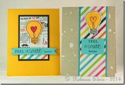
Feel Watts Better

I decided I’d better use up my SSS card kits so I made 3 cards at once. I needed a masculine card for my FIL at he last minute and realized I have very few masculine cards. I usually make them just when I need them and so don’t have a stash.

light bulb cards

The third card is identical to the right card. I just liked the splatters better on this one! They are the same size; weird the right one looks larger. Must be the angle.

light bulb cards2

For this light bulb, I stamped it on white cardstock and coloured it with two colours of Copics. The white splatters are MrHuey’s mist. I just flicked the stem of the sprayer onto the card.

light bulb cards3

For this one, I stamped with yellow ink on white cardstock using the solid stamp included in the set. I prefer the Copic coloured one tho. Just as a note, I quite shamelessly CASEd the cards from the inspiration sheet they include with the kit. Why reinvent the wheel right?

Enjoy, Rebecca

RECIPE
Stamps:
Love You Watts-SSS, Feel better Mega Mixed Messages –PTI
Ink: Memento black, summer sunrise-PTI, Archival black-Ranger
Paper: SSS card kit, HAwaiian shores CS
Accessories: Copic markers R27, 29, Y35, 38, foam dots-The Sticky Stuff Store, Mr Huey’s mist

April 11, 2014

I Love You Watts

I was so inspired by last week’s Unscripted Sketches that I made two cards. This one was for hubby; he’s been behaving himself lately so I needed to let him know. ;)

RebeccaEdnie251 v2

It’s hard to see but I coloured the backside of the vellum bulb bright yellow in the center of the heart and lighter yellow just outside of it. I love colouring hte back of vellum; such an awesome look. I wish it showed up more. The hearts are coloured with a Copic and then I added Glossy Accents to the top.

251

Enjoy, Rebecca
RECIPE
Stamps:
Watts and Watts-SSS
Ink: black Archival-Ranger 
Paper: SSS card kit, scraps white CS
Accessories: holiday shapes die-SSS, Copic R27, Glossy Accents

November 23, 2013

Winter Pillow Box for Unscripted Sketches

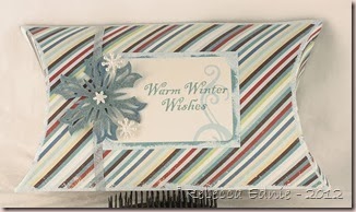
I decided I am going to make an effort to make items other than cards for my Unscripted Sketches design team projects. I was looking through my alterables and the first thing I found was this pillow box.

RebeccaEdnie232

I ordered a few of these as possibilities for my sister’s wedding but they were way, way too big. I find it hard to judge sizes unless something is in front of me. Anyway, I swiped the edges with Versamark then added a mix of white and blue embossing powder and white glitter to the pillow and label. The blue snowflake has heat n stick powder and white glitter on it.

I do hope you will join us at Unscripted Sketches this week. You at least want to visit to see all the awesome projects made by the design team! They are really awesome this week (I think I am going to find myself saying that EVERY week; these girls are talented!) You can make any type of project you like; we welcome things other than cards like scrapbook pages, packaging, notebooks or journals, home dec like configurations, frames, wall art or boxes, sewing projects, mixed media, even ornaments! Or anything else you can think of!

Enjoy, Rebecca

RECIPE
Stamps:
SU!
Ink: baha-SU!
Paper: echo park, kraft pre-made box
Accessories: snowflake buttons (backs removed) Jesse James buttons, Snowflake dies-Spellbinders, ribbon, white, blue EP, Dazzling Diamonds glitter-SU!, foam dots-Jody Morrow

November 07, 2013

Love Us Anniversary Card

I got a new Simon Says Card kit and decided to work ahead and make my hubby’s anniversary card early! Our anniversary isn’t until November 25th so I am way, way ahead!

love us annv card

I always remember the anniversary and we make plans but I forget about the card until the very last second. And if you know me, you know that I NEVER make things until the last minute. I added a red heart for each member of our family. I accidentally cut the patterned paper too short so that’s why the banner is at the bottom. I know it isn’t that balanced but hubby won’t mind :) I should have cut the DP and placed the gap behind the banner but for some reason I didn’t think of that ‘til now.

Enjoy, Rebecca

RECIPE
Stamps:
Love This-SSS
Ink: Versamark
Paper: black CS-PTI, DP-SSS kit
Accessories: heart die-SSS, paperclip-SSS kit, Nestabilities die, foam dots-Jody Morrow

October 24, 2013

A Tweet Thank You

This is the card I made after the ghost stamping didn’t work. It’s much better than my first try which is hiding under the top panel. I’m thrifty like that!

tweet thank you

I love how Hero Arts pale tomato ink looks on kraft CS. It’s hard to find a soft red that doesn’t look pink. I love it when I find papers and a design that look good as a guy card and I didn’t even struggle with the design! In fact, this was a rare time when I had an idea in mind BEFORE I started to stamp AND the card ended up like I envisioned. So many designers can just dream up card while they are somewhere else, then sketch or make notes and come home and make it.

Not me! I usually start with a reason for the card (like an occasion or person it’s for) and/or some kind of challenge, pull supplies that might work and see what inspires me from there. I wish I could dream up cards in my time spent waiting or when I’m watching the kids and can’t get to my craft room! How do you design your cards?

I’m always teasing Kristina Werner by commenting on her cards that it wouldn’t be a ‘Kristina’ card without her signature dash lines on it. Once I got this card completed, it looked unfinished without anything to separate the top layer from the matching colour card base. I was going to sponge the edges like I usually do but it just didn’t seem to suit the style. So I added some dash lines and I quite like how they look on this style of card.

Enjoy, Rebecca

RECIPE
Stamps:
Giving Thanks-SSS
Ink: Pale tomato, cup o joe, green fields-HA, summer sunrise-PTI, Paper: Lawn Fawn DP, kraft CS-PTI
Accessories: may arts twine, frayed burlap Distress marker

August 27, 2013

Miss You School-Themed Chalkboard Card

I’m entering a few challenges with this card. But mainly I want to encourage my son who is going into grade 1. It’s a big step and frankly, I’m worried how he will do. He’s plenty happy though, he has new markers! :)

school chalkboard miss you card

So this is for Simon Says Stamp Wednesday Challenge Back to School.  And for Card Maker Blog’s Card Corner Challenge: Chalkboard. I thought I could enter this week’s Fusion challenge too but apparently I was thinking of last week’s. Bummer.

Very CAS (for me anyway) but it suited the papers, sketch and my kiddo. He’d just rip off fancy bellies and play with them anyway!

Enjoy, Rebecca

RECIPE
Stamps:
alphabet-Graphic 45, sentiment-PTI
Paper: red, kraft-PTI, black-?, DP-OA
Ink: Versamark, archival black-Ranger, Frost white-Color Box
Accessories: buttons-Basic Grey, white EP-Hero Arts, twine-Divine Twine, foam dots-Jody Morrow