Showing posts with label MFT. Show all posts

July 05, 2015

My First Post for TSTR! Celebrate with Cake!

I am so excited to be part of the amazingly talented team who designs for The Shabby Tea Room! I love the photo we were given to work with this week!

tstr dt celebrate

I added some aqua and pink to help make the yellow pop! The chipboard pieces are from Maggie Holmes. Her products are shabby but modern at the same time. I don’t know how she does it!

ca tstr 255a

The cake was ivory before I Copic Airbrushed it. I overdid it a bit so I wiped most of the ink off with an alcohol-soaked cloth. I was very nervous that I was about to ruin my chipboard piece but it worked out really well. I also added the glitter to the cake plate. TIP! In case you were wondering, I carved out all but the top layer of paper on the cake plate on the left so it would overlap the balloon strings nicely. It is simple but go slow and easy so you don’t cut through the front layer of paper.

tstr de celebrate close

I also added some bling to the balloon. I started with embossing powder but either it doesn’t work well with chipboard or I overheated it slightly. It just looked a bit flat and icky. Have you ever overheated EP before? It gets an almost oily looking halo and flattens out. So that didn’t work out like I hoped :( To try and fix it I added some opaque glitter overtop. I didn’t have to cover the whole area, just some was enough. It matches well with the gold already on the balloon.

celebrate

Please join us at The Shabby Tea Room this week! I’d love to see some of my reader’s join along! We have a photo to inspire you each week so be sure to check back often. GO, visit now! See what the other gals have made for you! I am also entering this in the Curtain call-July1 Celebrate.

Enjoy, Rebecca

RECIPE
Stamps:
sentiment-Say It Loud WMS, triangle border-Sparkle and Shine-SSS
Ink: hibiscus burst, harvest gold, Hawaiian shores-PTI, Versamark
Paper: vanilla CS-SU! doily-Wilton
Accessories: chipboard-Crate Paper Maggie Holmes, EP-SU! Glitter-Art Institute, ribbon, gold glitter sticker paper (hearts)-stash, stencil-MFT, heart die-SSS, Copic Y21 and airbrush system
January 19, 2015

Shabby Love Story Card

I think I made this for a sketch challenge that I didn’t enter… AGAIN! Ugh…

girlie love story

I finally got some new lighting (Happy Anniversary to me!) so I hope that my pictures will look better from now on. (I don’t know yet what this one will look like as my monitor isn’t great. I check my iPhone to see if they are too dark etc. Not sure if that is accurate either!) At least one side of the background won’t look greenish while the other looks pinkish! I have two lamps with identical day light bulbs yet one has a  different colour cast than the other. Weird…

girlie love story easel open

This is a new (to me) set from MFT. I love the fronts they pair in these sentiments. I cut my paper carefully to eliminate any Valentine's sentiments or images as this is from a paper pack called Fourteen. I designed the card so as to leave as much of the GORGEOUS background paper as possible. Ain’t it purdy? As you can see, this is an easel card. I like making them because I can work on a card front and still decide at the last minute to make it an easel-style card. Other specialty cards take lots of measurements and planning. I don’t think of them until it’s too late.

Enjoy, Rebecca

RECIPE
Stamp:
MFT Love Story
Ink: London Fog Memento, Frayed Burlap Distress
Paper: Crate Fourteen DP, PTI Blush CS
Accessories: scalloped punch EK Success, lace-Fabricland, buttons-SU!, doily die, loopy border die-PTI, foam dots-The Sticky Stuff Store, hand-dyed Hug Snug Seam Binding ribbon

January 09, 2015

Love Story Card

I’ve been sick for so long, all of December (I’m still not better), I feel like a stranger to this blog. Thanks to all of you who are still here with me!

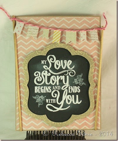
love story banner card

I used this week’s Fusion Challenge which happens to be their Anniversary! Congrats on a great year to Fusion! I was inspired by so much from this photo. I’d actually already pinned it from Maggie Holmes’ blog. It was a birthday party backdrop for one of her deliciously adorable daughters.

First Birthday

I decided to use the gold frame, banner, sticks with little flags on them and the overall pinkness as my inspiration. I really wanted to add some flowers and ribbon but decided to leave it as is. anything I envisioned just overwhelmed the design and left it too off balance. BTW, it is a rectangle card. The diagonal lines of the gold-painted sticks make it look like the top is wider than the bottom but it’s an optical illusion. It looks better IRL.

26-One Year Celebration[6]

To make the frame, I deliberately only lightly embossed the shimmery gold cardstock frame. I didn’t want the paper to crack nor warp the thin frame too much. It worked beautifully. The sticks were painted with a gold paint pen.

I’m entering this in the Card Concept Challenge #26. And another Happy Anniversary to the CCC! Yeah, I am so glad I found you. This is my first time even seeing this challenge!

Enjoy, Rebecca

RECIPE
Stamps:
MME love sentiment, flourishes-PTI
Ink: Versamark, Versacolour-could white
Paper: golf shimmer cardstock-SU!, kraft, black CS-PTI, DP-MME
Accessories: BBQ skewers- grocery store, Krylon gold paint pen, banner die-SSS, frame dies-Lifestyle crafts

September 17, 2014

Watercolour Poppies

I recently bought this stamp set used (love the cost savings!!) and I was eager to try it out. I needed a couple thinking of you cards anyway and I LOVE this Thinking of You sentiment from Simon Says Stamp.

watercolour poppies

I used Twinkling H2Os for the background. It is subtle but pretty and shimmery. I used green at the base of the poppies, blue at the top and turquoise at the bottom. I originally die cut the flowers with the matching dies but I wasn’t a fan of the white edge so I trimmed them by hand. Especially when layered over the stems which were not die cut.

I stamped the flowers in Distress ink but the results were splotchy on the watercolour paper so I smoothed them with a wet paint brush. Then I added some more colour from the ink pad smooshed on my craft sheet to add some depth. I’m afraid that doesn’t show very well in the photo. I added some black accents with a C9 and 100 (black) Copic marker.

To finish the card, I added some crocheted lace and twine. The watercolour panel was layered on an aqua card base stamped with the script stamp from the poppy set.

I’m really sorry to have posted so infrequently lately. Summer was really busy and I’ve been suffering with a really bad case of frozen shoulder. I have a lot of pain and very limited range of motion. So a huge thank you to all of you who have stuck with me and not unsubscribed!

Enjoy, Rebecca

RECIPE
Stamps:
Poppies-MFT, sentiment-SSS
Ink: Distress worn lipstick, aqua mist-PTI, green leaves-Memento, Archival black
Paper: Windsor and Newton Watercolour paper, aqua mist CS-PTI
Accessories: crocheted lace, Divine Twine, Twinkling H2Os, Copics, foam dots-The Sticky Stuff Store, sequins-SSS card kit

February 08, 2014

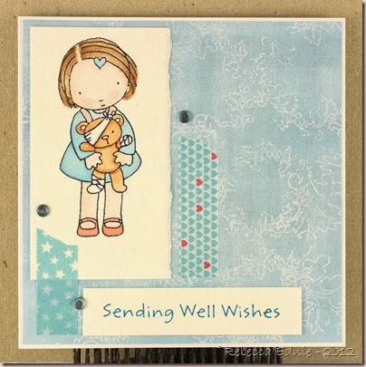
Sick Teddy Bear for Unscripted Sketches #243

I took a chance on going back to water colouring since I just had to get some Derwent Inktense Pencils. I mean, if Jennifer McGuire recommends them, they have to be amazing right? And they are except I have no flesh colour and dang it, it’s hard to mix!

RebeccaEdnie243

And as you can see, its a bit too light, maybe more than a bit! I tried mixing red and brown with lots of water but it was so hard to get just right. but she still looks awfully cute to me! I had brighter papers in mind but with her skin coming out so pale, they were too overwhelming so i looked for the softest ones I could find. Melissa Frances to the rescue. The background blue is much softer IRL but unless I increased the saturation, her face looked white. It is soft with a touch of gray really.

243

This sketch was fun, I loved the long skinny panels that were PERFECT for washi tape! Do you have lots of washi you don’t use often enough? How about ribbon? Any other ideas? Then come on out and play with us at Unscripted Sketches #243! We love to have lots of players to choose our top three from. Come on!

Enjoy, Rebecca

RECIPE
Stamps:
MFT
Ink: Memento black
Paper: DP-Melissa Frances, watercolour paper-stash, white CS-PTI
Accessories: Derwent Inktense pencils, washi tapes-stash, rhinestones-Dollarama

February 01, 2014

Cameras Today Card for Unscripted Sketches

I recently got some new (to me) papers so I was excited that this week’s sketch used so many layers!

RebeccaEdnie242

I coloured and paper pieced her with Copics. The camera was coloured with gold paint marker (backwards I think, oops!) On the kraft circle I used texture paste and added Perfect Pearls in gold. Please enlarge to see the detail, I adore the pattern on the pink paper; the cameras are A.DORE.A.BLE.

I really enjoyed this sketch. I can totally see myself using this one over and over since it is so well balanced. I hope you see the possibilities too and will come by and play with us at Unscripted Sketches #242.

242

Enjoy, Rebecca

RECIPE
Stamps:
Pure Innocence MFT
Ink: Memento ink
Paper: DP-Yes, Please Amy Tangerine American Crafts, 5th and Frolic, Dear Lizzy American Crafts, kraft CS-PTI, blushing bride-SU!
Accessories: camera veneer-Studio Calico, texture paste-homemade, washi tape-Queen & Co, Krylon paint pen, rhinestone-Dollarama, paper flower-stash, stencil-Crafters Workshop, Perfect Pearls-Ranger

January 03, 2014

Thankful for Your Friendship

I love colouring but to be honest, I haven’t been doing that much lately! I don’t really even know why. I guess it’s just the wax and wane of interest we all get sometimes. But when I coloured and paper pieced this one, I really had fun!

mailbox friendship

I’m pretty sure  I used a Mojo Monday or some other sketch challenge that I missed posting in time. I am soooo bad for that! These supplies are from one of the SSS kits I got. Don’t remember which one. For the first 4 or so I could keep them straight. After that, no way! I love this heart banner die, so sweet! But very delicate; it has to be handled so gently or you lose the pretty curve.

I learned a lot in my Copic Intermediate Copic class I took in the fall. It was amazing! I coloured this soon after. Fortunately, my favourite skin colour combo was one of the recommended ones for young skin so I used it here knowing it works well for images like this.

It’s a bit hard to see against the polka dotted paper but I used one of my favourite techniques on this, Outside the “Box” (tutorial on SCS). I love the result but HATE doing it. I am always chopping off a piece of paper I shouldn’t. You can see that the girl’s head, the bird and the ground are all outside the die cut circle. I looked for a paper in the kit that was a bit more solid so it would show up better but none worked better than this one.

Enjoy, Rebecca

RECIPE
Stamps:
girl-MFT, sentiment-SSS
Ink: archiva black-Ranger, Memento black
Paper: ?? SSS kit
Accessories: heart banner die-SSS, circle dies-Nesties

October 20, 2013

Sea Shell Mixed Media Canvas

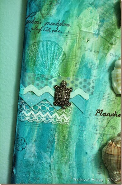
I ADORE anything beachy or ocean-related and I was in desperate need of some decor for my powder room AND I’m learning to do mixed media so this is what I created!

sea shell mm canvas1

It also happens to be perfect for this week’s SSS Monday Challenge Blog to create something with a nautical theme!

sea shell mm canvas2

I used die cut paper, lace, washi, glitter and charms to create little spots of interest on the sides of the canvas.

sea shell mm canvas3

You can see the shells I stamped. Because they were stamped with dye ink on acrylic paint, they didn’t dry so I clear embossed them. Since they didn’t stand out as much as I had hoped, I added some Faber-Castel Big Brush pen and smudged it in to accent them just a bit.

sea shell mm canvas4

The stamps are part of a sheet of rubber I bought so sorry, I don’t know who created them. Maybe Rubber Buggy Bumpers? They are out of business now. The background is music paper and book paper in three languages (French and Dutch) on top of a canvas board and then covered in gesso and paint.

sea shell mm canvas5

Enjoy, Rebecca

RECIPE
Stamps:
large shells-SU!, small shell-Flourishes, other ‘botanical illustration’ stamps-stash
Paper: vintage music and book paper, hawaiian shores, aqua mist CS-PTI
Ink: hawaiian shores-PTI, Archival cobalt, potting soil
Accessories: charms, lace-stash, MFT scallop die, various PTI dies, washi tape-MME, shells-school supply store, E6000 glue, Golden Fluid Acrylic paints

April 07, 2013

Summer Floral Journal

This journal is for the Summer Home Decor Challenge in the Moxie Fab World. Make some time to play along won’t you? I’m planning on making it part of a desk set for a partner I’m swapping with so she can keep it out as part of her summer decor.

summer floral journal

I started with a nice but too plain journal from Michaels. The cover had a purple binding, lilacs and yellow stripes with the scallops and cut outs and that’s it. I added the music paper, lace, ribbons, flowers, pearls, doily, stick pins with beads and buttons. This also makes a great hostess gift; I took one with me last night when I was invited out since I made two!

Enjoy, Rebecca

RECIPE
Paper:
vintage music paper-stash, white CS-PTI
Accessories: corsage pins-Michaels, gingham ribbon-SU!, green ribbon-Masterstroke, rose-Prima, lace-May Arts, purple bead-Swarovski, doily die, scalloped edge die-MFT, pearls-Dollarama, twine-PTI, if not noted, from my stash

Modern Hospitality Card for Mojo Monday

I think this is the last in a series of cards I’ve been making for my sister. She likes much more modern cards than I do so, once again, I made this set to her tastes. I promise, there are much more girlie and shabby designs to come!

mod hospitality for sarah

These were part of a wine gift set I gave her. I made or personalized most of what was in there: a wine tote made of oatmeal and black Paris-themed fabric with a handmade beaded rose and insulated sleeve to keep white wine cold (I even created my own design/pattern for the entire thing from a photo!), an engraved wine stopper with their last name and wedding date, hand stencilled wine glasses with their monogram, wine tags to go on bottles they may give as gifts when invited out somewhere, wine aerators, hand-beaded wine charms, some nice wine themed tea towels and these cards and of course a nice big bottle of wine. They loved everything, yeah!

I used this week’s Mojo Sketch and I’m pretty sure that for once I finally managed to get it up in time! Yeah again! Click on the sketch below to visit the blog.

Mojo287Sketch

Enjoy, Rebecca

RECIPE
Stamps: PTI
Ink: spring moss-PTI, London fog-Memento, Antique Linen Distress
Paper: aqua mist, white CS-PTI, DP-Basic Grey Upcycle
Accessories: rhinestones-Taylor’s Tiny Twinkles-TE, foam dots-Jody Morrow, ribbon-stash, doily die-MFT, angled labels die-PTI

March 03, 2013

Fight Like a Girl Get Well Card

I thought I had already posted this but I guess not. I got this set free as part of the a.muse October breast cancer campaign. You only had to pay $3 shipping! What a great deal!

fight like a girl

Sorry about the background. I should have used kraft instead of white. Not enough contrast. It’s hard to see but there is a squarish ‘think pink’ stamp in the set and I stamped it as a background alternating between stamping it horizontally and vertically. Click to enlarge the picture to see it better.

fight like a girl1

I am working hard to get better at colouring hair. In my opinion, it is the only type of Copic colouring I still really struggle with. Not that I am a genius at the rest but I think I have achieved intermediate status for most. But hair, yeesh! At least I am remembering to leave highlights and in the right places but getting them to look realistic is so hard. I’ve watched tons of videos and they make it look so easy but when I go to do it, well, it isn’t and takes lots of practice!

Sadly this is for a friend of mine who is struggling with cancer. I helped her with her kids when she had breast cancer the first time. Now the beast is back. Fortunately, now her kids are grown but this is just so unfair. I made it a while ago so I hope she enjoyed it.

CAS-ualFridaysNoWords

I’ve entered this in the CAS-ual Fridays Challenge 92 to make your own Wallpaper: stamp your own background on your creation. It’s a technique I love doing so I was thrilled to see this challenge. I just hope my card isn’t too fussy to qualify! It certainly is more CAS than most things I make!

Enjoy, Rebecca

RECIPE

Stamps: sentiment and background-a.muse, girl-MFT
Ink: Memento black, pink pirouette-SU!, sentiment pink??
Paper: blush CS-PTI, white CS-Xpress it, DP-Basic Grey, doily vintage typing paper-stash
Accessories: doily die-PTI, ribbon-Miss Alaynia Etsy, corsage pin-Michaels, beads, charm-local bead store, foam dots-Jody Morrow

March 02, 2013

Pet Sympathy Card

A sweet lady has been coming to support me and help handle my autistic son. It’s her job to help parents of children with mental illness but she’s a parent too. She has an autistic daughter herself so when I found out her daughter’s cat died, I had to make a sympathy card for her.

CASE study 129 cat symp

I took the photos during the day so the colours are a bit off; the orange is darker and the DP is brighter so they match better, sigh… oh well. Daylight mixed with my photo lights confuse my camera’s sensor. I made this as she was arriving and she had to take it with her so there was no time to rephotograph it later.

I used the CASE study 129 but since my kids dumped water on my computer, thankfully it is fine, I missed the chance to enter. Grrrrr…… I might have added some more embellishments to match the original but when I asked her mom if she would notice them she said probably not so I went with just the one cat. The style of this cat suits a teenager so I thought it was perfect.

CASE129

This is the card I was CASEing. I hope you like my take on it. I really liked the twine bits from each embellie. Thought is was cute and very clever. I was working from memory so I didn’t notice the one rounded corner; wish I had done that. oh well.

Enjoy, Rebecca

RECIPE
Stamps:
sympathy sent-MFT, flourish Vintage labels-PTI
Ink: archival black-Ranger
Paper: Max and Whiskers-Basic Grey
Accessories: twine-PTI, cat-Jesse James buttons

December 22, 2012

Beach Bum Babe for Dec SFYTT and Tuesday Trigger

I am so sad that this is the last SFYTT! However, I am thrilled that it seems I managed to play every single one all year! There can only be fewer than 60 people in the running for the prize because (I believe) that’s all who played in November!

beach bum SFYTT dec12

This also works for Tuesday Trigger on Moxie Fab World. I am very disappointed in the photo (again) because you can’t see the shading I added to her skin. I made it look like she has a bit of a sunburn. It is obvious IRL but like the pretty gold glitter I added to the sandy areas under and around here, you can’t see it! Bummer, I hate that! You can see it on her cheeks but it looks more like I just didn’t blend them well!

beach bum SFYTT dec12 1

I made the flower using fabric from the bridal section of the store. You have to make sure you get polyester so that it melts properly and preferably a tight weave. I used two different kinds, I believe they were satin and georgette. Lots of different types of flower dies will work. I use a heat tool to melt mine, not a flame because you won’t have to worry about soot marks. I also use tweezers to support the petal as a melt it so I can’t melt it too much.

beach bum SFYTT dec12 2

As I sat and looked at my card, I regretted that I’d put the darker aqua panel on the right side, opposite the flower. I thought the flower would pop more against the darker panel. So I added the flourish to help it stand out more and I’m so glad it did! It’s the first time I’d used the flourishes with the matching dies and I was pretty happy with them. I don’t have many dies that need to be stamped after die cutting so I was please how easy it was to line up and stamp.

sfytt dec2012sketch

tues trig dec 18 12

Click on the pix above to visit the blog posts.

Here’s my link to all my SFYTT entries this year. http://eclecticendeavours.blogspot.ca/search/label/SFYTT

Enjoy, Rebecca

RECIPE
Stamps:
focal image-MFT, shells-SU!
Paper: all CS except white circle-PTI, white CS-X-Press It
Ink: Memento black, aqua mist, hawaiian shores-PTI
Accessories: fabric-Fabricland, brad-stash, glitter-Art Institute, foam dots-Jody Morrow, mini scalloped punch-EK Success, Nesties dies, PTI flourish die, twine, May Arts ribbon

December 09, 2012

Happy 15th Anniversary Honey!

A couple weeks ago was my 15th anniversary! I was a bit late making an anniversary card for hubby, we aren’t that particular about the date anyhow.

TandR mojo ann card

Friends had us over for an anniversary dinner two weeks before the actual date, we went out for dinner and to see War Horse one week before the date and I was at a shower for my sister on the actual date. He gave me a card on the date so who was I to end the festivities by giving my card on time? I stretched everything out by giving him his card a week late! The actual date was November 15th but you could stretch it even further by leaving us congrats in the comments, pretty please!

TandR mojo ann card2

Back to the card. I used this week’s Mojo sketch which was a really nice one. Instead of three hearts, I added our initials to the heart. I think it’s ok to add hearts to a card for a guy if and only if it’s a love card. Some bloggers I follow add way too much girlie stuff to guy cards. For me, this is the absolute limit. There’s already scallops, a label shape, a flourish and rickrack for Pete’s sake! But there’s also serious stripes (strong colours, all the same size, none are little dots or dashes etc), distresses and torn edges, newsprint, non-girlie fonts and distressing. No bows, no glitter (unless it’s a winter card), no rhinestones, no ribbon unless it’s flat or tied in a knot,very sturdy and not frilly like grosgrain or corduroy. Ooh, or strips of suede or leather. Cool!

Mojo270Sketch

Enjoy, Rebecca

RECIPE
Stamps:
flourish-PTI, sentiment-PTI
Ink: frayed burlap, Antique Linen Distress, chocolate-PTI
Paper: smokey shadow, Ocean Tides CS-PTI, vanilla-stash, dp-MME
Accessories: Scrabble letters-, ampersand sticker-October Afternoon, rickrack, scallops die-PTI, heart die-Sizzix, labels 8 Nesties die

December 01, 2012

Snowman Card with Gift Card Pocket

As soon as I saw this sketch, I thought of adding a gift card pocket to the front of the card. And I had paper that was perfect!

deconstr79 snow gift card

The snowflake is made from 5 or 6 layers of cardstock glued together. It makes for quite a nice sturdy embellishment! In the center is glued a perfectly matched rhinestone! I know red is an odd choice for a background for a snowy scene but it popped much better than any of the aquas or blues in the paper. Brown was out and so was pure white so red it was!

deconstr79 snow gift card2

Here you can see the inside of the pocket a bit. It is a simple folded cardstock piece with a small flap that folds up from the bottom to secure the card and it adhered on  one side only. Let me know if you’d like the pattern. I trimmed the pocket a bit so the cover closes well and rounded the inside left corner. It is stamped with snowy flourishes. The metal snowflake accents? They are bead caps I wasn’t using because they weren’t working with my jewellery style. Too pointy and big. But flattened out, they make perfect snowflake accents!

deconstr79 snow gift card3

I added a few fun textural touches to this little scene. Nuts, I just noticed that the silver cord is over the scarf and pompom on the hat. Oops! It just needs to be slipped back underneath! The snowman is sporting Liquid Applique on his hat and the little girl has Pearl Pen added to her hat. The hats, scarves and coat are paper pieced. The buttons are dotted with Enamel Accents to make them raised and shiny. The snowman nose and the hill behind the scene, which I hand drew, are accented with Crackle Effects to make them look like they are covered in cracked ice. Lastly, the scene and the paper piecing are coloured and shaded with Copics. Oh, and the colour of the snowman hat is deepened with Distress ink. I had so much fun coming up with ways to enhance this cute little scene!

deconsketch79-332x286

Click the sketch to visit the blog post. Since this layout comes up over and over, I’m making a note that will help me and maybe you too. If your card is 4.25 x 5.5” and you want 1/8” borders and spaces between the panels, each one needs to measure 4” x just under 1 1/4” wide.

I’m also entering this in the Simon Says Stamp Challenge  ‘Anything Goes’ and the Cute Card Thursday challenge 245 to use snowflakes.

Enjoy, Rebecca

RECIPE
Stamps:
girl-MFT, snowflakes-CTMH
Ink: Fired Brick, Antique Linen Distress, Memento black
Paper: DP-Echo Park, white CS-Taylored Expressions, Navy, red CS-SU!
Accessories: silver cord-SU!, foam dots-Jody Morrow, Copics and Multiliner, Crackle Effects, Enamel Accents-Ranger, cream Pearl Pen, rhinestone-stash, Liquid Applique

November 24, 2012

Case Study Warm Winter Wishes

I loved the inspiration piece they chose for the CASE Study challenge this week. Click on the photo to check it out.

case study warm winter wishes

I decided to use snowflakes instead of leaves. I had planned on a very simple once layer card like the one provided to CASE but my brain just couldn’t stop trying to come up with my own spin on it; a way to make it my own. So I thought of die cutting a hole and adding the sentiment to acetate using white Staz-On ink. But honestly, I HATE using white Staz-On. It is messy and hard to clean off of stamps and blocks. It has to be re-inked every time you use it and doesn’t even always give a great impression. I guess I could have carefully heat embossed it but I didn’t think of that until I am typing  right at this moment! So I left the acetate alone and just used it to support the snowflakes I inserted into the opening then stamped the sentiment on the inside of the card.

case study warm winter wishes2

I got this all done and even photographed it then decided it needed more bling. So I added glitter to the aqua snowflakes and rhinestones to the sentiment area. Shame you really can’t see the glitter at all. It is white so it can’t be helped. I’m entering this into the Caring Hearts Card Drive. I have to hurry and get it and my other card in the mail. I’m sure they would love it if you could help out!

CASE study 118

Enjoy, Rebecca

RECIPE
Stamps:
SU!
Ink: hawaiian shores, aqua mist, blueberry sky-PTI, bashful blue-SU!
Paper: aqua mist CS-PTI, white-TE
Accessories: label dies-Nesties, snowflake dies-MFT, rhinestones-Kaisercraft, glitter-Stampendous

November 19, 2012

New Pets Card

My cousin got a new puppy and a new kitten so I wanted to say Congrats! Now this is where I KNOW my card making is an advantage. Try and find a card in Hallmark that’s a congrats on your new cat AND dog in the same card! Hah! Take that Hallmark!

new pets card

I used Max and Whiskers paper, specifically half puppy and half kitty papers. The heart tags are those Making Memories frames to which you add your own paper in the centers. Worked out well except I wanted warmer coloured+-frames than the silver they come in. So I used a Copic marker on them tapping the side along the frame. So now it looks antiqued/distressed.

new pets card2

Enjoy, Rebecca

RECIPE
Stamps:
puppy-CDS, kitty-H&M Stamps, sentiment-Clearly Sentimental About Pets-MFT, paw-PTI
Paper: DP-Max and Whiskers Basic Grey, chocolate CS-PTI, natural ivory-SU!
Ink: Memento black, Antique Linen, Vintage Photo distress
Accessories: Making Memories frames, foam dots- Jody Morrow, Copic, corner chomper WRMK

November 03, 2012

Let It Snow Scrapbook Page

I can’t believe I haven’t posted this before. It is one of my favourite scrapbook pages of all time!

winter wonderland scrap page

I’m afraid I’ve forgotten what supplies I used so this post will be short! The red doesn’t look very red but it is a either real red or riding hood red by SU! IRL. I guess I had trouble editing this photo. Sure wish my then almost 10 year old would smile nicely. He’s even more ‘tween-y’ now! {{SIGH}}

The journaling card records my kids answers to ‘why do you like the snow?’. Click on the photo for an enlargement.

Enjoy, Rebecca

RECIPE
Stamps and Die:
PTI ticket
Paper: night of navy CS, red CS-SU!, DP??
WRMK corner rounder, Masterstroke seam binding ribbon, MFT snowflake die?, SU! word window punch, Tim Holtz mini paperclip, Let it Snow stamp-?CTMH, white, white pearl EP-stash, Lumiere paint (diluted)

November 01, 2012

Teacher Thank You for MFT Sketch Challenge

My 5 year old's teacher is amazing. And she loves my son despite his erratic personality. I seriously would hire her to tutor him for the rest of his life if I had the money! Her favourite colour is ‘rainbow’ so I thought I’d go for an autumnal version of rainbow.

mft teacher thank you

So many bright, fun colours in this card. I used my PTI ice cream die, the cone part, to cut the banners. But they were too long for the card so I carefully measured an exact amount off of the top of each and trimmed it off. As the cut pieces lay on the table, I realized they were perfect for toppers for the banners! Cool right? I hope she likes it!

This card is based on the My Favorite Things Wednesday Stamp Club #96. Click on the sketch to visit the blog post.

MFTWSk96

Enjoy, Rebecca

RECIPE
Stamps:
Clearly Sentimental About Teachers-MFT, flourish-PTI
Ink: Archival black-Ranger, Memento Teal Zeal
Paper: DP-Echo Park, teal, olive CS-SU!, other CS-PTI
Accessories: foam dots-Jody Morrow, dies-PTI, scalloped punch-EK Success, rhinestones-Dollarama, ribbon-Offray, Bakers Twine-Divine Twine

June 25, 2012

PTI June Blog Hop Challenge #2–Every Cloud Has a Silver Lining

PTI blog hop logo

I ended up making 2 cards for this month’s inspiration challenge! I wanted to use some yellow too but when I tried adding it to my other card (see below), it just didn’t look right. Too bright! So, I made another one!

silver lining PTI hop

I hope it’s not too hard to figure out why there is a silver heart cut out from the cloud. Every cloud has a silver lining right? Or does the expression go ‘every dark cloud…’. I’m not sure, anyway…

silver lining PTI hop closeup

I added Glossy Accents to her little rain boots. Cute right? I used this month’s SFYTT for this card. Click on the sketch to go to that post.

SFYTTjun2012sketch

I hope you have fun with the rest of the blog hop. If  you enjoyed this card, I hope you will visit again; I have subscription thingies on my sidebar.

Enjoy, Rebecca

RECIPE
Stamps
: MFT
Ink: Memento black
Paper: All CS and DP-PTI except white CS-X-Press It and silver-unknown
Accessories: Oval Nesties, cloud and heart dies-PTI, ribbon-May Arts, Copic Markers and airbrush system, word window punch-SU!, foam dots-Jody Morrow, Glossy Accents-Ranger, Mettler sewing thread