Showing posts with label super girlie. Show all posts

February 14, 2013

Papertrey Ink Challenge–Pearl and Flower Necklace

PTI 6 ann

I’ve been getting more and more in to making jewellery lately so when Nichole challenged us to make some sort of accessory using PTI products, I decided to make a necklace.

pink pearl flower necklace

I was inspired by a couple different necklaces on Pinterest but this is different enough and the overall idea common enough I can’t really credit any one source. I used a PTI scalloped circle die to make the flower. It took a metal shim and a thick cardstock shim to get good cuts but once I had it set, it cut beautifully!

pink pearl flower necklace2

I am going to do a tutorial for the flower soon. I used ordinary 19 strand, stainless, coated beading wire for the pearls. At the ends I used Scrimp beads to secure a split ring. Scrimps are a large crimp bead with a tiny screw inside. They look nicer IMHO and hold securely. You can undo them unlike crimp beads to adjust the length by taking off some beads and redoing it. They also can’t break like a normal crimp which is a problem I often encounter. I guess I don’t know my own strength! Hee hee! I used a split ring instead of a jump ring (like a tiny key chain ring) because they are more secure. A soldered jump ring would also work.

The flower is made from chiffon, 16 pieces. It is pretty cheap to buy at the fabric store and they usually have lots of colour choices if they sell bridal fabric. I always get a small piece, like 6-10” or 1/8 yd but insist it is cut straight so I always get a ton more than I actually ask for. When cutting tiny things out of it, it adds up! On the back I glued on a pin back but also a lobster claw clasp. The lobster claw attaches to the split ring but the pin back allows me to take it off and use it as a brooch!

Enjoy, Rebecca

RECIPE
Glass based pearl beads-Michaels, split rings-BeadFx.com, stringing material-Beadalon, Scrimps, fabric-Fabricland, scalloped circle die-PTI, thread-Guttermann, ribbon-stash
October 17, 2012

Rustic Elegance Triple Challenge Card

I am going to enter this in three challenges. I Spy sketch Challenge, Shabby Tea room Rustic Elegance challenge and Simon Says Challenge to use dies.

rustic elegance card

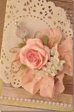
Most of this card is pretty obvious. I was so bummed that I had no pearl swirls except a deep tan one so I kinda engineered the swirl in the corner. I pieced together several smaller swirls and clipped the adhesive in between them to change the shape. I am pleased with the result.

rustic elegance card closeup

I hand dyed my own seam binding. I’m adding the recipe here so I can remember it myself later. But maybe it will help you out too! I used 5 drops each of pretty in pink and blush reinker and one drop of Antique Linen so it isn’t too bright.

ISSC37

tstr _136

I used a die to cut the doily (SSS) and I used pearls and the stick pin as elegant elements and the twine and board flooring paper as rustic elements (TSTR).

SimonSaysStamp_160x240

Click on any photo to visit the challenge blog post.

RECIPE
Stamps:
flourish frame-SU!
Ink: Champagne Versamark
Paper: All Dolled Up-MME, moss CS-PTI, doily-vintage typing paper
Accessories: HugSnug Seam binding ribbon, Porcelain paint-MS, reinkers as above-SU!, pink flower, pearls-Recollections, white flowers-stash, twine-PTI, corsage pin-Michaels, various beads-stash, doily die-PTI

June 24, 2012

Book Loans Album for Mom

I’d have sworn I already posted this project; I wonder if I did and it got lost, hmmm. I make this mish mash journal style album for my mom. She often loans out her sewing books and then asks me if I have them and doesn’t quite believe me if I say no because I have a bad memory. She started writing down what people borrowed then loses the papers! So, this is the solution!

book loans cover

Please click on the photos for a larger view. I tried to decorate some pages but also leave some pages empty for writing. I used a variety of ribbons to decorate the rings and a gorgeous Recollections rose.

book loans 1

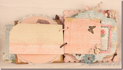
The little circle hanging on the string is a Tim Holtz fragment tag. the other side has a little flower showing through some glitter and glossy accents under the clear plastic tag. I’m not sure why I photographed it like this (as I remember, I was in a hurry) but it hangs down slightly when the string is wrapped around the button. The right page is an envelope where I put some library cards for the books she lends out more often. I also gave her some library pockets to put in those books.

book loans 2

I used a lot of Webster’s Pages paper for this. I did a bit of stamping…

book loans 3

…and made some shaped pages.

book loans 4

Some of the pages are covered chipboard. One is a doily and some are just plain paper.

book loans 5

I also used a recipe card that was a stamped image I was given and some Basic Grey paper too. I’m afraid I missed photographing the page behind the recipe card Sad smile

book loans 6

This page is one of my favourites. I love the cherry chipboard and vintage magazine advertisement. The left page is meant to be viewed when turned 90 degrees.

book loans 7

Although certainly not an exact match, I tried to embellish the cherries to have green stems like IRL. The right page is one of the most embellished. I added a stamped image, pearls, a tiny key and a stick pin.

book loans back cover

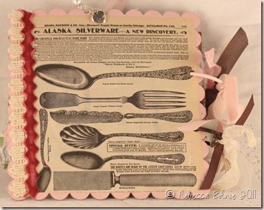
and finally the back cover. Another vintage magazine ad and some lovely velvet rick rack.

I hope you enjoy my album, my mom did!

Rebecca

RECIPE: Sorry, I made this a year ago, I’m afraid I don’t remember much. Email me if you have a specific question.

April 02, 2011

Ribbon Flower Gift Box for the OCC Challenge

This week was a fun challenge! Sharon challenged us to create a card, 3-D project, scrapbook page, etc. on the theme of Girl Power. Let's show our feminine side and make something girly!  There are requirements: include a hand-made paper flower, ribbon and some bling.  Doll it up!

ribbon flower gift box

Well, I got the paper flower part, sort of, I am ashamed to admit that I missed the handmade part of the paper flower. I mean, I started with the handmade part. I made the base and then made some really pretty handmade, scrunchie, scalloped circle flowers. Only problem is they looked too drab for my project even though I made them from paper that matches the colours in the DP. Funny thing is, I have no idea why. I made one peach and one yellow but they looked the same colour and much too boring to match the project.

ribbon flower gift box2

After that, the paper flower idea got stuck in my head as I searched for a substitute, only as I type this am I realizing I forgot the handmade part. I decided to use a chipboard flower and cut the petals off, covering them in my favourite green ombre ribbon to make them look like leaves. They are handmade I guess, they are a type of paper and they used to be flowers. Do you think that counts?? LOL!

ribbon flower gift box3

I really like this template. I love how the paper you use for the flap shows at the back! And since I used pretty DP, it makes it that much better! It is by Lauren Meader of My Time Made Easy; I’ve been somewhat critical of some of her templates in the past, loving the shape and design but not loving the imperfections and occasional asymmetry. This one is pretty much perfect! YEAH! I didn’t change a thing AND I will ribbon flower gift box4make it the same way next time so I was very happy constructing it.

I made the flower from ribbon (a la Monica Geller, “I KNOW!”) but I can’t tell you how yet as that will be my video tutorial for my May Arts Design Team application. I used Distress Crackle Paint on the Maya Road flourishes.

I’d love to see your name over at the OCC blog! This one is pretty easy so there are no excuses! And of course, when you visit, you can see the other AWESOME gal’s work! I’ve seen it, it is TOTALLY worth surfing by!

Enjoy, Rebecca

RECIPE
Paper:
American Crafts Botanique, natural white CS-SU!
Accessories: May Arts ribbon, tulle, beads chipboard flower-stash, chipboard flourishes-Maya Road, pearls-Dollarama, labels 14 Nestabilities, Velcro-Wal-mart, Crackle paint-Ranger

February 12, 2011

Happy Mail for the OCC

This week’s challenge is to fussy cut! You can cut out your image, paper piece, hand cut some shapes, anything you like!

Happy Mail

I hand cut the little girl, her dress and her pockets. And since I couldn’t get my $%^&* die cutter to work properly, I ended up trimming and hand cutting my mail box template too. GRRR! It sure is cute though isn’t it? Smile I am not going to give a link for the template because it didn’t assemble properly. I’ll try it again and if it works, then I’ll link it.

happy mail cupcake stand

The cupcake stand is made from…. guess what?…. a ribbon spool from May Arts! Cool right? I wrapped the center with a strip of DP. Then I traced the top onto another piece of DP. I punched a strip of DP (it is coloured on the other side), stamped it, scored it then glued it to the top of the stand. The fold aligns with the top edge of the ribbon spool. When you get to the corners, clip the paper so it will fold neatly. Then glue the top on. I didn’t have a cupcake (though I found a new bakery just today!) so I filled a small tin I had handy with Hershey’s Cherry Cordial Kisses.

happy mail closeup inside

Here’s a close up of the mail box showing the interior. You can’t see it but the floor inside is also covered in DP that matches the top of the cupcake stand. It is filled with Hershey’s Mini Chocolates.

Enjoy, Rebecca

RECIPE
Stamps:
little girl, sentiment-PTI, Sweet-Mixed Messages PTI
Ink: memento black, rose, pretty in pink-SU!
Paper: DP-Bittersweet Basic Grey, white CS-Taylored Expressions, pink, chocolate CS-SU!
Accessories: Spellbinders tag die, lacy circles, Copic Markers R21,81,8385, E00, 11, 21, 31, 33,93, Y21, B14, flower-Prima (I think), dotted ribbon-stash, seam binding ribbon-Masterstroke, brad-Basic Grey, MS punch

January 11, 2011

Pretty Pink Bird Challenge Card

It’s been a while but it seems I’m back into doing challenges again. I kinda go in spurts! This one is for The Shabby Tea Room’s sketch challenge, also for the Our Creative Corner a.k.a OCC Design Team search challenge and the Crazy 4 Challenges inspiration challenge!

pretty pink bird shabby

I knew I wanted to use a bird for the OCC challenge so I dug out some Basic Grey porcelain chipboard pieces and layered them. The frame lead me to the idea of cutting a hole in the center of the card so show the inside. I love how it looks with the music paper behind! Granted there is little to no room for a message but oh well!! I changed around the location of the sketch elements and omitted the middle panel but I’m sure it is close enough!

pretty pink bird close up rose

Guess where I got that rose? You won’t be able to figure out which store because I made it! Yep, I used the 5 petal flower dies from Heartfelt Creations, split the layers of cardstock for the white petals, embossed all of the petals and assembled them all according to a genius YouTube video. I don’t have the link handy but if anyone wants it, just email me. She has figured out how to copy so many fabulous store-bought Prima type flowers. I am not nearly as fast as her, this one took me an hour, so they are only for special cards but I think this one was worth it. Maybe I’ll get faster as I made more. The rose is much whiter and brighter IRL but I had to darken the photo to show the detail, the white blows out very easily.

occ chickadee-wintershot.thumbnail
The stick pin is really just a head pin used for jewellery making. I like them better because they are WAY cheaper, they come in varying lengths, they don’t have sharp points and unlike some stick pins, they are thin enough for almost all beads to thread on nicely. You can also get them with pretty heads though I don’t have any right now.

shabby tea 44

I dyed the seam binding ribbon myself using Copic markers RV10 and R20. I know, one of those is a purplish pink and the other is peachy. But because they are both so pale, they seem to work together. I colour lightly and streaky with the one marker, then go back and fill in the lightest areas with the other marker. Then I spray some alcohol ink on my hands then scrunch the ribbon tightly in my hands which helps blend the colours, but not too much as I wanted some variegation. Then I lay it out to dry which takes almost no time.

C4C69 pink inspiration

The background DP was too bright by itself, which I found strange since it is from the same line of paper, so I layered vellum over it. I have to say, getting all 4 papers lined up with even borders and even scallops AND all matched at the center circle was quite a feat since I couldn’t send everything through at once! But it was worth the work! I am thrilled with how it turned out.

Enjoy, Rebecca

RECIPE
Stamp:
Music Scrapblock (hard to see, on card base)
Paper: Basic Grey Porcelain, sweet blush CS-PTI, chocolate CS-SU!, vellum, vintage music paper-stash,
Ink: Vintage Photo, Antique Linen Distress, Sweet blush-PTI
Accessories: lace-stash, flower-handmade, chipboard-Basic Grey, Copic markers R20,22, RV10, PTI scalloped edge die, head pin-Michaels, 1/2 pearls-Dollarama, pearl beads-SU! pretties kit, pink Czech bead-That Bead Lady, seam binding ribbon-Etsy, Circle Nestabilities

June 23, 2010

Snapdragon Removable Bookmark Card for Doodle Pantry

After making a fun bookmark with this snapdragon image, I decided to make another one.

snapdragon shabby chic card
This time the bookmark is removable with a magnetic back. I just posted all about it, then the battery ran out on my laptop and I thought I had longer than two minutes to finish and post. I lost the whole thing with how to add the magnets to the back and how to dye and crinkle the ribbon. I am too tired and annoyed to rewrite them so look for it later today.

Be sure to sign up for the newsletter at Doodle Pantry because most issues feature FREE images!

Enjoy, Rebecca

RECIPE
Later today.

November 10, 2009

Girls in White Dresses with Blue Satin Sashes

Flourishes has such a fun challenge right now. Be inspired by the song, ‘My Favourite Things’ from the Sound of Music. My first thought was of this gorgeous dress stamp I’ve had almost since I started stamping in late 2004. (Well started again, I stamped a bit in the late 80’s but there were so few supplies back then I lost interest.)

white dresses blue sashes (2)

It was hard to figure out how to get it white and still see it but using white EP on vellum seemed to do the trick. When I added the blue Copic to the back of the vellum it really started to come to life. Adding a bit more to the lower dress layer and the outline made it just so much prettier!

white dresses blue sashes closeup (2)

The layout I used is from the OCC this week, SASSC39. Worked perfectly with this large stamp. To put it in perspective, this is a 5.25” square card. It is hard to tell because the blues are so close to the same but in the center of each daisy is a tiny blue brad. I love the hat pins from the SU! pretties kit but there aren’t very many of them. So I bought some head pins from Michael’s and now I use those unless I need the length of the SU! ones. I used perfect pearls over the entire card base to get a super shimmery look.

Enjoy, Rebecca

RECIPE
Stamp:
unknown
Ink: Versamark
Paper: bashful blue, white-SU!, vellum-stash
Accessories: pearls, beads-SU! pretties kit, head pin, satin ribbon, daisy chain, brads-stash, sheer ribbon-stash, Perfect Pearls-Ranger, white EP

August 13, 2009

Guess I Should Play My Own Sketch Right?

So here it is! I need thank you cards to give as a shower gift and the shower theme colours are black, red and white. Has anyone else heard of the guests at a shower being asked to wear matching shirts? We have been all asked to wear red, the mother-of-the-groom is wearing black and the mother-of-the bride is wearing white. I have no idea what the bride-to-be is wearing! Is this a new thing? Anyway, for my shower gift I am giving shower thanksher an album for her shower pictures and thank you cards to give for the gifts she gets. This is one of those cards. I’ll make a matching holder for the cards, probably a Timeless Template, I think the one that looks like a desk organizer.

The cross piece is made from ribbon and ric-rac stuck on with foam dots. I’d love for you to play along and don’t forget to enter for my blog candy. Please note: I have added to the blog candy! A COPIC sketch marker! I was planning on adding it, but I just wanted to make super sure it was a duplicate of a colour I already have!! Click on my COPIC blog candy to enter!!

Enjoy, Rebecca

RECIPE
Stamps:
lingerie and thanks-unknown, Autumn Leaves-swirls, Heart bkgd-SU!
Ink: Memento black, real red-SU!
Paper: all SU! except Taylored Expressions white CS for image
Accessories: Doodlebug brads, Zva rhinestone, ric-rac and red dotted ribbon-stash, flower punch-EK success, foam dots-Jody Morrow

July 10, 2009

Oooh La La!! French Corset Card!

Boy I wish I looked this good in my underwear! And red too, Wooo Hooo! Can you tell how much fun I had making this card! I sat down to make cards and I really didn’t feel like crafting but DH took the kids out to play at the mall playground so I felt like I just HAD to take advantage of so much alone time! So I started with french corset
the card you saw in the last post, easy peasy and then, browsing my blog list, I saw this card! It reminded me I needed to use a French Boutique set I’ve had for ages but barely used. After choosing the stamp I looked through a french corset closeup tin full of French labels I’ve had for ages which I save for cards where they will really shine. This one was just begging to be used on such a girlie card. I shabbied it up a bit with caramel and cocoa ink applied with Cut n Dry Foam. The background was inspired by recent videos on Jennifer McGuire. Trust me, I am not even going to link to a specific video because you HAVE to watch them ALL! Even if you aren’t a technique fan, these videos are AWESOME! I used one of her resist techniques to create my background. Start by stamping a background pattern on your cardstock, then stamp a semi-solid or solid image in Versamark and heat emboss with clear embossing powder. You can stop there but if you sponge a darker ink over, the clear embossed areas will resist the sponged ink and you get a background like mine! If you don’t love the shiny areas, put a couple layers of paper towel over the card/background and iron, the embossing powder will melt into the paper towel and your design will be much less shiny!

I used Copics on the corset itself, I had a lot of fun colouring this one, I am actually REALLY pleased with the results. Copics do take a lot of practice but they are so worth the effort!!!! I started with a medium pink, covered it with red, then  french corset copics shaded with deep red. Imagining this fabric is a bit shiny, I left a highlight where the fabric folds into the seams. I couldn’t decide what to do with the bottom of the dressform which had a wire ‘cage’ extending the bodice making it longer. The lines were too thin to cut out around and I didn’t like the white paper showing so I just cut them off. The skirt was fun to do, I had a roll of tulle left from my wedding! (1997!) so I cut off a piece, stitched a quick running stitch along the edge and inserted it into a slit I cut at the lower edge of the corset. I had cut almost all the way along the dropped waistline just leaving bits attached at each edge so the tulle fit in there perfectly. I attached the dressform with a double layer of extra tall foam dots so it is about 1/2” above the main card. The pearls are tiny beads meant to be strung so I placed them carefully so no holes where facing up. The ribbon is hand dyed and painted seam binding tape from Kim Hesson, her Etsy store is Miss Alayneeah (get it, miscellanea!), wasn’t it just perfect for this card??

 french corset bling closeup This card screamed, “Add Bling!!” so I put rhinestones all over, so pretty! I added clear Spica pen to all of the flowers and leaves on the sticker, outlining them, then added more to the roses and the lilacs. I also glittered the oval around the sticker, the dots on the corset and the dressform stand to make it look more like metal. I even managed to get an angle that shows the sparkle and bling. WAY COOL!!! You might have to enlarge it to see it though.

Enjoy, Rebecca

RECIPE
Stamps:
Fashion Boutique-can’t remember! I thought I had transferred the company name to my newly organized CD cases but I guess not!, flower-Hero Arts, script-Hero Arts?
Ink: Memento brown, perfect plum, cocoa, caramel-SU!
Paper: pale plum CS-SU!, Taylored Expressions 
Accessories: tiny pearls, tulle-stash, ribbon-see above, rhinestones-Zva, Clear Spica pen, foam dots-stash, clear EP-SU!, Copics, sticker-Cavallier Printing, Shimmer Mist-Luminarte
Technique: emboss resist