October 31, 2008

Fall Hope

Three challenges in one card! Thing about these challenges, they encourage me to try things I might not otherwise think to try. I'm sure I will come up with some non-challenge cards but since I am having so much fun doing hope leaf these, I am in no hurry. Now I just have to get around to posting them to the right galleries, not just here.

The Limited Supply Challenge 191 was: Use a leaf image as a focal point and use pink for breast cancer week. I hope coral is close enough to pink. Ways to Use it 189: Choose one word as a sentiment, in recognition of Breast cancer week, make it something inspirational like courage, soar etc. The last challenge was for a sketch challenge SFYTT at I heart 2 stamp (see link on sidebar). I love using these little words, I know I used mine more than once but the challenge was to choose one word, it didn't say you couldn't use it repeatedly! It also helped offset my crooked stamping. I would have stamped first and used the Coluzzle to cut it out after, except I was using a scrap and cut the oval out first.

The card base is Cameo Coral  stamped with a little leaf, I forget which set it is from, in the same ink. The squares are a retired SU! designer paper matted with chocolate chip CS. The oval is confetti white CS edged with chocolate chip ink. The leaf is from Natural Beauty stamped in Staz-On ink and watercoloured in with Ruby Red, Cameo Coral and Chocolate Chip. The ribbon is threaded with a buckle from Copper Hodge Podge Hardware.

October 30, 2008

Glitter Snow People

How PC is that, snow people?? HE he he. This stamp was perfectly suited to Sketch Challenge 198 featuring a perfect half circle. I looked through the photos in the gallery and I wasn't the only one to use this stamp set, no surprise. I have never used a layout anything like this one before but it may become a favourite.

snowpeople

I started out with cool Caribbean for the card's base stamped with a snowflake wheel in Versamark ink. I would have used the same colour ink but I didn't buy that one. When I placed the soft sky cardstock next to the Caribbean, it looked kind of dull so I decided to jazz it up with iridescent ice embossing powder. I coated the cardstock with Versamark and heat set the powder on both the cardstock strip and the circle layer behind the focal image. I am really glad I did because it really changes the card and adds a lot to it. I stamped the image on a scrap of Whisper White CS with Ranger Adirondack black ink and coloured it with Copics. I used the palest, icy-est' colours I had, then added Stickles frosted lace over the snow people. It was the first time I had used it since I just bought it at the Creativ festival this past weekend.

snowpeople copics

Note to self: next time try very hard not to get Stickles on water based ink because some of my snow people's faces are unfortunately blurry. Perhaps they are melting! Next time that will mean not getting any on their faces I suppose. The circle in the centre was punched with a 1 3/8"circle punch and stamped with Versamark to which I added heat 'n' stick powder. I used it once before but didn't like it only to find I wasn't using it properly. I stuck it in dazzling diamonds glitter. Note to self: iridescent ice and dazzling diamonds are pretty much the same thing, one just melts and the other doesn't! OH, and the dazzling diamonds comes off of the heat 'n' stick powder too easily! I finished the centre of with a snowflake from my stash and silver ribbon. The ribbon actually disguises how dumb I am to have placed the stamp to close to the edge of the cardstock so there is a seam in the paper under there. I really like it though and I would never have put it there otherwise. I love it when a goof creates something beautiful. Such is art!

October 29, 2008

Here Kitty, Kitty, Kitty

In honour of Breast Cancer Week, yes, my cat is pink. I usually make him an orange tabby in honour of my kitty, Ginger, {recently departed:(}  but I dared to be different. Funny thing, with the piggy card in my last post, I wished he was peachier, here I wish I had had used RV markers so he matched the paper better though he is closer IRL than he looks in the photo. OH well, I am still learning with these markers. The stamp is from a little known company called Eat Cake Graphics. According to the little story that goes with the image, the cat is not about to eat the mouse, rather they are pals just hangin' out. Too Cute! They have over 600 stamp images; quite a few have stories so you just have to check them out! They also have some great colouring tutorials.
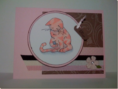
pink cat

Colour Challenge 189 Pink Chocolate Kisses and Weekend Sketch Challenge 63. The base card is 4.25x5.5" Pink Pirouette - my new favourite colour! -  with a panel of Close to Cocoa designer paper from SU! The pink and ivory dotted strip of paper is from Anna Griffin and the ribbon below that is from my stash. I wish the cocoa paper didn't show through but I didn't know until I had placed it and since it is adhesive ribbon, there was no going back! The ribbon holding on the tag is 1/8" pink satin also from my stash punched with the word window punch in Close to Cocoa hole-punched with the Big Bite of course. The tag is shorter than normal because I punched it, then fed it back into the punch from the bottom forcing one end of the tag through the hole and between the punching plates. I held the tag still with one hand and punched again with the other. I actually used tweezers to help me hold it. I stamped 'Hugs'  from the same set as last post, in Chocolate chip ink , see how inspired I was?? The flower is from Prima and the embellishment in the centre from Stamping Bella, a Canadian Company in my neck of the woods! She calls these Baubles. It looks like a pearl but it is more like some embellishments I have seen others use called Dew Drops, only the Baubles, at least the colour I have, are semi-opaque. They are also not perfectly half circle like  pearls, again, more like the shape of a dew drop. She does mail order and the dollar is in the favour of Americans right now so visit her site. One last thing, I made my own version of  a 'prima' leaf out of Old Olive CS just to satisfy the colour challenge of Chocolate Chip, Pink Pirouette and Kiwi Kiss or Old Olive. Check out the instructions here. I forgot the last bit about using an embosser so mine isn't as rounded as hers are. Hope you appreciate having the Copic  colours this time, even though I wasn't happy with them! I know, a few of you who are particularly observant and picky have noticed that I have used whisper white paper for my stamped image with pink and IVORY dotted paper and pink, IVORY and brown striped ribbon. I am not sure what to do about this. I prefer colouring with Copics on white because ivory paper muddies the colours. On a blog I read (sorry, I don't remember which one) the artist coloured the entire back ground with an ivory E marker. That seems like a lot of work. If anyone has a suggestion, feel free to leave me a comment.


pink cat copics

October 27, 2008

You Cured Yet??

I made this little piggy card for a couple of Challenges on Splitcoast Stampers. I am really enjoying making cards for challenges. So often I sit down to make a card and unless I have an urgent need for something specific, I am at a loss. Not that I get a lot of time to sit down and craft with two little boys, Jameson age 7 3/4 and Spencer 17 months. This really inspires me and strangely enough, I have gone back to supplies and techniques I haven't used in ages. Sketch Challenge 199 and Limited Supply Challenge 190 called Single Blue Eye! The goal of the latter was to use one (single) patterned paper and ribbon, the colour blue and no embellishments other than eyelets. Since I tend to go with fewer embellishments and layers, this suited me just fine. I love other artist's work with multiple layers so I am trying this out myself, just not with this card.

cured yet

The card base is Bashful Blue 4.25x5.5" with a retired SU! Designer Paper for the panel on the left. The yellow panel is So Saffron and I'm not sure if you can see it well but I stamped 'Hugs' from the fancy Flexible Phrases set several times along the bottom because it just looked too plain otherwise. I am loving the effect so I will use this as a border on other cards. I always felt guilty that I didn't use this set much so I am glad to now be inspired by it. The edges of the saffron panel were distressed with my Heidi Swapp distressing tool. It is the little one that looks like a pink  pacman! You can see it in the bottom right of this page. LOL! It is so easy to use and I get quick results without ruining my fingernails.  The piggy from Farm Fever set was stamped with black Ranger Adirondack Ink on whisper white CS and coloured with Copics. I was happier with the results this time, could I possibly be getting better at this? WOOHOO! Originally, I coloured the pig with RV markers and I wasn't happy, he looked too perfect and clean, not very pig-like. So I tested my colours first, not wanting to make it worse but I likes it so I coloured over with a YR marker (sorry,I didn't make note of the colour numbers, I will for the next post) and it made him more peach and less perfect looking. I edges the white panel with chocolate chip ink to grunge it up a bit more. I used my BRAND NEW Crop-a-dile Big Bite to set the eyelets in the corners of the white piggy panel; that thing is awesome! The punch went through the lower left 4 layers like it was tissue paper. Last step, add the ribbon. Now I have a card in my stash for the next time someone is feeling crappy. Usually, by the time I get to making a card, especially one with colouring, they are feeling better. Come one, I know it has happened to you, be honest! Be sure to subscribe to email updates from Feedblitz to be notified of my future postings! Sorry for the less than stellar photography. I am taking the photos with my iPhone so they could be better but I think you get the idea.

October 23, 2008

Pink Monogrammed Card

More firsts. First Colour Challenge, first monogrammed card which is my first try at Ways to Use It and first card I have made in ages with me in mind. Now only do I love pink, black and white together but I got to use this stamp set for, wait for it... the first time! Of course, I will probably end up giving it to my girlfriend who is also named Rebecca! CC188 and WT187

cc188

The background card is 4.25" square of pink pirouette stamped with pretty in pink ink using the Baroque borders wheel, the edges are inked with pink also. I just loved the Scalloped border punch medallion tutorial on Splitcoast Stampers so I had to try it. I layered it on a basic black square and threaded three grosgrain ribbons through the back. The top layer of pink is punched with the 1 3/8" square punch. That makes the black square under it about 1 5/8". The monogram is from Lovely letters as are the flourishes in the corners. The actually stamp from the set is a double flourish but I carefully only inked one half. The bling are heart shaped from my stash of dollar store stuff. Of the four cards I posted today, this is my favourite. now for time to stamp cards for pink week challenges...
