September 30, 2012

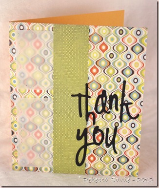
SFYTT September–Chic Thank You

This is my second card for September’s SFYTT. It’s for the family that hosted my sister’s engagement party. I would have put them in the same post but those linky things get mad if you try to post two cards from the same post. So scroll down to see the other card.

sfytt sept elegant

Nuts, I just realized that I messed up and reversed the panels on the left side. I like how it looks but I didn’t mean for them to be that way. They are seriously glued in so I don’t think they are going to move! I used some strong glue so that the panels would hold, considering they are only adhered on the one side. I used my scoring tool to make a pretty, elegant frame on the vellum.

The right panel is two die cuts stamped with Vintage Labels from PTI. The brown one has white embossing on it to make sure the white was clean and crisp. I love the paper underneath so I was happy this sketch doesn’t cover it all up and the vellum panels served two purposes. One, I didn’t want to cover up more of the background paper and two, like the card below, I didn’t have another paper I liked in the pack that coordinated.

sfytt sept2012sketch

Click on sketch to go to challenge post.

Enjoy, Rebecca

RECIPE
Stamps:
frame-PTI, sentiment-SU!
Ink: Espresso Truffle Memento, Versamark
Paper: DP: Offbeat Basic Grey, white CS-Taylored Expressions, vellum-stash, brown CS-SU!
Accessories: foam dots-Jody Morrow, Label 1 Nesties dies, white EP-stash, MS scoring board

Last Minute! September SFYTT–Funky Thank You

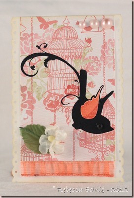
My sister’s best friend and her family had an engagement party (yes, another one) for her last night and I wanted to make a thank you card. Since I needed to get my butt in gear and make a card for SFYTT for this month, I combined them! I try not to wait to make thank you cards or I forget to send them.

sfytt sept funky

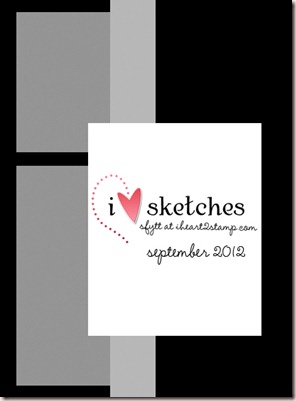
This one is for my sister’s friend. I’ll be blogging the one for her mom and dad shortly. This sketch has lots of possibilities, I went C&S for this but there are lots of fun things I could do shabby chic-ish.

sfytt sept funky2

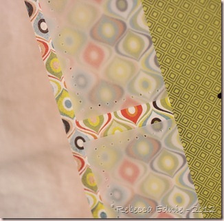
To add a bit of character, I pierced the vellum panels. My husband just asked me why my ‘fabric is so blurry’. Uh, that’s vellum on paper dear… gee whiz, that’s a man for ya! I explained I used the vellum panels because I didn’t have another paper I liked that matched. He still isn’t convinced.

sfytt sept2012sketch

Click on the sketch to visit the challenge blog.

Enjoy, Rebecca

RECIPE
Paper:
DP-Basic Grey Offbeat, black, orange CS-SU!, vellum-stash
Accessories: Piecing guide-SU!, alpha dies-Quickutz

September 28, 2012

Shabby Gift Bottle for WMS Sketch Challenge

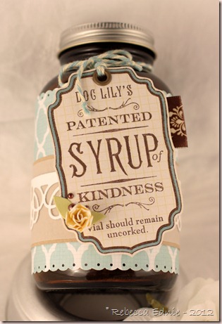
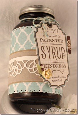
I’d recently finished a bottle of supplements and noticed that , for once, I had a nice bottle with a nice metal lid without any weird colours or writing on it! Yeah, can you say embellishing opportunity! And then when I saw this week’s WMS sketch, I knew it would be perfect!

WMS sk shabby bottle

The sketch lent itself, I thought, to having a tag as the focal panel. I made the tiny little flower with a Cheery Lynn Cuties die, sorry, I don’t remember which one.

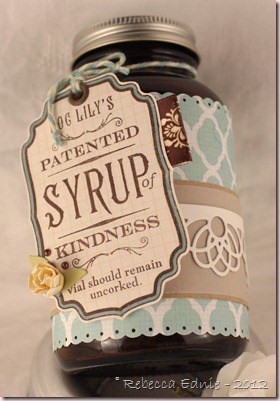
WMS sk shabby bottle2

I decided not to do any distressing because I don’t know the recipient very well. This is for my future brother-in-law’s mother! I know there are a few people out there who think distressing looks dirty and I wouldn’t want her to think I make junk! I think I’ll fill it with some chocolates to accompany the thank you card I’m making for having an engagement party for my sister. My family doesn’t know his family so it was the first opportunity for us to meet them all and his is a BIG family as he is one of 7 kids and they are all older with their own families!

WMS sk shabby bottle3

I am very pleased with the result. I love altering and decorating pretty found items and I feel so green doing so!

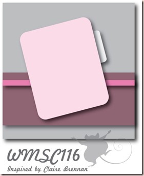
WMSC116

Click on the sketch to link to the challenge.

Enjoy, Rebecca

RECIPE
Stamp:
WMS
Ink: chocolate, banana-SU!
Paper: MME Follow your heart, vellum, kraft CS-PTI, white CS-Taylored Expressions
Accessories: cuties die-Cherry Lynn, leaf die-SU!, border die-PTI. mini scalloped edge punch-EK Success, twine-MME, foam dots-Jody Morrow, ribbon-Walmart, pearls-Dollarama, eyelet-WRMK, Copic marker

September 12, 2012

Pretty Packaging

I searched high and low on Pinterest back when school ended looking for packaging ideas for my gifts for my kids teachers.

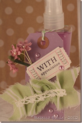
pkg purple tag

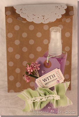
Didn’t this tag turn out adorably? I tried to go very collagey with this one.

pkg dotted gift bag

I put this in the most adorable bag, I’ve seen them in so many places lately but I was fortunate enough to have won these from the Stamp Simply Ribbon Store.

pkg purple gift bag

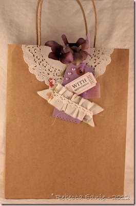
My other gift was much larger so I used a similar tag but a bigger, plain kraft bag. I added some hydrangeas from a larger stem. I often buy stems with big clusters of flowers and gradually use them up individually.

Enjoy, Rebecca

RECIPE
Stamp:
PTI
Paper: Doily-Wilton

September 11, 2012

Tim Holtz Inspired Metal ATCs

I’ve been wanting to enter a project inspired by one of Tim Holtz’s 12 Tags of 2012 and I finally got to it. Funny that this was the month because his tag this month is so not my usual girlie style! But I joined a metal madness ATC swap on Swap-Bot and his tag was perfect!

metal holtz inspired ATCs

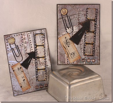
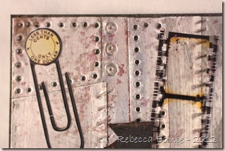
Aren’t these cool? They look so industrial and it was fun and easy to make. I had some old Karen Foster metal sheets for so long they were dusty and I’m amazed I remembered where they were!

metal holtz inspired ATCs closeup1

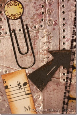
Tim used various techniques to distress and mark the metal. A pen makes rivet-like marks, a piercer makes the holes and I used a bone folder for the lines. Alcohol inks give the rusted look, I actually used red, green and grey together and it turned out amazingly I think. Those are all the colours I had so I was glad it worked out. Check out September 12 Tags of 2012 for more details and to see Tim’s tag.

metal holtz inspired ATCs closeup2

Enjoy, Rebecca

RECIPE
Paper:
Grungeboard arrows, vintage stickers-Stash, vintage music paper, black CS-SU!
Ink: SU! black craft, alcohol inks-Ranger, vintage photo Distress
Accessories: TH filmstrip ribbon, copper eyelets-SU!, metal sheets-Karen Foster, tiny stapler-TH

Grad Hat Box

I can’t believe I forgot to post my latest video! I made it ages ago but I guess I still have a pretty hefty dose of baby/breastfeeding brain.

grad hat box

Here’s the link. Graduation Hat Box I wish I knew how to post the link that shows up as a thumbnail of the video with a play button in the center. If you know how to do that, pretty please leave me a comment?

grad hat cards

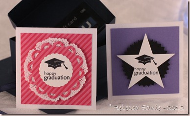
These are the cards I put inside each box. I was making them for triplets plus one other kid from another family so these are just 2 of the 4 cards I made. The inside of each grad hat coordinates with the cards.

The circles and star are dies by PTI and I added a sweet doily to the girl ones. They are very simple as that is all I had time for after spending quite a lot of time making the boxes. We added gift cards to the boxes too but there was lots of room for a tiny or small gift. The cards measure 3 or 3 1/4” so they aren’t too small.

Enjoy, Rebecca

RECIPE
Stamps:
PTI
Ink: archival black-Ranger
Paper: doily-Wilton, DP-Echo Park, CS-SU!
Accessories: PTI dies, iTop (grad hat brad), foam dots-Jody Morrow, embroidery floss, ribbon-SU!

Miscellaneous ATCs for Swap-Bot

I have a blast making ATCs to trade on Swap-Bot.com. Here are a few I haven’t blogged yet.

Oh my word, I just got tot he bottom of this post and came back up to add this note. I can’t believe how many projects I found I’ve never shown you! And how many ATCs ended up in this post! WOW!

enjoy the ride ATC

I think this one was for a book page swap. The requirement was to use a real book page as part of the ATC.
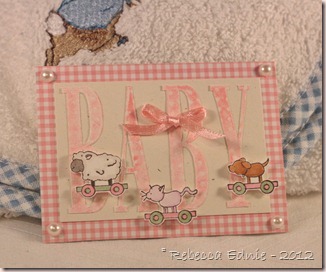
baby pull toy ATC

I didn’t execute it very well but this one was showcasing kissing technique. The letters were kissed with a dotted background stamp.
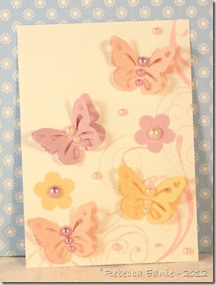
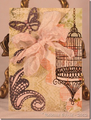
butterfly and swirl ATC

I made a card like this then miniaturized it into an ATC. The lighting was bad so the colours are way off but I still love the design.
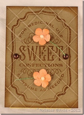
grid tech ATC

This one shows grid technique where you stamp after embossing lines in the paper. It looks kinda like tiles and I think it suited this stamp well.
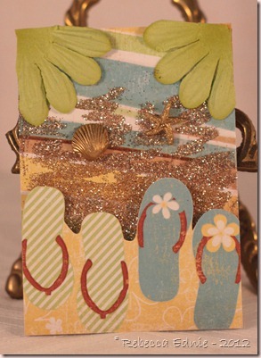
flip flop ATC

I’m sure this one was for a beach themed swap. I absolutely LOVE this paper. The whole thing is rows upon rows of pretty flip flops. Here I trimmed the paper into a cool border and I added gold glitter to look like sand. The paper flower was cut apart and placed to resemble palm tree branches leaning over the scene.

interactive ATC craft stuff

This one was for an interactive ATC. The wheel inside rotates to show different craft supplies and one image has the sentiment ‘...crafting.’
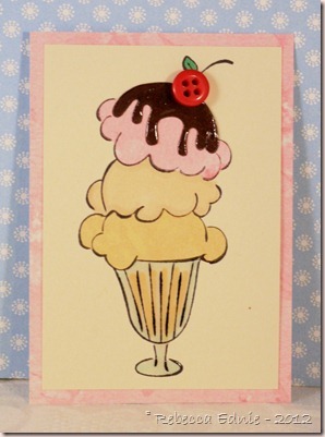
icecream ATC

This one was probably summer fun or sweet treats or similar. I added glossy accents to the chocolate sauce.
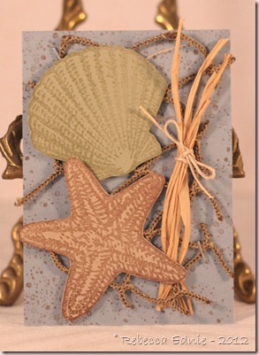
shell ATC

Another beach themed one. I love this real fishing net I got when I was in Ocean City, NJ. I have scads of it and so I don’t have to hoard it! I’d decorate my whole house in a beach theme if it wouldn’t seem so silly in the middle of our too long winter!
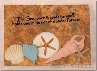
faux marble shell ATC

This one was to use a new technique. i may have tried faux marble a million years ago but if so, I know I didn’t make anything with it. I also tried metallic rub-on paste using the die as a stencil for the first time.
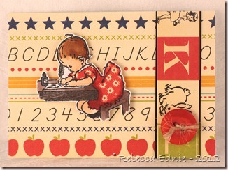
school ATC

This one was ‘add a number’. The number could be in any form you liked.
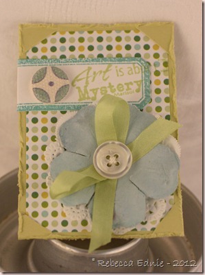
no adhesive ATC

This was one of the biggest challenges I’ve done. No adhesive allowed on this one! Can you see the techniques I used?
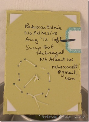
no adhesive ATC back

You can definitely see them from the back! A brad holds on the label. Slits hold the background paper in place and the brad reinforces that. I sewed on the doily and the button which holds on the ribbon and the flower. I had lots of other ideas too but these just ended up being the ones I used.
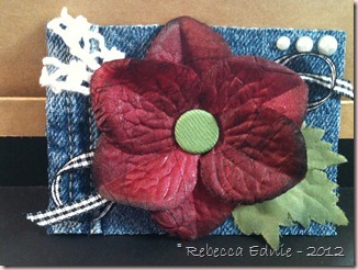
no paper ATC

I know the photo is atrocious, so sorry. This was another tricky challenge to make an ATC without paper! Yikes! I used plastic from packaging as the base and the rest you can see.
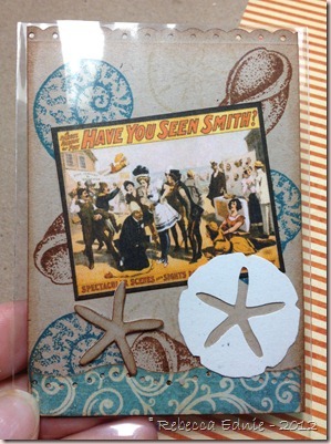
vintage bathing beauty ATC

Vintage Bathing Beauty ATC.

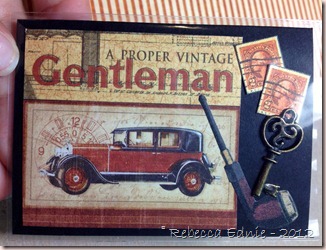
vintage gentleman ATC

I have no idea what I made this one for. Hmmm…
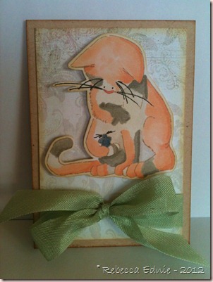
kitten ATC

Copic coloured kitten ATC. According to the website, which has a story for each character they draw, these two are friends. No munching in imminent.
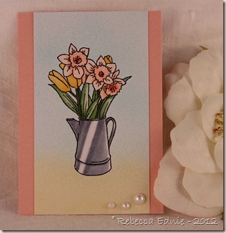
 

daffodils ATC

I guess this one was for flowers. I am always working on making metal look shiny and realistic. Not sure if I got there or not…
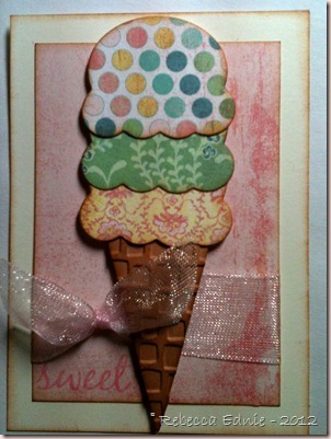
sweet summer treat or drink ATC

I love using this embossing folder on the cone. Doesn’t it look so much like a real sugar cone? Summer treat or drink theme.
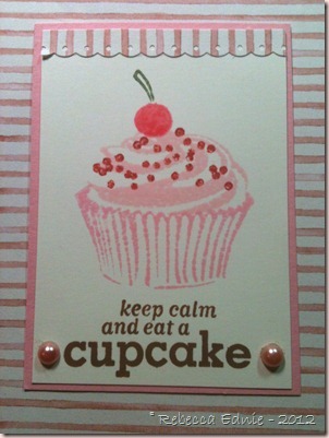
keep calm cupcake

Pink Cupcake, part of a cupcake series.
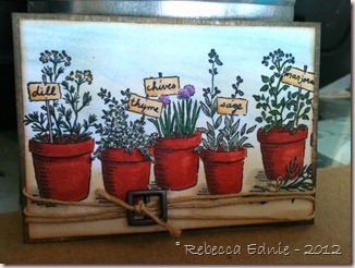
herb ATC

I think this one was for my Nature Series: Plants.
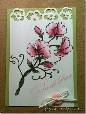
sweet peas ATC

Nature Series: Flowers

bird ATC

Pretty Bird ATC.

porcelaine shabby ATC

No idea, I made this one two years ago!

If you got this far, you deserve a gold star! Especially since I am always running behind with my swapbot swaps and I take most of these with my iPhone and they aren’t great photos. Thanks!
September 04, 2012

Major Copic Colouring-Travel Postcard

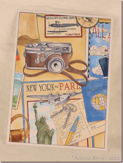
I’ve had this stamp for ages but finally got to colouring it last summer. Yes, it’s true, this sat un posted THAT long. I kinda  forgot about it but then I was reviewing some old photos and stumbled upon it. I am very glad because it took me about 4 hours to colour it and I HATED to part with it once it was done but I made it for a swap so off it flew! I added a backing and turned it into a postcard.

travel postcard copic

Please, PLEASE click on it for a better look! I relied heavily on the water coloured stamp block image but since some of the shading wasn’t totally accurate, I added my own touch. I think I’ll colour this again soon and maybe try some other colours. Such fun!

Enjoy, Rebecca

Sweet Bee Card for Mojo Monday

I liked the sketch for this week’s Mojo Monday so much, I decided to make a second card using it!

bee mojo_thumb

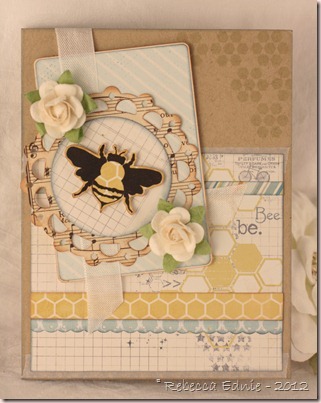
I just bought this stamp set second hand and I was thrilled that it went so well with some new paper too! The yellow hexagons just screamed bee to me! I LOVE the shape of this bee; it is realistic without being creepily so. I have a huge bug phobia but it looks sweet stamped right? And no icky, overly detailed eyes (I find totally realistic eyes especially creepy). The stamp set includes a body stamp to make the bee yellow but I have no ink that even approaches a colour that would coordinate with or match this paper. So I paper pieced it instead which also gave it a sweet yellow halo! I LOVE how it looks. Can you tell this card is going to be hard to part with? {{ GRIN }}

Mojo257Sketch[6]

Did you notice what I stamped directly on the patterned paper? They already had ‘be.’ on the paper; I added the ‘Bee’. I thought it made for a cute play on words! Then I added a little ribbon tab in place of the flag in the sketch. If you ever like to enter the M0jo Monday contest, be warned that I’ve found the judges are particular about seeing you not deviate from the sketch too much. Sure you can swap out the shapes and add a layer or two as matting but they really like to see all the elements and in the same places and relative proportions. I won in July and made sure every element was on there! I added a bit of washi tape sticking out from under the largest panel for a bit of interest.

Enjoy, Rebecca

RECIPE
Stamps:
PTI
Paper: MME DP, kraft, rustic white-PTI, vintage music paper
Ink: Archival black-Ranger, London Fog Memento, Bordering blue-SU!, Old Paper, Vintage photo Distress
Accessories: roses-Prima, button card die-PTI, lacey circles, circles dies-Spellbinders, WRMK corner rounder, EK Success mini scallop punch, washi tape-Studio Calico

September 03, 2012

Pretty Bees Card for Mojo Monday

I liked the sketch for this week’s Mojo Monday so much, I decided to make a second card using it!

bee mojo

I just bought this stamp set second hand and I was thrilled that it went so well with some new paper too! The yellow hexagons just screamed bee to me! I  LOVE the shape of this bee; it is realistic without being creepily so. I have a huge bug phobia but it looks sweet stamped right? And no icky, overly detailed eyes (I find totally realistic eyes especially creepy). The stamp set includes a body stamp to make the bee yellow but I have no ink that even approaches a colour that would coordinate with or match this paper. So I paper pieced it instead which also gave it a sweet yellow halo! I LOVE how it looks. Can you tell this card is going to be hard to part with? {{ GRIN }}

Mojo257Sketch

Did you notice what I stamped directly on the patterned paper? They already had ‘be.’ on the paper; I added the ‘Bee’. I thought it made for a cute play on words! Then I added a little ribbon tab in place of the flag in the sketch. If you ever like to enter the M0jo Monday contest, be warned that I’ve found the judges are particular about seeing you not deviate from the sketch too much. Sure you can swap out the shapes and add a layer or two as matting but they really like to see all the elements and in the same places and relative proportions. I won in July and made sure every element was on there! I added a bit of washi tape sticking out from under the largest panel for a bit of interest.

Enjoy, Rebecca

RECIPE
Stamps:
PTI
Paper: MME DP, kraft, rustic white-PTI, vintage music paper
Ink: Archival black-Ranger, London Fog Memento, Bordering blue-SU!, Old Paper, Vintage photo Distress
Accessories: roses-Prima, button card die-PTI, lacey circles, circles dies-Spellbinders, WRMK corner rounder, EK Success mini scallop punch

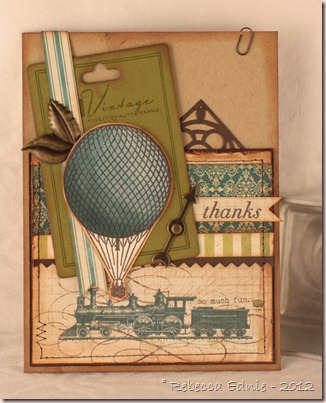
Steampunk Balloon Card

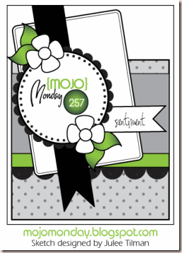
I love this week’s Mojo Monday sketch. It is detailed, asymmetrical and includes elements I love.

steampunk ty mojo

I used the train pattern on the paper to enhance the bottom of the card. Very masculine right? This is such a great paper pack I had a blast choosing which papers to use! I won a mystery box from PaperCrafts Connection blog (YEAH!) and it had THREE stamp sets with hot air balloons!  This vintage one is from Studio Calico and I thought it went perfectly with this paper.

Mojo257Sketch

Click on sketch for link to blog.

The only thing I wasn’t too sure about was the flowers, which of course didn’t suit the style of this card. So what else to use in their place? I dug into my Tim Holtz embellie jar and found these cool metal leaves and game spinner arrows. Fun right? The stamps on the green card are from button boutique!  Who says that this set can only be used on girlie cards! It’s hard to see but the layers are all distressed, looks very vintage IRL.

Enjoy, Rebecca

RECIPE
Stamps:
Studio Calico, PTI
Ink: Memento Espresso Truffle, Vintage Photo
Paper: My Mind’s Eye designer paper, Kraft, chartreuse CS-PTI, ivory CS-Taylored Expressions, brown CS-SU!
Accessories: metal accents-Tim Holtz, foam dots-Jody Morrow, button card die-PTI, accent die-Cuttlebug, pinking shears, sewing machine, Copic markers